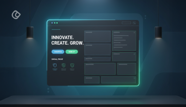
Web site designing is undergoing a fast change with all the smaller digital devices like mobile phones picking up the internet. The buzz words we hear recently are ‘minimalism’ ‘responsive’ and ‘flat design’. Large companies like Microsoft started embracing flat design concepts and naturally we are going to witness everyone following the same.
Though the Flat Design has been around for many years, 2013 really is considered to be a year of flat design in the digital front. This concept is not a new one and the trend towards ‘flat’ is resurging slowly on top to stay there for many years to come.
Flat Design avoids big buttons with gradients and many other such call-to-action stuffs, based on the belief that technological literacy has improved a lot in the last few years and so the users are aware of what to do on a website.
So the fear that UX experts had before, that users might miss a button or an icon if it didn’t pop off the screen, is now changing as they start to believe that users are more matured technologically and so they just focuses on making the design an uncluttered and a non busier one. The Flat Design trend is obviously towards simplicity, minimalism and user experience.
What is Flat Design?

Previously, best web designing means bombarding the users with a stunning interface, packed with animations and flashy elements. After this web designers tried to bring real life into the screen with drop shadows and faux-realistic textures. Now is the time for ‘Flat Design’ to rule the scene.
Flat Design has within it the concepts of ‘minimalism’ and ‘responsive’ attitude. With this design, users can concentrate on the content without any distraction. The main focus of flat design is the usability. At the same time, flat design does not mean just dull, ‘content only’ design.
Features of Flat Design:
- The design is a clean one without any complexity.
- No ornamental elements to distract the readers. The key to this aspect is eliminating unnecessary components or features that don’t help to fulfill the purpose.
- Choice of colors plays a significant role in Flat Design. Lively, bright colors are used to make the appearance pleasing and sophisticated one.
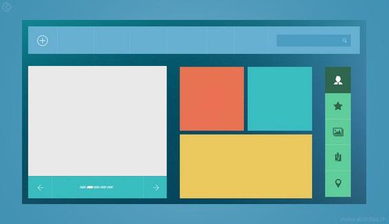
- Basic design structure is based on grid pattern with block elements.
- They focus on 2D images. Intelligent usage of 2D objects giving out a 3D effect is the underlying concept.
- Liberal Usage of Icons makes the site interactive, attractive and interesting. Users can identify the content easily when they are represented with icons. In addition, they can easily understand what the message is about before even reading the content. Colorful little icons grab quick attention. Moreover, icon fonts enable easy inclusion of them in the website without any fuss.
- Well planned typography is the lime light in flat design. They are presented with clear spacing between words and lines. Font faces used are clean, neat and legible with large enough size. All the whole typography of a flat designed web site presents the readers effortless reading.
Guiding principles of Flat Design
The central idea to keep in mind while designing flat designed website is ‘simplicity’. Designers must not deviate from this central concept. They must adhere this rule to whatever feature they are implementing.
Use vivid and vibrant colors to design the site. Designers can refer the ‘Flat UI Colors’ online tool as a guide for selecting right color modes. Though bright colors are attractive, it is not a compulsory feature for flat design. Plain colors or just black and white is also enough to come out with a good flat designed website. The underlying concept is sophistication and pleasing appearance.
In good typography usage ‘sans serif’ font face ensures clear and crisp appearance. The content presented must be precise and to the point. All elements of User Interface such as links and buttons must be noticeably distinct.
When you are hearing about “flat design” for the very first time, then you will be surely impressed by it and the flat design has become a new web design trend in the recent days. The flat design is completely based upon two-dimensional aesthetic. In a flat design, the buttons will never look like a 3D made one and it will be a simple layout with some graphics added to them. The following are some of the reasons why you should use a flat design for your website.
Benefits of a Flat Design
Flat designed websites can load faster when compared to the ones that have complex graphics and animations on them. The flat designed websites can easily adjust to the screen sizes in which the website loads with. As the mobile device usage has been increased in the recent years, the flat design is the best way to insert many web browsing tools in your website, so that your visitors can make your them by browsing your website through their mobile phones. The flat design is a user-friendly one and it can be easily designed.
How to make use of flat design in your Web Page
Using a flat design in your webpage can make your visitors feel comfortable while browsing through your web page. The following are some of the things that you must do while making use of a flat design for your website.
#1. Choose a simple background
Never use a loud image or the brick-wall patterns for your website. Make use of a plain background with smooth colors on them. The color palette should be a subtle one so that your visitors can stay on your website. The color palette should not disturb the human eyes.
#2. Say no to effects
Never make any kind of bevels, gradients and animated transitions in your website. A flat design will never have such effects on it. Flat design portrays the depth and a live emotion towards your website.
#3. Take out the icons
A flat designed website would have icons that provide a streamlined user experience to the visitors. Make sure to design your icons simple and clear so that it can be easily noticed without adding any kind of effects to them.
#4. Play with the shapes
Squares, circles and lines are the most used shapes in a flat designed website. Create a clear vision of your content and make them visible by dividing your flat design with the common shapes.
#5. Go for the bright colors
The color palette of a flat design must be a fresh, cheerful and a light one. Make use of bright pinks, greens, blues and yellow colors. These colors can easily attract a human eye and it can make the visitors to stay on your web page and read all your contents.
#6. Create the basic navigating methods
The navigation menus and all the links on your website must be simple. Remove all the effects on the navigation menu so that you can view only the navigation menu with text on them. Make use of simple boxes to create a navigation menu. Never create any kind of shadows or highlights on the navigation menus on your website.
Design principles have witnessed a shift from the skeumorphic designs of textures and drop shadows and have moved towards more simplistic and aesthetic appearance. Known as Flat design in the everyday Design parlance, this is the new trend which is gradually gaining ground. Let us take a look at the principles and best practices that govern Flat Designs.
Defining Flat Designs
Open, clear, crisp and compact are some of the attributes that can be assigned to flat designs. It focuses on usability without compromising on aesthetics. Though without any frills and fancies, Flat designs, are nevertheless, appealing to the eye and easily comprehensible to the mind. They use bright colors to compensate for the bevels and drop shadows, and are two dimensional in nature.
Flat Design Principles

Flat Designs are based on the principles of minimalism. Ornamental illustrations that do not add any functional role in the design is removed to clear real estate space. Also Flat Designs are uniquely characterized by the fine differentiation it makes between real life objects and interface elements. With a distinct intention to move away from schematic design elements, Flat designs are functional and do not act as a distraction to user experience.
To compensate for the lack of flashy graphics and to avoid boring the user, Flat Designs are characterized by bright big blocks of color comprising simple and intuitive text and graphics. While the colors help to grab the user’s attention, the graphics are contextual and can be easily interpreted. Flat Design websites are able to therefore successfully achieve the objective of user retention without becoming boring or monotonous.
Flat designs therefore are based on the conventional principles of design being a functional tool. The success of a design depends on how well it is able to solve the issue at hand rather than how pretty it looks.
Best Practices for Creating a Flat Design
The concept of Flat Designs, which has been around ever since the 1920’s, has been resurrected and included as the latest design trend. Let us take a look at some of the best practices that can be followed in order to make it contextual in the current scenario.
1. Be Honest, Avoid Illusions
Flat designs harp on honesty. Avoid treading on the gradient rich track of 3-D effects and illusions. Appreciate and comprehend the fact that users view designs on flat screens and desire a coherent experience which can be provided by avoiding dimensional graphics.
2. Use Appropriate Fonts
Focus on the use of correct fonts to complement the design strategy. Use simple, strong, bold fonts that have adequate white space to enhance readability.
3. Establish a Visual Hierarchy
Draw the user’s attention on specific areas of the design by establishing a visual hierarchy. Use of grids can help you achieve this. Apply basic principles of layout and content organization to ensure the best possible results.
4. Use Color Strategically
The color turns out to be the most important element in your designs. Owing to the absence of 3-D effects and flashy illustrations, color is the best tool for you to play around with. Apply it strategically using different shades of the same palette to create a unique look. Explore the potential of contrasting shades without running the risk of using too many on a single design. Be as innovative and as creative as you can dare to be for the sole purpose of attracting attention to the relevant sections of your design.
5. Flat Design from the Major Companies
With the three tech giants (Microsoft, Google & Apple) moving towards flat design in their efforts to improve the overall user experience, many consider Flat Design as the new trend in digital design, especially in website design and the mobile applications arena. Many other big tech companies like Twitter, MySpace, Firefox, etc have already started to follow the flat design standards.
Microsoft made the big impact on the flat trend with the introduction of Windows 8 and their modern UI. They introduced this new UI experience to the masses, which radically diverted from the sea of icons which most desktop used till then.
Apple also entered the game by redesigning the look and feel of iOS7,its new mobile version, to have a flatter look and with solid color tones compared to its previous interface.
Though even before this Google have hailed Flat design to some extent, the change of logo was considered as their obvious leniency towards the Flat trend. ‘Google Now’ is a great example of flat design which uses a card-like system to display information brackets. Rather than restricting information inside of static icons, ‘Google Now’ displays data on a standard-sized card that’s easy to read and easy to swipe away. (Anyhow ‘Google Now’ is not considered as a full flat design, but as a variant of it, called Almost Flat Design)
Why use Flat Design?
1. No gradients or shadows. No Added effects
Flat design employs a two-dimensional style, and simply “flat”. There won’t be any eye-popping effects and no extras, though it still will have a distinct look and feel.
2. Strong focus on color
Flat design is colorful, but done in a way that users won’t get distracted by it. Rather than limiting the colors to the traditional ones, Flat Design uses new shaded and bright colors to make your design lively and not boring at all.
3. Beautiful Typography
Flat Design relies on typography a lot. As all the other fluffy and shiny effects are removed, typography is considered to have a more prominent role to play in the aesthetics of the design.
4. Keeping multiple devices in mind
Nowadays, as a major chunk of visitors to any website comes though the mobiles & Tablets, no one can ignore the relevance of a responsive web design. Flat design, because of its simple nature, will be easier to scale across various screen sizes and is a welcome solution for responsive website design.
5. Focusing on Content
One reason for the wide acceptance of Flat Design, especially among big tech companies, is because Flat Design gives a higher focus on the content while eliminating the distractions from UI elements.
Other Trends related to Flat Design
As the Flat Design is getting widely accepted, several other trends have begun to emerge out of this. A couple of important ones from these are:
Almost Flat Design: Almost Flat Design is based on Flat Design but may include some degree of minimal effect, such as a subtle shadows and or slight gradient. The new Gmail can be considered as one of the most prominent examples of Almost Flat Design. The new design of MySpace can also be a good example for this.
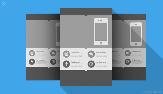
Long Shadow Design: Long Shadow Design is used almost exclusively for icons. The shadow gives a sense of depth to the icons, yet still maintains the flat look of the object.
You would find most designers, either designing the web apps or the websites, talk to the flat design in the most peculiar manner. You will find flat designs an integral part of almost all web based products. Some websites have managed to illustrate the flat design in the best possible manner while some others have not been able to give justice to flat design. There are some obvious pros and cons attached with flat design. Here are a few pros and cons listed out for your reference.
It’s Trendy
Flat design is surely trending in the best practices for web design. If you are the ones who keep abreast with the latest trends, then you know for sure how good flat designs are for your website. In case you don’t follow trends, try following them with flat design. It will give your website a new look.
While being trendy has a definite advantage for developers, there is a flip side to the story too. You see a lot of designs that are absolutely flat. This can cause a major issue in the lifeline of the website. In case you are looking for a long life of the website, you may want to consider something simple.
Usability for Users
While the interface is great with this flat design, there are some concerns related to the usability of this flat design. You will see that the flat design does not manage to support complex experiences. You will normally see that all users are not really aware of where to click when using a mobile app. The directions are required for the user to use it perfectly. In such a case it is essential that the flat design be replaced with something more simple for the users.
Nice Bright Colors
When you indulge in flat design, you are actually indulging in an experience with fantastically portrayed bright colors that would give out a good mood when you try and open them. Bright colors are perfect for engagement. The flat design possesses hues that are brilliant. In fact, all the colors of the palette are considered to send in positive vibes which is perfect.
Color Palettes: A Tough Game
Mixing and matching colors to create the website would be difficult with the flat design. You will need to find the various colors and then match the ones that go together. You would find that you are not really working on the harmonization of the palette and are actually making it appear uniform in terms of saturation which is not really a good thought. So, maybe you need to work on this feature else change your flat design to something else.
Flat design may be cool, but it certainly has its own share of issues and advantages. Be sure what you want before you choose flat design.
Interesting Interface
You can create beautiful mobile interfaces by indulging in simple yet intuitive flat designs. Yes, flat designs can be simple yet communicative and that is the kind of design you should ideally indulge in that would give your mobile app a beautiful framework to develop within.
Benefits of flat design
Flat designed websites can load faster when compared to the ones that have complex graphics and animations on them. The flat designed websites can easily adjust to the screen sizes in which the website loads with. As the mobile device usage has been increased in the recent years, the flat design is the best way to insert many web browsing tools in your website, so that your visitors can make your them by browsing your website through their mobile phones. The flat design is a user-friendly one and it can be easily designed.
How to make use of flat design in your Web
Using a flat design in your webpage can make your visitors feel comfortable while browsing through your web page. The following are some of the things that you must do while making use of a flat design for your website.
Design it for your visitors
Who is it that you are designing your website or flat design site for? Of course, undoubtedly, it is your visitors! If they cannot understand it, then, what’s the point?
Flat designs are considered to be the simplest form of designs. Most of the designers designing flat designs try to keep it simple. The problem is though the design is simple and there are no complexities involved, it is not necessary that the people will find their way through the website and take the expected action.
You will have not just one kind of visitor but many of them, but recognizing their desires and then, offering them with the best is where you need to show your smartness and efficiency as a designer. It is possible for anyone to design an absolutely aesthetic design, but designing a website that your user can understand and move across is what makes your flat design functional too.
This is possible only if you plan your flat design strategy based on the interests and the point is in designing a website that is useful to the end users.
What’s the trend?
Is there actually a trend or is there any parameters based on which you design your website?
Yes, sometimes we have parameters that are set based on our client business requirements and expectations. There are those designers that take a page from the book of other designers and go ahead with designing their flat designs.
But, when you go about designing for the web, the usual tendency is to abandon all the existing trends and embrace one of them. But, wait, why do you want to do that and give a boring appearance to your site? Why, can’t you collect bits from everywhere and incorporate these onto your site? It is understandable if you like flat designs but do not want to make your design totally flat. Chill! It happens and the best way to go about a flat web design is to collaborate a few different styles together and then, present it to the user.
How well do you deal with white spaces?
White spaces are the most important gradient of any web design. Leave flat designs it is needed everywhere. Imagine how boring it would be if you have all your design decked up with text, buttons and colors. You do not need that! As the user’s eyes scrolls across these designs, ensure that they are able to relax and do not find it difficult to gaze across and fix the thing that they wanted most.
When everything is crowded without white spaces, chances are that people will miss out what is important.
Font matters
We do not need to tell you this. How important is your font in flat web designs? You know that very well! Font has an important role to play in attracting people to the websites.
Do you know what the highlight of flat designs is? It is minimalism. Flat designs focuses more on providing content that is necessary for people rather than those images that create nuisance.
Your design looks more attractive and beautiful if it has great font on it.
Transforming from online to offline
When we think of flat designs, we are all concerned with websites. But, designs and people are everywhere.
Don’t you think it would be a wonderful idea if we could bring this idea of design across everything that is connected to our business, for instance, our flyers, business cards, brochures, and even the stationery.
You use the same logo and colors, then, why can’t you use the same design?
Ever thought?
But, it is time to think and implement the same!
User friendly
There used to be a time when flat design was not considered user friendly. Actually, a lot of people still hold that belief. But that doesn’t have to be true. Make sure that users know where to click. How? By telling them click here. Use words, or animation, to trigger engagement.
Don’t forget the ghost buttons
What do you think is one of the most amazing and surprising part of your flat design? It is nothing but those transparent buttons otherwise known as ghost buttons that come with a solid core for border.
You can leave it colorless. There is no rule that says you need to keep colorful or colorless buttons for your flat designs. It is your choice and the appearance of your site that matters when designing ghost buttons.
Can you make your users click?
This is the first question when you start designing! Do you think your users will click through your design! Can they understand what you are trying to convey.
Unless they can follow the flow of the design, they are never going to take the desired action and your business will suffer with such a website.
You need to create an intuitive flow for your web design so that your people know where it is going and what they can find where.
One of the highlights is that the solid colors attract the attention of people to the site.
Choose a simple background
Never use a loud image or the brick-wall patterns for your website. Make use of a plain background with smooth colors on them. The color palette should be a subtle one so that your visitors can stay on your website. The color palette should not disturb the human eyes.
Say no to effects
Never make any kind of bevels, gradients and animated transitions in your website. A flat design will never have such effects on it. Flat design portrays the depth and a live emotion towards your website.
A flat designed website would have icons that provide a streamlined user experience to the visitors. Make sure to design your icons simple and clear so that it can be easily noticed without adding any kind of effects to them.
Play with the shapes
Squares, circles and lines are the most used shapes in a flat designed website. Create a clear vision of your content and make them visible by dividing your flat design with the common shapes.
Go for the bright colors
The color palette of a flat design must be a fresh, cheerful and a light one. Make use of bright pinks, greens, blues and yellow colors. These colors can easily attract a human eye and it can make the visitors to stay on your web page and read all your contents.
Create the basic navigating methods
The navigation menus and all the links on your website must be simple. Remove all the effects on the navigation menu so that you can view only the navigation menu with text on them. Make use of simple boxes to create a navigation menu. Never create any kind of shadows or highlights on the navigation menus on your website.
Do I need a Flat Design?
It depends on your target audience. Though adopting Flat Design will make you up-to-date with the latest design trends, you don’t need to have a Flat Design only for the sake of having a Flat design. The key for any website design is still its User Experience and you can’t sacrifice that over any specific design style or element. But if you’re already decided to revamp your existing website or to do a new website for your business, Flat Design is certainly something to be considered.
Are you looking for someone who can provide you with Flat Designs?
Then, we at Acodez are experts at it!
Acodez IT Solutions is a web design company in India offering all kinds of web design and web development services to our clients across the globe. We will provide you with flat designs for your websites as per your desire. You just need to tell us what kind of website you need, the rest our web design team will take care of. For more details, you can contact us today.
Looking for a good team
for your next project?
Contact us and we'll give you a preliminary free consultation
on the web & mobile strategy that'd suit your needs best.


