Utilizing your products should not be boring, thanks to microinteractions in user experience. Microinteractions are brief periods of interaction in a design. They represent trigger feedback on your website, app, or gadget.
Swiping, scrolling, clicking, muting, and unmuting phones, liking, sharing, and saving things are just a few examples of our daily microinteractions.
Most people believe that only effective communication is required for successful relationship-building, but they now realize that microinteractions in UX are the real game-changer.
The article will explain why you should incorporate microinteraction into your marketing strategy, different usability heuristics, examples of microinteractions, and the most effective way to accomplish user interactions.
Microinteractions, at their most basic level, are discrete points in a product’s design that carry out specific tasks while enhancing what is supposed to be the natural product flow.
They serve as the link between UI and UX, where functionality meets design.
It is common for people to confuse UI and UX. User Interface (UI) is the graphic layout of a software program. Design is required for every visual component, interactive feature, and animation.
How users interact with an app influences theiruser experience(UX), affecting how well they find the app. So UI directly impacts UX.
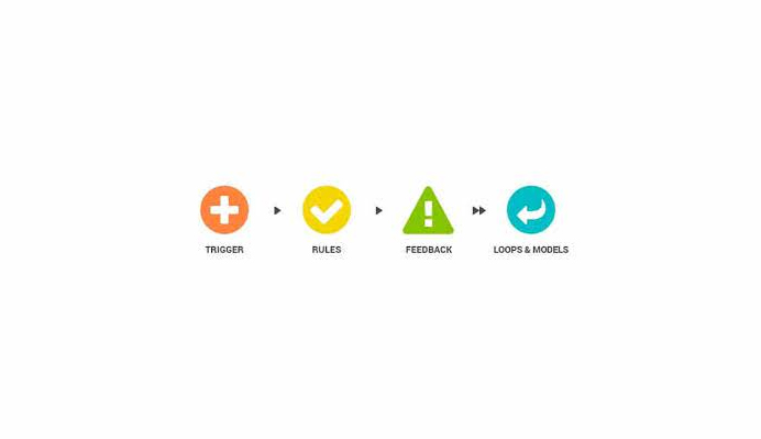
Below is a model explaining the micro-interactions parts.
Microinteractions Parts – Image Source: Userpeek
1. Triggers
A trigger starts an interaction. Users can initiate triggers, or the system can. A user-initiated trigger requires the user to commence an action. The software activates a system-initiated trigger that starts an action when specific criteria are met.
2. Rules
What happens after a microinteraction is triggered is determined by rules. For instance, an application for a flashlight uses a button as the trigger to turn the light on and off.
3. Feedback
Feedback informs people of what is occurring. Feedback is anything a user experiences during a microinteraction, including what they see, hear, and feel.
4. Loops and Models
The meta-rules governing the microinteraction are determined by Loops and Models. What should happen in a microinteraction when circumstances change is the question.
For instance, if you had previously purchased an item on a site when you click the “buy now button,” it might change to “buy another.” Loops and Models are essential for user satisfaction.
The Importance of Microinteractions
Unfortunately, many web designers and developers are unaware of the possibility of losing because clients overlook microinteractions in UX details. The key difference between a website that is exceptional and one that is average is attention to detail.
The following are some justifications for taking microinteractions seriously:
1. They Convey a Feeling of Control
The objective is to keep the user abreast of events. Therefore, explain to your user what they are doing when they press this or that button. Was the phrase cut off? Have I deleted anything?
These are some of the questions a user will ask themselves. It demonstrates consideration for your user’s feelings by adding animated micro-movements to the functional elements. You give someone the impression that they are in charge of the situation and that every action they take is obvious and has a specific result.
Furthermore, these animations show the current state of the process and what needs to be done next. This improves your website or mobile app’s usability, increasing user retention.
The below themes are frequently seen on social media accounts; the love and thumb symbols ask you to like something, while the star symbol asks you to rate it.
Application Themes – Image Source: Dribble
2. They Increase Brand Recognition for You
Some logos are connected exclusively to a specific website or application. As a result, your products become distinctive because customers immediately recognize them when they see the logo anywhere else. This, in turn, creates curiosity in different people.
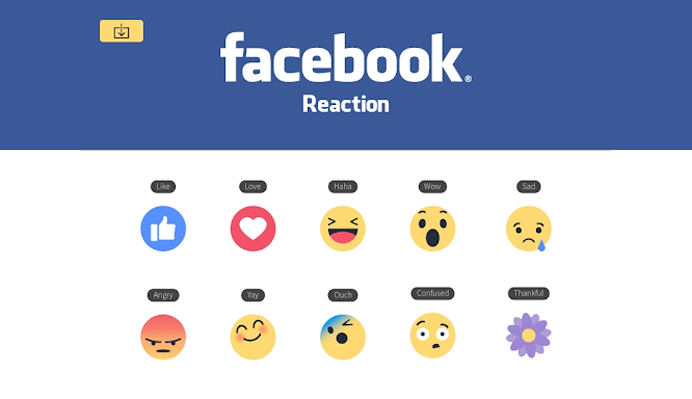
Facebook’s website and application are good examples. The product’s traditional appearance and actual like-button version involve microinteraction, significantly changing how the user perceives the product.
It continued by incorporating emojis and gifs to convey various emotions. The like button evolved into Facebook’s primary branding tool.
Facebook Microinteractions – Source of Image: Dribble
3. They Amplify the User Experience
Microinteractions expand the user experience’s range of emotions. The product has two sides: features and details. Features are what initially entice customers to use your product. Customers return because of the details.
Microinteractions are the necessary components that give a UX’s tactile side a visual counterpart. An animated icon’s movement, for example, is a microinteractions in user experience but very effective. These components act as a link to bring a digital experience closer to actual actions.
4. They Ease Navigation
Microinteractions contribute to the usability and are not merely decorative. By providing users with hints about what to do next or how to go back, they assist users through a series of actions.
Additionally, they can identify the specific website section the user is on or display the progress of an ongoing process.
When to Use Microinteractions
The trend for microinteractions in UX is dynamic due to advanced technology and different needs. Many organizations are implementing various microinteractions to facilitate simple navigation and keep customers.
Here are some illustrations of microinteractions usability heuristicsand how they affect the user experience.
1. Data Input
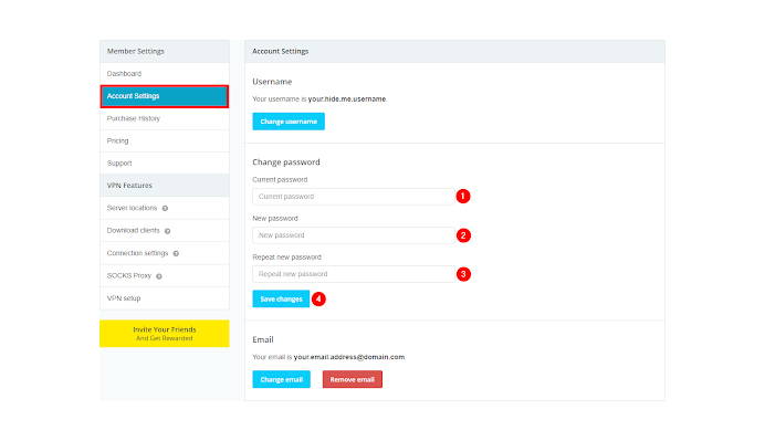
For most products, data entry is a requirement, such as sign up, log in, shipping details, etc. For many users, it frequently causes frustration. As anillustration, consider the account creation process. Various products have various password requirements.
After pressing the submit button, the user may often see an error message stating that their password didn’t meet the criteria. With inline validation, this unpleasant experience could be avoided while saving the user from having to enter a new password.
Below is an illustration of a user who wants to modify their password. You could offer a choice where the initials are shown during entry to eliminate confusion and guarantee time savings.
Changing Password – Image Source: Hide.me
2. Support Undo
It is simple to make mistakes when using applications and websites, especially in the purchasing sector. We should set expectations for customers who want to change their minds as sellers.
It is crucial to let the customer know how many times they can cancel a request to ensure between the buyer and the seller. As a result, customer retention is preserved, and no one feels under pressure.
Some examples are radio buttons, checkboxes, tabs, and other components that use micro-interactions.
The social media platforms with the “like” button are a good example. If you wish to change your mind after clicking it to like it, simply click the opposite icon. It goes the same for the Youtube subscribing button.
Here is a button for a Youtube subscription example. When you subscribe, a bell icon appears; when you click the same button to unsubscribe, the bell goes away.
Youtube Subscription – Image Source: Pixabay
3. Standby
Sometimes a product needs several steps to complete a single task. A microinteraction will be used after the initial trigger to inform the user that the product is now waiting for more inputs and is in standby mode.
This encourages the user to keep using the product to carry out the intended action.
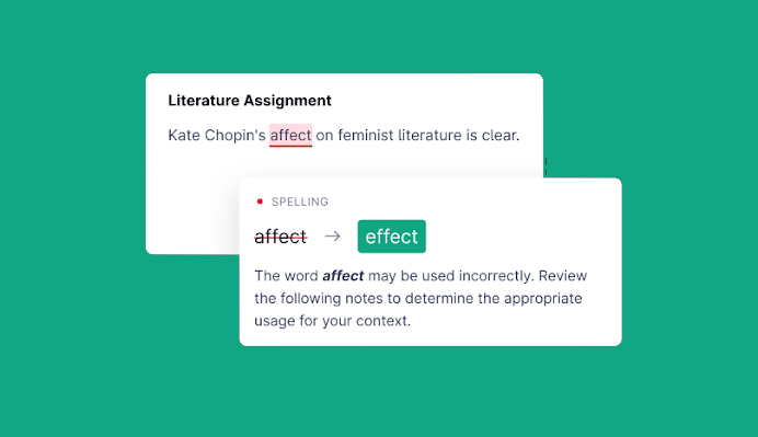
A good illustration of regular activities is the Grammarly word checker. The user is informed of any spelling mistakes in a document.
Text can use different colored underlines to show users what they should do. Clicking over the texts requires user action to make changes.
Spell Checker – Image Source: Grammarly
4. Loading
Microinteractions can significantly enhance the experience even though loading is required for every product. They let the user know that the device is still trying to respond to their commands.
The user always wants to be aware of a process’s real-time status. If the user thinks something is wrong with the system or it is not working correctly, they frequently close it immediately or refresh it.
They might lose everything they had done up to that point leading to frustration.
If your product has a feature that takes a little longer to load, think about including a microinteraction so you can amuse the user while updating them on the status.
This can be done using a brief website animation that switches from red to green to denote completion.
5. Call to Action
Call-to-action objectives are included in microinteractions in user experience. It is a good marketing strategy, especially if you want to increase views on some articles or videos.
Most micro-interactions encourage users to use their products, such as “sign in to make orders,” and “read the article to make a purchase.”
6. Error Prevention
Eliminating error-prone situations and verifying actions are the main goals of error prevention usability heuristics.
With this, the user is aware of the potential consequences of performing specific tasks on their devices, such as installing software that might damage their device’s operating system.
How To Design Micro-Interactions
When designing your microinteractions, it is easy to get carried away because it is both an exciting and time-consuming task.
Most developers update their existing microinteractions while introducing new ones to enhance microinteractions in UX.
Here are some guidelines to use as you design your micro-interaction.
1. Recognize your user’s case
If your users act frequently, you should ensure that the feedback you provide during the interaction doesn’t impede or slow them down.
If there were an extravagant animation that prevented you from scrolling every time you liked something, that would likely grow tiresome after the first few times.
Therefore, before implementing any animations or other microinteractions, ensure they aren’t hindering user navigation, which will obviously cause you to lose users.
2. Making useful animations
Animations are not just for entertainment; they also serve to increase usability through user feedback.
Although these micro-animations are frequently disregarded or only partially considered, they are essential to your design.
For instance, when designing a button hover state, think about the transition between those states and the length and type of easing.
3. Have fun with your customers while also enjoying your work
If the brand and product guidelines permit it, you might try to smuggle a few fun micro-interactions into your product.
An example would be adding emojis to your confirmation notification or refreshing the page with a humorous animation or illustration.
The quality of a product’s or application’s microinteractions can make the difference between a delightful user experience and one you merely tolerate. They are a crucial component of microinteractions in user experience design and should be given the same consideration and time as other design elements.
4. Use human language
Avoid using complicated interactions that could confuse your users. The intention is for the customer to unwind mentally while using your products.
Microinteractions Examples
We can now look at a few typical examples of microinteractions to better understand how microinteractions in UX impact various product usage.
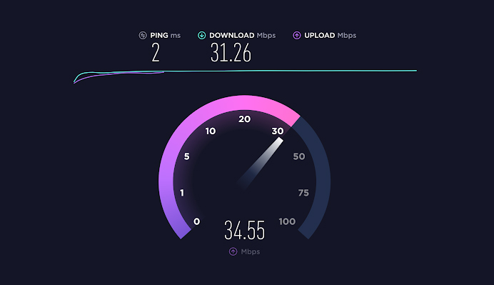
1. Speedometer
Speedtest on the internet is a crucial tool. The user must know what is happening when starting the test because determining your internet speed can take a few seconds to several minutes. A progress bar at the top of your device’s screen appears.
Internet Speed Test – Image Source: Minim
2. Swipe
The “swipe” concept creates a more engaging, dynamic experience by utilizing parallax. This enables one to navigate through various ideas easily, for example, viewing pictures in a gallery without quickly growing weary.
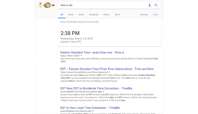
3. Google
It may be difficult to notice changes to their branding and website design because they have been slow, gradual, and consistent.
The inclusion of suggested searches is one noteworthy change. When you enter different words into Google, it indicates several options, making it simple to find content.
By engaging in these brief interactions, you can save time and gain insight into what topics other people have been looking up.
Google Search Results – Image Source: Wordstream
4. Pull to refresh
Anyone who feels that a website or application is not responding to their expectation to refresh status is normal to do so. When someone does this, their status generally improves.
Things have improved since it used to be common practice to lose all of the content you accessed when you refresh a page.
Some websites have engaging animations rather than just leaving the page blank after refreshing. As you wait for your page to reload, you discover a wide range of animations that calm your mind. After refreshing the page, you’ll probably be taken back to your previous position.
5. Uploading and downloading
The website, internet speed, and file size are among the factors that significantly impact how quickly you can upload and download content. Notifying your user of the expected completion of the download or upload is a good idea.
Microinteractions in user experience will determine whether the customer wants to use your services again. In case of download or upload problems, inform the user when the process is completed.
Downloading Status – Source of the Image: Dreamstime
6. Add to cart
The world of digital marketing is crazy and competitive. You need to develop designs that are not boring to appeal to users visiting your platform.
Most likely, you have used an online store to buy something or simply to interact without making a purchase. These stores offer an incredible shopping experience. It provides various options, including wish lists, purchase details, and options with different price ranges.
You can add an item to your cart on their platforms if it has caught your attention, but you aren’t ready to buy it yet.
Amazon Platform Overview – Image source: Accorin
7. Social share
You can share a variety of content using different apps. Advancements have been made for various applications to improve the microinteractions in UX. Even getting together for physical conversations is becoming difficult for people.
Emojis and gifs have been incorporated into several Facebook applications. This keeps the conversation interesting between you and your counterpart. This has helped the Facebook apps gain a large number of users worldwide.
The inclusion of the like option makes different users express how they feel about certain people and things.
As of the first quarter of 2022, Facebook had approximately 2.93 billionmonthly active users, making it the most popular online social network globally.
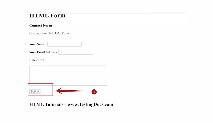
8. Submit button
The submit button is always at the very end of the form. If the information has been entered incorrectly, it will be obvious where you made mistakes by starring the area.
Once all the information is filled in correctly, the form is submitted, and you should receive notification that the process is finished.
Form Filling – Image Source: TestingDocs
Conclusion
You can add more than a hundred microinteractions to your business to make it user-friendly.
As we’ve seen, taking care of your users’ feelings when they use your website requires reasonable loading capacity, data input techniques, a call to action, and directing and guiding them through various steps. This will make them spend less time trying to analyze something on your website.
Always project thrilling microinteractions for your users while also being simple to understand. Make sure to put yourself in the user’s shoes while designing those microinteractions. Always test all microinteractions before bringing them to the public.
Asking for reviews will help you learn what customers think of your product and identify any areas where you can make improvements. Everyone must deal with microinteractions in this fast-paced technological world.
Acodez is a web design company in India offering a wide range of services. We are a digital marketing agency offering all kinds of digital marketing services to our clients helping them take their business to the next level.
Looking for a good team
for your next project?
Contact us and we'll give you a preliminary free consultation on the web & mobile strategy that'd suit your needs best.
Rithesh Raghavan, Co-Founder, and Director at Acodez IT Solutions, who has a rich experience of 16+ years in IT & Digital Marketing. Between his busy schedule, whenever he finds the time he writes up his thoughts on the latest trends and developments in the world of IT and software development. All thanks to his master brain behind the gleaming success of Acodez.