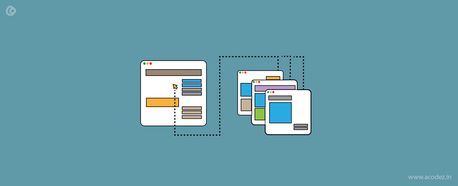
You want users to your website to focus on one thing and one thing only; you don’t want to distract them with loads of information – or just anything. You only want conversions. So what do you do? You develop a microsite. Come again? Yes, you heard it right the first time. The best way for you to ensure maximum conversions is through a microsite.
A microsite is a small website consisting of a single or just a few pages that helps you to focus the attention of users onto purchasing a specific product or small set of products.
Whenever you’re developing a website, you need to consider numerous factors before you actually start: the audience at whom it is targeted, the UX you want to provide, the goals you hope to achieve with the website, the kind of content and messaging you want it to have, the color schemes you will use, the navigation, CTA buttons, and whole lot more. You may think that a microsite design should be easier to execute, but surprise, surprise – it can take just as much thought!
In fact, in a microsite you may need to deal with more minute details or sensitive issues and perhaps even several iterations of the design, all thanks to issues like branding concerns or company policies/issues.
In essence, a microsite is a site of one to three pages that focuses on a specific goal, like informing about product or service offering, releasing study results, or creating awareness on a specific campaign, AND is usually time-sensitive. It is used for an upcoming campaign or initiative that needs immediate action. These sites often function as an accessory to the main website of a business by affording a unique identity with tangential branding; yet it creates a buzz around your specific campaign or project.
The main advantages of developing microsites

- Save cost: as you’re creating just a couple of pages, it doesn’t cost you much. It’s great marketing without burning a hole in your pocket. It allows marketing teams to work smarter, faster and more efficiently.
- Easier ROI measurement: When you have a site with a single goal, measuring the ROI becomes much simpler
- Speed: Microsites design allows rapid deployment and multiple launches quickly. The marketing team can save a lot of time through implementation of sites with concise information and clear focus.
- Enhance SEO: It is highly likely that implementing a microsite will give a boost to your SEO, as well as allow a hitherto untapped audience to find your business online.
- Streamline parent website: every time you have a new product launch or special campaign, you need to spread awareness about it. Imagine if you had to add a new page to your main website every single time. You would end up with a massively bulky website that would take ages to load – and you’d have to keep updating, deleting and adding to your site. By launching microsites you can keep your main site uncluttered – and engage more efficiently with your target audience.
Things to consider when developing Microsites

Here we have attempted to list the best practices you can follow to develop a microsite that will help you achieve your purpose:
The KISS principle:
Keep it simple, silly! The vital aspect about microsites design is simplicity. Less is more – so restrict the site to a single page that is scrollable, or if you must have more, limit the site to 4 pages at the very maximum. The site should be to the point, and users should be able to take the requisite action immediately, without any distractions whatsoever.
Let the URL be unique:
Having a separate, unique URL for your microsite ensures that it has enhanced SEO and branding prospects. It also establishes your microsite as an exclusive, legit and independent venture, and not just another page on your existing website. The campaign or initiative is important enough to justify a unique site.
Prioritize content:
Sure, you’ve spent a great deal of time researching to create amazing content and to get the most amazing pictures for your site. But what you need to remember is that visitors to your site will take just a few seconds to come to a decision of whether to continue reading or leave your site. So you need to get your juiciest, most engaging content, and very concise, so that the visitors can get the message in a jiffy; and then, prompt action immediately after.
Be Bold, Be Different:
Let your microsite be different from your main page – think out of the box and brag; create hype and a sense of urgency – and above all, ensure that it is user-friendly. Microsites design needs to be different, and more creative than the main website of your business. You can use bold design, fonts, colors and images. The bolder, the better – it’s all about being in your face! Intuitive navigation for easy information access is an absolute must as well.
Use a CMS:
A content management system offers an easy way for you to build a small site, update it and most messages – you don’t have to be a technical whiz to do all of this with a CMS.
Engage and Prompt:
The whole purpose of a microsite is to get your users to take some specific action. Therefore it goes without saying that you need to get them to perform those actions quickly and clearly. This means you need to have CTA buttons, checkouts or contact forms that are easily accessed, bold, and very clear – with no space for ambiguity. Your microsite needs to perform as sort of an extended landing page. Keep a check on a performance metric (conversion rate) so that you can determine how effective it is. Make sure that your calls to action are aligned with your content so that they become relevant, and appear interesting to users.
Stay Connected to your Brand:
Your microsite will feature a bolder design, of course, but you also need to ensure that it’s not a polar opposite of your main website and brand. Your visitors need to be able to relate your microsite to the main site on some level. You can link back to the parent site. This will be especially important if your visitors have found your microsite through social media, links, or organic search, and are not really familiar with your brand or business. By linking back to your parent site, you will help them to get familiar with your brand – your products, services, values – the big picture, in short.
Think Mobile:
Even when you develop microsites you cannot afford to ignore mobile – what with millions of people using their mobile devices to browse and purchase. While you need to deliver tons of high value interactive content to the users, you’ll have to optimize all of it for mobile. You will need to think in terms of widgets, and size of text and images; you will have to strike a balance between adequate text and images for your mobile sites, to encourage conversion. You would also do well to stick to standards – use familiar page elements, fonts and layouts, and page controls that are easy to access and use. Ensure consistency in pages so that whatever the type of device your visitors are from, they find it easy and intuitive to use your microsite. Mobile users also have microcosmic attention spans; they are fleeting prospects, so make sure you deliver your message and value proposition clearly and succinctly, and that they get it quickly. Enable them to find what they are looking for very quickly. Keep the text short and crisp, and easily digestible. Skip the flowery language, and stick to business! Ensure that your crucial elements like CTA buttons are bold, visible and near the top – rather like keeping important elements of your desktop pages above the fold!
Test, and test again:
You may think you have come up with one heck of a microsite – only to be devastated by poor results! Just because something worked for you in the past, there is absolutely no guarantee it will work again. Only your visitors and their current preferences can determine what will work and what will not. The best bet would be to deploy several iterations of your microsite and comprehensively test every page individually to ensure maximum success for your microsite and optimal success for your business and brand.
Extra Tips

You can consider giving your users an option to contribute in some other way if they are not able or ready to make a purchase just yet – maybe just sharing the link to your microsite, or collecting their contact details so that you get leads that you can nurture and try to convert in the future.
After you have developed and deployed your microsite, it’s a good idea to spread some awareness on social media; promote the site and ask your fans and followers to share the link as well.
To Sum Up…
When you develop and implement a microsite, you’re giving your main site significant support in terms of online presence. Get creative, but keep it simple and focused, and encourage your users to take action quickly – don’t distract them from your main purpose! As a marketer, it makes a lot of sense for you to create a microsite to promote your company’s agenda.
Thinking about setting up a microsite for your upcoming campaign or product launch – or any other reason? Contact reputed web development agencies in India for competitive quotes!
Acodez is the leading web design company in India that specializes in providing the best web development services to its clients. The websites are developed keeping in mind the latest web development trends to provide you with the best looking and feature-rich website. It is due to the dedication and the excellence in the services provided that has helped us earn numerous awards since its inception.
Looking for a good team
for your next project?
Contact us and we'll give you a preliminary free consultation
on the web & mobile strategy that'd suit your needs best.


