The terms ‘mockup’ vs ‘wireframe’ are usually used interchangeably. Though visibly they might not appear to be very much different from one another, but there are considerably a few aspects that separate the two from one another. Once you go through this article, you will realise why it’s not right to use the two terms interchangeably.
So, let us dig deeper into what mockup vs wireframe . After you read this article, you would have a better idea on which is better than the other or why there is no better because both serve different purposes.
Let us get started with mockup vs wireframe then:
Wireframes: An Introduction
These are nothing but blueprints, which are generally presented with placeholders for the final outcome that will be fitted in generally at a later stage somewhere in the design phase. Wireframes are the point in a design, which helps in deciding what will be placed within a design and here the design team do not have to invest a lot of their time delving into the intricate information.
Now the most important question is why wireframe?
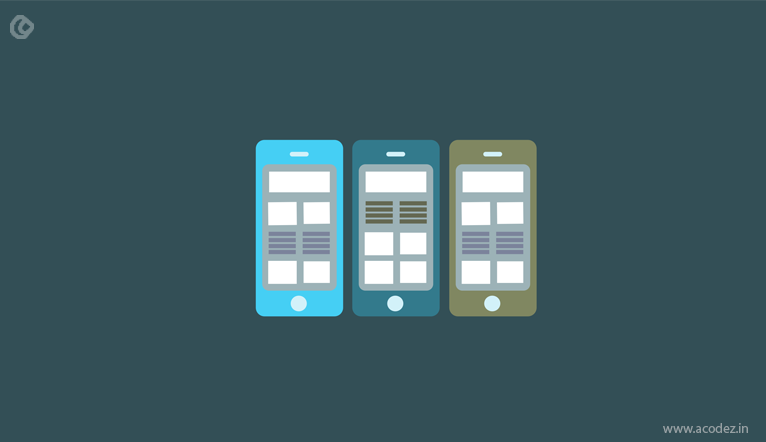
When you think about an app or site’s layout, it looks well and better than your imagination while in paper. Don’t you agree? You might be able to express it or orally give a description of how you expect your design to appear. But, a visual or picture could convey more than mere words. This is where a wireframe comes into the picture. Imagine a situation wherein you have verbally recorded all that you plan to do with your design in a long-page document. No one would even want to read it, whereas it is not the case when you get this design stacked out on a wireframe that is colourful. We are providing an insight into how we expect our design to appear. It will convey our ideas to the clients and we will very well understand whether all of us – including the designers, developers, testers, stakeholders and clients are on the same path – to delivering what the end users would need.
Now everyone, including the stakeholders and users know what they will get.
We are on a journey to building trust between the users and us. They have entrusted us with getting help on building their business empire online. It is necessary to ensure that we are helping them to meet their goals and the expectations of their end users.
The colors, visual aids or even components such as the breadcrumbs would help them identify what section of the page they are on. Also, your wireframes would be in line with the target audience expected to use it – and this kind of user profiling is usually referred to as personas. After this phase comes the stage wherein we will define these personas further taking into account factors such as user behaviour and their level of interaction.
Moreover, wireframes are the stage where a client approves and validates your design, which is your green signal to actually define the real project in real time.
Now that you have the client’s approval and validation, the next factor that you need to take into consideration is how to utilize this for saving time and money.
Wireframe helps in getting a clearer picture of how and what the final result or product will look like. One of the best things about wireframing is the amount of time it helps in saving as all the extra work is cut short. Over time, a wireframe is shared across the team so that everyone can access it and add their changes as and when a new idea or modification pops up. This gives everyone an idea about what others are doing and what further changes each of them have to incorporate to make the product more appealing in real time.
Why some people do not prefer wireframing?
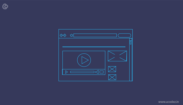
It is not necessary that a wireframe is capable of introducing or showcasing all the vital entities within the design. When the user takes a look at the dummy text content or the grey boxes, they need not understand what the colors or contrasts convey or how they would influence the content, the impact of the graphical elements on the visual appeal, or those generated by brand design, components, colors and the contrasts.
At this point, the client might not necessarily understand what the wireframe is representing or which of the elements added here are the most important or what is it that the wireframe entities are conveying, which indicates that your wireframe was a waste of time. So, in such cases, it is recommended that you come into a conclusion regarding the components with your client and then get them up on a wireframe.
Mockups: An Introduction

A static visual design in the form of a draft representing the site or app, providing further visualization of the content while conveying the functionalities of each of the components in a static manner. Wireframes, as we know, are grey boxes and dummy content, but mockups give a visual detailing of the color and typography involved.
Mockups will take the viewer on a tour of the appearance of the final product, providing a more realistic appearance of how they will find the end product. A mockup is basically an extension of wireframe. Wireframes act as design placeholders or document the entire team’s objectives and mockups shed some extra light on these features. The mockups come with an added advantage unlike the wireframes. It provides more exemplary visuals, considered to be more useful by the stakeholders and clients. The wireframes lay out a base to which the mockups add further visual power.
How can mockups further help in the design process?
1. Organizing the details in a better and structured way
Before you can decide the final visual of your product, mockups will drive you to deciding what are those visual elements that you would be including. Some of the visual elements and their arrangements, such as color and font, are decided during the mockup stage of any design process. Here the visual elements are sorted better than in the wireframe, hence mockups give the stakeholders a better idea of the visual appearance of the design.
2. Identifying the errors at an early stage
Mockups provide you with the flexibility to add and edit as and when required, which means every time you need something new, you need not create a new mockup. Revisions are easy when working with mockups as they do not involve any code or programming.
3. Ideas are relatable
It is always a wonderful idea to exhibit a digital mockup when presenting to a stakeholder or client. Visualization and translating the strategies through a wireframe might not convey what exactly your clients want to know. It might not be easy for your clients to analyse the results just by going through a graphic file as it might be that it is different from what has to be conveyed. Mockups can convey in a language that is understandable by all unlike wireframes.
4. Communication within the team
The mockup is a fresh start for introducing the rest of the team members to what one or the other of their teams are up to. This will give them further idea on what is required on their part and how they can better contribute to make this a success. Also, this will prevent them from deviating from the goals of design.
5. Phase of design implementation
How do you think you can find out your initial design flow and its performance? The mockup would give you further insights on how the final product or design will appear and its functionality.
6. From the user’s eye
Of course, paper and other forms of low fidel mockups are presented to users, but they are most of the times ignored. When a user is presented with an earlier version in the form of a mid fidel mockup, then they can find out and know whether this is in line with their requirements and expectations.
Why people do not approve mockups?
The notion is that mockups take too much of time to design mockups and even a number of resources are wasted in this objective. These screen mockups can upkeep the requirements collection process when presented at the appropriate time. But, it is better not to introduce it too early as this can be a concern.
Mockup vs wireframe tools are considered to be a lot user centric. So, it is recommended that it should not be restricted to roles, including information architect or user experience designers. Wireframes are the property of everyone. It is suggested that everyone, including the designers, creators, users, stakeholders, and others should be allowed to edit, comment and test this. But, it is impossible for paper mockups present all the flow.
Here are a few more advantages of mockups:
1. The richness in the visual details
It’s focus on color, layouts and graphics provides the consumers with a better visual experience and appeal.
2. Simple and easy
This is one of the aspects that both developers and designers are served with when using a mockup.
3. A high degree of simulation
When we compare mockup with wireframe, mockup is something very close to the final product.
4. Review is easy
This provides easy review of the product as everyone in the team can equally analyse and provide feedback about the product simultaneously.
5. Very easy to use
Mockups are easy to create as there is no need to code. This can be done with the help of a few tools.
Acodez is a web design company in India offering all kinds of latest web design solutions to clients in India and abroad. We also have an in-house UX design studio in india which enables us to create outstanding experience to our clients. With the knowledge garnered with an experience of over 700 projects in different parts of the world, the team members help you to take your brand to the next level.
Looking for a good team
for your next project?
Contact us and we'll give you a preliminary free consultation
on the web & mobile strategy that'd suit your needs best.




Thank You sir , for providing such a great article. keep it up sir.