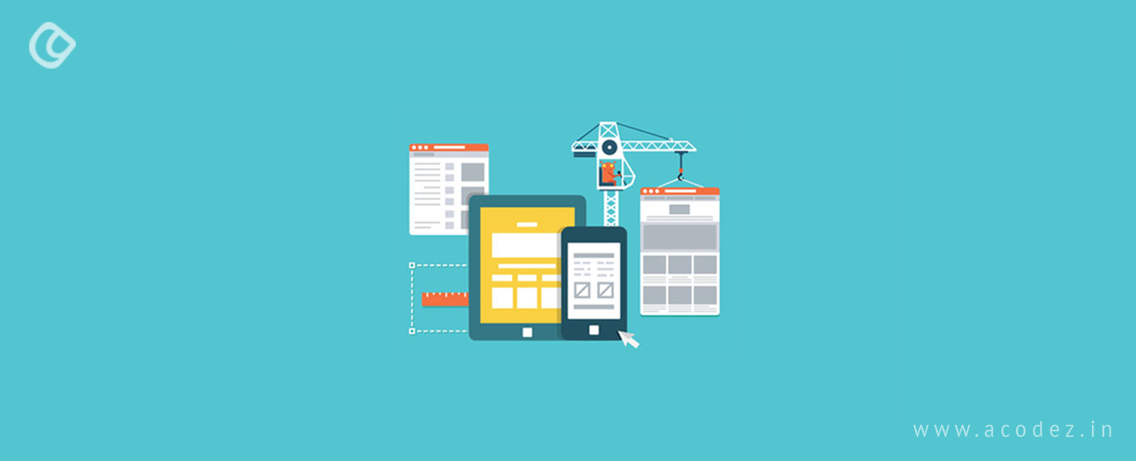
For any application or websites that we develop, our focus is mainly centered on user experience, which is not easy to accomplish with the rise in competitors and varying customer demands. In fact, we have reached a point in time where responsive web design frameworks should become an integral part of our design and development process. A responsive web design framework ensures that your website is user-friendly, regardless of the device or screen size, or any other parameters. Moreover, the essence of responsive web design frameworks lies in creating websites for mobiles, irrespective of the screen size or device. Currently, all websites offer mobile responsiveness the first priority before any other aspects.
Additionally, with responsive web design and web development frameworks, your design process becomes automatically easier and implementing a variety of front-end features are also made easy by these frameworks.
But before we discuss the types of responsive web design frameworks, let us take a look at frameworks.
A framework is a comprehensive set of practices, categories, and concepts that revolve around a specific problem. The solution that evolves out of the afore-mentioned strategies can be later used as a reference for a similar problem that might arise in future.
Precisely, a framework comprises file and folder structures, which include standardized code that can be implemented for developing a site from scratch. Another concern these frameworks will help to overcome is that you can now use a common structure for building websites. This means we need not start again from scratch as we can reuse the code anytime. Here we are saving time and effort.
Responsive frameworks collate CSS and HTML 5 tags. This collaboration is what helps in creating exceptional website designs. Here we will list out some of the most preferred and popular web design frameworks.
Bootstrap

Bootstrap’s popularity is one of the reasons why this tops our list. The latest version is Bootstrap 3 version. Bootstrap offers a wide variety of features, including a navigational element, a grid system that is well organized and many more. Since Bootstrap is inclusive of a wide number of features, it makes the design and development process easy. So even if the site builder has no or little technical knowledge, they can easily craft an excellent website. This provides an option to create layouts that are flexible and fluid. It comes with a mobile-first feature, so it is easy to develop a website that would fit into any device using Bootstrap.
Montage
Several hundreds of websites have been created using Montage as it is an HTML5 framework. Montage offers a wide range of features that can be utilized for creating scalable websites. With Montage, you can now maintain HTML5 applications for any device, regardless of whether it is a desktop or mobile phone. Montage is popular for the reusable components that are clubbed with HTML5 templates. Apart from these, it comprises declarative data binding and declarative component model. What else can a designer ask for?
Gumby
Gumby is popular for the wide range of features that it exhibits. Some of these features are swapping responsive images, fancy tiles, flexible grid toggles and a well-defined UI kit. These features actually make Gumby an exceptional framework as it combines SAAS aspects, which has an important role in speeding up the development process. It provides customization features which further helps in creating typography and even a grid system of your choice.
Cascade
Cascade is a step ahead of all its peers as it provides both semantic and non-semantic grid layouts apart from the base templates navigation and table design components. Since it implements a universal approach, it makes the designer’s job even easier by helping them include more number of features to their designs. Designers and developers are in awe of this framework as it allows you to create high-performing web pages irrespective of the browsers or devices.
Skeleton
Do you have a website project that needs to be developed under tight timelines? Then, Skeleton is the best choice as it helps in creating websites at a high speed regardless of their size. This lightweight 960-grid base can be used for building websites for any devices, such as tablets, mobiles, desktops or any others, with no compromise on the quality. It comes with basic UI elements, form buttons, tabs, foundation design and even a file structure that is perfectly organized. All these features collectively contribute in helping to reduce the development time. The wide range of features that it offers is making it popular, which in turn will help in generating an exceptionally professional website.
Siimple
One of the best options for developing a website is using the Siimple framework as it offers a flexible, aesthetically built and a succinct front-end CSS. All this helps in ensuring that an excellent website design is accomplished. The web pages developed using Siimple are clean, flat and beautiful. These are some of the most important things that need to be taken into consideration when your focus is your audience. Another interesting feature is that it comes with just a few lines of code, which can be easily zipped into a total size of 6KB. So if you are starting to develop for the first time, then this is the best choice with minimal code.
Foundation

Foundation is one of the most exceptional front-end frameworks. It provides you with the ease to create ultra-responsive frameworks. This further can be used for developing seamless designs, apps for web, mobile and email templates. And for amateurs, this could be one of the best points to start from your journey of web design. Some of the interesting features that it offers include navigation, library containers, media and layouts. The wide variety of plugins that this plugin offers will be an asset for the developer community.
Pure
Again, one of the best options to get your web development project up is using ‘Pure’. Comprising of a small subset of CSS modules, Pure comes with a small bandwagon of features. In fact, ‘Pure’ was developed for mobile with the principle of ‘minimal style’ in consideration. On the basis of the requirement, developers can now fuse in the expected styles within the application. Pure comes with a comprehensive range of CSS components. Also, it offers a customizer that can be implemented for developing CSS frameworks depending on your choice and requirements.
Montage
Montage is the new gen web development framework since it is an HTML 5 framework. The wide range of features offered by Montage will further help in creating websites that are scalable and feature rich. Regardless of whether your device is a desktop or smartphone, you can use Montage to maintain the HTML 5 applications for any kind of devices. Apart from the HTML template option, it also provides reusable components, declarative data binding and declarative component models.
Semantic UI Framework

Semantic UI framework can collaborate within other processors that flaunt third-party styles, which can be assimilated into the library. The features offered by Semantic UI framework include buttons, loaders, collections and drivers. Some of the modules included within the framework are popups, dropdowns and sticky bones. The ease of use and the feature-rich nature of Semantic UI framework makes it popular among designers.
UI Kit
Within the UI Kit framework, you will find SASS, CSS and LESS pre-processors. People love the UI Kit for the number of responsive components that it offers with the unique naming codes. This comes under 30 modular-based, extendable contents. Some of these include side navigation tags, basic elements – including overlays, badges and buttons, HTML-based forms and tables.
This UI Kit framework is customizable and can be organized to add additional features without impacting its appearance. You can include components such as nestables for creating advanced user interfaces.
HTML Kickstart
The HTML Kickstart processor is widely preferred by HTML 5 developers as they have access to a variety of elements, including layouts, such as jQuery, HTML 5 and CSS 3, and front-end systems. Some of the features of HTML Kickstart include menus, typography matter, slides, icons, grids, buttons and other tabs. With this framework, you can create indigenous HTML5 wireframes, which can be implemented within demo-page layout designs for a short period of time.
Leaf
The Leaf framework is powered by the CSS, which in fact helps in collaborating design-based elements across the webpage’s layouts. This framework is popular for its minimalistic style and flexibility. You may access the components tabs over the navigation menu for finding out more about its features.
Milligram
Milligram framework is almost similar to Skeleton. Both are light-weight frameworks. If you compress the Milligram pre-processor, it is likely to occupy not less than 2 KB space. It is powered by the CSS FlexBox Grid Modules. Some of the elements offered by this framework include blockquotes, lists, typography, buttons, and forms. Also, the most interesting part of Milligram is that it implements a minimalist design.
SproutCore

If you are thinking of responsive web design in terms of the traditional design ideas, then SproutCore should be on the list. Being the oldest in the lot, it is very much preferred for its feature-rich and easy-to-use nature.
These are some of the interesting web design and web development frameworks that we have been implementing at Acodez.
Acodez IT Solutions is a web development India offering all kinds of web design services at affordable prices. We are also a SEO agency in India offering inbound
Looking for a good team
for your next project?
Contact us and we'll give you a preliminary free consultation
on the web & mobile strategy that'd suit your needs best.


