Designing should be for people and not for robots or machines. It is people who are going to visit your website and not any machines. So, before you get ready to design your website remember the people on the other side have emotions and it is your emotions that will hold them and walk them through whatever you are trying to convey via your website.
People often tend to interact with various design elements in the online world in a way that gives them a feel of reality. For any design to work, it needs to connect to the user emotionally, that goes beyond imagination and feels obvious to the user. This interaction between the user and designer is something most designers need to work on.
According to a study conducted, it only takes about 3 seconds for an average user to get an impression of the website he/she is looking at. Graphics on the page really helps in reinforcing the message one would want to convey to the user. It creates a welcoming impression on the user, making him more connected to the design ideas. Here are some of the best tips & techniques to help designers achieve this goal.
#1. Design Environment:

Designing starts with identifying the environment. Do we need a realistic design? Or an extraordinary design? To make the design more human, one should be careful to use natural design elements and not overdo it with fake lighting and shadow effects which affect the design negatively. On the other hand, extraordinary designs are not meant to give a humane feel.
#2. Ergonomics Matters:
Designs should be very comfortable and obvious so that when you see it you feel it’s easier to operate (interface design). Mobile phones and tablets are perfect examples of hold and touch designs. The placement of the buttons, size of the screen etc are given a lot of emphasis while designing them. Your product or design should be easy and convenient to handle and use, giving the users exactly what they want.
Also Read: UX Design: Psychological aspects of User Behavior
#3. Show, not tell:
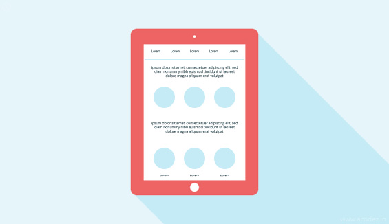
Your designs should be easy to grasp and understand. It should not be over complicated and must be able to help them operate with intuitive design ideas. Using big visuals can be a good idea to achieve this. This is similar to how we gather information from mere body language of humans, without any direct communication.
#4. Involve the senses:
Humans use their senses all the time. Whenever we plan a design project one should try to involve more of the senses. For instance, the use of vibration & movement in mobile phones during certain even triggers is a good idea, when used properly.
#5. Think out of the box:
Usually, most designers follow the same standard procedure in all their designs. But sometimes it pays off to be a little quirky or different. This can be anything from a design element you never tried or even the use of a new colour. This surprise element can many a times help you build an engaging design, people will love.
#6. Use of Color and Texture:
A good designer knows the importance of colors. Whatever project you’re on, elements like colour, texture, tools, and interface are very important. Colors and texture are mainly used to grab the direct attention of the user, if used.
Also Read: 9 top psychology tips behind using colors in website design
#7. More Social:
Work towards creating something urges the people to talk about it and share it. The user should be granted a feel of ownership so that they feel free to share it. This attachment will make them promote the design to others. And it’s the best way of publicity for design.
#8. More Options:
Options are another way of providing ownership and possession of design to people. Users like to feel as if they are making choices, not just stuck to a single option. This can be achieved in many ways. Allowing users to move from one category to another; like apps, where there is variety of choices about what to do next.
#9. White Space:

White pace is a very important part for design. It’s a always a great and challenging option. As humans need their personal space, consider white space a similar thing to your designs. This is necessary to make sure that your design looks clean and is not cluttered with various elements.
Also Read: 9 Top Reasons why you need to implement whitespace in your web design
#10. Create Focus:
Start with the most important part of your design & then work around it. This is where your user will be looking at first, which will then guide them to the rest of elements around it.
#11. Convey your Ideas to Every User:
Every user is different. It is not necessary that each and every user will interpret your design the same way. This is why you need to think from multiple point of views while designing as some people would require additional means to understand design. For instance, messages can be explained by image or sound, or video as a supporting option. The focus should be to deliver your message to every user out there.
#12. Use Contemporary Techniques:
Adopting contemporary techniques & styles will help you get that emotional connection with the user. Modern interface, design and color are more engaging and the users are willing to interact with them.
#13. Incorporate Familiarity:
Every actions and gestures should be familiar with real life action. No one would like to function in opposite way and struggle to understand the controls and function of design. Every element of your design should seek familiarity with real life if you are looking to give that human experience
#14. User Control:
Give users a good amount of control over the design be it the colour scheme, fonts, avatar or whatever that gives them a feel of control. This will get them more engaged to your designs.
#15. Visualize interface as your friend:
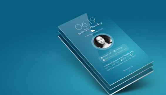
Last, but not the least, think of the visual interface as a friend to the user. It should be able to help users which would in turn keep bringing them back to your work.
#16. Grid is important:
Designing is not an easy task especially now when we are in the year 2017. Also, it is high time we bid goodbye to the old school tactics where you are sitting and moodboarding the things to be included in your website design. Why bother when you can get it done in a jiffy?
Yes, the Grid is your partner! A designer’s true love!
This structure that comprises of a sequence of straight or horizontal or vertical or curved guide lines that intersects into one another give rise to a structure where you can fit in the content.
Also, it will serve you as a guide as to where you can include all the graphic elements which can be fit in a manner that the consumer will love.
You can use the grid to arrange the graphic elements in accordance with your web page. Also, you can make the arrangement of these elements based on the other elements on the page. This arrangement is also applicable to the different parts of these graphic elements.
#17. Graphics are the trendsetters:
Of course, the grid should be filled in with something saucy and interesting. I mean you need to fit in something inside the grid that will entice the visitor. And, a design is completely incomplete without graphics. If you are a designer then, do not forget to add some salt to the meal so that the people will love the taste!
No meal tastes good without the salt! So, are designs without graphics!
It adds to the visual beauty of your design. To add up some interesting graphics to your website you need not be an excellent photographer. Are you good at Photoshop? Then, you don’t need to worry much about anything! All you need is to get your hands on some impressive stock images.
#18. Repeating patterns and textures are a blessing:
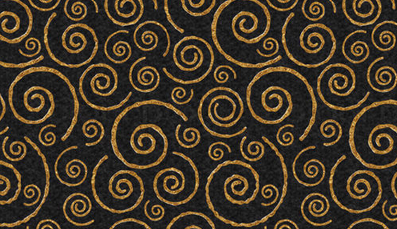
Why add some repeating tiles and textures to your website?
It will attract the visitor’s eye unlike the normal standard color schemes which people find attractive but not as much as these repeating tiles and textures will contribute to the background of your website’s design.
You can use the Noise Texture Generator, which is one of the webapps that you can run on any browser and is absolutely free of cost.
All you have to do is choose the color of your Background along with the volume of noise you need. The app will automatically synchronize the background images to fit into the tiles.
#19. Let’s cut the crap:
Many a times it happens that web designers believe a lot of elements are necessary on the website and go around adding every other element they find. But, in fact, they are not realizing that all these elements are contributing to creating a clutterish feel on the website rather than giving a cool appearance to the visitor.
These kind of unwanted elements ward off the visitors rather than attracting them. Let us get rid of the unwanted photographs, animated gifs, graphics, etc, that are creating a sort of nuisance appearance on the website annoying the visitors.
Imagine an unwanted flashy image making rounds of your website stealing the visitor’s gaze when they are here to buy something but instead run away from the site because of the irritation it has caused to their eyes.
#20. Background images:
What is new in your website? What could you possibly add to make it appear more attractive and beautiful?
Why not add some images? But, do you think just any random images will have a great impact on the pages?
Of course, not!
So, what will be an effective way of improvising your website’s appearance?
Why don’t you add some full screen background images? Haven’t you seen all those websites that appear beautiful just because of the background images that they showcase?
Websites that flaunt large background images have greater chances of attracting user attention rather than others with smaller or no images at all.
The next question is where can you find such images? jQuery Backstretch plugin is the right place to search for your solution.
#21. Browser Support:
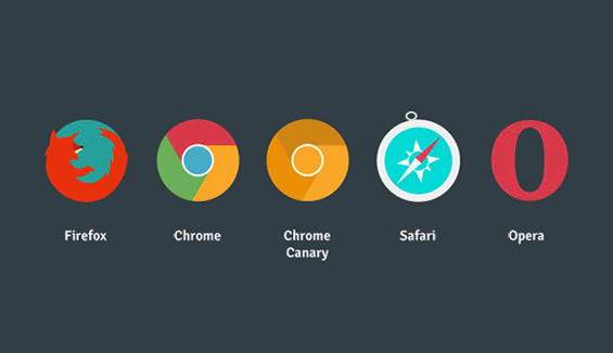
Of course, it is pointless to discuss that you should be making your website responsive. But, there is something that you need to be doing to ensure that your website is responsive and also, works well across all the different browsers.
Ensure that your website works well and is compatible to run across various browsers including the latest ones such as the Chrome, Mozilla Firefox, Opera, IE9, Safari and more.
What are the things you do to keep your website humanized?
Share your ideas and thoughts with us!
Acodez IT Solutions is a web design company in India offering all kinds of web design and development services to our clients across the world. We are also helping our clients to make their online presence known across the world. If you need a similar assistance you can reach out to us and we will help you build a great business empire in the online world. We have done this before and we know very well what it takes to achieve the next milestone.
For more details, contact us today!
Looking for a good team
for your next project?
Contact us and we'll give you a preliminary free consultation
on the web & mobile strategy that'd suit your needs best.


Very informative article. Keep it up guys.
But I’m wondering why don’t you have any sharing buttons…?