There are literally thousands of websites out there – in fact, the figure had already crossed the 1 billion mark in September 2014 itself! Has it ever made you stop and wonder how do some websites get really noticed and do well, while others just seem to fade away? A website has numerous elements like design, content, color theme, images – so what is it that makes some websites stand out from among the seemingly endless number of websites?
It’s not just one thing; there are heaps of tiny details you need to take care of to ensure that your website is high quality, and achieves your business goals. What do we mean by a successful website? A successful website has the ability to convert visitors into customers without too much delay – the more conversions your website can perform, the more ‘successful’ we say it is. Today we are going to let you in on not one, not two, but 11 secrets that make a website successful:
#1. Responsive Design:

You may roll your eyes and say, ‘Oh no, not again’. But the importance of responsive website design simply cannot be stressed enough. Globally, mobile traffic data grew by 75% in 2015, and in 2016, mobile internet users crossed 2 billion. Need we say more? You have to ensure that your website delivers the same browsing experience across devices and operating systems. Even if they are viewing your site on a 5 inch screen, they should be able to see everything they need without undue scrolling, zooming or minimizing. Make it easy for users to navigate with just their thumbs – which is what we do on the mobile.
#2. Unique Fonts:
Developing a unique font, or using one that is very rare helps viewers identify it with your brand name; the type of font you chose can also convey what kind of company you are: fun, serious, health related, educational, and so on. Typography can also help you to lead readers to different parts of the pages on your site using a single design trend across the website.
#3. Call-to-Action (CTA):
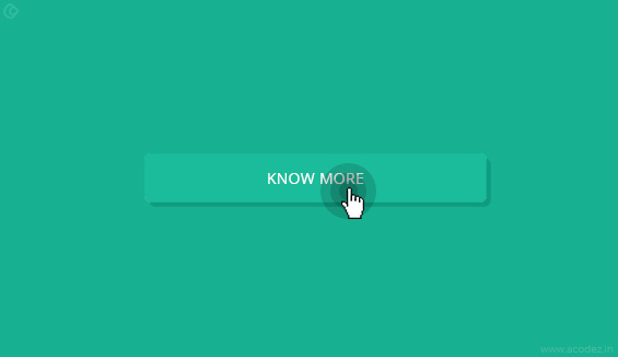
An effective, attractive and relevant CTA is very, very important. Make sure the CTA text tells your potential customers exactly what action they will be taking when they click on the button: ‘Download our free ebook’, ‘Sign up for our newsletter’, ‘Schedule your free consultation’, ‘Buy Now’, etc. are examples of CTAs that very clearly tell your visitors what they are expected to do by clicking on the button.
Also Read: Call-To-Action that works: Above or below the fold?
#4. Large Hero Images:
Check this image ; large images like these eliminate the previously revered concept of below the fold and above. Focusing on the image with the text instead of social buttons or CTA, a strong visual experience is created, arousing the curiosity of viewers and inducing them to scroll down for more. Such images can help you tell your story without undue reliance on only text. Regardless of what device your visitors see it on, huge powerful images like these will surely capture their attention. Make use of white spaces between content so that it becomes easier to read, and more appealing visually. You also need to ensure that the hero image you use is relevant to your business, and that it helps you to connect with your audience. The colors you use should complement one another, and your website must look clean and simple.
#5. Background Video:
It is a fact that visual content tends to attract more people than text can. The human brain processes video 60,000 times faster than text; most visitors may be put off if they have to read tons of text, but will happily consume your video content. With increasing data speeds and higher usage of mobile data, video experiences are improving globally. When videos play automatically in the background, you are able to educate your visitors about your business – tell them your story effectively, with minimal content. Videos will attract visitors from the moment they land on your page, telling them the main features of your business, without them reading any text.
#6. Staples:
No website is worth a cent if it’s missing any of these: Simple navigation, quick loading, About Us and Contact Us. You must ensure that your site loads fast; patience is not a virtue of netizens. If your site takes too long to load, they will just find another that loads quickly. Surveys show than over 40% people abandoned websites that took more than 5 seconds to load! You can achieve quicker loading times by compressing images down, using browser caching for cahed version of static resources, minimize the number of plugins and HTTP requests required on loading. Make sure that your navigation is simple. People should be able to get to the page they want quickly and easily, with minimal clicks. It is advisable to have fewer menu options, to minimize confusion in the minds of users – 7 is considered to be ok; also, make sure to use descriptive, self-explanatory titles for the menus, rather than formal, cryptic ones. Even if you tell your story through a video, make sure to have an About Us section (text) – there are still people who want to know in detail who and what you are all about. Unfortunately, many companies don’t seem to realize the importance of this section. Take the time to tell your story, and tell it well. Make it easy for your potential customers to contact you – display your contact information prominently, on every page, and offer multiple channels of contact: email, phone, live chat, online form, and so on; they can choose the mode of communication they feel comfortable with.
#7. Relevant and Interesting Content:

Make sure you deliver the content that your audience wants and needs. Firstly, you need to be absolutely sure that your content is free of factual errors, and there are no grammatical or spelling errors, or punctuation mistakes. Make it interesting and valuable for them, and they will not be in a hurry to leave your website. Answer their queries, resolve their problems – and you will find them coming back to you. Also ensure that you use the right keywords and optimize your content for search engines so that your content reaches your target audience.
Also Read: Content Marketing Tips For Small Businesses In The Year, 2016
#8. Space:
Space is crucial because it directs everything on your website, from flow to readability. Today, designers are getting ever more creative with space – there are huge spaces in the design, more space between lines, and on the whole, a great use of open space. Consistency in spacing is very important – elements that are alike should feature similar spacing. The space between lines in any given paragraph must be the same as say, the amount of wrap around images. Space is also useful for creating a central point for your users; for example, a piece of text or an image surrounded by white space will seem to be bigger and more important than when it is squeezed into a small location in the site design. Mind you, space does not have to be white always; it could be a texture even.
#9. Hamburger Menus:
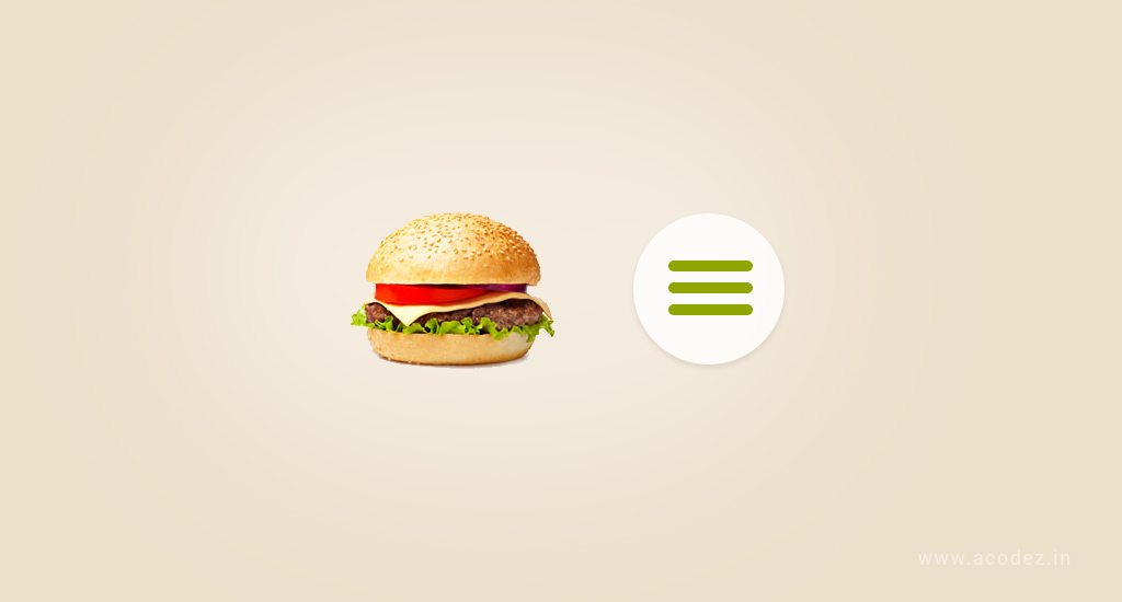
Ah, now what’s this you may ask? Hamburger menus are menus that look like a hamburger because they are stacked on top of each other, just like the patty, veggies and mayo is stacked in a burger. Why use those? Well, it saves you a lot of screen space, and gives your website design, a cleaner look. If you have used Google Chrome for browsing, you would have noticed the hamburger menu in the top right-hand corner. It shows a very clear and well-defined path for the user to navigate. By making the navigation simpler and free of distraction, you improve the chances for the user to find the info they need and take the action you want them to.
#10. Huge Images of your products:
Using gigantic images of your product makes it easy for you to highlight different features of your product, and the benefits each feature offers. A majority of the visitors to your website are more likely to just skim through pages initially; large pictures help imprint the product and its features in the minds of your audience very effectively in such cases.
#11. Card Design:
Thanks to the growth of Pinterest, designers, marketers and internet users are going ga-ga over cards. With different individual cards, you can deliver information visually, allowing your audience to consume small pieces of content without feeling swamped. When different content is broken down into cards, it allows the users to choose which the articles that interest them, and expand only those; this keeps the homepage minimal and clean, and avoid using too much text. You can highlight several solutions or products side by side on the same page.
Conclusion
You may have heard the saying, ‘The Devil is in the Details’. Well, there you have it! If you want to ensure that your website is found by your audience from among the billion websites, and that it converts visitors into customers, you need to take care of all these details, and then some.
Acodez IT Solutions is a web designing company based in India serving the needs of clients from the country and abroad. We have an experienced team of web designers to make innovative and creative websites that can create a strong customer base for your company. With our expertise, also in the field of inbound marketing services and mobile app development, we deliver nothing but the best results. For more details contact us today.
Looking for a good team
for your next project?
Contact us and we'll give you a preliminary free consultation
on the web & mobile strategy that'd suit your needs best.



To run a website successfully the above said all the features should be involved in the single website. It should be all in one pack.
All the tips given in this post for a good website are very good. I consider the point that a successful website requires a responsive design and unique content. This is a very nice post for the one who wants to know the elements of a good website.
Nice point sharing with us
as on this post some new things I learn, I dame agree two points that are responsive website design and attractive website design and layout rest of all point they also important for a website. I little confuse about background video is really helpful.
you explain all of the points it’s easy to understand for anyone