So you have made a fabulous website, and you’re getting pretty good traffic; but are they staying on? Are the visitors getting converted into buyers?
You must have heard the term ‘bounce rate’; if you don’t already know what it means, it’s a website analytic metric that measures the percentage of visitors who leave your website after visiting just one page. So here, a ‘low’ rate is good! It means that our visitors are spending more time on your site, exploring and engaging with it. A high bounce rate means people do not really like your website.
It’s not uncommon to have a high bounce rate. Some of it could be because they landed on it by mistake, or because you don’t have the product/service they are looking for, and there’s nothing you can do to stop those visitors from leaving. However, if they are leaving because they find your website boring, irrelevant or unattractive, there is quite a bit you can do to induce them to stay and explore. Let’s look at these tactics:
Read more tips to keep the visitors more time on your site.
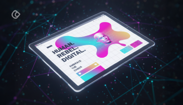
1.Your site design must be attractive to your target audience:
By this, I don’t mean that it has to be ‘in your face’; rather, the design must be neat and uncluttered. Sleek designs normally win the day – but you may need to customize it to reflect your brand, products and so on.
The design should be aesthetically pleasing to your target audience; if you’re dealing with women’s products, soft designs with pastels and pinks, butterflies and hearts and similar stuff will work; children’s products means your site should have cartoony fonts and images, bright colors, and so on; a financial services company should sport a clean, minimalist look but with detailed information on the products and latest financial news – you get the idea. Some things common to any website are – leaving no scope for confusion, not cluttering up space, and not making it very dull. Rather than going with free themes, invest a little and spend money on purchasing a good theme that will really suit your brand. Use actual images and not stock images. First impressions do count, and if you’re not able to attract the visitor with your site’s appearance, chances are you’ve lost them for good.
First impressions do count, and if you’re not able to attract the visitor with your site’s appearance, chances are you’ve lost them for good.
Know more tips to attract more people to your website by understanding the weak points
2.Highlight your brand personality:
Make sure that the personality of your brand shines through in every element on your site – not just the font and color theme or the home page; the content on every single page must reflect your brand personality. An uncluttered or simple design doesn’t mean that your site must be boring! Your website must convey the message of your business through images, fonts, colors and the text you use on the site, whether you’re happening, laidback, fun or serious.
3.Empathize:
Talk more about your customers and their problems – and then tell them how your products or services can help solve their pain points and improve their lives, rather than keep talking about your business. Everyone loves to feel they are important and that they matter – and your visitors will love you for thinking about solving their problems. Headlines, images, copy, subtitles – everything should focus on this particular aspect.
4.Your content should be relevant and interesting:
The content on each page must match the user’s objective; that is, it should describe and match the purpose the visitor has arrived on a particular page. The content on each page must be unique and offer focused unique content. Offering valuable information for free, in the form of blogs, ebooks, white papers, resource pages etc. is also a great way to delight your visitors. Keep in mind, however, that the content needs to be fresh and interesting; don’t EVER copy-paste. It’s akin to committing digital suicide. If required, outsource your blog writing to creative professionals who understand your business and can do a great job.
5.Structure your Text:
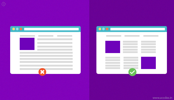
Reading a huge block of text can be intimidating and boring – unless you are in Finance or Academics! Break up your text into small blocks, and use bullet points, headings, images, and if possible, audio and video snippets, to make it more attractive to the normal user. It also makes the page more visually appealing and allows visitors to quickly scan and take in information in bite-sized bits.
6.Ensure easy Navigation:
This may sound like a no-brainer, but you’d be surprised to learn that many companies fail to incorporate this element in their website! Navigation needs to be simple and intuitive, allowing for users to find just what they want in a couple of seconds. They should not have to go through several pages; rather, they should be able to get where they want with just a click or two – like the checkout page, blog, news, contact information – these should be accessible to the visitor regardless of what page they are on. If yours is an e-commerce site, ensure that the checkout is smooth, and only necessitates a click or two to take them to the payment page.
Check out the pros and cons of a third-party e-commerce site.
7.Increase website Load Speed:
Nobody is going to wait for half a minute for your website to load. Avoid Flash and other stuff that slows down your site. Make sure that your site loads real quick, or be prepared to lose your visitor to a fast loading website. If your website loads in 3 seconds, you can expect to reduce your bounce rate by about 35% – that is quite substantial.
8.Ensure Responsiveness:
With more and more people browsing and shopping on the go, you MUST ensure that your site is responsive; provide the same browsing experience on mobile devices as on a desktop or laptop. Include finger friendly navigation, buttons, easily readable fonts and so on.
9.Confirm your Credibility:
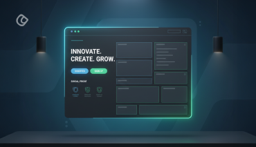
Ensure that customer reviews, your contact information, social media buttons, and affiliations with trusted sites (like Tripadvisor or Google Reviews) is displayed prominently – preferably at the top right-hand corner as well as in the footer. This helps build trust and make you look credible in their eyes. Visitors will be reassured and are more likely to interact further and purchase from a company they can trust.
10.Have a social media presence:
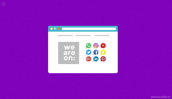
The majority of internet users today have a presence on at least one social media platform, and they love interacting on it. It is, therefore, crucial that you too maintain a social media presence, and allow visitors to your website to post to Facebook or Twitter with just one click with ‘Click to Tweet’ or ‘Share on Facebook’ buttons. Also, provide space on your website for your visitors to leave reviews or express their opinions. The net savvy visitor of today will lover your website if you incorporate these elements in it.
Read more on how social media can improve SEO practices.
11.Redesign when required:
You may feel that you have the perfect website, but you need to review it every few years – depending on the type of industry you are in. You may need to revamp your website to reflect current trends and customer preferences; your ideal customer profile is likely to undergo a change every few years. If you don’t refresh your website, you could end up losing customers. But don’t do it too often – people do feel comfortable with what is familiar to them, and are likely to resist frequent changes.
Read these proven tips for redesigning the website.
12.Professional Logo:
Your logo is your professional salesperson. It reflects your business vision; often, people identify brands from the logos; the most famous logos being Mercedes-Benz, Apple, McDonald’s, Nike, Citibank, Pizza Hut, Chanel – to name just a handful. Having a professional logo also helps inspire trust and makes your brand easily identifiable. It gives the impression to customers that you mean business, and are not a fly-by-night operator.
Know these important tips for designing the website logo.
13.Personalize their Experience:
Everyone loves to think they are special; so go with it! Offer deals, discounts, vouchers, and so on – of course, in exchange for say, their contact info – give access to premium newsletters … you can come up with many different ways to do this. Give them an option to sign up, if possible, and display content based on their past browsing history and preferences, and they will love you for it! Incorporate personalized search options: one website that has mastered this art is Amazon; it offers suggestions based on your purchase and browsing history, as well as products that complement your current purchases, and so on.
14.Keep them coming back:
By running contests on your website, announcing freebies (who doesn’t love those, right?) for the first few responders, and by providing fresh information or having a different theme every month (or quarter depending on your type of business) you can give them a reason to love your website enough to keep coming back to it!
So you can see that you need to revamp your website so that it is visually appealing to your target audience, provide valuable and relevant content in easily digestible bits, provide quick and intuitive navigation, showcase your credibility, think from the perspective of your customer, and personalize their engagement experience – and voila! You will certainly be able to reduce your bounce rate considerably and even attract higher numbers of visitors to your site each day.
Acodez IT Solutions is a web design company based in India offering all kinds of web design and development services to our clients in India and abroad. We are also an SEO agency offering all kinds of inbound marketing services. We help our clients with business analysis and then, fix up their business to fit the modern day needs.
For more information, contact us today!
Looking for a good team
for your next project?
Contact us and we'll give you a preliminary free consultation
on the web & mobile strategy that'd suit your needs best.



Your blog is really useful that how we make interesting e-commerce websites by which we can get attention by online customers.In your blog you said that your website should be user friendly , adaptive,connect with your customers and solve their queries time to time .
Thanks for sharing this great information.
Your site design must be attractive to your target audience,Empathize,Your content should be relevant and interesting,Ensure Responsiveness
Good job! I think you`ve mentioned the most significant website’s features visitors pay attention to.
I also want to emphasize the importance of a landing page. Let me explain this term mean with an example.
A person obtains the information from an external source about a specific product or service and clicks through the link to its provider. And voila – he or she is on a landing page!
So landing page is a part of your website, so you can’t just let it go.
Don’t confuse landing page with home page. Home page has too many options and looking through all of them to find the particular product can distract a visitor from making the decision. So landing page is in most cases much more efficient than home page.
Read how to create an effective landing page here https://kraftblick.com/blog/saas-landing-page/
This is great, I will follow these tips. Thank you so much. I am excited to launch my website.
Fantabulous way to explain every point of way,
I already know some point that you explain above but some of the important thing that I still don’t know and that things I learn from your post.
I really appreciate you for sharing whit us