As per Wikipedia, the animation is the dynamic medium in which the images or objects are manipulated to appear as moving images. Now animation can be designed with the help of computer-generated images. This has impacted the web design industry as well. In the earlier days, the websites were quite basic with the help of simple text and static images.
Illusion???
Human beings are illusionist creatures. Anything that appears to be appealing to the eyes attracts people. They love visualizing virtual motion, and animation is all about creating this visual magic.
At Acodez IT Solutions, my team of web designers loves to explore all possible exponents of animation to generate a great user interface. We believe this helps in enabling and speeding up the process of interaction.
My explanation for animation is simple as I believe it is the process of breathing life across the non-living objects with an active soul that is capable of sparking an interaction. When we think of animation, “motion” is the word that strikes the mind. How about anything that moves in virtual space. Lovely!!!
This game of motion didn’t start today or yesterday. But, it already existed since the day human beings started discovering and utilizing the gifts of nature in a quest to find what else is in place that we can utilize for making our lives more pleasant. Archeological findings that depict cave carvings and rock paintings extend back in time when there was no technology in place. But with technology and its development, we realized a great deal can be done.
The people or things in motion that you can find in these paintings and carvings is the evidence of how human beings are closely related to the aesthetic beauty of motion. This brings us to our topic of discussion. Here, I have summed up a brief on how designers develop designs using animation.

Now various new innovations have been implemented into the websites. One such element that is used in almost all the websites is animation. The animation in web UI design range from the full-screen moving images, sliders, hover effects, GIF animations, and in various other such places. It is because the animation is quite on trend and is fun and user-friendly. It has become feasible in recent days with the latest innovations in web technology and the increase in high-speed connections.
Website animations are available in different formats like GIF, SVG, or video. In the earlier days, Flash was used to achieve this feat. These are now replaced by the different web technologies like HTML5, CSS, WebGL, canvas, GSAP, JavaScript and other such technologies. Different web animation API is also available that makes the animation process easier and faster. Nowadays the animations smooth, sophisticated and is easily available on mobile devices as well.
These can be elements like simple underline that appears when you hover over a word, full-screen video, background image, website scroll, rotate effects, and various other such effects. Animations nowadays have become quite usable and mainstream. In a number of cases, these are self-evident that the users need to either click or scroll to visit the different sections of the website.
Even now, if you are using flash on your websites, it is the time that you switch to alternative technologies as flash is not supported by a number of websites. Adobe too will be ending flash support by the year 2020.
Reasons to Use Animation on Your Website
Now a major question arises, why should you use animation on your website. There are various benefits of using animation on the website.
Some of these are as follows:
- The animation of the website helps you to stand out from other websites. Small animation helps you to create some amazing website designs and effects on the website.
- These can help to draw the attention of the users to a certain element to display a piece of certain information that can turn out to be useful to the users.
- It also helps the users to keep them entertained while the website is loading. Beautiful and interesting animation keep the user to stay on the page until the website loads and do not go to the other website. Good loading animations are engaging and if they are provided with something interesting to watch they wait and focus less on loading time.
- Realism in web design is implemented in today’s world and makes use of flat and minimalist design. In such designs, simple animations can help guide the users to how to access the website by showing them with the next step on their journey through the website. This is achieved without the need to change the aesthetic of the website.
- It can help you to tell the stories in a visually aesthetic format.
- Some of the animations can also help you to keep your visitors entertained thereby helping them to visit the website again and again. This enhances the website rankings as more and more visitors frequent the website.
- It provides a better user experience to the visitors of the website thereby improve their online experience.
- Call to actions are the ultimate goal of the website. In a number of cases, the animations help the users to be notified of these call to action buttons and then help the users to perform the task intended. This can be done by telling the story in the form of animation and create visual interest and keep them engaged for a longer time duration.
- Communicate with the users by telling them if the form is filled correctly or not. It can also help to know if the element is clickable by highlighting that element.
It is necessary to keep in mind that the animations that you implement on your website must help the engaging and interesting. In this case, you need to also ask whether the animation would add to the user experience or not.
A proper balance must be maintained in the web design as mixing up too many moving effects can lead to chaos in the web design. It is necessary that you decide if the animation implemented will add to the user experience or take away from it? Will they influence a user’s behavior and help conversions and CTA clicks? Knowing your personas is important so that animations truly help achieve your company’s business goals.
The animations into a website can be of two different types, small animations, and large animations. Small animations are the animations in the small items on the website like hover effects on menus, highlighting or underlining certain items on hover, color change on clicks, zoom effects on clicks and hover and several such tasks. These contribute to the overall aesthetics of the website.
Large animations are the animations with a scale to them. These occupy a major portion of the screen and form a contributing factor to the website design. In order to put it into action, you do not need to perform any extra task. These may consist in the form of movies or large images.
How to Implement Animations in Web Design?

Implementing animations in web design is quite a complex process. Here are some of the ways in which you can properly implement the animation in web design:
Functional Animation:
From a designer’s perspective, we could simply put it as the thing that we include in a user interface design to meet the demands of the process. This principle works because people are easily drawn to anything that is visually enthralling, which means animation is the only essential tool that you can use to attract your people.
Animations While Page Loading:
This is one of the most popular forms of implementation of animation. It is advised to make the page load times as fast as possible. However, in quite heavy sites, the page load times can’t be reduced. In this case, it is necessary that the animation is fun and engaging. However, it is necessary that the animation loads faster and do not take too much time to load. Any other sound effects should not be played while loading the page as it turns out to be irritating for some users. This can also be implemented when fun loading times are short.
For Fun Purpose:
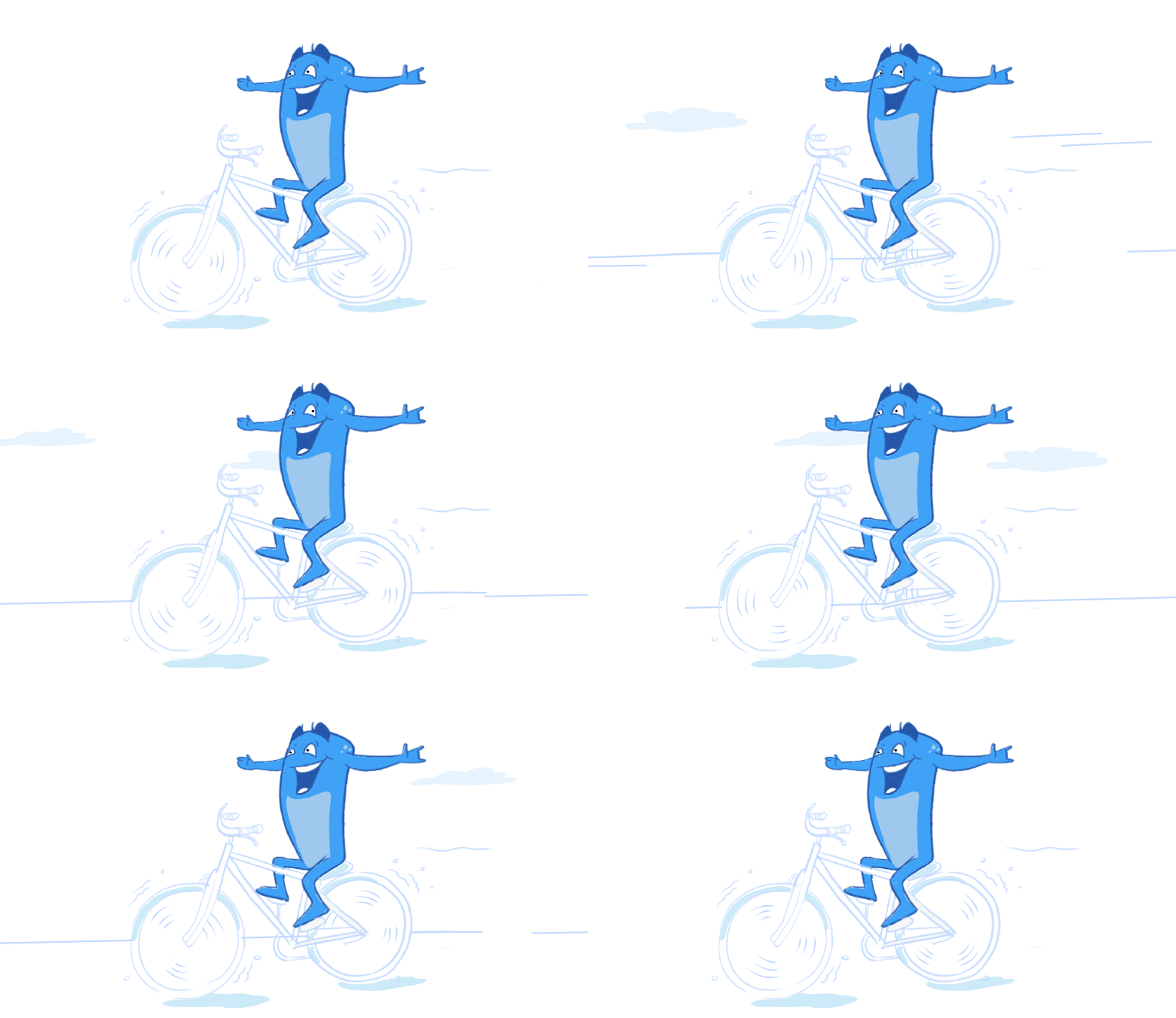
Animations can be sometimes used to keep the users engaged and can also be funny sometimes. In such cases, it is necessary that you use such graphics that can keep your users engaged. Take for example Acodie, the mascot of our website. It is quite funny with Acodie sitting on the bicycle. A closer look shows Acodie moving on the bicycle and clouds passing. Even a closer look shows the eyes of Acodie move from one side to the next.

Progress Animation:

The progress of a particular task can also be achieved through animation. This can be used for both the linear progress and multi-step linear progress.
Animated Responses:
In a number of cases, new users may not have any idea of how to proceed with communication. In such cases, the animated responses can help the users to get an idea of how they should proceed with a particular task. This reduces the confusion of the users and helps them proceed with the task that they intend to do.
SVG Animation:
The SVG animation is also used by a number of web owners by creating SVG animations. These can be used to scale small elements and makes sure that it works the best on all the devices.

Hover Animation:
In some of the cases, it is necessary to provide information to the users that certain elements are interactive. In order to know if certain elements are responsive, the users hover over certain sections. This can be used to display the information that they have clicked on the button or other such important information. Hence, in such cases, it is necessary that you provide hover animation to know that certain elements are interactive.
Interesting Logo:
While most of the logo is static, it is not necessary that they should be so. Take for example the Xmas logo for Acodez. Here you can quite clearly view that the blue part of the logo transforms to become a Xmas tree. The transformation is sure to attract the users and have a look at what transformation is taking place in the logo and see the end results. In such a case, it is necessary to not the transformation to last for too long.

Elevation for Mobile:
In the case of mobiles, the hover option is not available to the users. Hence in such cases, it is necessary that interactive elements must suggest what these elements do before the users tap on them. This helps to provide instant feedback after the interaction.
Storytelling:

Every website or web owner has a story to tell. This can be either their progress over the years or awards achieved. Hence it becomes necessary that you implement the animations properly to tell your story to the users. Take for example the site Acodez awards page. Here the different awards can be accessed by sliding the slider and helps to better understand the growth of the company.
What Was the Driving Force?
The impact of mobile phones and the growing influence of these on the lives of people is one of the reasons that made designers think of animation as the most important aspect of the design process. Animations help to brighten up a product while making it simple, clear and user-specific ultimately ensuring a better user experience.
It Serves a Logical Purpose
Logic? I know Logic is not the keyword for a designer, as we are creative people, but if we implement an animation that is part of a logical process, then we are possibly using a valid functional animation and this is how I justify the use of animation in designs.
I would rather view animation as a tool that fits into user needs.
Let me take you across the types of interface animations, which forms the focus of our discussion:
- Decorative Animation
- Animations defining microinteractions
- Flowchart Animations
- Explanatory Animations
- Decorative Animations
I don’t have to explain too deeply about what is meant by decorative animations. The word “decorative” says it all. The main purpose of decorative animations is to attract people. This intends to develop user interface designs that are original and appealing to the eyes. It gives life to the interfaces as well as presents it in a more interesting form to the viewer though it will not contain any important features to give a spark to an interaction process. The main objective is to grab the user’s attention towards the image that stands apart from the rest.
Animations Defining Microinteractions

We discussed that decorative animations do not focus on interaction but it is about the interface. Microinteraction animations mainly satisfy the need to trigger interaction.
Ever used animation to wind up a microinteraction? This kind of a situation arises when a user successfully completes an operation such as when they fill up a form, or when toggles are pushed, or when a button gets closed. Also, animations have developed so far that now these have the ability to notify the user when actions are incomplete and this helps the user through the process. Also, this is another way of providing a smooth interaction for the users.
Flowchart Animations
This process is a broader aspect of the microinteractions phase. Here the users will not only be notified with the completed tasks, but also the process involved across each task.
Explanatory Animations
Usually used in tutorials and tooltips, though they have a greater level of application.
Now, I will take you across the most important principles of Animation as specified by the ‘nine old men’ of Walt Disney Studios. Sorry, I should have mentioned Disney a little earlier, as it is the thing that hits our mind when we think of animation.
The Evolution of a Few of the Best Animation Principles
As we know, necessity is the mother of all inventions. All humans love motion alike and this is what prompted these great men at Disney to churn out something that would express character and personality with ease and their practice helped them enhance these principles further.
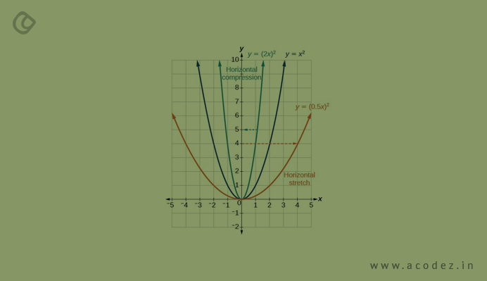
Compress and then Stretch:

I know you are Googling your eyes at the screen. But, the fact is this forms the most important part of your animation process. How do you apply this principle to the objects that are drawn? Simple, all that we want is to enliven the objects that are in discussion. So how do you accomplish this?
Add Some Weight and Flexibility to your Objects
For instance, just think of Disney’s looney cartoon character Mickey Mouse and the various expressions that form across its face. Wonderful! Ain’t it? Now you have a clear picture of what compress and stretch is.
Remember Bluto the villain from the popular “Popeye” series, a scene from the series where he gets stuck in a doorway when compression and expansion extends a certain limit it gives a lot of colors to the comics. I know you are laughing at the thought of how Popeye gulps in the spinach and his body expands, there was a time when we were kids and used to think whether he is a piece of a rubber band, how beautifully he can stretch? Hehe… Now we know the secret.
So let me reveal the secret – the volume of your object remains the same regardless of whether it is subjected to compression or expansion.
Apprehension
It is like generating curiosity in the minds of the audience who wait eagerly to know what next! Here, what we are doing is getting the audience ready for an action that is going to happen the next second and moreover, our aim is to ensure that this action appears pragmatic.
For instance, let me take Jurassic World and Mad Max: Fury Road, the two of the highest grossing movies in the one year. We already have an idea, the dinosaurs breathing fire, what the next move might be and look at how people jump from their seats when the dinosaur springs up and pounces the next moment.
The War Rig across the deserts in Mad Max: Fury Road had audiences eagerly waiting for the next action. Also, apprehension can be used to depict actions that involve less physical activity, like when a character turns the focus away from the screen or something of that sort.
Organizing

Let us view this aspect from the perspective of staging as in films and theater. As always, our main intent is to attract audience attention, working on everything in power to hit their eye. Also, once you manage to grab their attention the next step is to help them realize the most important portion of the scene.
Taking a page from Peperzaken’s blog on animation and interface design, which describes in detail all the 12 principles of animation, wherein they have mentioned a definition for organizing which states, “the presentation of an idea so that it is completely and unmistakably clear, whether that idea is an action, a personality, an expression or a mood”.
How do you get this done? Quite simple, ensure that the lights and shadow are aptly placed, the angles and camera position and also, last but not the least the proper positioning of the character in the frame. Let me put it in a simpler form, our focus is just the object in discussion and why not push the unnecessary details into the trash?
Start, Action, Camera
Now I will take you across the process of drawing! How we do it? There are two options when it comes to drawing. You can start drawing scene by scene from the scratch which comes under “Straight ahead action” and then the next is you can just draw a few of the key elements while you can fill in the incomplete blanks at some point of time. The first one helps in producing more pragmatic views of a particular action sequence but difficult to manage proportions while the latter helps to depict emotional and dramatic scenes with enhanced ease. It would be great if you can combine these.
Chase and Conquer
Remember the never-ending chase of “Tom and Jerry”. We all wanted to see Jerry being captured. It was just a sugar cube for my dear readers. Well, let me not deviate from our main topic of discussion. What is chase and conquer? In this context, by conquering, I refer to overriding.
Chasing and conquering are closely related when it comes to depicting movement that is pragmatic. You can see characters becoming alive and moving across as if straight out of your Physics standard textbooks, even taking into account the law of inertia as stated by Newton. So what really happens in this process? Chase- Once the body ceases to move, the parts of the body keeps on moving while overlapping is nothing but the various parts of the body move at different times.
This technique is combined with a third technique known as dragging to provide a better visual experience for the viewer.
Keep Up with the Timing
As we have already seen, that the law of physics is applied to animation, which contains how exactly the human body moves and the time it takes to speed up and slow down. This is what makes animation pragmatic and this is why it is suggested that you use more drawings at the start and towards the end of action, which helps to regard extreme poses that involve sitting and standing. The same is applicable for inanimate objects too.
Attraction

When it comes to the cartoon characters there must be a certain deal of attractiveness in it that can hold on the crowd. Even monstrous characters and villains can be attractive. The magic lies in how the audience perceives your characters and their personality.
Essential Animation with CSS3 and HTML 5
CSS3 additionally brings some extraordinary liveliness methods, and they work flawlessly with HTML 5 code. CSS3 and JavaScript has a “start” and an “end” strategy you can use to move a symbol starting with one area then onto the next. You normally utilize this sort of coding when you require a basic activity, for example, a thumbnail picture that needs to move starting with one area on the screen then onto the next. You put the picture utilizing CSS3and afterward move it utilizing the JavaScript DOM “start” and “end” activity. You can likewise make a picture twist utilizing CSS3.
Utilizing the HTML 5 Canvas Element

The genuine power in HTML 5 movement is the new canvas component. The canvas component is another HTML 5 expansion that completely replaces the old Flash code objects you needed to install into your web applications.
You begin off utilizing the “canvas” tag. The principle HTML 5 code for the canvas is essential, and it’s the same than other HTML labels you utilized.
Make intuitive sites
HTML 5 and CSS3 is impeccable instruments for HTML 5 animations. You generally won’t have to stress over clients introducing Flash or supporting Flash in their programs. Firefox, Internet Explorer and Chrome help HTML 5, and the new dialect is getting to be more famous. It’s additionally utilized as a part of versatile advancement, so HTML 5 is underpinned by all the real gadget producers. With HTML 5 and some inventiveness, you can make some cool, intelligent liveliness for your clients.
Web Development
Web improvement is positively moving towards open innovations and non-restrictive measures like HTML 5. Moving towards open innovations gets to be fundamental for the engineers, particularly at Programming goliaths like Microsoft are additionally grasping open programming like JQuery and are likewise going to make it a piece of visual studio.
So with them in a war of glimmer (a restrictive innovation) rivaling Html5 (an open standard), Html5 (the complete stack) has a greatly improved possibility of winning till the features are comparable.
Additionally, HTML 5 is rendering straightforwardly by the program (blaze is rendered through the customer side advances as they don’t have control over it and are relied on upon what the customer is utilizing (e.g. the customer may be utilizing IE on windows, or maybe utilizing iPhone to get to the site). In such cases, open guidelines and programming are a finger wager.
It is seen that JavaScript skeletons like JQuery and so on are consistently supplanting blaze in any event.
in things, for example, energized menus and fundamental web liveliness. So, web designers are currently utilizing Flash in any event for lesser things than they used to utilize it a few years prior.
glimmer module); in the event that there is any bug in it they can be specifically settled by the programs. The programs don’t need to hold up for adobe to alter the bug in the glimmer module.
Animations turn out to be quite useful for the web owners and if implemented properly can help them achieve outstanding results. Hence it is necessary that you provide your users with a fun and positive experience on the website with the help of animations. A balanced approach must be taken to make the web engaging and not overdo it to make it irritating for the users.
Summary:
Animations turn out to be quite useful for the web owners and if implemented properly can help them achieve outstanding results. Hence it is necessary that you provide your users with a fun and positive experience on the website with the help of animations. A balanced approach must be taken to make the web engaging and not overdo it to make it irritating for the users.
Acodez is one of the best web design company in India which aims to provide a beautiful aesthetic website to the clients. It also aims to make sure that the website designed follows the latest web guidelines mentioned by the experts by implementing the latest web technologies.
Looking for a good team
for your next project?
Contact us and we'll give you a preliminary free consultation
on the web & mobile strategy that'd suit your needs best.


