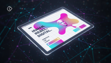
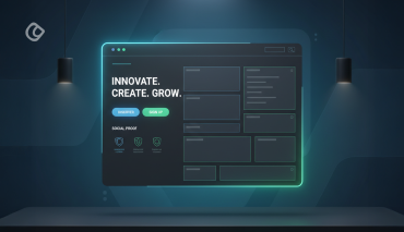
Single page websites were quite infamous until a few years back. These single page websites that you love today once served the purpose of business cards. Well, they are no more business cards but a website that drives customers over the web and converts them into leads, prospects and generates income.
These websites were very cheap, and they were also very boring to the user. Sometimes the user used to get frustrated and as a result, they used to hate the websites. There was no fun. No gaming issues, no chatting facility were available over there.
Things are changing now. The designers are very much smarter now. They think like a user and then creates a unique thing with their wit.
Now single page removes the clutter from a design and then leaves bright and gorgeous interface with lots of concise and focused content that are sure to draw the attention of the user.
If you see from the UX perspective, then there are good as well as a bad thing about single page design but due to their excellent interface people love to visit these websites as they often found some entertaining stuff.
Many say that the single page conversion rate is very high, but they are not correct. It depends on upon the page. For some its high and some it’s low.
Of course, when everything else seems to stagnate over the internet, a single page website could be the only way you could attract customers.
People want everything to be clean and precise. Even a designer wants to take his people to what they are searching in an instant, and this gave rise to single page websites.
But, let me ask you whether these single page websites will fit into your business requirements? Do you think so?
When you begin working on a web design project the first and foremost thing that you need to consider is the requirements.
What is the business type and who is the end-user? Whether the website that you are designing will suffice their needs? Will it do the magic in driving sales and spreading a word of mouth?
Are you designing for the customer or some machine?
To be honest, websites with a lot of content do not synch well when optimized into a single page website. Also, a single page website is an excellent option if you have very few products to promote.
I have seen designers struggling hard to fit in a lot of content into a single page website. The effort is almost similar to filling a lot of items into a box that is sinking under the pressure of the overload and screams out “I can’t take this anymore!”.
A single page site is similar to this box and tends to give up when overloaded.
It needs to be image driven rather than trying to showcase your copywriter’s skills.
But, creating a proper combination of all these could take your site to the next level.
Here are some facts that do not come as a surprise:
- Navigation of one page is pretty straight forward as there is no scope to get lost because everything is one or two steps away.
- The pages are very focused and evident that helps to communicate the central message of the website.
- These work smoothly across all devices as their navigation system permits scrolling and swiping rather than tapping and clicking.
You need to make the single page much more interesting to hit the eye of the visitor.
Before we examine the tips on designing a single page site, you need to be clear with the pros and cons which will help you identify whether it will work well for your website:
Pros:
- Storytelling takes a new form as the content is too precise and small and takes the audience directly to the point.
- Managing a site with multiple web pages is a hectic task while single page can be accomplished with ease.
- Also, you are in control of the user’s movement across your site. They will find what they are looking for rather than creating random bounces.
- A site that blends in the essence of storytelling, and interactive design drives user engagement.
- You can brilliantly implement CSS3, HTML 5, Javascript to manage animated and graphic images that are found to excite visitors.
Cons:
- Limiting your content and making it too precise could be a difficult task. Because always more is less!
- All the components in the site load at the same time, which prevents the site from loading faster increasing the bounce rates.
- Also, you need to be proficient in CSS3, HTML 5 and Javascript to design a single page website.
- When you have lesser content, it becomes difficult to optimize the page for SEO. Also, a single page means fewer meta and title tag descriptions unlike in multiple web pages.
- Since all analytics data comes from the same page, it will be of least help in tracking the behavior of the users visiting your site.
Now, you can determine whether your business will fit into a single page website.
Here, we will examine a few tips on how to design your single page website for good:
#1. Break your content into smaller sections:
When you find that you have limited space to tell your story, then do not fill it with too much information so that users get boring. Recommended that you have multiple sections as it creates a better feel. Make sure that message and the media are very clear. Here are some links that you can follow: designawatch.mijlo.com and agencysurvivakits.com
#2. Alternate navigation for easy access:
Single page websites are all about scrolling. It is almost like you are traveling to the Amazon forest without knowing anything. Keep users always on track and to use a traditional navigation system along with it. If your page is long, then you must have the bottom to top button.
#3. Call-to-actions need to be strong:
Use well-made CTA system as it will perform most of the job, but not the full job. The quality of a call to action determines the chances of a conversion regardless what work you do.
#4. No boring stuff, but simple and humble:
Designing a single page website needs a lot of effort as it needs to be creative too. Just make your web page simple and do not overdo with stuff and do not insert too many templates. Use advanced HTML5 and CSS3 to make it look good.
When you are designing a multi-page website, it does not matter if you brag to some extent. But, when it is a single page site you have to fit in everything in that single portfolio. So you need to take care to ensure that the site is precise, simple, beautiful and yet professional.
#5. Loading time:
Sites that are stuffed in with a lot of graphics and images take too long to load which is one of the disadvantages. It automatically forces the visitors to leave your site.
What can you do to reduce the load time?
Include very few images or light-weight things to prevent your site from failing to load quickly under the overload.
Let us reduce bounce rates and increase business.
Also Read: How to Enhance The Loading Speed Of a Website by Perfect Optimization
#6. Coding and design:
It’s a single page website, and all that you want is to provide the best user experience. So, how do you plan to provide your users with a great user experience?
The code provides lots of visibility to your website. The color of the site, the behavior of the links, forms, and all the other components need to be in synch with the design of the site.
Markham BOOTCAMP / www.trueresultsmarkhambootcamp.com is an example of One Page UX Website we designed and developed for True Results Fitness, a boutique fitness studio based in Canada specializing in weight loss and body sculpting.
It’s easy to get a customer, but it’s not that easy to satisfy them. So join the best ux design team in India that meets all your requirements.
Acodez IT Solutions is a web development company offering a wide range of services including website design in India and abroad. We also provide digital marketing services at affordable prices.
We also design single page websites that fit in your business requirements.
Contact us today for further information.
Looking for a good team
for your next project?
Contact us and we'll give you a preliminary free consultation
on the web & mobile strategy that'd suit your needs best.


