Web design is ever-evolving; there are constant innovations, in technologies, trends, design, and styles. For a few years now, one design style has caught on and become increasingly popular – the card design. Food products, real estate, news, social media, or fashion websites – they are all using cards in their website design. These are nothing but small rectangles that contain information and images, and they are usually interactive. Remember that cards are not merely design, but they have functionality; cards need to contain info that induces further visitor engagement.
Cards have the advantage of being suitable for a range of screen sizes. A card is simple, with just an image or icon, and some essential information like title, username and sometimes, a little text. They can be of many shapes, colors and forms, but rarely complex. Cards are incredibly flexible, but can still deliver a consistent and delightful user experience. They are functional and visually attractive, and deliver your information and message quickly, easily and efficiently.
Advantages of Card Design
Responsiveness:
They help to reposition and reorder content fast, based on the screen size. So they significantly help in creating responsive design and providing a seamless browsing experience regardless of the device used.
Neat:
Cards help to organize the content on the web page neatly and avoid clutter.
Readability:
Cards contain minimal information, making them easier to interact with
Suitable for social media: Social media is all about speed and accessibility – cards are just perfect for this. They are also easy to share.
Flexible:
This design can be used for almost any type of content; as there are set design rules, you can let your creativity go full flow.
Easy to digest: crisp bits of information and related images, videos or animations make the cards easy to consume and understand.
User-friendly:
All the above mentioned features taken in totality make this style very user-friendly; which can translate into greater visitor engagement and conversion.
Types of Card Design Styles
There are many variations in the design styles of cards; in fact since they first burst on the scene, they have undergone significant transformation. Let’s check them out:
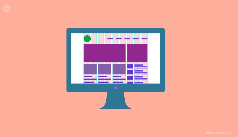
Flat Design
First introduced by Microsoft, these cards were vibrant and chunky, and based on the metro typography design language. Nowadays however, they include gradients, shadows and skeumorphic design techniques – making the depicted objects as similar to the real-life objects they represent.
Pin Design
If you’ve been through Pinterest, you’ll be familiar with this style. It’s primarily used in WordPress themes; when they first made their appearance, they only had very minimal content and links. Today they have evolved into containing more information, and video content, images, forms and even tools for social sharing. Some interfaces also have cards with microinteractions like notifications from Facebook.
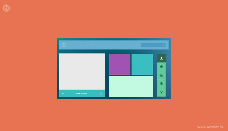
Grid/Masonry Card Design
This style consists of well spaced out or perfectly connected blocks across the layout. Some designs have container type patterns that are interlaced, and others display images or graphics in conventional grid style.
Magazine Style
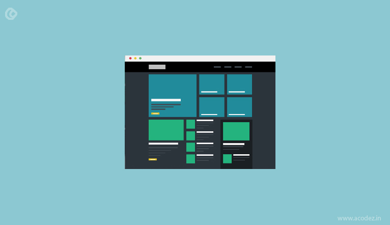
As these cards are of numerous categories, they necessitate a strong visual balance; these cards usually contain an image and some text which lead to more detailed information on other pages or sites. Obviously it is most used by news and magazine sites; however it is equally suited for blogs, portfolio and other sites that are content heavy and sites which are frequently updated.
How to Effectively Use Cards in Web Design
Here are a few pointers to make this work for you:
White Space
To highlight each element and to lend clarity and aesthetic appeal to the layout, you need to use plenty of white space. When you have to display a link, a header, CTA button and an image, all in a limited space, leaving a lot of blank space around each element is crucial. It helps visitors to focus on each individual card as there is no clutter. Think of the white space as a buffer for each element; it will help direct the focus to the different elements, and make them easily understood.
Minimal Information
Ensure that there is just one piece of information on a single card – it makes more sense than jamming it up with info. It renders the design cohesive and enables various types of content to properly function in the same space, and make it look organized. It also allows visitors to decide what content they want to consume and share.
Attention to Detail
Yes, the whole idea about card design is simplicity; it also means that you simply have to pay attention to every finite detail. The trick is to strike a balance with crisp but informative text, and eye-catching images. You can also provide visual instructions to the visitor and induce them to click and interact further.
Personalize it
While it is true that cards are planned, it doesn’t mean they have to be monotonous! Add stuff that helps visitors identify it with your business – colors, fonts, animations, – whatever works. Avoid run of the mill concepts, and personalize your cards.
Grids
Using a grid will help you to align everything properly and ensure consistency in design; it will also help to seamlessly realign the content according to the screen size it is viewed on; in other words, grids are very useful for creating a responsive design. When you create a grid framework with contrast and consistent spacing, it makes the page clear, easy to understand, and visually appealing, without the extra baggage, or clutter.
Catch the Visitor’s eye
Images are critical when it comes to card based designs. It goes without saying that you need to include attractive, eye-catching images, even though they have to be placed in a small space. If you don’t have such images, for some cards, you can implement a very crisp, attention grabbing headline, or animation, or artistic drawings and so on that will intrigue visitors and compel them to engage.
Typography
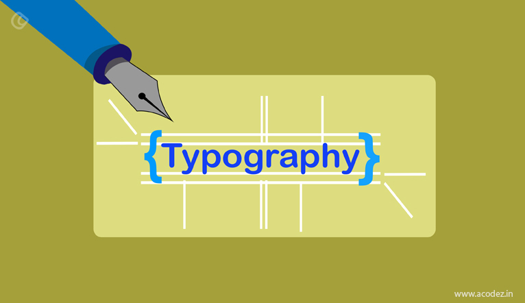
Use the same typeface throughout the layout to maintain consistency; you can vary the size for different types of information. Use colors that are easy to read, and contrast it to the background color. Choose a simple font to display text on or near the image, so as to not rob the attention from your image.
Surprise them
Human beings love surprises – positive ones, of course! Try adding some exotic details like 3D effects, hover effects, angled edges, or color overlays, to add some pizzazz to your design. To maintain visual balance of individual cards, you could try adding these effects only to the important parts of the content – the stuff you want to highlight.
Usability
When you design, make sure that along with good looks, the site is usable too. The main goal of doing all this is to induce the visitor to take a certain action, like say, clicking to subscribe, continue reading the article, or, in most cases, buy a product. The whole point of the interface is engaging the visitor to lead them into taking one of these actions.
Mobile Friendly
Whenever you create a website, you need to consider making it mobile friendly – we know that millions of people prefer browsing on mobile devices. We’re not just talking about responsiveness here, but also actions like swiping and tapping, rather than just clicking. You will need to ensure the buttons are placed prominently and are big enough to be used easily (even for those with clumsy fingers). This means there has to be sufficient space between elements so that the wrong actions are not taken by mistake.
Card Categorization
After finalizing the design, you need to determine what content to place in the cards. You also need to decide on grouping the content by subject or type (video, text etc). Decide on the categories. You can perform card sorting to organize your content; for this you can either use a card sorting website like Optimal Workshop, or you can use good old pen and paper. While the conventional method may take more effort from you, you will be able to lend a personal touch.
Card Preparation
Make a spreadsheet, listing every element or item you want to test; these could include labels, pages in a site map, product categories and so on. Write each item on a single card and write a number on the opposite side. If your system is going to be huge, you will need to break those tasks into easily doable chunks.
Deciding the Processes
Depending on the complexity level of the system you’re creating, and the time and funds at your disposal, you can decide between running solo or group sessions. If you opt for group sessions, the optimal number of participants for getting reasonably useful results, is 15 people. Then you need to look for these participants; make sure they are people who are familiar with the system you are creating.
The Actual Process
Make sure the participants are given clear instructions on how they need to organize the cards in a way that they feel right, and that there is no ‘one correct answer’. Be sure to stick around and clear any queries they may have as the organization session moves forward.
Analysis
At the end of the sorting session, you need to perform an analysis. You will get a fair idea of trends and related stuff when you find items that are grouped together the most, items that got sorted into more than one group, items that the participants found hard to classify, and labels that were newly formulated.
What Does the Future Hold?
We may well see cards in the near future supporting rich multimedia content, and more detailed elements like auto-updating content. Videos may replace images, and they may get more engaging and interactive. We may also very well see the cards getting bigger in size, allowing the use of intricate typography and increased detail.
Cards may evolve and change, but this certainly doesn’t seem to be a passing fad. Its many advantages to both users and businesses mean that they are here to stay.
Acodez is a leading web design company based in India offering mobile-friendly website designs implementing the latest and modern design trends and techniques to enhance the accessibility of these sites across a variety of devices.
Looking for a good team
for your next project?
Contact us and we'll give you a preliminary free consultation
on the web & mobile strategy that'd suit your needs best.


I find cards in Bootstrap 4 very interesting. Thannx for this great article. Would be interesting though to find a page that has all the source codes for every different card.
Thanks for sharing such a nice information about design .