Have you ever been annoyed with one of those apps that led you to dead ends? Of course these might be those popular apps from reputed brands and no one in their slightest dreams would have thought of reaching nowhere after moving through a smooth process from the beginning.
One of the major drawbacks of dead ends from the design perspective is that it creates a lot of confusion and also leads to additional and irrelevant clicks. It can also ward off your visitors, because no one has the patience to wait for too long when there are various others who provide them with exactly what they need.
Let us discuss in detail one of the commonly disregarded but eminent factors of website design also called as the empty states and its impact on customer acquisition. Thanks to Benjamin Brandall, Content Contributor at Tech Crunch whose article on “The Most overlooked aspect of UX design could be the most important”, helped me in my efforts to gain an in-depth knowledge of Empty States.
Analyzing Empty states from the designer’s perspective
An empty state also referred to as zero states are usually an afterthought development process for the designers. Most of them consider implementing this state towards the later stage of the design process as it forms a minor or temporary part of the user experience.
When do users encounter Empty states?
- First use: App Download
- Errors: Runs into some issue
- User cleared: When clearing the content
But usually designers make the mistake of assuming that this state has nothing to do with enhancing user experience when it actually has the potential to delight users, drive engagement and retain visitors.
What are empty states from the user’s perspective?
It is actually what the user sees when there is no data available to display on the screen.
When do the users encounter empty states?
- When they have signed up for the first time
- When they have cleared up the data
- Or when there is an error
But how you deal with the empty states can lead to possibly 2 kinds of outcomes:
- Enhancement in the user activity and retention
- Permanent or Temporary abandoning of the app
Before we provide you with the details on how to utilize empty states for your benefit by enhancing retention and providing your users with value-added services, we will go through some examples of the three different types of empty states:
Signing-Up for Gmail:

The new user Gmail onboard looks exceptional. But what happens if you end up in the app?
Emails: It provides you with further information that will be in the same format as you will see in the future.
Also, it provides instructions on how the users can utilize the app for deriving more value ultimately leading to user success.
Process Street’s Zero Data State
The zero data state of Process Street elaborates the users on how they can populate the app. The core foundation of Process Street is templates and without these, there are no checklists, folders, tags or anything. Hope you are clear!
Eventbrite’s Error Page
Unlike the usual error messages, that usually annoy you taking you over to dead ends, here the error message itself tells you what to do next. The message is engaging, has some value and possesses the potential to engage users.
How do you ensure your Empty States are helpful?
Start from the user perspective. What would you like to see in an empty state? It should tell the users:
- What it’s for
- Why they are seeing it
- How they can utilize it or fill it up
While designing remember user experience comes first and appearance is the lesser priority.
The “what, why and how” of the empty states must be taken into consideration while you design the app as your goal is to retain the users and ensure maximum (re)engagement. These 3 formulas form the minimal requirement consideration while designing the empty states.
Grab the User Attention
As we have already discussed, retaining the user attention intact should be your focus. Empty states are the process to actually re-engage your users and help them to utilize it efficiently to meet their specific requirements.
So, now let us find out how you can derive user attention and keep them engaged?
Think about the first thing that flows across your mind when you land here.

Empty. No trips. It tells you what the screen is about, but no other information.
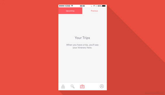
This tells you why it is empty. But then why are you here? It is because you have no idea about how to add a trip.
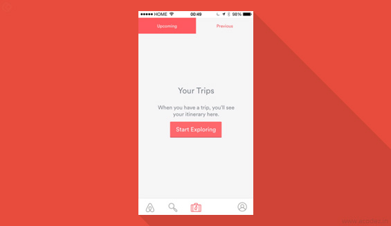
Yippee! Now this is something understandable and the CTA copy has the solution to your problem. If I had encountered something like “no trips”, then the app would turn out to be intentionally unhelpful.
Now let us use another app and do it all over again.
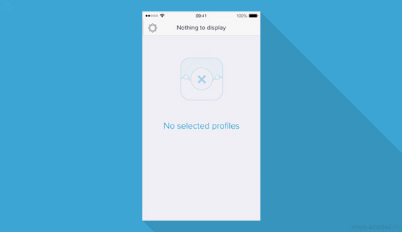
There is nothing to display. No data and no help. It tells you that the page is for displaying selected profiles and nothing more.
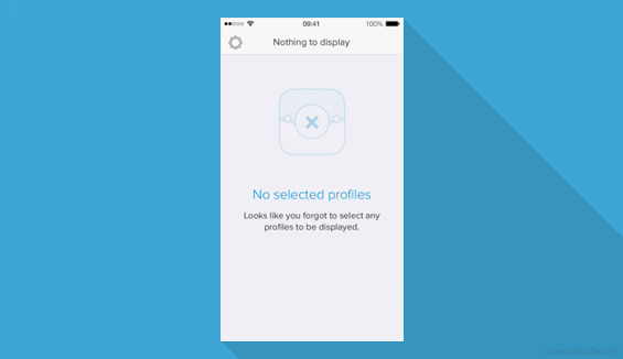
Now you know why you are here, but there is no clue on how you can fix the problem.
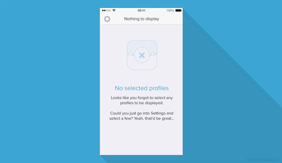
How mean of the app? We prefer helpfulness and that is what apps are designed for. Now you know how to get the problem fixed by filling the empty states with data.
In both the illustrations, we have clearly found out how to implement the “what, why and how” to re-engage customers during empty states.
Consider Personality & Benefits while designing the state
Personality and Benefits are the other two major factors that need to be taken into consideration while working on empty states.
Personality is ensuring that your app provides an exceptional and pleasant user experience.
Benefits is how well you manage to communicate with your users, tell them why they need to implement your app, which will increase retention and helps to fix any issues that arise during user on-boarding.
Here are a few instances to help you understand the importance of personality and benefits:
Khaylo Workout
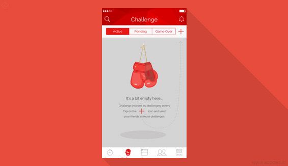
You know very clearly that you have reached an empty Challenge screen and you are here because you haven’t challenged any of your friends and with just a tap on the ‘+’ icon you can fix this. This illustrates how beautifully an empty state can communicate the app’s personality through awesomely blended graphics and impressive language that prompts the users to challenge their friends.
Here is another example:
Beamly
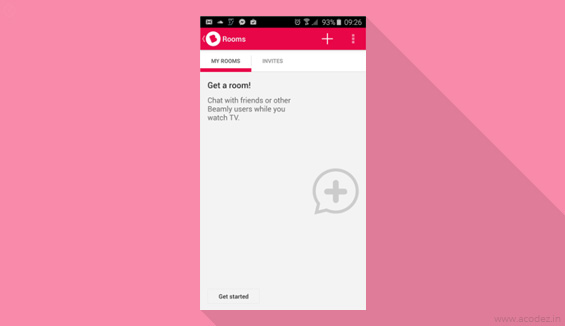
Though you might be using it for the first time, you know very well how exactly the app works and where it will take you. It gives a pleasant experience across the “What, why & how” of the empty states plus it also slips in a funny remark while explaining the core value of the app to new users or users who have returned but need a quick & helpful reminder.
See how beautifully it can be done!
How do you implement brand personality?
Do not forget this is one of the best chances that you can utilize to bond with your users and familiarize them with the awesomeness of your app’s personality. Web designers love to experiment with 404 pages by inducing something creative and innovative; the same formula can be implemented for empty states too. A general analysis of human needs and how this can be connected with the success of an app’s user experience is based on how pleasurable your app is, apart from being functional, useful and reliable.
Here are some simple tips to help you make your apps pleasurable:
- Surprise. Refers to something that was unexpected and fresh.
- Grab attention. Offer discounts or deals, or some kind of incentives or provide a solution, no matter whether you have been asked or not.
- Stay unique. Stand apart from others.
- Be positive. Humanizing is the trend.
Emotionalize with Empty States
Remember our example on the topic of inboxes, I don’t know whether you have noticed it but there are some inboxes that in fact congratulates users for taking the effort to have reached there while there are other kinds of apps that prompt you to fill it up.
The feel that your empty state conveys depends on the purpose of your app.
For instance, while using Hangouts it requests the users to add content whereas with Outlook, you are prompted to remove the content.
Hangouts
It looks sad. Looks like the user has got some incentives to send invites on Hangouts! See how tricky the design is…
Outlook:
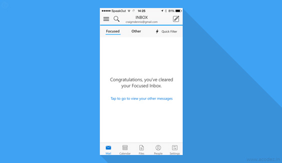
Wow! You have achieved success with this functionality. It defines positivity approximately.
Surprising your Users
Error messages generally tend to surprise users more often frustrating them. Why do you want to annoy them with such a surprise when you can creatively utilize this opportunity to delight them? You don’t want your users to encounter error messages too often while they use your app. Offer them with something delightful rather than upsetting them for having used your app.
Cognito Brain Training
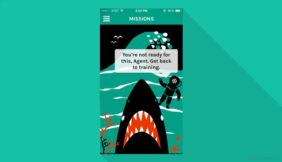
Shark is it? Something people will find funny!
Timehop
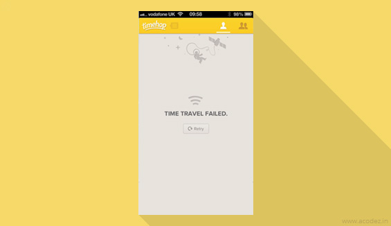
Failed internet connection! But it represents no element that might annoy the user. Personalize your communication.
Using Empty States to convey Benefits:
Now let us focus on another important aspect of Empty States and that is copywriting.
You need to exert greater importance to the empty states when it comes to user on-boarding process. Don’t miss out on any opportunity that you encounter while (re)selling and during each empty state
ensure that you communicate the benefits of your app to the users. The user on-boarding process is not a smooth one as people usually assume it to be. It can happen that after signing-up the app becomes a partly or totally forgotten icon of their home screens, and it might even take days, weeks or months for the users to revisit the app. There is even a possibility that the user who stopped using your app mid-way through the on-boarding process might end up abandoning it. Now it’s your turn to take some serious action. Here is how:
- Let your user know what your app is capable of doing
- Tell them why they should use it
Here you can implement the old rule of inbound marketing which says sell with benefits, support with features.
Let me prove it with the help of a few examples:
Here is Basecamp’s Projects’ Zero Data State:
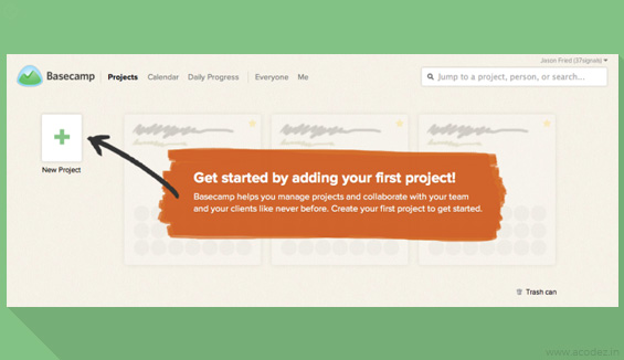
Now that is something helpful! It tells you what to do, how to get it done and why you should do it. The “What, how and why” well explained!
Dropbox’s Team Zero Data State
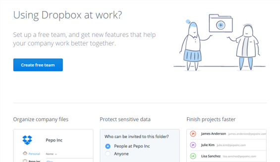
Amazingly, no need of further explanation! Look at how well the copywriters have accomplished their task. Even though the feature might not be necessary in certain cases, but it seems like people will try it out for the awesomeness that it exhibits.
A summary of our discussion on how well you can utilize the usually disregarded aspect of UX design that is actually the most important one:
Start by setting up an answer for the formulas:
- What is this screen about?
- Why do I see this?
- How do I fix this?
Once you are done with these, to add cream to the cake you need to work on:
Turn your app into a delight for people and here you can make smart utilization of the features to connect with feelings.
During the first time empty states (user on-boarding); tell them why they need this.
These are some of the most important aspects of the Empty states that you need to start implementing today.
Image Credits: Benjamin Brandall/ TechCrunch
Acodez IT Solutions, is a leading web development company in India implementing state-of-the-art technology to develop web design & development solutions that exceeds the expectation of our client base across the globe. We also provide SEO and inbound marketing solutions to help businesses reach their customers with enhanced ease.We have also satisfied more than 10,000+ clients since our inception as an ux agency in India. To avail our value-added services, contact us today and we will provide you with the necessary assistance!
Looking for a good team
for your next project?
Contact us and we'll give you a preliminary free consultation
on the web & mobile strategy that'd suit your needs best.