One of the key aspects of any great website design lies in the designer’s ability to feature a handful of commonly designed pages that exhibits almost similar usability characteristics. This brings us to our main point of discussion that is the need to implement 404 error pages which form the most common yet the least acknowledged of pages that every site should contain.
The importance of 404 error pages is realized when it comes to your rescue to guide visitors away from broken links or missing pages ensuring that they browse the site without any further interruptions. Designing a 404 error page is quite a simple task though designing the one that blends in well with the existing design specifications and balancing the naturality is the one that requires quite an effort.
Here, we have clubbed in some really helpful usability tips along with certain splendid examples that we found on live websites to help you design excellent 404 error pages:
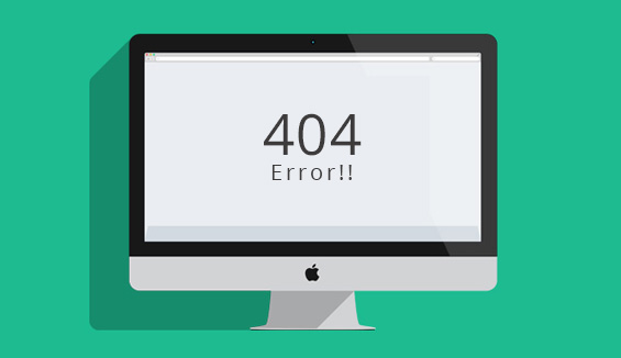
What is 404 Error?
404 Error is the most popular among the existing array of the available HTTP error codes. Usually, in situations where either a page is missing or in the case of a broken URL, the server fetches and displays the 404 Error page.
Don’t assume too much, because it is not necessary that always your users readily understand what the Error page is trying to imply. Also, the users who actually have an idea of what the Error page is for might not be able to troubleshoot the error. So, let simplicity be your call. Keep it as simple as you can.
There exists a usability element on every page that exhibits a natural charm at appeasing and retaining the visitors. The appearance of a page from the user perspective determines the user’s actions. So, put yourself in the users shoes and define the requirements before designing your 404 error page so that it exactly fits the requirements.
Say no to Defaults
Fetching a 404 error page is not a big task for any server, they can easily return one and the worst part is that these are exceptionally ugly, insensitive, non-specific and unattractive. Do we need to say more?
One of the general rules that you need to keep in mind while designing 404 error pages is that never go for the default server 404 error message when you can easily use the site’s main template to design a page and keep your 404 error message simple and attractive.
Consistency is the key feature that works the trick and when you implement 404 error pages that align with your site’s template design, you are doing a great job maintaining the uniformity. Even though they are met with a page that does not exist, nothing has changed because they are still on the website. Implement a logo or navigation in the header to take them back to the other pages on your website.
404 error page with a natural UX flow
A 404 page is a temporary excuse, don’t expect your visitors to stay here, why would anyone in their right mind want to? It is just a design feature that helps your visitors navigate back to the website.
Whenever you design a 404 page, aim for experience. Your objective is to help your visitors find their way back home without the slightest difficulty. Your text should be clear, big and easy to read. Do not make your design too intricate, because all that you want is to direct visitors to the home from the 404 page without confusing them.

Researches show that people would love to help their favorite businesses at such crucial points. You can allow them to help you with direct links that will take them to the contact page wherein they can report a broken 404 link. This will be of assistance to you in examining and resolving why the page is missing.
A 404 page is actually an apology for annoying the visitors – do it an a cool and simple way!
It is not a hectic task to identify the reason behind a 404 error, so it is best to simplify things rather than complicating everything. Do you think your visitors will waste their time unnecessarily resolving these 404 errors unless they are provided with the root access to the server?
It is better not to reveal too much about status codes or server messages because it usually tends to annoy people especially people with minimal or no technical knowledge at all.
Keep everything simple, just think how you would feel if you were them, humor can be a great choice to retain your people. Here, you are trying to apologize for annoying your visitors. Why complicate things when you can keep it simple and humble?
Where else do you think you can use humorous images or graphics? Grab the opportunity and utilize these to retain your visitors. Your goal is to seek apology rather than making them feel wrong for having visited you. Also, you can brilliantly manage the situation by either offering them with solutions or links that will take them to alternate pages.
Use humorous web copy and/or graphics to keep visitors interested in the site. Don’t make anyone feel like they’ve done something wrong. Instead, try to offer solutions or links to alternate pages to keep people engaged on your site.
Also Read: 10 Common Web Development Mistakes That You Are Making And How To Avoid These
Below are some of the cool 404 error pages on the web:
Here, we have cited out some amazing examples of 404 error page designs that we found on certain live websites that work along common usability tips. Study them carefully and next time implement them while designing your 404 error pages:
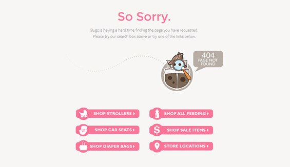
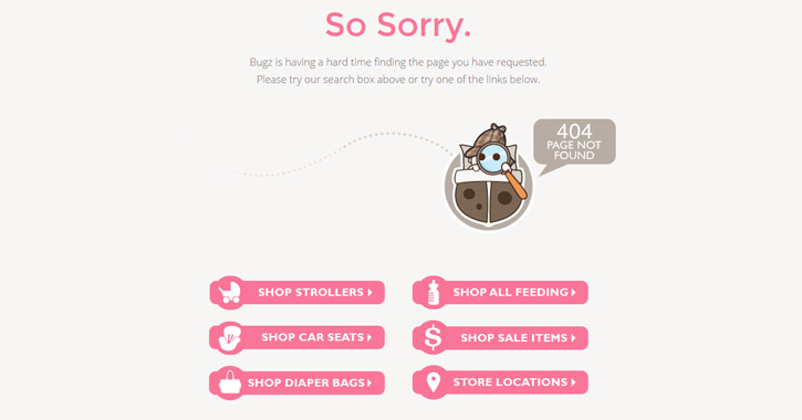
Check out the styles used for the buttons and icons on this page. Don’t you think it gives an impression of being a part of the layout structure. The same design structure helps to tie this 404 page structure with the website layout creating a feel of being an inevitable part of the Snuggle Bugz website.
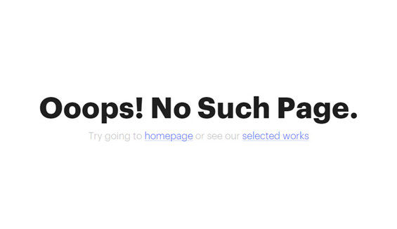
#2. Acodez

This is amazing!! Isn’t it? A simple and precise structure with impressive custom illustrated style of being lost fits well for the eye catching 404 error page. Everyone would readily catch it and search whatever they require. Check out the animated page link here
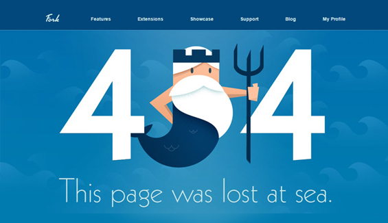
Wow, this looks awesome now! The impressive iconic branding of Fork CMS catches the eye across their 404 error page. To add cream to the cake, the brilliant fusion of the beautifully woven copywriting fits well into their aquatic theme.
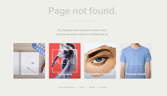
Look at how wonderfully they have taken the advantage of transforming a potential blunder into a sales opportunity here. Though the 404 page of Gumroad doesn’t feature any internal links, it is self-sufficient as it exhibits some of their featured products at random.
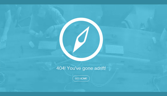
This is one of the excellent ways to design a 404 page with simple, neat and precise components. Ramotion’s 404 elements are easy to interpret and there are hardly any chances for blunders to take place.
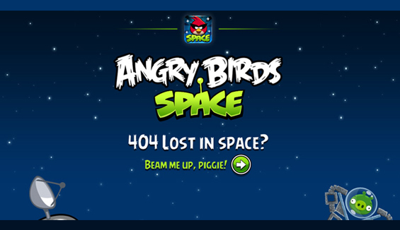
Look at the branding used on the Angry Birds page, don’t you think this dons a vital role in the design. It contains a link that will navigate people back home along with other important components that are mandatory. The branding helps people to essentially understand what is the nature of the site that they are browsing across.
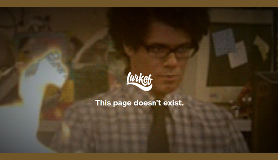
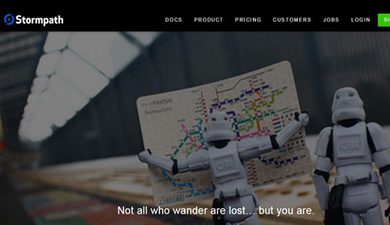
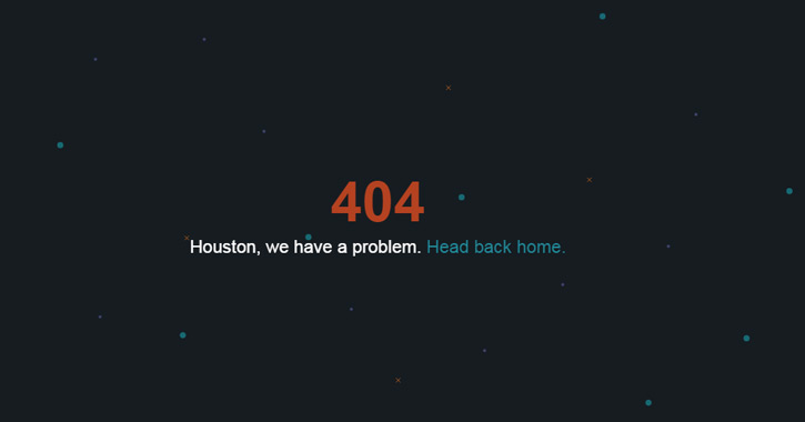
As we have already discussed people love humor and here is a beautiful illustration on how effectively you can utilize humor to apologize for the inconvenience that visitors experience. Look at how witfully they have utilized the full page background video clip from The IT Crowd. The only constraint is the lack of links as there is no way to help people get back to the main page unless they manually edit the address bar.
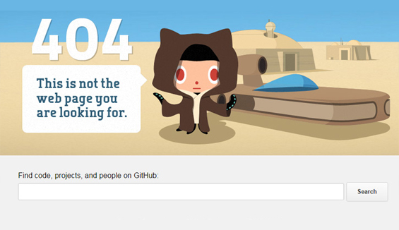
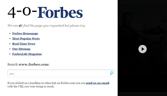
Look at the enormously large search bar on the GitHub’s 404 page. Now isn’t that something tricky and impressive? People would readily grab it and search whatever they want.
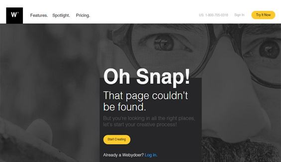
The large typography and bright contrast have been blended well across the Webydo’s 404 error page design. You can utilize these techniques to catch the visitor’s eye towards the specific areas of your page.
Also Read: Why is Typography So Important in Web Design?
This is more focused on technical people and look at how smartly they have implemented some great photography and an interesting web copy that is intended to attract visitor attention.
If you examine the site you will find that it manages to easily attract visitor attention with the help of very few links. And take a look at the full -screen video that has been brilliantly utilized to showcase the awesomeness of the Underbelly team, something that you can think of while wasting time on unnecessary page loads.
This is yet another beautiful illustration on how typography can be brilliantly utilized throughout a site and across the 404 pages also. Blending in an excellent search bar with a beautifully ordered list of links will lead the visitors to find exactly what they are searching for. The video that has been brilliantly utilized to showcase the awesomeness of the Underbelly team, something that you can think of while wasting time on unnecessary page loads.
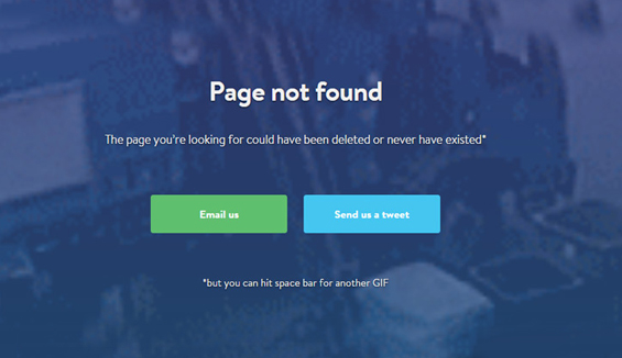
Beautiful, simple & precise, people have no confusions, as they can either choose to Email or Tweet though they could have implemented a larger link that leads to the Homepage.
This is one of the popular websites and look at the order of the links along with the wonderful navigation bar that helps to keep their 404 page simplified.
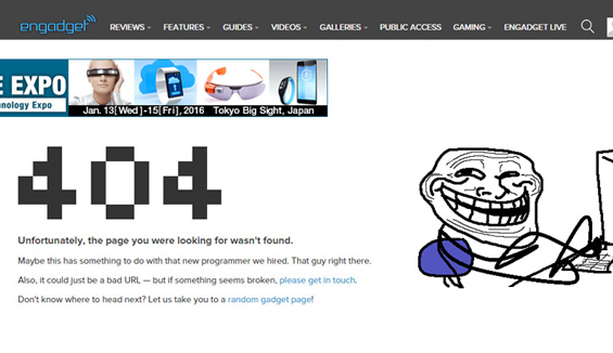
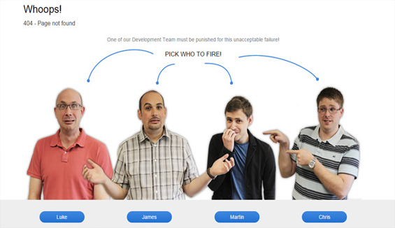
Again something that people love, the friction that these cartoons and memes with a friendly aura will delight the visitors for having reached the 404 error page.
It is easy to write long folds of content, but the impact of the little amount of text with a contrasting design makes the page appear attractive while it manages to stay on the topic.
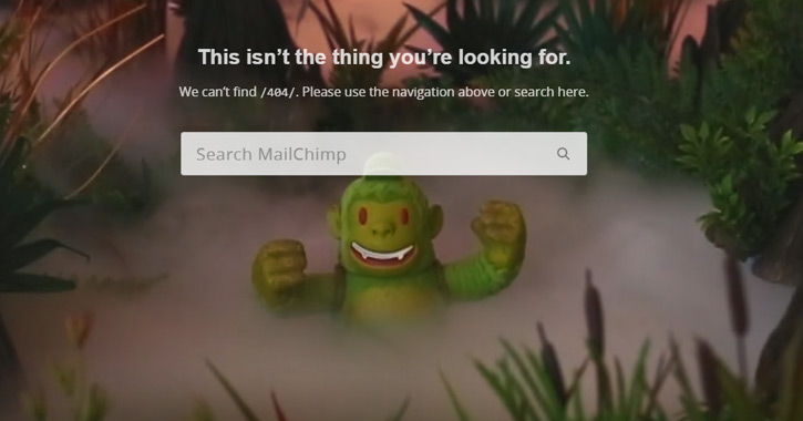
Look at the MailChimp header that is etched to the top of the page, with this if someone says they can’t find their way back home, either they are lying or they have some problem with their visual sight. Also, the large search box is another added advantage.

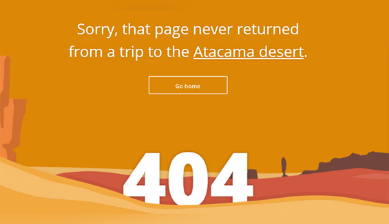
The 404 page has only one link to take the visitor back home. The animation is quite lengthy and might be an annoyance if the visitor does not have enough time, but the simple and clean UX will surely solve the problem of the users.
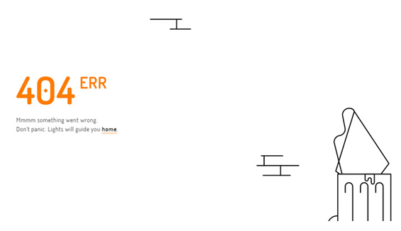
Vector graphics is something trendy now and TinyCarrier has brilliantly utilized the power of these graphics here which makes their 404 page appear just like any other ordinary web page on their site and also it contains a contact link that visitors can use to report broken links.
The fun game toying with the staff, that Email Center’s 404 page showcases which help to retain visitors.
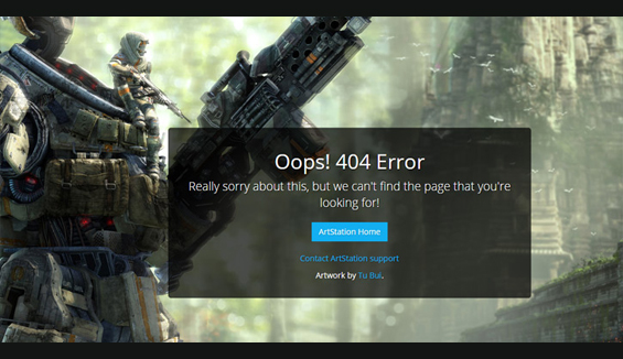
Wow! This is simply impressive. Look at how beautifully the message has been curated. It is one hard thing for people to miss and also the block button link that will take you back to the homepage. The offer that you can utilize to send a contact message to the team at ArtStation shows how well you can provide incentives for favors.
Conclusion
As a designer there is no limitation to the tools and techniques you can utilize to improvise and enhance your website designing strategies. You can research, contemplate and come up with innovative ideas to strategize design fundamentals based on excellent usability tips that will make your work easier.
No user wants to feel sorry for having reached the wrong place and with attractive and friendly 404 error page designs you can ensure that they are happy to have come to you rather than forcing them to find a reason to crawl out.
Have you ever tried any of these usability tips while designing your 404 error pages? Or do you use a technique apart from these and how well has it helped in your efforts to retain users? Share your thoughts and feedbacks with us and help us increase the list of usability tips with your valuable contributions.
Acodez IT Solutions is a web development company in India catering to a wide range of clients operating across different industry domains with business specific solutions to fit their requirements. We are also a digital marketing agency helping businesses plan and organize their business solutions as per the varying demands of the online marketing industry.
Looking for a good team
for your next project?
Contact us and we'll give you a preliminary free consultation
on the web & mobile strategy that'd suit your needs best.


