Graphic design is a unique and interesting field in the design domain. Graphic designers often try to bring about innovative ideas into their design strategies. This helps to attract user attention and enhance the appearance of your website or app wherever it is being implemented. What people want is icing on the beautiful and delicious cake that is baked for them. And graphics is perfectly the topping that enhances the yumminess of the cake.
With more number of people joining the field of graphic design, it is becoming a common thing these days. So everyone wants something new! But before we go about blessing our designs with newness, it is important to ensure that we are following the existing rules, which are really important to keep our design intact.
If you start implementing innovative and new ideas without being aware of what the existing rules are, there are chances that you might end up in the middle of a mess. The end product would be poor graphics, which would ward off customers rather than attracting them. This would impact a designer’s career in a bad way. However, if you could combine the goodness of the existing ideas with the innovative ones that you already have with you, magic will brew.We will take you through some rules of graphic design layout that you ought to follow when when using graphic design tools. When exploring tools for graphic design, consider canva or canva alternatives that provide fresh perspectives and unique features that cater to different design needs. These alternatives offer diverse templates, and collaborative features, empowering designers to create stunning visuals that stand out.
Important Rules of Graphic Design Layout
1. Consistency is one of the most important points to be noted
We always say that consistency is most important when it comes to any design components that would be exposed across any of your brand’s face. This helps the audience to relate to everything they see which might be related to your brand. For example, the elements that you might introduce across your brochure if used on your website as well, we have more chances of creating a lasting impression on your user’s mind. With consistency being achieved through the design and branding use on your promotional or marketing materials, we are actually making sure that there is no misinterpretation of any kind happening for our brand because the elements are same everywhere.
Here are a few elements that should be made consistent with the other, no matter what:
Web fonts or typography: It is always ideal to use a single font type across. But if you plan to use more than one, make sure that it doesn’t go beyond three.
Color palette: The color shades should be limited to five within your branding; keeping it to a two or maximum three would be the best choice for color palettes.
Though you have been recommended to use similar elements throughout your promotional materials for branding and/or your website, make sure that none of it looks alike. Bringing about a slight variation across these attributes would work wonders. The idea is to ensure that all your branded materials look more or less similar – like they belong to a series – but do not look like the same kind of marketing material on a different channel. For instance, when your website is designed, make sure it doesn’t look like your brochure, but don’t forget to use similar branding elements for relativity.
2. Everything should be clear, crisp and beautiful
The crux of the graphic design layout lies in its beauty. Clarity is one of those aspects that should be focused on when you choose a font for graphic design, regardless of whether it is for web or print. If there is no clarity, how do you intend to convey the brand’s message – which is why your audiences are here and when they do not get what they want, they probably leave.
In fact, there are chances that they will never return to your site again if there is no clarity to what you present. This starts with choosing fonts that your audiences would like while ensuring that it is compliant with your brand. For example, if your audiences are women and your business in the clothing category, then probably a font that belongs to ‘Times New Roman’ or ‘Arial’ would be ideal. This would help to improve user experience as they would get what they want in exactly the way they were expecting it to be.
To improve the clarity of your font, you can use a contrasting color for the web font that you have chosen.
3. It is important to eliminate color disharmony
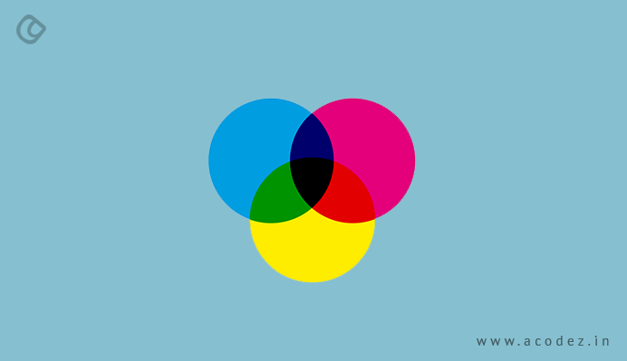
As we are aware and as per our discussions, color is one of the important aspects of any design, but it could also be dangerous if not handled well. It is important to choose colors that go well with one another to eliminate creating any kind of disharmony in the design. Think of white font on a red background or yellow font on green background – isn’t that too annoying?
The yellow font is trying to capture the user’s attention, while the eyes give away under pressure from the green background that stands out making it difficult to read what is written in yellow. But think of the white background and black font – wow, that seems like complementary! We don’t need anything more.
4. Graphics and text should be proportionally organized
The measurements used for organizing graphics should be used for organizing text as well. A balance should always be attained between the two. Stretching images is not a great idea and does not go well with the audiences. They happen to feel annoyed when they encounter such unprofessional and terrible appearances of images. It exhibits poor branding. The size of your image is another important aspect that needs to be taken into consideration when it is uploaded to the website, social media ads or brochure or any promotional materials related to your brand.
A little bit of editing here and there helps. If you are not an expert at graphic designing, then it is better to get help from a professional for help to scale images. The main point of ensuring that your designs – and design elements are scaled proportionally is to ensure that the poor design does not deflect the audiences’ attention from the main point or content but distracts them toward what doesn’t even matter much.
Sometimes, for instance, on an e-commerce website, image is very important – because it is after taking a look at the image, the user decides to make a purchase.
5. Raster-based images are no longer a trend
Decades ago, raster-based images used to be a part of graphic designs. Even today, amateurs end up using raster-based graphics in their design without being aware of how it affects the when they try to maximize or minimize the size of the image. The best thing you can do about this is to use images that are larger in size with higher resolutions to ensure that they are clear and eligible though you might have to scale these.
When it comes to using symbols or icons, it is always ideal to go with vector graphics. These can be easily scaled with no compromise over quality. Since Adobe Illustrator is a vector-based app, you can be reassured that none of the icons that have been developed using this illustrator would become pixelated when resized. Since a lot of people prefer using Adobe Photoshop for flyer illustrations and posters, raster-based graphics become a part of designs, which is a grave risk that must be avoided in your designs.
6. Alignment should be taken care of well
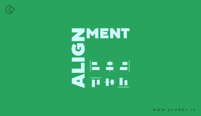
As we have discussed about scaling the text and images, the arrangement of these elements is also an important part of any web design that needs to be taken care of particularly well. When these elements are poorly aligned, there are chances that this would expose your business or brand in bad light. All you have to do is get to arrange all the elements perfectly in a good proportion as needed.
It is important to ensure that your objects are well-aligned complementing one another over a canvas or wherever they are being used. It is better to follow the thumb rule: where you need to choose a line on your page, and align your graphic and text elements in line with it. It does not matter whether the alignment is horizontal or vertical, but well placed than going for random arrangement on your page. When elements are hazily and lazily organized on a page – it might make the user annoyed up to an extent because they do not have an idea of where they ought to be looking at or should they rather not take a look at any of these. You can make use of columns if you are not too sure about any other method of bringing about an alignment across the elements.
7. Grammar, typos and punctuation are important
When your marketing elements have great graphics and if the content comes with grammar, spelling errors and punctuation mistakes, then, it would be even more annoying than an inappropriately placed element or using a raster-based image. It is always good to have a proofreader go through the content before you publish it to get rid of grammar, typos or punctuation errors that might be an annoyance for someone who really is a language pro though not all of your audiences would have a strong language. However, it would really matter for a linguistic expert.
There are online tools available, such as Grammarly, which would help you to check through the basic errors that you might have missed out if you opt for the free version, though the premium version comes with far more advanced options.
These are some of the most important points that you need to note with graphic designs.
Acodez IT Solutions is a web design and development company offering all kinds of web design solutions at affordable prices. We are also an SEO agency offering inbound marketing solutions to help take your businesses to the next level. For further inquiries, contact us today.
Looking for a good team
for your next project?
Contact us and we'll give you a preliminary free consultation
on the web & mobile strategy that'd suit your needs best.


Using grids for designing is one of the foremost rules of graphic designing. Grids allow you to align your design as well as text in the proper manner. Apart from this, it makes your design clean and clear.