When designing a website, letter-spacing is frequently one of the most overlooked elements. Nevertheless, this subtle detail can have a significant impact on a website’s overall aesthetic and readability.
This article aims to shed light on the importance of letter-spacing in web design and provide insight into the do’s and don’ts of letter-spacing. Additionally, we will examine examples of effective letter-Spacing in web design.
By the end of this article, you’ll have a better understanding of how to use letter-spacing effectively and how to avoid common mistakes that can detract from your website’s readability and visual appeal.
Whether you’re an experienced web designer or a beginner, the information provided in this article will help you create more visually appealing and user-friendly websites.
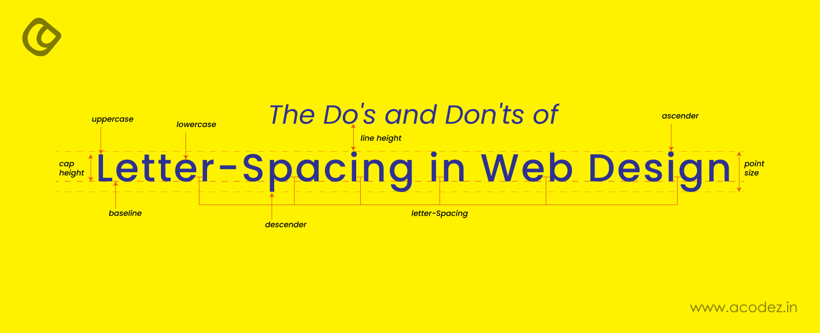
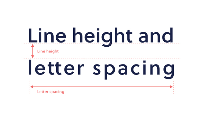
Letter-spacing, also known as character spacing is a key component of typography and has been used in printed materials for centuries. Letter spacing refers to the horizontal space between each letter. In web design, it is often used to control the space between letters in headlines, titles, and body text.
Adjusting the letter-spacing of a text can have a significant impact on its readability, legibility, and overall visual appeal. It can help to prevent text from appearing too cramped or too spread out, making it easier for the reader to scan and comprehend the content.
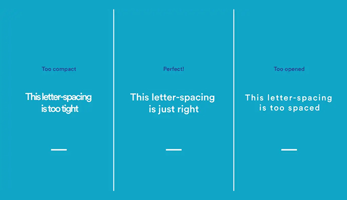
What Is Letter-Spacing in Web Design? – Image Source: Rocketspark
In addition to its practical applications, letter-spacing can also be used as a design element.
By adjusting the spacing between letters, designers can create unique and interesting visual effects that can enhance the overall look and feel of a website or web page. For example, increasing the letter-spacing of a title or headline can make it stand out and draw the reader’s attention.
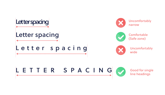
Letter-Spacing for Single Line Headings – Image Source: Rocketspark
It’s worth noting that letter-spacing should be used with care, as too much or too little spacing can have a negative impact on readability and legibility.
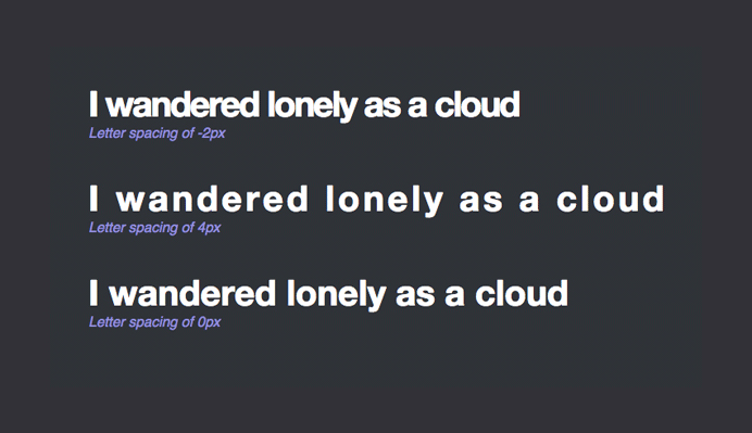
How To Use Letter Spacing Effectively in Web Design – Image Source: Google Fonts
Designers should aim to strike a balance between the visual impact of the text and its ease of readability.
In terms of implementation, letter-spacing can be added to a text using CSS (Cascading Style Sheets). To do this, designers can use the letter-spacing CSS property and specify a value in pixels, ems, or percentages. Alternatively, many design programs also have built-in options for adjusting letter-spacing.
Overall, letter-spacing is an important element of web design and can have a significant impact on the visual appeal and readability of a website or web page, as we will discuss below. By paying attention to the spacing between letters and characters, you can create a more polished and professional-looking website.
Additionally, optimizing letter-spacing can improve the accessibility of your website by making it easier to read for users with visual impairments or reading difficulties.
In the following sections, we will explore the best practices for using letter-spacing in web design invoice templates and provide examples of how to use it effectively.
The Importance of Letter-Spacing in Web Design
Letter-spacing is an important element of web design because it can have a significant impact on the overall look and feel of a website. When used properly, letter-spacing can help to create a more pleasant reading experience for visitors to your website.
In this section, we’ll explore some of the reasons why letter-spacing is essential in web design.
1. Improving Readability
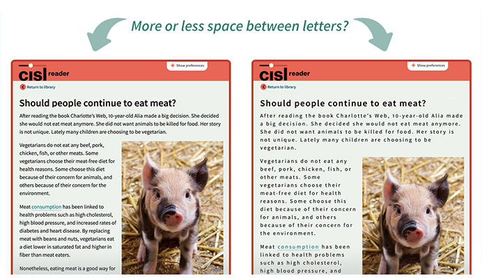
Proper letter-spacing is essential for improving the readability of a website. When text is too tightly packed, it can be difficult for readers to distinguish between individual letters, causing eye strain and making it harder to understand the content.
This can be demonstrated well by the image below.
How Letter Spacing Improves Readability – Image Source: Inkbot Design
On the other hand, when the letter-spacing is too loose, it can create too much white space between letters, resulting in an unpleasant visual experience and causing readers to lose focus. By finding the right balance, designers can create a comfortable reading experience that helps to keep visitors on the site for longer.
2. Creating Visual Interest
In addition to improving readability, letter-spacing can also be used to create visual interest and style within a block of text.
By selectively increasing or decreasing the space between characters, designers can create a unique look that sets their site apart from others.
As of today, there are over 1 billion websites on the internet, according to Siteefy’s estimate of approximately 1.13 billion websites worldwide. This abundance of websites has necessitated the development of more diverse design strategies to accommodate the wide range of website types.
For example, adding extra space between the letters of a heading can create a bold and modern feel, while reducing the space can create a more traditional look. By using letter-spacing creatively, designers can create a unique visual experience for their users.
3. Enhancing Readability for Accessibility
Letter-spacing is also a crucial factor in making a website accessible to all users. For example, people with visual impairments may find it difficult to read text that is too closely spaced.
In fact, according to a research cited in a Forbes article, 71% of people with impairments tend to leave websites that are difficult to use. In the UK alone, this leads to an estimated annual loss of £11.75 billion (or $14.4 billion).
However, businesses that fail to comply with online accessibility guidelines may not receive complaints from these lost customers. In such cases, adjusting the letter spacing could enhance text legibility, lower bounce rates, and potentially influence organic search engine results.
Enhancing Readability for Accessibility – Image Source: CAST
Similarly, people with dyslexia may benefit from increased letter-spacing, which can make it easier to distinguish between individual letters.
By making small adjustments to the letter-spacing, designers can help to make their website more inclusive and accessible to a wider audience.
4. Creating Emphasis and Hierarchy
Letter-spacing can be used to create emphasis and hierarchy within a block of text. For example, designers can selectively increase the space between the letters of important words or phrases to make them stand out from the rest of the text.
This can be particularly useful for headings and subheadings, which need to grab the reader’s attention and convey important information quickly.
By using letter-spacing to create visual hierarchy, designers can help to guide the reader’s eye and make it easier to find and understand the most important parts of the content.
5. Using CSS for Letter-Spacing
In web design, letter-spacing can be controlled using CSS (Cascading Style Sheets), which allows designers to adjust the spacing between characters of text across an entire website.
CSS letter spacing can be used to apply different letter-spacing values to different types of text, such as headings, paragraphs, or links.
Letter-spacing is an essential element of web design, and there are several ways to use it effectively. Here are some tips to help you get started:
1. Consider the font size
When setting the letter-spacing, consider the font size. As a general rule, the larger the font, the more space you should leave between the letters. This will help keep the text legible and easy to read.
2. Use a consistent letter-spacing value
Using a consistent letter-spacing value throughout the block of text is important to maintain the visual balance and consistency of the text. Consistent spacing will also help avoid any awkward spacing or distracting visual disruptions within the text.
3. Use letter-spacing to highlight important words or phrases
As mentioned earlier, letter-spacing can be used to emphasize important words or phrases by increasing the letter-spacing in word or phrase.
Creating Emphasis on Headers – Image Source: Twitter
This technique can help draw the reader’s attention to the most important information and create a visual hierarchy within the text.
4. Use letter-spacing to create visual hierarchy
Again, as mentioned earlier, letter-spacing can be used to create a visual hierarchy within a block of text. By increasing the letter-spacing of the heading, you can make it stand out from the body text and create a clear hierarchy between the different levels of text on the page.
5. Utilize letter-spacing to break up words
Letter-spacing can be used to break up long words into more manageable chunks. This can help improve readability and make the text easier to scan. It is particularly useful for headings and titles that contain long words or phrases.
6. Use letter-spacing to improve readability
As previously discussed regarding the significance of letter-spacing in web design, it can be utilized to enhance the legibility of a body of text by increasing the space between the letters.
This technique can help make the text easier to read, especially for people with visual impairments or dyslexia. It is important to be careful not to overdo the spacing, as this can make the text difficult to read or unattractive.
7. Choose the right font
Choose fonts with the proper spacing to maintain readability and aesthetics. Letter spacing varies between fonts, impacting the appearance of the text. Also when pairing fonts, make sure to choose fonts with similar letter spacing.
8. Adjust for different screen sizes.
While spacing letters, ensure that they are readable on various devices. The text should be clear when viewed on a phone or computer. Use scalable units for font sizes to ensure that the text adjusts properly on various devices.
The Don’ts of Letter Spacing
While letter-spacing can be used to improve the readability and visual appeal of text, there are certain mistakes to avoid when it comes to using letter-spacing effectively in web design. Here are some tips to help you avoid the common pitfalls of letter-spacing:
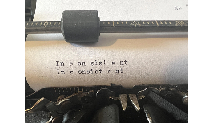
1. Don’t use inconsistent letter-spacing
Inconsistent Letter-Spacing Example – Image Source: Reddit
Using inconsistent letter-spacing can make the text look unprofessional and disjointed. Therefore, it’s important to maintain a consistent letter-spacing throughout the text.
However, this doesn’t mean that every letter or word should have the same spacing, as adjusting letter-spacing according to the specific needs of the text is essential to optimize the readability.
2. Don’t use letter-spacing on all caps text
On an average visit, users read only half of the information on pages containing 111 words or less. In the full dataset, the average page view contained 593 words. This is according to a research study by Nielsen Norman Group.
This means that if users devote all of their time to reading, they will have time to read 28% of the words. However, in reality, users typically only read about 20% of the text on the average page.
It’s important to consider readability when presenting text to users. Using letter-spacing on all caps text may make the text harder to read and can create an unbalanced appearance. All caps letters are typically designed to be used without letter-spacing, so it’s best to avoid it.
Increasing the Letter Spaces by Tracking – Image Source: Pimp my Type
Instead, use the tracking feature to adjust the spacing of all caps text as you can see in the example above.
3. Don’t use letter-spacing to fix design problems
Using letter-spacing as a quick fix to design problems can be tempting, but it’s not always the best solution.
Instead, try to address the root of the problem by adjusting the font size or the line-height of the text. Using letter-spacing to fix design problems can make the text look unnatural and unprofessional.
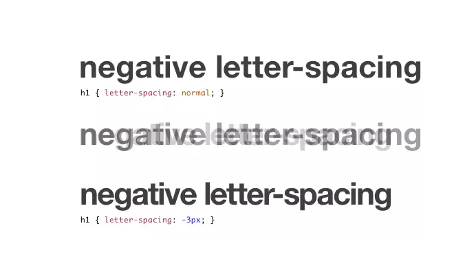
4. Don’t use negative letter-spacing
Negative letter-spacing can be used to create a compressed effect on the text, but this is not a good practice. Using negative letter-spacing can make the text difficult to read and also affects the letterforms.
Negative Letter-Spacing Use Case – Image Source: SitePoint
If the above style is used at a smaller size, it would be challenging to read. You can save negative spacing for rare occasions and only at substantial sizes however it is not recommended and should be avoided whenever possible.
5. Don’t use letter-spacing excessively on lengthy texts
When it comes to lengthy texts like articles or blog posts, it’s important to use letter-spacing judiciously. Using excessive letter-spacing on lengthy texts can cause reader fatigue and make the text difficult to read. Therefore, it’s best to use letter-spacing sparingly on lengthy texts.
By following these tips and avoiding the common mistakes of letter-spacing, you can effectively use letter-spacing to enhance the visual appeal and readability of your text.
Examples of Effective Letter-Spacing in Web Design
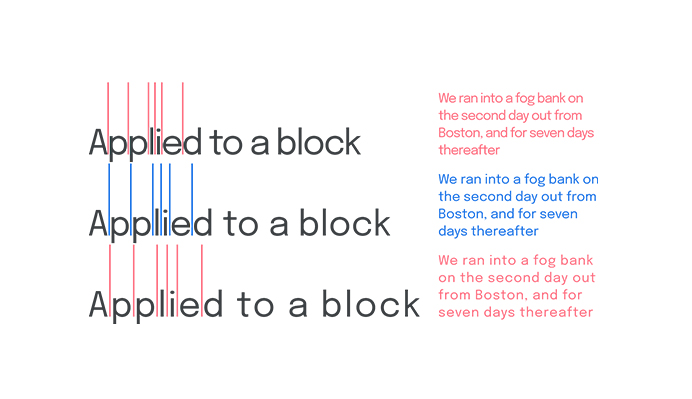
Letter-spacing is a simple but powerful technique that can greatly impact the design and readability of text on the web. Here are 3 examples of effective ways to use letter-spacing in web design:
1. Using letter-spacing to enhance branding
Letter-spacing can be used to enhance branding and create a consistent look and feel across a website.
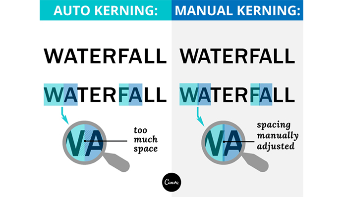
For example, a company’s logo may use a specific letter-spacing or kerning that can be carried throughout the design of the website.
Kerning refers to the space between two characters, including letters, numbers, and punctuation. In contrast, letter-spacing refers to the loosening or tightening of an entire block of text. Kerning involves the adjustment of the space between specific pairs of characters, rather than the entire block of text.
Each letter in a typeface is contained within a box, making it impossible to move the letters closer together while typing. However, adjusting the kerning allows you to manipulate the box and customize the space between individual characters.
Manual kerning, as depicted in the accompanying picture from Webdesignledger, is the preferred method of adjusting kerning.
Kerning and Letter-Spacing – Image Source: Webdesignledger
2. Combining letter-spacing with other design techniques
Letter-spacing can also be combined with other design techniques to create interesting and visually appealing text.
Visually Appealing Text – Image Source: Elementor
For example, using a combination of bold text, different font sizes, and varying letter-spacing can create a dynamic and engaging design.
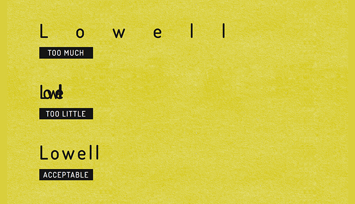
3. Avoiding excessive letter-spacing
Although letter-spacing can be a useful technique, it’s crucial to avoid using it excessively. Too much letter-spacing can make the text difficult to read and can take away from the overall design.
As the image below demonstrates, when symbols are too far apart, words can start to resemble individual letters, which can affect a broad spectrum of your audience, including those with dyslexia, those who are learning the language, and those with limited eyesight.
Letter-Spacing Usage – Image Source: CSS-Tricks
As a general rule, it’s advisable not to use more than 2-3 times the font’s size when adjusting letter-spacing.
Conclusion
Letter-spacing is a vital aspect of web design, as it plays a significant role in the overall appearance and feel of a website. Properly utilizing letter-spacing can make reading a more enjoyable experience for website visitors.
By implementing the tips and best practices outlined in this blog post, you can hone your skills in the art of letter-spacing in web design. This can help you create websites that are visually appealing and easy to read, resulting in a more satisfying experience for your audience.
In addition, a visually appealing and easy-to-read website can improve the credibility and trustworthiness of a brand or business. When visitors see a well-designed website that is easy to navigate and read, they are more likely to view the brand or business in a positive light, which can lead to increased conversions and sales.
With a keen eye for typography and an understanding of letter-spacing, you can elevate your web design to new heights and impress visitors with a polished and professional look. So, take the time to master this important skill and watch as your website stands out from the rest.
Acodez is a leading web design company in India offering all kinds of web design and website redesign at affordable prices. We are also an SEO and digital marketing agencyoffering inbound marketing solutions to take your business to the next level. For further information, please contact us today.
Looking for a good team
for your next project?
Contact us and we'll give you a preliminary free consultation on the web & mobile strategy that'd suit your needs best.
Rithesh Raghavan, Co-Founder, and Director at Acodez IT Solutions, who has a rich experience of 16+ years in IT & Digital Marketing. Between his busy schedule, whenever he finds the time he writes up his thoughts on the latest trends and developments in the world of IT and software development. All thanks to his master brain behind the gleaming success of Acodez.