These days, people are spending a lot of time searching or browsing the internet, specifically using mobile devices. Looking for the reviews of a restaurant before ordering food online from that particular site or checking the Amazon app for reviews on a book to be purchased, mobile search offers a great app experience.
A mobile search that has been well-strategized and clearly done offers a faster and effective user experience, regardless of whether the product’s navigation or user journey would depend on search functions.
Have a look at the evolution of mobile apps.
What do users look for when they download an app?
Of course, they are here for the content. So we have been working to offer them the content that they need. Most of the times, we sit back and relax thinking that we have given them absolutely what they are looking for. But all said and done is not as easy as when the user starts to search for info within an app.
There are times when they are annoyed and then return to Google for the required information. We ourselves have done this before. Let us make sure this doesn’t happen when we design an app next time. To help you with this, we have come up with some of the best practices to help with app search.
A mobile app search that satisfies all the desired parameters is more or less like having a great conversation. App search intends to provide users with access to the content that you have.
But before they can begin to search, it is important that they get a clear understanding of your app and its products. This will provide them with clarity on how to search, what should they be searching for, and how to draft their query to perform the search.
To resolve this knowledge gap, a successful search interaction should be like a good conversation between you and your users that ultimately helps them find what they need.
This search can be thought of as comprising three main components as listed below:
- The query to be searched (which will be entered)
- In case there was no match, show no results
- Even in a case, where one result was found, show results
So what are the above components?
The Query to be Searched
The user cannot see the results unless they type a query into a search bar. Then, the query that the user typed will be matched with the data within your database and then, results will be returned. If your app has a great search engine, the desired results would be returned.
Entering the Query
Before the user can ever see any results, they have to type a query into some sort of search bar. The query then gets matched to the data in your database and the appropriate results returned.
Is Your Search Discoverable?
In case your app relies mostly on the search for driving user engagement, it is important to ensure that the search interaction is easier to discover. This would mean that there should either be a search bar on the upper area of the screen and/or an icon of a magnifying glass need to be placed in the Navigation or Tab bar.
Is Your Placeholder Self-Sufficient?
It is important that your placeholder stand out in the crowd. With something such as “Search” in the search bar, it might not capture the attention. But using something descriptive, providing the user with details on the information that they are looking for. In case there are limitations to your search, it is important that you let your user know about it.
It is always great to offer suggestions.
What happens when the user taps the empty screen below the search bar?
It is a grave mistake. Don’t waste the limited amount of space you get on a mobile screen. Here, you can guide your user through the conversation. You can always offer the user with this space to provide suggestions, such as ‘Favorites’, ‘Closest’, or ‘Popular Searches’, and others.
One of the greatest advantages of such a pattern is that here the user might not need to perform a search, and they have the option to choose from a predefined set of content, which will get back to them with the results that they desire.
What is Auto-Complete?

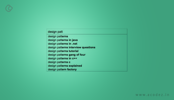
A most popular and preferred design form is auto-complete. It is otherwise referred to as ‘Search within Search’. When the user types, the app will suggest a range of related queries from which the user can make a selection.
It is beneficial to mobile users. The typing time is less. You can, in fact, persuade the users to move in the direction that is best from their perspective.
Search From Within
This kind of search provides the users with an option to search within a category where they have navigated. Users love this, but not many apps or businesses feel the need to own it. This is one of those searches that would help to eliminate errors as you would be leading the user’s way to look for something that would respond.
Saving Search History
Don’t you like it when the app returns with the history of what you had been doing through in a previous browsing session? This kind of section enhances the search flow, thereby building user’s trust in your product and creating curiosity in them to explore further. This can be achieved either by saving the user’s search pattern data automatically as they move through or if the app would make it easier for the user to save the search.
Can You Offer a Search Scope?
Suppose your app comes with content, which can be split into a wide range of categories, then it would be great if you can implement a scoped search approach. This will help your users to understand the space within which they are and this can be changed quite easily.
Forceful Search
Is your app quite clear about the type of content that it offers, then the best way to allow the user to search what they would need is to make them search through a variety of parameters? This will allow the app to have clarity on what it actually needs from the user and the user would be clear on the parameters that are laid by.
Designing New Features for Your App

When you are adding new features to your app, it is important that you help your users to identify, diagnose, and finally recuperate from the errors. You can do this with ease if you think of the worst scenarios initially and move with your design in such a way that it would help the user to easily recover.
Why Do You Need the No-Results Page?
This would be a great opportunity to get you to connect with your users, thereby helping you gain their trust via various techniques.
What next?
How to Communicate the Issue?
It is always good to let the user know if there is an issue along with information on what the issue is.
Is anything misspelled? In such a case, how can that be fixed?
This could be a reason for a no-results screen. It would be great to detect and fix misspellings.
Making Search Less Specific
If the user is overly specific, it will result in a no-results screen. This can be taken care of by removing parts of your search query, in order to create something that will match. In case the user had been searching in a specific category, you can provide them with a view of the whole set or group.
Fallback
When there are no results after implementing everything, curated content or popular searches can be returned as a fallback.
Login Option
An ideal approach is to always provide the login option. In case, they have been searching in a category that might require a login, provide them with the option to log in or signup.
Results Display
When the users find the results they were looking for, they are happy. Always keep in mind that you cannot crowd all the results on the page and wait for the user to find out what they need.
Default Sort
It is important to provide a default logical order, which can be easily found and identified while displaying the search results. You can choose to sort it out either in the alphabetical, date, distance, or order them by price. Ensure that these results are sorted in a way that they would be most relevant to your customer and the product that they are looking for.
Sorting Your Results

When an app needs search, it would mean that the content would fit within a specific category. You can sort this by providing headers to each of your search results.
View Options
You can display your search results in various modes – such as a map, list, a carousel or even in the form of thumbnails. You can display these in a way that suits or fits into your context. In case the results need multiple steps to change views, you need not use multiple ways to get the results displayed.
Infinite Scrolling or Pagination
There are a few apps that follow the pagination approach for results screens. You could simply include a show more button instead of pagination or infinite scrolling.
Show Search Progress
What would you do if the results don’t appear upon entering a search query? You would think something is not right. But if you get a progress bar or HUD, it will be clear that something is happening and it is worth a wait.
Number of Results
When you categorize the search results, it would be ideal to display the products in each category for the user to choose from.
Highlighting Keywords
It might be challenging to glare at the results and find the connection with their related search queries. The user can be helped out by highlighting the search keywords.
Try out some of the examples we listed above and check out how it works with your app.
Acodez IT Solutions is a web design company in India providing web-related services to businesses worldwide. We are also a digital marketing company offering all kinds of services including SEO, SEM, SMO, PPC, inbound marketing solutions, etc to help take businesses to the next level. For further information, contact us today.
Looking for a good team
for your next project?
Contact us and we'll give you a preliminary free consultation
on the web & mobile strategy that'd suit your needs best.


