The visual internet is no longer what it once was as we enter a new era.
What was once an H1, H2, paragraph text format, and one image positioned to illustrate your message is now overused. Now, we want storytelling that is responsive, complete with full-size images, dynamic scrolling, and perhaps a few data-intensive animations to cap it all off.
We prefer tales that are not only convincing in their words but also presented to us in the best engaging manners possible. Publishers and brands are unavoidably experimenting with new formats to engage their viewers.
A long narrative is turned into an engaging platform using Scrollytelling. By conveying ideas that one cannot express in words alone, audio and video material offers a deeper depth of meaning.
With Scrollytelling, you can keep readers interested by gradually revealing a story’s intricacies. It tells gripping stories by utilizing the best aspects of the web.
The idea of visual storytelling is not new. In truth, it has existed since humankind painted stories on cave walls with stone and pigment. But because of technology and visual storytelling tools, scrolling stories, or visual storytelling in its modern form, have unquestionably improved.
This article will discuss scrollytelling and its impact on digital content but first, let us understand what is scrollytelling.
What Is Scrollytelling?
The combination of scrolling and storytelling is known as scrollytelling. It is a technique for dynamically narrating lengthy stories as the user scrolls.
In this framework, user interaction causes all manner of styling techniques and element transitions, including text-to-image switching, image-to-text switching, engaging backgrounds, animated film effects, sizing adjustments, and more.
Each component works in concert with the others to create a seamless, enticing story in motion. These visual effects aim to captivate your audience by providing them with exciting content at their fingertips.
Scrollytelling, sometimes known as “narrative visualization,” uses several visual components in a predetermined order to tell a story to visitors. The most distinctive aspect of this cutting-edge storytelling method is that people add to your narrative through their distinctive movements.
It occurs collectively and individually because each piece can have unique settings, such as timed entrance animations or motion effects.
The word “scrollytelling” was initially used to refer to online long-form stories featuring audio, video, and animation features activated by merely scrolling the page.
The scrollytelling style marked a break from simple stories with hardly any graphics and engaging stories requiring a lot of navigational effort.
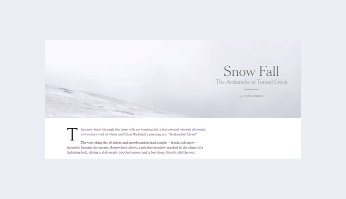
The New York Times’s Snow Fall: The Avalanche at Tunnel Creek was among the first works in the genre to garner widespread attention.
The New York Times’s Snow Fall – Image Credit: Nytimes
A tale with a straightforward chronology is particularly well suited for scrollytelling. One can use the style to animate the who and what as events take place.
You might think of scrollytelling as visual storytelling that elevates a tale and draws the viewer’s attention. The contents dance and entice you to scroll farther after each landing page and layout.
Scrollytelling’s Impact on Digital Content
What does the rapid evolution of an idea like Scrollytelling mean for digital creative teams?
Scrollytelling focuses more on the actual text displayed on the screen and can be used to explain concepts, highlight important details, include an interactive aspect, etc.
Provided the content is captivating enough, successful scrollytelling will be able to hold the audience’s attention regardless of the subject.
Let’s go over some of Scrollytelling’s impact on digital content since its range might be pretty broad and why it is a good idea to implement it.
1. Education
Digital storytelling may be highly beneficial to teachers and students of all grade levels in terms of exposing concepts and learning. It helps educational material stay in memory longer and makes it engaging in a variety of ways.
There are additional options, but using it with teacher-generated content is the most obvious. Educators can produce an exciting piece of knowledge when they use scrollytelling to generate their content.
This practice can stand alone and be developed further in class or using other media. In that instance, it acts as a springboard to engage pupils and pique their interest in subsequent material.
Scrollytelling might also be included in a series in which the instructor explores a more extensive subject.
It enables the learners to work on their team-building skills when group tasks are required. Scrollytelling can be a fantastic teaching tool primarily utilized for marketing goals.
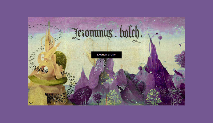
Scrollytelling About Life And Work – Image Credit: Museo del Prado
Several governments and public organizations, such as Madrid’s Museo del Prado and its “Bosch. A story in pictures,” scrollytelling is put in use. Using some of Bosch’s paintings as a backdrop, this resource takes the user on a tour of his life and creative output.
The user will automatically encounter the primary explanations for the paintings while wandering, but further details are available if they wish to learn more. A clean, uncomplicated layout is the outcome of that amount of customization.
Adults and children who want to learn more about Bosch will find it the perfect resource because of the fluid transitions and informational tidbits.
2. Publishers
Some initial users of scrollytelling were magazines, publishers, and newspapers. They used it for sponsored content and feature stories to display statistics, define concepts, and engage online audiences in a multimedia experience.
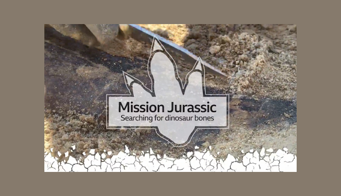
Take, for instance In, the article Mission Jurassic: Searching for Dinosaur Bones. BBC News delves into the realm of fossil-hunting paleontologists using a wide range of media, including text, images, video, infographics, and illustrations.
Scrollytelling in Mission Jurassic Article- Image Credit: BBC
The narrative provides an engaging, informative experience. A scientist describes the equipment she uses to detect bones in a video. A brachiosaurus that is computer-animated waves hello.
A Boeing 737 and dinosaur sizes are in contrast in this infographic. In a stunning passage, the user scrolls past a picture of a fossil and sees the overview of a stegosaurus’ bones. The bones are then given names and are made understandable to laypeople.
Using scrollytelling for their branded content has been successful for several publishers. Readers get a more engaging and unique brand experience because of the visual changes in the story.
3. Brands
Brand journalism has advanced beyond the straightforward dissemination of company or product attributes and announcements, driven by the need to foster more meaningful interaction with customers and the community.
Businesses all over the world are recognizing the importance of brand narrative and having an editorial voice. Many people have devised original ways to include multimedia content in their PR, owned media, and marketing communications strategies.
If you didn’t know it, web designers love scrollytelling. They have decided to employ scrollytelling on their own.
Some people use it as posts highlighting some of their most noteworthy successes as web-building pioneers and exciting facts about their team.
Simple statistics and phrases are spiced up by web designers using some of their favorite widgets, highlighting the joyful nature of their accomplishments. Some elements change position as you scroll down, while others stay still fixed in place.
One can create a vivid, unconventional post structure with the help of a few Lottie animations, spinning icons, entry animations, and of course, lazy loading.
4. Non-profits and Charity
Scrollytelling appeals to non-profits and organizations to establish strong bonds with their audiences, raise money, and ignite a positive impact on the world.
NGOs, art foundations, and government agencies use Srollytelling for interactive journalism.
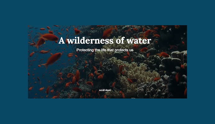
A good illustration is A Wilderness of Water, a poignant narrative by the United Nations Development Programme (UNDP) about the challenges to the world’s oceans. The UNDP combines spectacular photography, art, and film to convey its message effectively.
As the reader scrolls, sea monsters display on the screen, but it quickly becomes clear that the real ocean monsters are pollutants, plastic, and human exploitation, which is frightening.
A Wilderness of Water Scrollytelling Page – Image Credit: UNDP
5. Creating Portfolios
The plot may potentially get more complex as you scroll down the page if you were to describe your professional development and the projects you’ve done.
The project thumbnails can be improved with various graphic effects and animations, presenting your collection of unique works as a coherent whole.
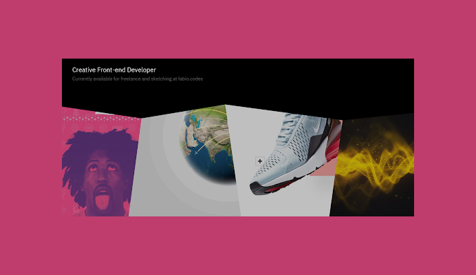
Fábio Azevedo, a front-end developer from Portugal, exhibits his inventive process in an exceptional slider gallery.
Scrollytelling in Fábio’s Portfolio – Image Credit: icantcontrolmyego
Fábio presents numerous diverse picture styles in succession without borders that don’t look too chaotic or confusing to the viewer by using straightforward out-of-the-box image shapes.
As we can see, he continually applies his talent to each endeavor, but each one demonstrates concerted individualism.
The hover features that Fábio uses, in which the image overlay vanishes on hover and reveals the program’s name, client’s name, and coding languages, further contribute to the gallery’s coherence.
Scrollytelling is a fantastic way to promote both new and existing products. Big-name companies frequently prefer creating more creative campaigns than straightforward advertisements to market their products.
6. Marketing Products
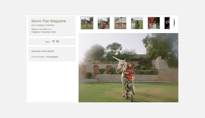
Let’s look at the collaboration between Gucci and Savoir Flair in 2020, the “Gucci Epilogue Collection.” This commercial shows incredibly creative still images and video clips of Lulu and Wathek going about their somewhat fanciful day.
Gucci Epilogue Collection – Image Credit: Savoir Flair
However, the collection’s guiding principle is “What you see is not what you get” therefore, a twist will appear as the user scrolls down to expose amusing or provocative circumstances for the two characters.
The user feels like a part of the organization while using this type of customer/brand interaction since they scroll down to see what comes next, highlighting the company’s look and products.
Gucci chose to focus on fantastic photography rather than just selling their items since they were aware of their customer base and wanted to take an aesthetic approach.
By scrolling down, the user can learn more about the business and its product without reading much.
7. Telling Stories
The ideal format for narrating stories with a timeline of events is scrollytelling.
It turns out that Scrollytelling is a fantastic approach to showing chronological sequences, and Historiography amply demonstrates this.
A Scrollytelling Site on Historical Events – Image Credit: Histography
A timeline with several dots representing historical events is displayed on this page. Each one’s details are taken from Wikipedia pages that one can access from the timeline. The ideal format for narrating stories with a timeline of events is scrollytelling.
The Salvation Army in Norway helped Julie out after hearing about her struggle with poverty on this scrollytelling website. This narrative has the feel of a full-length animated film.
Through beautiful graphic illustrations that feature many personalities emerging in the same backdrop scene on the scroll, Julie’s life is brought to life for us. It makes someone suffering more relatable and enables one to empathize with what they’re going through.
8. Health Promotions
The public’s disinterest is a significant challenge for those who communicate science and health issues. This issue opens up enormous possibilities for using scrollytelling to increase public awareness of all things health-related.
The public they are intended for ignores many public service announcements that offer recommendations. Scrollytelling can be applied in cases like that to focus these efforts more effectively.
For instance, spreading knowledge about illnesses such as diabetes or cancer could save lives. Experts may communicate with their audiences more effectively by understanding how their messages are conveyed.
Occasionally, medical gadgets and therapies require non-medical scientists to perform particular tasks. Scrollytelling allows medical professionals and other experts more control over the message that patients hear.
Medical businesses can use this resource to enhance their interactions with patients and doctors. It includes details on procedures that aren’t explicitly connected to health, like payments, policies, and resources.
9. Describe Current Events
Websites dedicated to raising awareness of a cause or event must make their narrative as compelling as possible.
A website like “Every Last Drop” has as its primary objective spreading awareness of its campaign for water conservation. What better way to convey this than through the daily preparations of a red-headed astronaut in an anime tale?
A Scrollytelling About Saving Water – Image Credit: Everylastdrop
In actuality, a lot of water is wasted in the modern world. A five-minute shower uses 40 liters of water, a typical bath needs 80 liters, and the UK wastes 150 liters daily.
We may have anticipated that several paragraphs of text would clarify how these statistics are possible after the visuals.
Scrollytelling comes to the aid. An animated story of a normal joe on his way to work teaches us everything we have to know, as opposed to extensive explanations of study results and scientific principles.
Tracking the astronaut’s everyday routine reveals how fast the average person uses water without knowing it. The astronaut represents a significant portion of the world’s population.
There is no need for data visualization, graphs, dashboards, or, most importantly, lengthy explanations because the evidence is already there.
10. Product Pages
In regards to what they can do with its scrollytelling, the Apple dynasty has the advantage because they can put a lot of emphasis on graphics and don’t need to describe their products or give context for their added value.
One reason is that Apple products are so well-known that anyone familiar with the mobile device market can immediately detect the item’s added value and distinctiveness while using a new Apple gadget.
Apple thus has the luxury of stressing the intricate aspects of their products through scrollytelling as opposed to balancing images and textual.
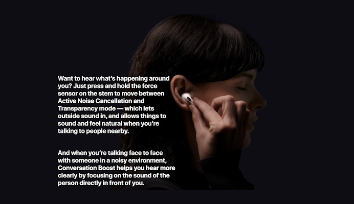
Precisely this is displayed on the product page for the AirPods Pro, which has the freedom to display the various color options for their earphones and interactively.
The AirPods Pro product page, which has the freedom to interactively display the various color possibilities of their headphones and present a use-case of a satisfied client using them, demonstrates this precisely.
The AirPods Pro Product Page – Image Credit: Apple
They can use very few words and get directly to the point about what makes the earphones unique and how they improve the user experience without going into great detail about the product itself.
Conclusion
If done correctly, scrollytelling can be a powerful visual storytelling tool. Teams working on technology and digital material must adjust as this format becomes more prevalent.
The most effective scrolling tales result from the teamwork of content producers, designers, and developers. The intersection of design and development is the ideal situation.
Design and development should work together from the beginning of the brainstorming phase, according to Nelly Gocheva. The appropriate team, funding, and technology could make Scrollytelling an exciting, scalable endeavor.
There is no denying that the Scrollytelling format can provide its various stakeholders with sound, value, and aesthetic appeal thanks to its limitless effects and creative outlet.
To keep the audience engaged, you must divide your text into manageable, snackable chunks, whether you’re creating traditional or interactive content.
Even if scrollytelling can be more challenging to make, it’s so memorable and effective at drawing an audience in that it’s worth taking into account.
Believe us. Put your name in the hat now since this is one of those dynamic content trends you can count on to become more successful.
Acodez is a leading web design company in India. Over the span of 6 years, it has successfully completed over 600 projects and helped the users achieve the dreams. The emphasis on the quality and customer satisfaction has helped us win numerous prestigious web design awards and being featured on various high ranking websites over the due course of time. Contact us today!
Looking for a good team
for your next project?
Contact us and we'll give you a preliminary free consultation
on the web & mobile strategy that'd suit your needs best.


