This era of the web has been decisive while considering the turnaround in the field of web design. With the emergence of mobile and smart devices taking over, everything is evolving at an unbelievable pace. Typography is one among those sections of the web that has always been open to change and always offering something new to keep the people engaged.
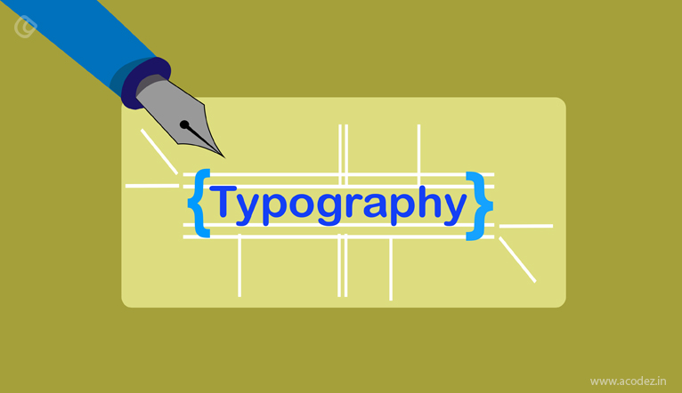
Typography is the vital ingredient in web design. It functions almost similar to the images and photographs that help generate the user interest, through the textual styles. One wrong textual style can make your design flop and can be the reason for your user’s loss of interest.
Just imagine you are on a website where the content comprises of very small-sized text, congested words, and lines, cramped without enough space, and how would you feel. Even people with normal eyesight will find it annoying and stressful. This could cause people to leave the page. If people start leaving, then how will your website accomplish the business goals? How will the conversions take place and the expected audience turnover into your sales funnel? This is where typography of the website comes in. It is the duty of the web designer to put maximum effort to satisfy the typographical points on the website he designs.
Reasons for the importance of good Typography
Effortless Understanding:
Typography must help readers with effortless understanding. Reading until the end must be easy and effortless so that visitors can concentrate on the content without distraction and easily grasp the message.
Increase in Redundancy:
After completing the reading, visitors should be able to remember the message for a long term, which will happen only if the typography is good. Otherwise, they will remember only their effort or difficulty experienced while going through the content.
Affects the mood and sets the emotion:
Because typography influences the emotions and mood of the audience, it can be utilized toward reaping maximum benefits to website owners. At least, web designer must take steps to prevent damages caused by bad typography.
Increased Conversions:
Everything put together leads to better conversions, which is desired by all.
Tips to select the right font face
Usefulness:
While selecting fonts give weightage for the usefulness of the font rather than their appearance. Designers are tempted to use pretty fonts, but must restrict their preferences and select only the fonts, which help to increase the readability.
Complement:
Font faces that complement the message will make the visitor to remember the content and not the beauty of the passage.
Good pairing:
Corresponding and contrasting typefaces, after thoughtful experiments, increase the readability and the overall appearance of the page.
Simplicity:
Don’t complicate or over exaggerate things; keep your font simple and clean, people will love it. Variety of fonts can be implemented only when the web designer is experienced and sure of his choices.
Consider the niche:
Selection of typefaces must be done according to the niche. Whether the appearance needs to be formal and friendlier or authoritative and informal, it should be decoded based on the demography of your audience and your industry.
Clear and beautiful:
Select a typeface with large counters to ensure legibility and readability.
Consider Capitalization:
People like to read in small letters especially online. Hence, avoid capitalizing all letters in a sentence, even if it is a title. In addition, capitalizing the first letters in titles must also be avoided.
Maintain Right Length:
It has been found that very short lines and very long lines fail miserably in reaching out to the audience. Constant eye shifting of lines to grasp the meaning irritates the readers consciously or unconsciously. Hence, maintain right line length.
Use Optimized Spacing:
Spacing between letters, words and lines is also important to save readers from frustration.
Thus, good practices in typography are a must for better conversions. To find out the result and the effectiveness of the typography, doing A/B testing is the right way.
Typography: described as an art
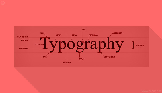
Typography is the art of arranging type to make the writing language more appealing to the readers helping them with effective learning and recognition. This involves different techniques like selecting typefaces, point size, line length, line spacing, kerning, etc. Typography requires the combined effort of typesetters, compositors, typographers, ux designers, art directors, graffiti artists, clerical workers and comic book artists. Some of the typographers are confused by the terms used in typography. So, here we present some basic terms that every typographer need to know.
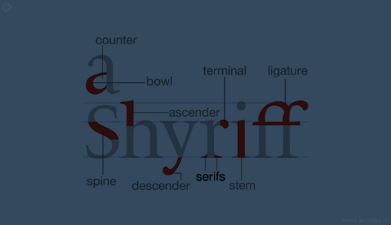
Ascent:
Ascent is the line that the upstroke of lowercase letters should reach. This is not the same as the cap height, which is at the apex of capital letters. To be more concise, this is the line, which the upstroke of the letters, such as b, f, and l touches. By now, you might have got the difference between cap height and ascent. In some fonts, the ascent is taller than the cap height. In fonts like Blake, the cap height is taller than the ascent. Both can be same in some cases.
Median:
Median is the same as x-height. This is the line, which the lower case letters without ascendants should reach. It is the height of x in your font. Fonts like Cabrito Sans keeps strict median. This gives a very calm and controlled feel.
Base Line:
Base line is the lowest point of all capital letters and the lower case letters without descendants. Whatever the font is, all the capital letters just sit on the base line.
Descent:
Descent is the line, which the lower case letters with descendants (strokes that go below the base line) touch. The letters like p, y and j touch the descent.
Ascender and Descender:
Ascender and descender are the upward and downward strokes that touch the ascent and descent, respectively. Ascender is the upward stroke of the lowercase letters like d, b, and f. Descender is the downward stroke of the letters like q, p and j. Ascender and descender are only for lower case letters.
Serifs:
These are the finishing strokes at the end of characters. Serifs are the semi-structural details on the ends of some strokes of letters and symbols. Fonts that lack serifs are sans serif or simply sans.
Counter:
This is used to describe the space inside the letters like O, A, S and H. The presences of these types of letters cause the fonts to look taller than they really are. So font styles deal well with these types.
Bezier Curves:
These mathematical curves are scaled to any size. They play an important role in making fancy serifs and tails on characters. Computer typography needs them a lot.
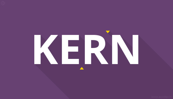
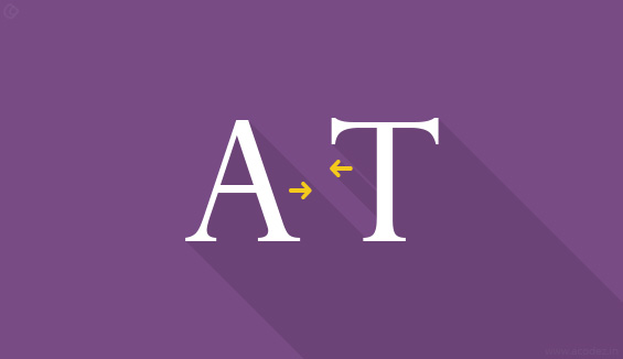
Kerning:
Kerning is about controlling the spaces between letters – that includes those between words. It describes the act of adjusting the space between characters to create a harmonious pairing. For example, where an uppercase ‘A’ meets an uppercase ‘V’, their diagonal strokes are usually kerned so that the top left of the ‘V’ sits above the bottom right of the ‘A’. People who don’t really understand typography sometimes use kerning and tracking interchangeably. Tracking is different as it relates to the spacing of all characters and is applied evenly.
Bold:
Bold is one of the most important style attribute. It basically attracts attention to all major important and significant parts of a webpage. Apart from this, it is used to scan the page quickly to get a list of the material in the hands. The use of bold style makes it easy to access the information.
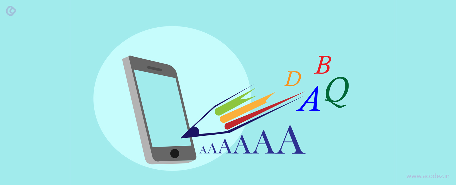
Typography has seen enormous changes, because of cell phones. Apple, Google, Amazon has presented their own typefaces trying to adapt up to the move. Amazon particularly designed a typeface for their Kindle gadgets, called Bookerly.
Kindle e-readers faced a lot of challenge due to the typeface that wouldn’t sink into their device. But, with Amazon’s Bookerly, here is a permanent solution to Kindle typeface-related concerns.
This font that has been designed from the scratch is comprised of a fresh layout engine that provides text justification, drop caps, image positioning, kerning and more.
Google launched the typeface Product Sans to react to the changing needs of web and likewise Apple’s custom typeface San Francisco was presented with Apple Watch.
Let’s look at the best typography trends in 2017 that helps your business to expand your organization’s web authority.
Typography trends in 2017
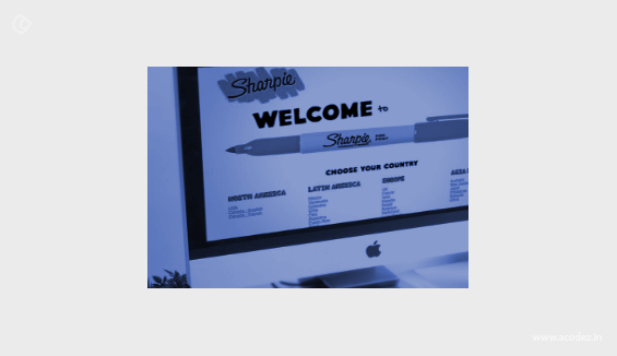
1) Custom Typefaces
Thinking back to when Apple launched their sans-serif typeface “San Francisco” in mid-2014 first utilized as a part of their presentation of the Apple Watch, techies have gradually started to see this heading towards mark particular typefaces being sought after by other industry perceived huge organizations. Google recently built up another multi-script typeface previous year, with its motivation being done from worldwide type designers to support Unicode web publishing in the South Asia, Middle East and South East Asia.
It can be favorable for your business to consider following improvement of its own typeface. While it requires investment and interest at the starting, individuals appreciate differing qualities and what better of an approach to demonstrate it at that point having a customized textual style. One that is sufficiently agreeable for the client to look at for broadened time can go far in building organization reputation and brand amiability with purchasers.
2) Variable Typefaces
The Open Type Variable Font was introduced in mid September 2016 as a joint development project by Google, Microsoft, Apple and Adobe to change the manner which we understand responsive web design. It is described in a best way by Adobe Typekit Blog, As a natural part of responsive web design, imagine sharpening and rounding brand typefaces as a choice by designer, imagine raising fonts to favorite height just a touch at small sizes, imagine reducing descenders clearly so that headings will not be crashed into one another.
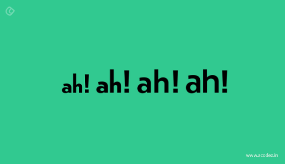
3) Extreme Size Typefaces (tiny and large)
Extreme size typefaces have been the trend for some years. Fundamentally, this pattern is to utilize extraordinary sizes to pass on the message. Extensive text dimension is utilized to feature and make an effect and small textual styles are utilized to additionally clarify the message.
A few people may fear implementing this pattern, yet it can be tried, as it is still one of the ongoing trends in 2017.
Likewise you can go with small text styles, yet they must be joined with large or hero images.
4) Handwriting Pattern
Manually written typefaces are becoming a trend than ever. We’re starting to see that a bigger number of brands are utilizing a written-by-hand text style for their website pages, visual logos, and social portrayals. This is of simple reason. It makes a friendly and inviting feel for clients who are diving into a business’s website page. The uniqueness of a text style can go far in managing a buyer through a focused on client travel in which an organization needs to fabricate a story. This can be any place from introducing a product or explaining the behind insights with respect to developmental ventures.
5) Mixed Typefaces
An incredible and interesting trend we have seen in 2017 is this thought behind utilizing diverse typefaces together to make a bigger theme. Mix and match typefaces doesn’t simply mean a minor variation from a single text style, however a keen coordination of altogether different textual styles that play on each other’s characteristics to make a general visual impact. Effectively uniting diverse styles in topography can prompt a superior visual portrayal of your image therefore making customers more anxious to collaborate with what items/benefits your business brings to the table.
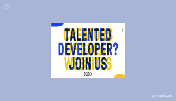
6) Using different Fonts in one Image
As indicated by Wichita State University, textual styles like Arial, Times New Roman, and Cambria can be understood by all sable individuals while textual styles, for example, Kristen, Gigi, and Rage Italic have a tendency to please individuals who are more inventive. Organizations are beginning to perceive that diverse text styles to attract more traffic and in the present digital world this can represent the best trend to drive more client leads. Try various textual styles and see which ones can be connected with others too.
7) Superimposed Typefaces on Images
Social media has brought this trend. The vast majority of the images and quotes are designed with superimposed typefaces on images. They are so fascinating. This pattern rapidly got into limelight in typography. While using this kind of typography, you have to consider a couple of focuses. Check out the contrasting colors and roles. You have to make your content emerge of the picture yet unobtrusively coordinate into it. You have to likewise check the position of the content as it ought not to be an obstacle to anything on the picture. Also break points for various device resolutions must also be noted as well.
8) Mobile Website Fonts
The significance of having a text style that is obviously noticeable on all different cell phone screen resolutions is important for your business. The adults using Smartphones in the US, has crossed 72% in last year, the significance behind giving responsiveness to your business’ typefaces and mobile user experience design is enormous. In any case, what is the best text style? Many sources will reveal to you that “Serif Fonts” are your most logical option while showing content on cell phones. Their adaptability for various platforms and simple to peruse structure makes their textual styles the best for mobile phones and tablets alike.
9) Artistic Fonts
In some cases, we never go for normal ones. Isn’t it? Thus, we go for artistic fonts to attract the visitors to our web page. Content written in such text styles will be a visual treat while it would be more of a web element than a typeface.
This technique has been there for a long time and is exceptionally good in advertising posters. This procedure prompts intelligibility and de-emphasis of the message. This means if utilized appropriately it could create magical wonders. It should be utilized carefully as they are not for everybody and have certain disadvantages.
10) Geometric
A best way to deal with displaying words, the sharpness and characterized feel that geometric letters have on a website page are amazing. An important factor of typography that we are certain to see in 2017 is this style of nearly cube-shaped like letter composing.
Deciding the right font face among the plethora of choices is a bit difficult for designers when they decide not to use standard or the most common font faces. However, web designers must avoid certain wrong practices while implementing whatever font face they choose.
Top Mistakes to be avoided in Typography
-
The right line length:
Easy reading depends on the line lengths too. Though, right line length has been long before found out, it is ridiculous and cannot be followed in the recent responsive world. However, to be on the safe side, keep the line length within 45 characters minimum and 80 characters maximum. Very short line, very long lines and lines starting with the next line at the end pose difficulty to the readers.
-
Tracking Space:
Tracking is the space in between the letters. The reading fluency gets affected when tracking is not good. This varies with font types and hence, careful consideration must be given to ensure good tracking. Of course, Logos and Titles can be fancy, but not the body text. A simple test to fix the tracking is to check the easy identification of letters ‘V’ and ‘W’ when written consequently.
-
Mismatching among fonts:
Some time ago, the choices of font types is very limited. Now, with the inclusion of web fonts it is very difficult to select the right one. Of course, the choices of looking good as well bad have increased tremendously. Experimenting is the only way to set up good font combinations. The main goal is to achieve harmony.
-
Wrong Font Choices:
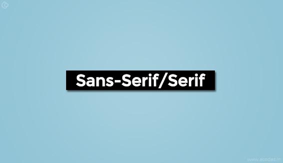
Many good fonts go wrong when used in the body text. Decorative fonts that look very attractive need not suit the body text. Designers must not allow themselves to get carried away. The main rule is to select one that is easily readable, linear and classic. One more point to remember is to go with the situation. Thick, rounded fonts like ‘Sans Serif’ are suitable to deliver friendly messages, whereas ‘Serif’ types are for authoritative content like legal documents.
-
Wrong Color Choices:
Neither very strong nor very weak contrasting colors are ineffective.
-
Leading:
Sufficient space between lines is very important. In general, 140% of font size is ideal.
Here are some ideas to help you strategize a great typography design:
Let’s start with the basics.
This should be your first & most important step towards learning typography. Learn basics of art for a better understanding of ideas. If you are unfamiliar with the concepts, you may mistakenly think typography is fairly a simple battle to win.
So, if you are good in usage of alphabets, you are eligible to win half of the battle it seems, right? In reality, typography is not as easy as it seems to be; it is quite complicated and is a scientific art, which more often is critical to the performance of a website.
Specific jargons in the anatomy of a typeface, precise measurements and general standards must to be known and respected. With several forms of design, you can only go breaking the rules to prove a point, only if you really know what you are doing.
“I love Typography” is one of the best places available online to learn about typography. This is a blog completely dedicated to beautiful type settings. Spend some time there to get a grip on basics. You can also check out this blog on Canva.
Analyze your Kerning
What exactly is kerning?
Kerning is a method of adjusting the space between two letters in a given font. However, this should be considered as a separate issue in comparison with tracking, which is used to make space adjustments between all the letters simultaneously. You may think that expensive software like Adobe Illustrator would automatically solve all the kerning chaos for you. But this is not true & you have to make sure kerning is provided the due attention it deserves.
Font Communication
Your font selections should never be an arbitrary process. Simply scrolling through your entire collection to find a good font that you would like will rarely produce that required effective result. The reason is that there is an essential psychological association with certain types of fonts, which you should watch for.
Alignment
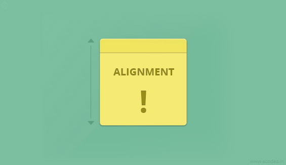
Alignment is one of the most important concepts in typography that needs to be worked upon. For some reasons, non-designers tend to instinctively center align everything. In reality, center alignment is the weakest and toughest to read and should be used in selective and important designs only.
Choosing a good secondary font
Just after choosing a primary typeface, the next important step is to choose another font which will complement it. The supporting font should not be more ornate and harder to read than the primary font, as this will detract from the primary font, which should be avoided. Both the fonts should not be similar in thickness to be used together. Be sure that both the fonts should be different enough to prevent visual confusion and hold more emphasis on the primary font.
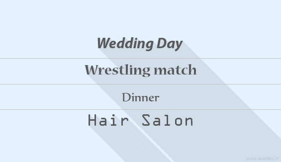
Size Does Matter
If you have created tons of designs over the years, one of the most important thing you would have learnt is that headings are very important. At most, you will have maximum a second or two to give your best to get someone’s attention. If you miss that opportunity, you lose your potential consumers. The heading requires to be read word by word clearly, so that the reader gets a sense of what the message is all about.
As known, every browser has its own story to recite that makes managing typographic aspects eccentric. This all mesh can lead to certain discrepancies because of the difference in fonts. With specified fonts based on CSS properties, complete control can be accessed leading to kerning, creating drop caps and even smoothing of fonts. Besides this, a lot of problems related to layout come to the forefront and has to be dealt efficiently. The problem with the managing typographic tools is that a level of clarity has to be maintained. Indeed, with the prevalent changes, certain web tools in companion to libraries and frameworks happen to become a life saver. Let’s check out them:
Typographic tools that works well
Type Rendering:
The core functionality of type rendering is to identify the browser engine and augments the chances of adding customized classes based on the findings are utilized for applying the specified stylizing rules for type rendering process.
Kerning Js:
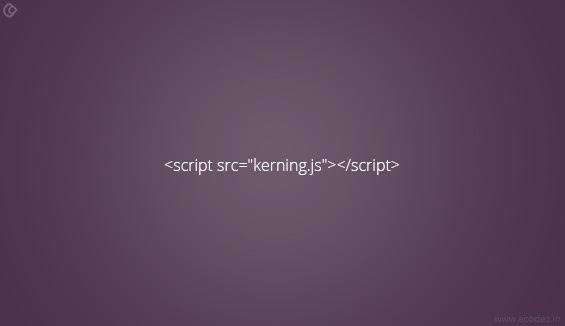
Being not able to get accustomed for the usage in web world; but, this framework are improvising with new properties and functionalities for a enabling a better performance. It is a javascript based library that augments better control over kerning and fonts.
Dropcap Js:
Though developing a Dropcap is feasible with existing CSS standards, the upshot is not ideal. Still, at times, it is blatantly detrimental. Conceptualized by Adobe Web Platform, Dropcap Js is delegated with the duty to permit web designer for the application of suitable Dropcap Js ideations.
Lining Js:
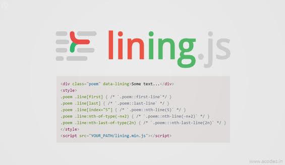
As a highly integrated javascript based library, it is progressing towards adding a specialized class in every mentioned paragraph of the content. The ideal task is to agree to stylize the line in a separate manner. It imitates the design of apparent classes that have not formed a part of CSS at present also. Designing is essential and it gives a special meaning to the design and helps the people in identifying best looking website on a web platform.
Underline Js:
Underlining the text and making it highlighted can be a hard nut to crack; but, with the integrated assistance of Underline Js, the things are becoming easier to perform. Being a framework based on Javascript, it has accentuated the need to make the text identifiable. The importance of highlighted text lies in its underlining that exhibits the emphasis on what has been stated.
Flow Type:
Positioned to adjust the font size in a website, flow type is a plugin that acts dynamically to beautify the font on specified wrapper width. It empowers the developers to pertain an ultimate number of characters within one line at any screen width. The spacing between the font and their flow in a given context is essential to enhance the overall appeal of the website and make it look appealing.
Hatch Show:
It increases the size of a font, so that it can fill the whole width of its container. The plugin performs effectively from of the box with the assistance of the algorithm. Explaining completely, it identifies the container width with that of the length of the font character and affix the appropriate size of the font. As the font is clearer, the message will be clear to the users and enable them to relate to the information offered on the website.
Grid Lover:
Considered as an excellent tool in the framework, it is perfect for developing basic styles for the typographic arrangement having simplified easy slide of user interface. This exclusive framework is expert in developing style sheets in SCSS, LESS and Stylus for inclusion in the project and developing technically advanced platform. Every part of the content is ought to have specialized style to let them have a unique touch.
Type Scale:
Type Scale is a web-based tool framework for empowering a user to help in easily verifying the appropriate font size for the website. The tool offers an easy perceptive GUI to interleave base scale, font size, and font family that was always needed. The outcomes will be identified for allowing the users in playing around with the scale, to have simply the suitable value. As all know that font plays an imperative part in making the message or content appear on the website as effective. This calls for the use of Type Scale.
Modular Scale:
It is a specialzied tool utilized to ideate font scaling along with the body and the heading text. Generally, the output is in Sass that should be in liaison with the similar library. Besides this, some can take help from Javascript also.
FFF Fallback:
It is a practical tool that enables you to find the finest font stack that will mortify benevolently. The tool is available in the form of a book marklet, which will scrutinize the font relations on the website’s page and propose a combination of fonts to use as fallback. This is an ideal framework tool helpful in articulating font for easy content management.
Font Pair:
Google Font is an essentially famous web font library that is being used by hundreds of people, and host over 500 font families. Font Pair is an anthology of matching Google Fonts, where one can locate a variety of combination amongst font families and typefaces without difficulty. Font Pair makes selecting a font join hands with a little less awe-inspiring.
Typography and frameworks are essential factors that determine the entire stylizing factor in the website. They are meant to lend a style class, decide over their position and enable them to shine effectively on the website for dispersing clear message. This is the reason that technology is gaining pace in terms of web development and allowing for a better looking website.
Acodez is a web design and web development company in India offering all kinds of web design, UX design, UI design solutions and development services ranging from carousel sites to complex data driven web & mobile applications. We are also a full service Digital Marketing agency based in India offering all kinds of digital ads and inbound marketing solutions to our clients.
For more details, please visit our website or contact us today!.
Looking for a good team
for your next project?
Contact us and we'll give you a preliminary free consultation
on the web & mobile strategy that'd suit your needs best.


Thanks for sharing imagining rules and guidelines. I want those to be implemented on my blog.