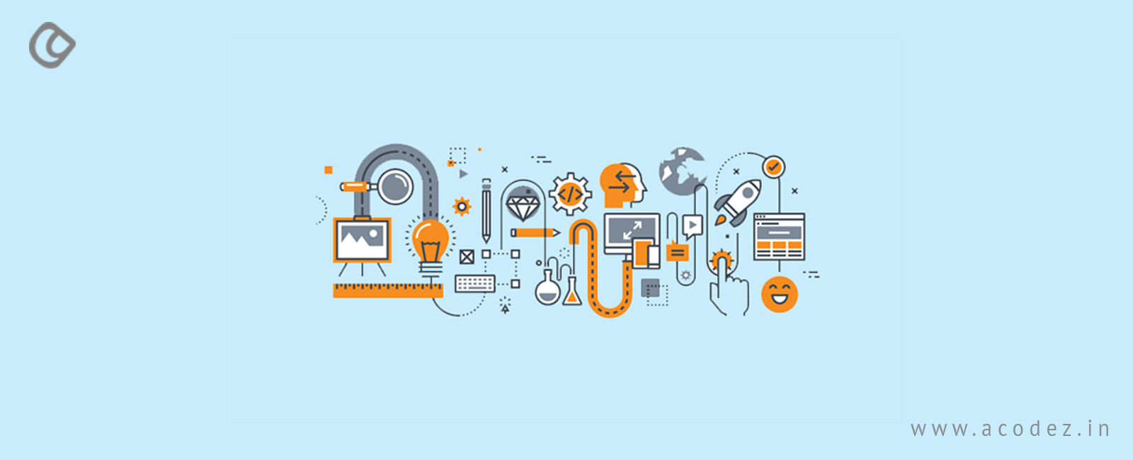
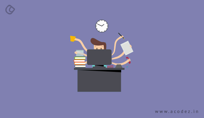
Essential UX Design Tips to Follow
As a UX designer, you may have worked on numerous designs. However, you still feel that there is something more for you to contribute. So let us get down to the basics and start to see what you may have missed. Take a look at some of the attributes that should be part of the skill portfolio of every UX Designer.
1. Be the User
As a UX designer, you have to deal with the user perspectives. It is these, which need to be built into your designs in order to make yourself useful as well as usable. Therefore, it is crucial that you understand your users and are able to read their mind. Researching about the prospective user base and creating a user persona based on that research always helps to be prepared to read their minds and listen to their needs. Also empathizing with your users helps you to step into their shoes and study the situation from their perspective.
It is also a common mistake to confuse the business stakeholders with the users. Learn to differentiate between the two in order to avoid misrepresentation of ideas and end up serving users with a botched up user experience.
2. Identify the Problem, NOT the Method
As you interact with users, try and identify the real problem from a user’s perspective and not from that of a designer. In other words, do not focus on how an element needs to be designed rather to try to comprehend the reason why that element is required in the first place. For example, if there is a requirement for a menu, evaluate the reasons for the user requiring that menu rather than how that menu needs to be designed. The reason once analyzed will help you to identify the ideal way to design it. This will ensure users with a better experience rather than what would have been gained by the use of a specific color for the menu.
3. Sketch Your Thoughts
At each of your project meetings, think visually. Sketch your ideas and communicate to express your thoughts better. Moreover, research has revealed that sketching while talking helps to activate the brain cells better. It helps to release the creative juices more freely and lets you become more innovative.
Another very helpful utility of sketches is the emotional aspect. Images have always been associated with something we hold close to our hearts. It helps to trigger the emotional factor and helps you to retain the concepts far longer than verbal conversation would have been able to.
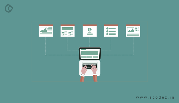
4. Organize Content for Higher Accessibility
Content is important but should not be made static. Make sure that your users are able to navigate around it if required. There are other contents, which may be more important, and if the user is unable to get past one block of content to reach the other then it results in poor user experience. Your job is to abet and not impede their experience so make sure you organize your content effectively in order to bring in the best results.
UX Designer Tips For Landing Pages
Gone are the days of static websites and even the rest like the carousels, and the ones with hamburger menus. Though, all these seemed to impress and weave magic in the minds of people in the early days of the web or maybe until a decade or so back, it was not until recently that people actually started realizing and differentiating between things that they need and need not.
Landing pages are the soul of any website design. Poorly designed landing pages are equal to grossing zero business. So, when you land up yourself on a landing page through an impressive ad, just to find yourself in an annoying place, how would you react? To be honest, you would never return. You would leave the page as soon as you can and then, find business elsewhere.
1. Aligning Landing Pages
Are there any parameters on which you can align your landing page?
Of course, there are:
- It should be in synch with the ad that directs to the landing page.
- Provide the promises you made. (Since, this is the reason why they are here. Why annoy them?)
- Let it be impressive.
2. Give the Users What You Promised
What happens when you don’t provide what you promised?
- People lose interest in you. They vow to never return.
- Increased bounce rates, which will spoil your reputation in Google’s eyes.
- Reduced sales, which will lead to a loss in sales.
- Negative opinions start spreading like wildfire ruining your reputation amongst all the audience.
How could you solve this? Remember, when Math taught us all problems come with a solution, so does your landing page.
An appealing user experience with an excellent platform to directing your users to fulfill their user goals is the door to conversion that starts at your landing page.
3. Importance of User Experience
Why should you care about the user experience?
Weird question! You are doing business for your people, so if you do not provide them with a great user experience, how do you expect them to convert them into sales.
Designing must be always intended and aimed at your people.
It’s in your hands to take your people to the product. And, the experience that you provide them with while on their journey is something that matters. Their level of comfort, the interaction level, the ease of communication, problem-solving efficiency and above all whether the product satisfies their needs, marks your success.
And, the exciting part is that all this has happened within a short span of time of just 50 milliseconds that you have. This is where you can utilize your skills and talent and design a great landing page that people can relate to.
4. Landing Page Expectation of Users
What kind of a landing page are your people expecting?
No one knows exactly, but in a generic sense, you could incorporate some of the above-listed items to design an interesting landing page:
- Leads capture form that is clean, clear, and precise, and above all is secure.
- Eliminate distraction (e.g., navigation elements, etc.)
- Include enticing offers and compelling promises that actually are true. (A CTA that would not fail their hopes.)
- Finally, timely response and completion of tasks without no time or effort wasted on waiting.
This is just an excerpt.
Here, we will examine all the UX factors that you need to be focusing upon to experience an increased conversion rate:
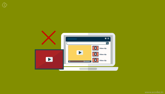
5. Videos Can be Leading and Misleading Too
You need to find a balance between the two.
There are two kinds of videos here. One is the persuader video and the other is the explainer video. Most people do it wrong often. So, which one should you be using on your landing page?
How about a persuader video? What’s your opinion?
Now, some logic!
Persuader videos have real-time impressions of people. They love to hang over when they could see some real-life activity. These videos take them on a tour of how your product is designed to work and even you could include existing customer testimonials and how they found your product to be life-changing. Explainer videos can be misleading; since these animations do most of the product promotion, which you could even include on your social media page.
We want real-time human interactions to take place and this cannot happen unless you have real humans online. If you could get an existing customer to speak up for you and your product then, it could work wonders as this helps in generating trust. And, people trust it when others say!
6. Navigation: Is it Good or Bad?
Would you like to navigate or scroll?
Hundred and one percent of people want to scroll over navigation, which is out of trend today. So, when there is no navigation, you do not have to be insecure about where you would include all the landing page elements and end up crowding the space above the fold with a lot of garbage. This happens because all those elements seem to be too important to be missed out. And, you really do not want to miss out on your customers just because you didn’t include one or two of them.
An excerpt from an observation from Click Tale’s user scrolling research history parameters reports that:
- Pages with scrollbar attracted more than 90% of page views, which is really impressive
- And, this accounted to more than 70% of scrolling activity
- The rest 20% accounts for scrolling from top to bottom, which is, of course, a positive sign.
People love scrolling. So, now again the ball is in your court. It all starts from how well you manage to convince your people and ensure that they stay there and while they are here they get some time to view the benefits and finally, they decide to click-through making your CTA a great success.
7. Visual Cues
Otherwise, also referred to as the anchor tags, are the guide that directs visitors across your website to that location on your landing page, where you want them to be. These visual cues that could be anything including human sight or arrows all need to point to the CTA button, which is your door to conversion.
Try including anchor tags at the bottom of your page, which will coax your people to scroll across and come down toward the end of the page.
This is how you could get your users to jump from one point to another on your page through the links that you have. Make it easier and navigable for your users helping them find the treasure on your landing page.
8. CTA Buttons
The most important of all on a landing page is the CTA button. This should be something that people can relate to and easier for them to follow and stick. So, how could you ensure that it stays in their heart forever?
Color it in contrast to the landing page’s color. This way it will be noticeable and strike the eye and also, make it sticky so that it sticks to the mind of the visitor as and when they scroll.
A great viewing experience and excellent user experience is what matters the most when someone is at your website on your landing page. Give them what they need and they will return the favor as a courtesy for what you have done for them.
These are some of the simple things that you could jot down in your UX design diary which will help you with designing the next time you are designing a landing page.
Also Read: The Ultimate UX Design of the Perfect CTA Button
UX Design Improvement Tips to Boost Conversion Rates
What do you do when you visit a website that has a poor choice of colors, bad content, bad design and a site navigation that is poor?
We immediately leave the site marking it in mind to never return even by mistake.
Now, I would suggest you to imagine your visitors leaving your website to never come back again. We don’t want that to happen to our website.
We want people to visit our website and stay there and always keep coming back and also, refer others to us.
So, how do you think you can make it possible with a website that has nothing much to offer?
User Experience is the key to your customer’s heart.
If your website has a great user experience design, then it will have unbelievably amazing conversion rates too.
Definition of User Experience
It is as simple as this- user experience is the increasing awesomeness that your visitor experiences as they continue interacting with your website. The level of user experience enhances as your website manages to please your users.
So, now you know the secret to improvising the conversion rate on your website.
Before we examine the elements that are the most important part of a UX design, first things first, you need to understand the basic differences between UX and UI design.
UX design as you know deals with the user experience design and UI design as you know is the User Interface design.
User Interface design is nothing but the front end of your website. The elements of your website that is visible to the user such as the navigation, layout, design, and pages etc. which is different from the user experience design.
User experience includes things such as loading time, usability etc.
I know you are wondering why we are discussing user interaction when our topic is related to user experience.
It is because both the factors are closely related and inter-dependent. You are fulfilling the first and foremost requirement at offering a great user experience by optimizing your user interface to meet the customer needs.
Let me make it simple: the feel and experience that your website’s UI manages to generate during a visitor/ customer interaction is user experience.
Also, the UX design of landing page matters. While we have discussed some good UX and UI tips previously, we will take you through some UX design tips for landing pages:
Adding Value
User experience focuses on the concept of providing value to your customers when they come to you in search of a solution to their concern.
There are 6 principal factors that make user experience awesome:
- Usable
- Useful
- Desirable
- Findable
- Credible
- Accessible
So, let us find out what each of them means:
- Usable: You need to design a site that is easy to access and simple to use.
- Useful: Content that users are searching for and should be useful too.
- Desirable: The world of marketing is focused on making things desirable. So, let’s make the image and other similar elements desirable.
- Findable: Provide the customers with an easy to find content that is navigable.
- Accessible: Users with disabilities should be able to access your content
- Credible: Credibility is one of the most important factors that actually matter. Provide your people with information that is trustworthy and genuine.
Design v/s User Experience Design
The design relates to the product, images, words, pictures, and even the spaces. User experience design is associated with how you take each of these elements and combine them together and present it to your users in a way that is beneficial to them.
Tips to Increase Customer Conversion
1. Are There Any Boken Links?
When your users encounter 404 error pages which are caused by broken links, it annoys them. They are on your website because they found it to be impressive and wish to do something when it led them to a dead end. The action is never complete and they leave to move on with your competitor’s site.
You can try the following to tackle broken links:
- Use tools: A lot of tools are available these days to deal with the broken links on a website. For instance, if you are working on WordPress you could select from a number of plugins that are available such as the All 404 Redirect which takes the user to the Home page or some other page on the website.
- Let us make the errors a conversion factor: When users reach the error page on your website make it easier for them to continue on your website.
- Search option: When they reach a dead end provide search tool so that they can enter a set of desired keywords which will fetch suggestions.
- Let them reach you: This is one of the best ways you can improve the conversion by providing a great user experience. Provide your contact details such as a contact form or a live chat so that they can contact you.
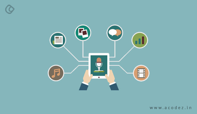
2. Humanizing
Humanizing is more about creating an emotional attachment to your users. Of course, content plays an important role in creating humanization. You can use storytelling to create this impact. But, when it comes to design you can do a lot more than this. Prove it to your customers how others are attached to your product and how much they are enjoying the same. You can add some images that include happy and smiling faces of people. Even, videos can play a great role in creating an emotional bond with people.
You can use videos to demonstrate your product or any of the following that will represent your brand well:
- Product review
- Educate your people on how to use your product
- Team events
- Behind the screen scenes
3. Simplify the Process
Rather than keeping the people wait on your website you can simplify the process to improve the user experience design and here is what you can do to achieve it:
4. How Easy it is For Users to Locate What They Are Searching For?
One of the most important things that you need to consider when working on improvising the user experience on your website is how easy is it for users to find whatever they are searching for.
5. Simple navigation is the key.
Before designing, think of all the things that your customers will search for when they reach your website. Make it easier for customers to locate these things on your site.
6. Eliminate All Errors
Are there any grammatical or spelling errors or missing PDF’s on your website? If so, then, take these down. Error messages mainly appear amongst website content. So, it is important that you proofread and eliminate these to offer a great user experience to the people who visit your website.
7. Contact Information Could Take You a Long Way in Generating Conversion
You can put up your contact information on your website so that it gives them an idea of how legitimate or genuine you are. Putting up your physical address is one of the best ways to reach out to your customers. They might not only visit your website but you need to put up your phone, and Email Id’s too. Also, try not to include those captcha codes that are too frustrating. It is easier to fill up a form that is free of captcha codes.
8. Building Trust
Regardless of whether you are selling something or not, it is important that you generate or build trust.
How do you generate trust?
Assure them that your company is reliable. Also, your product performs all promised actions. You have added genuine information on your website. Here, is how you can get it done:
- Add social proof: It is important that you provide social proof. Include images of people in your customer testimonials as it creates the impression of legitimacy.
- Add real images of your product. People want to see what your product is capable of doing.
- Security: When you are asking people for some information, they will provide it only when they know that their information is safe with you. Add security badges while creating your design.
- Endorsement: When you can gather endorsements from popular people or brands, it could help.
9. Eliminating the Unnecessary Elements
Here, is a list of things that your website does not need:
- Service offerings list that is endless
- Links to any of your websites or blogs that are inactive
- Pages that are blank or under construction
- Customer testimonials/ reviews that are irrelevant
- Unnecessary ads
Here, is a quick summary of all that we have discussed:
An aesthetic and user-friendly website with appropriate call-to-action will always improve the conversion through the website. Even though the important aspect to increasing conversion is to monitor website traffic and their behavioral pattern and optimize the site continuously, there are many minor and major things that can bring in a big difference to conversion rates. Some of these are listed below:
Design & UX Aspects
There are many minor UX stuffs which could add a big impact on the web conversions. Even though all of these couldn’t be listed here, as they have to be synced with the design and need to be taken care during the design/development phase, some are listed below:
- Make your site easy to use — and useful. Research shows that sites win credibility points by being both easy to use and useful. Some site operators forget about users when they cater to their own company’s ego or try to show the dazzling things they can do with web technology.
- Create a compelling and clear value proposition – It’s the primary reason a prospect should use your service
- Show Your Signup Form/button on the Homepage first fold
- Use white space effectively in your design so that it draws the eye in toward the call to action.
- Double-check our form fields and give examples of what needs to be written in every field
Increase Trust
- Make it easy to verify the accuracy of the information on your site. You can build website credibility by providing third-party support (citations, testimonials, articles in well-known publications, source material) for the information you present, especially if you link to this evidence. Even if people don’t follow these links, you’ve shown confidence in your material.
- Show that there’s a real organization behind your site. The easiest way to do this is by listing a physical address.
- Highlight the expertise in your organization and in the content and services you provide.
- Make it easy to contact you. A simple way to boost your site’s credibility is by making your contact information clear: phone number, email address etc
- Update your site’s content often. People assign more credibility to sites that show they have been recently updated or reviewed. If you have a blog or a news section, make sure they’re updated regularly. Nothing says “out of business” like an abandoned blog.
- Avoid errors of all types, no matter how small they seem. Spelling errors and broken links hurt a site’s credibility more than most people imagine. It’s also important to keep your site fast, up and running.
Offer Proofs/Credentials
- Customer testimonials
- Case studies
- Third-party reviews
- Certifications, Awards, Accolades
- Social proof
Blend these points into your UX design and you will experience a high conversion rate like never before.
UX Designs Tips for Travel Websites
When we think about travel website UI, the first step is to provide your users with a place to start. It is generally the homepage, which receives most of the clicks. This is not because it is the entrance to the website, but when the users reach it via the search engines, the next click automatically goes to the homepage.
This means that your Homepage must have an impressive layout with an engaging content if you really want your visitors to stay on your website, there is more to be done.
For instance, if you take the homepage of booking.com, you will find that their content addresses the customer’s needs. Fabulous, isn’t that? Let us make it simple, while you are on a travel site what is it that you are looking for? You either know the destination where you want to go but you are looking for directions and the rest of the information or you have the least idea of where you want to go and need directions for the same.
Booking.com directly takes you across an overall search form on the left-hand side of the homepage, which means you need not waste your time crawling across irrelevant content. This is found to be one of the best travel website user experience.
Let us find out some of the good UX and UI design tips for travel websites:
1. Make the Navigation Prominent
The navigation of TimeOut.com is one among the best. It comes to the visitors help exactly when they need it and is never an annoyance. This navigation system is accompanied by four elements:
- A huge and swiftly recognizable search tab
- The main menu having well-defined categories that include city guide, film, music, art, and culture, food and drink, etc.
- A breadcrumbs bar that is well-defined
- And a sidebar that enlists the most popular cities.
Timeout has designed the navigation system in an intuitive manner, which offers the visitors with a number of other reasons to explore the travel website UI.
2. Highly Impactive Images
Remember that stocking photos do not leave a good impression on the users. They bore the visitors and also do not motivate them for moving forward.
The substitute for stocking photos is high impact imagery, which places powerful emotions in users. We are all aware of the fact that an increased number of emotions helps to gain a higher customer loyalty.
The travel websites generally use high-quality images.
3. The Formula Lies in Keeping it Simple
Less is more and that is why it is always good to keep things sweet and simple and concentrate on just the information, which is relevant. The world has a lot of distractions which the visitors would definitely be grateful in case you save them from the unnecessary things.
4. Implement Action Verbs
You must be familiar with the terms “action verbs” found mostly on career websites. The action verbs not just engage the recruiters in scanning through the resumes but also with the visitors who happen to browse through the web pages.
The action verbs are actively involved in moving the users from a sleeping state to an active one. Positive user experiences are a spark of the activities contributed to the users’ front.
5. Streamlining the Forms
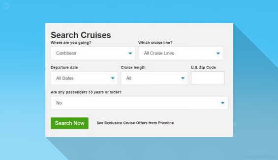
It is a strange but well-known fact that all the complicated forms are abandoned in the end. You can address this complication with a smart approach by streamlining forms on your website with a high degree of efficiency. This also helps to enhance the user experience.
You can refer the Homepage of the website Priceline.com and check their universal form that has been streamlined to provide a great user experience.
6. Weave Personalized Stories to Create an Impact

You can efficiently enhance the user-engagement by taking your people across a vintage of personalized stories from your personal experienced as well. This has been skilfully depicted on the website of GoBackpacking.com.
The adventures and experiences of people always excite the readers. The visitors do not want to read the same cliché things as on the other websites. Anyone can generate this kind of similar information that has no impact on the readers other than repelling them off.
The ratings, reviews, moderated and directed documents, blogs, status, stories, etc. add a personal touch to the website. Thus, introducing high-quality info helps the users to connect emotionally.
GoBackpacking has made its homepage colorful and attractive by weaving in the personalized stories of its visitors. This lures in the visitors to the website and they want to know more.
7. Product Description
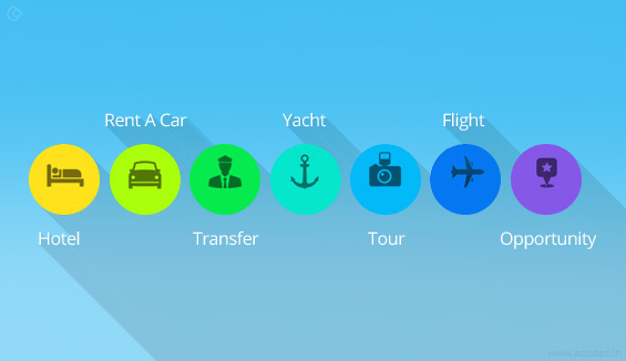
If you have observed you might have witnessed all the big E-Commerce names utilizing the recommended, related and famous products widgets to reach out to their customers. Influenced by their customer turnover, travel websites are also implementing the same strategy for their websites.
The website HotelTravel.com takes a different and smart approach to sort out the tasks.
The designers of the website HotelTravel.com have gone a step ahead in aligning the related products into a proper synchronization, which further helps the users in grouping the recommendations into four different categories that include best services, best values, best room standards, and best locations.
In order to bring about an excellent visual experience about the widgets, the components such as the price, the rating, small thumbnails and short quotes from latest reviews are included for giving maximum assistance to the visitors and they can choose for themselves the accommodation that fits best into their requirements.
8. Point Out the Benefits
Generate a friendly approach by taking your visitors across the advantages rather than boring them with the dull and dingy facts.
As we have already discussed, the homepage of booking.com exhibits the smartest utilization of the UX design principle. If you have observed, you might have noticed a section on “why use booking.com” towards the right-hand side of your screen as it lists out the 6 benefits that add value to the information that travelers are searching for.
Definitely, this value has been drafted in a very user engaging way and comes with links where the prospective users move on. The widget “why use booking.com” is an enhanced version of the generally used features section.
The components such as the highlighted links, colorful icons, and the user-specific data, makes the visitors believe that they’re visiting a professionally built website which they can completely trust. You can find a showcase of the famous locations from Dublin to Sydney on the left-hand side as well as the small widget of the third-party Review Center, all together helps to gain the trust of the users.
9. Providing Social Proofs
Talking about the social proofs, they generally signify social-media widgets such as Like Box and Facebook, which is a powerful element of well-designed UX. But, the homepage of TripAdvisor offers a wonderful example of how the other forms of social proofs work.
The whole concept of social proofs is based on the psychological rule, which says that people would definitely do something if they see other people around them doing it. External validation is a huge motivation for most of the people. Thus, wise website designers embed social proofs into their websites in such a way that it encourages the visitors to follow suit of their previous visitors.
How good is your site at converting customers?
It is possible to increase your conversion rates if you choose the best UX design company in India like us.
Share your thoughts, feedback, and suggestions with us.
Acodez IT Solutions is a web design company in India offering all kinds of web design and development services in India and abroad. We also offer mobile application development services. We are also an SEO agency in India offering inbound marketing services to help our clients take their business to the next level.
For more details, contact us today.
Looking for a good team
for your next project?
Contact us and we'll give you a preliminary free consultation
on the web & mobile strategy that'd suit your needs best.