Mobile has been rewriting the existing trends in the world of technology and the web. The previous and traditional mode of mobile and communication is changing, and we are being offered a better way of living without any hassles, with just a finger touch.
The mobile industry and businesses have been collaborating and brainstorming on ideas to make things easier and trendier for its people. But, sometimes not all experiments happen to impress people. There are failed user experiences too.
So, what is the impact of a failed user experience? Nothing, but the user will leave the app and never return. This is in fact directly or indirectly related to the app development process, which was not well executed.
Every mobile app development process is the result of the collaboration of a number of app designers and developers, consultants, research specialists and other experts to help create and render the best user interface to ensure a great user experience. The point is that the app must provide a great user interface to anyone and everyone who chooses to use it.
So, you need to actually create a well-defined structure and strategic model for your mobile app, which will ensure that you are creating a great user flow, ensuring that the experience will stay with them forever.
A small carelessness or pitfall can ruin the entire app experience though everything else has been well designed and developed by you and your team. So, we have actually incorporated in some of the regular pitfalls that people fail to notice while designing their apps to help you improvise your interfaces.
But, before we check that, it is imperative that you understand more about your consumers and what are the things that are bound to annoy them:
Let us start with why users delete their mobile apps
There are different reasons for why people delete the apps. Some could be because of freezing or constant crashing, which consumes time and is in fact a boring and annoying process if you are in a hurry. Some could be because it is not responsive or its taken a page from the snail’s book when it comes to performance. While there is another lot of people, who never had any use with the app, so they just got it deleted.
Here, are a variety of other reasons that could be actually the concern if your people are deleting the apps:
- They don’t consider it to be safe.
- The messaging part is annoying, as it is constantly happening.
- Data usage is crossing the set boundaries.
- Slow at loading.
- No updates are found. The same old information gets loaded every time.
- Functionality is boring and there is nothing much to do.
- A party of fonts and colors await the user, which is frustrating than interesting.
- Lack of options, such as search and others and more
Now you know that one of the aforementioned reasons could be warding off your people from your app, causing them never to return. But, we need to change their outlook, ensuring that each experience was awesome for them.
Here, are some tips to help you change the face of your mobile app development process, while getting rid of these issues:
Helpful tips for mobile app development
1) Simple and engaging
When we discuss engagement, user interface design (UI) comes into the scenario. The design is something that attracts people to your app in the first place. It is not necessary that you decorate it like a penthouse, but ensure that it catches the eye and stays there in the memory. Simple designs can do the magic.
It is not necessary that you decorate apps like a penthouse, but ensure that it catches the eye and stays there in the memory. Simple designs can do the magic.
Each step of the user as they move through the design, starting from the point when they logged in till the final purchase is made, it is imperative that a constant intuitive flow is maintained to keep them engaged. It is always good to not ask a lot of questions while they try to login, because this frustrates them. Sometimes, this could also be one of the reasons why they abandoned the app mid-way.
2) The icon of your app
This is where it all begins.
Have you observed the icon of Facebook app? That is one of the most simple and beautiful ones till day. People can relate to it with ease, while there is nothing complex about it. Customize a beautiful one for your app, people will like it. It should be distinguishable and unique, and help people differentiate it from the others in the play store and on the people’s mobile.
Ensure that you get this tested across all the various kinds of wallpapers so that it would look good across. It should be identifiable, no matter the wallpaper or background that your user is using.
3) Screens – do you need splash?
Often, people end up doing all the wrong things in their app design. Splash is one such blunder that happens usually. Firstly, you need to ensure whether it is necessary for your app.
Splash screens could be time consuming. Before, you think about implementing a splash screen for your app, it is important to identify why you need it or how could it be good for your app.
It should be something that helps people to relate to your app with ease, rather than making them feel like it’s wasting their valuable time.
4) Content legibility:
Content is as always the king. While your user is here, they are looking for some guidance and information and it is your responsibility to provide it in the form of content. Your content needs to be legible, clear, precise and to the point.
Your people need not zoom while they read the content, so if that’s the case, if they can read it without zooming, then you have done a perfect job.
5) Forms
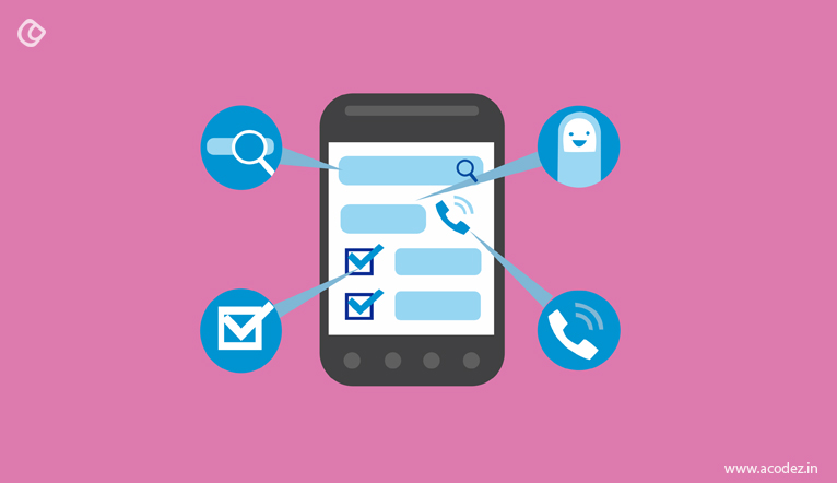
This is one of the most important areas of your app that you need to focus well while designing. Ensure that your forms are easily understandable. Everything including the breadth and height of the input field should be organized accordingly. Forms should provide people with an idea of where they are now and where they are being taken to the next. Auto correct and auto complete are two options that will help to save your user’s time and save them from the frustration to have done something that went wrong.
Also, the data type that the user enters into the various fields also matters. Provide them with appropriate insights on what is expected of them. Try not to include the manual data input wherever it’s feasible to again save them the effort and time.
6) Images
How you design your images is in fact another concern when it comes to the app. You are here to sell something. Don’t you want your people to identify it immediately and be able to relate to it? Yes, of course, we all are here for that. So, ensure that you use only high-resolution images to help people identify what it is and relate to it with ease.
Also, the speed and time taken to load the image is going to affect the app, if its being used by people with weak internet connection. So, take into account all these factors before you set out to design your app.
7) White space
How can we forget this most important part of any design or app? This area where there is no content actually attracts attention and helps to relieve tension as it adds some cleanliness to your design. It also provides the user with an idea as to where their sight should wander through the app, saving them from not wasting clicks that happen randomly.
8) Navigation
This is one another important factor of any mobile app UX that you need to consider before strategizing the design process. It should always offer a natural flow and should be intuitive no matter which OS is being used to access it. Provide the user with a good picture of the orientation rather than deviating their attention to unnecessary places, by shifting the navigation to wrong places.
Your navigation should be well places, such as that it moves in the direction of the user’s hands.
It is better to refer popular apps with effective navigation before getting into the design process.
9) Layout
What kind of layout are you implementing? Whether it is the portrait or landscape layouts? Firstly, it is important to decide whether you actually need any of them. It is better not to choose the layout changing option that these apps come with. Because, the UX architecture that follows these options is rather complex and makes navigation too difficult for people.
10) Rating your apps
It is always a great idea to refrain yourself from requesting your people to rate your app too often or constantly. Give them some space. They will rate it, once they start enjoying the experience.
Wait until then, it will be worth the wait.
11) Security
This is one of the most vital aspects that need to be taken into consideration when designing any app. In case, if your mobile app user happens to encounter a security threat or concern, undoubtedly they will leave and never return. A lot of things need to be checked and examined before you finally go live, like ensuring that their bank account details and other tracking activities are safe within your app.
Do you need help with designing an app that will change the life of your business?
Then, we can help you.
Acodez IT Solutions is one of the leading mobile app development companies in India. We also offer digital marketing services and web development services in India and UX design for clients across the globe. We’re also a Google Certified partner agency and offer inbound marketing solutions that’d take your business to the next level.
For any further details, contact us today.
https://www.forbes.com/sites/quora/2017/09/11/what-are-the-most-common-ux-pitfalls-in-mobile-app-design/#4fc832581b98
http://www.panaceatek.com/7-ux-mistakes-can-easily-avoid-mobile-app-development/
Looking for a good team
for your next project?
Contact us and we'll give you a preliminary free consultation
on the web & mobile strategy that'd suit your needs best.





I am very happy to get this information, You shared a lot of instructions and tips they very nice and very useful to us. Thanks for sharing the information with us.
Well written !!! Since user experience is greatly responsible for the success of your mobile app, it cannot be ignored. The tips that you have provided in this article would be quite helpful for engaging users on your mobile app.