The need to web design and develop great websites and apps is increasing day by day. People’s expectations are changing. They want more. What happens is usually when we have a great design, it does the job of driving the user to our website, but if the functionality part is weak, the user experience suffers and people leave. In some cases, the functionality part is amazing, but there are no users to experience it because the design part failed to attract them.
Creativity and Functionality Should Go Hand in Hand
To find a balance between creativity and functionality is one of the challenges that web designers and developers are going through these days when creating websites for business, corporate purposes or even online stores. Our major aim is to ensure that our site is capable of attracting people and then offering them a great user experience that fulfills their expectations.
Designers have been implementing grids to ensure that their page layouts appear beautiful and instantly drive user attention, with dynamic effects. But now, it is time to break the monotony and introduce something beyond the grid. This is being achieved by breaking the grid. It might not be easy to get rid of the grid entirely since it has already become a norm over the internet. It has been playing an important role in offering a distinct and beautiful experience to the users, enhancing a brand’s prominence and thereby bolstering conversions.
This is where an asymmetrical layout can be thought about – for organizing text, irregular shapes, and image overlapping. The realistic effect will bloom within your site with no compromise over the functionality part.
For learning about asymmetry, it is first important to have a clear understanding of what exactly grids are.
What Are Grids?
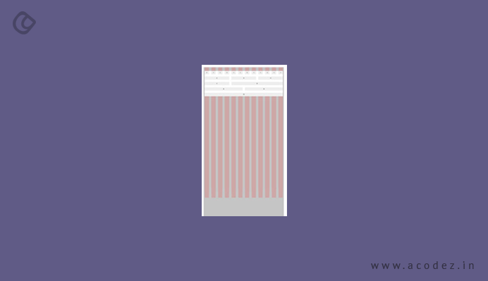
A grid comprises a system of lines which are connected or crossed against each other to form structured content.
In its simplest form, a grid is a network of lines that cross each other to form a series of squares. In design, grids are used to divide pages vertically and horizontally into columns and inter-column spaces (also called gutters).
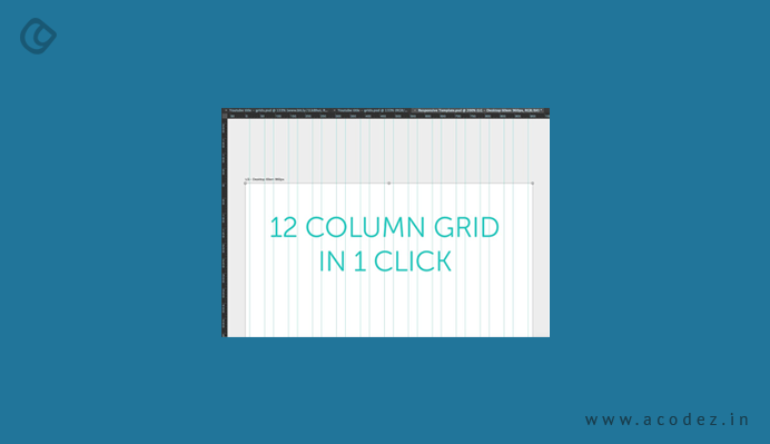
12 Column Grid
Essentially, they provide a framework that dictates how to organize elements on a page. They ensure all UI elements – like navigation menus, images, text boxes, and headlines – are arranged, spaced, and sized relative to each other by providing guidelines. One of the best things about grids is that they are loved by designers, developers and users, all alike for the functionalities and features that these offers.
When it comes to a user, they are happy with the grid – as it directs them from one section of the content to another, within a content system that is well organized, in order to help the users find what exactly they are looking for. With the help of a grid, designers can organize elements in a seamlessly intuitive manner, which will guide the users from one point to another with ease.
Advantages of Grids
Plus, another interesting advantage is that with the help of a grid, you can get your user’s attention to any specific element that they are actually looking for on your site. A beautiful and powerful grid helps developers to utilize the beauty of a design, while they have control over the functionality of the site.
But the grid has certain restrictions when it comes to creativity.
Grid and its Limitations
This happens mostly when a newbie or an amateur takes up designing and is trying to implement the grid system. Since grid has an already defined structure, it prevents the designers from thinking out of the box as they have to follow a set of specific guidelines. The learning curve might not go up if the designer doesn’t get a clear understanding of what they are dealing with when it comes to the grid. A lot of wise and smart calculations are involved when you are working with the grid.
This simply means that a proper calculation would strategize the text and images into a grid structure appropriately. Mainly, this gives us a framework to ensure that the components of our site are well organized. In fact, most of the websites, these days, are using grids to arrange text, white spaces, images, navigation buttons, and other elements, ensuring that an appropriate sizing and spacing is established among and for these elements.
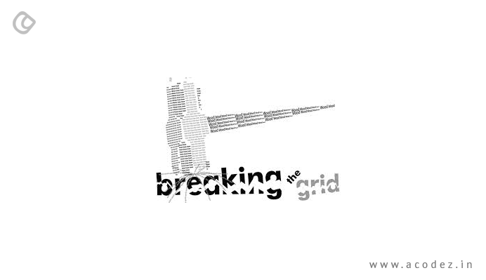
Breaking the Grid
For designers, a grid is the language of the wireframes that they create for their pages and when it comes to their users, it is a visual language, which helps them to find the content, navigate through the website and take specific actions that are desired of them. The most preferred and popular grid forms that we can find online is the 960 grid system. The main aim of this 960-degree grid system is to streamline the workflow of the web development process by implementing a common dimension, which is aligned into a 960 pixels width.
The use of 960 pixels is because this is a divisible number, and the layout created using this opens up a number of possibilities to help decide in which dimensions the elements on a page should be arranged. However, this 960-degree system grid comes with a few disadvantages, such as eliminating design creativity, which might affect the appearance of design.
When we use the grid system, we are limiting our options of bringing about some innovation to our design’s creativity. Since grids have nothing new to offer and no such customizations available, the layout all appear almost similar and consistent – and are moreover predictable when users visit the site.
So this gives us more than one reason to break the grid. We will take you through some interesting ideas that you can implement to break the grid.
Grid Positioning
It is quite obvious – when you think of position the elements of your grid – make sure they are non-relative to one another. Usually, there is a linear layout, which is very much clear to everyone and they know about it well. So when it comes to images and text that need to be organized on a page, now, designers can set up pages that look great and awesome without having to fear the norm of intuitive design, which users are bored with.
How About Layers
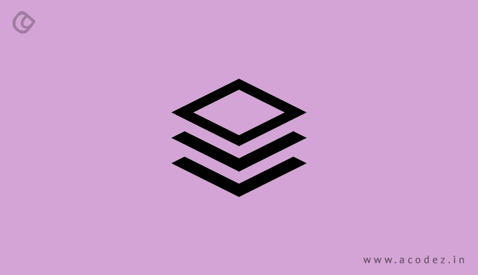
When you organize components of your page into layers, somewhere, a collaging effect is groped in – and the grid’s usual style is overcome in this situation. With an overlapped set of elements, a connection is established and we can easily identify these as a single object.
Add Some Color
When it comes to breaking the grid, you do not always need to break the columns or create a collage, but you can add some minor color to make the page look real. Some of these minor details on the page leave a major impact, thereby increasing the sales.
How About Parallax Scrolling
When you follow the modular grid system, you can take the liberty of breaking up your UI design’s horizontal grid with parallax scrolling. With parallax scrolling effects, the background will look like it is moving slower than the foreground. Now, you have a 3D effect created while the user scrolls down the page, making the content the center of focus.
Out of the Grid
With this system, the layout makes sure that no important information is missed out and the user finds everything that they are looking for. Adding new information is easier, as you do not have to change the entire layout in order to add or remove some material. Now, people are finding it similar and nothing unique, so it does not create the magic that is usually used to.
There are reasons to why this is no longer effective.
The popularity of the grid system’s layout is such that people have the option to overlook important information. When they see the grid, they come to understand that the page will contain more or less the same kind of information – with just a peek at the title as to what information is contained in it and they will not read it further.
But this is where asymmetrical layout or broken grid can be used to your benefit.
How Does Asymmetrical Layout Benefit Your Needs?
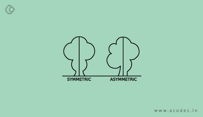
Just by throwing elements here and there, an asymmetrical layout does not appear. It is important to carefully bring along elements within the design that will altogether establish a beautiful hierarchy. Designers can do this by using certain uncommon positioning patterns, layering with textures and colors. You can repeat irregular patterns, use white space, and use typography to bring about some depth to the page. Without a grid layout, this cannot be achieved. So asymmetrical layouts work hand in hand with grids.
Introducing Asymmetrical Layouts with Grids

If you are an amateur, it might be a bit challenging to use this, one of the reasons why many designers prefer to not use asymmetrical layouts. However, it is not rock breaking task – you can do it. This can be done by mixing and matching both symmetrical and asymmetrical concepts within your design project. When you break your design into smaller sections, you will find bits of those parts that carry the balance that we discussed at the beginning of the article.
Firstly, it is important to have a clear understanding of why you are using asymmetry. Once you have a clear picture of what you are planning to accomplish with the visuals – you will know what are the best methodologies to accomplish it. Asymmetry is very good at driving attention.
Conclusion
When the asymmetrical balance is achieved – you would have offset elements using space, weight, focused on colors, used a grid for aligning and placing elements, and emphasis has been given to motion and more.
Acodez IT Solutions is a web development and web design company in India, offering all kinds of web design services to our clients at desirable prices. We also provide SEO services to help take businesses to the next level. For further information, please contact us today.
Looking for a good team
for your next project?
Contact us and we'll give you a preliminary free consultation
on the web & mobile strategy that'd suit your needs best.
