Mistakes? I remember someone say – Mistakes make a man perfect! So, no website design is picture perfect.
There are one or the other kind of flaws in every design. I am sorry for being blunt, but the truth is bitter, there are mistakes in website designs.
By mistakes, I am not discussing a missing comma or misplaced semicolon. But, these are some critical ones. In fact, if you glimpse into your previous designs, you will think was it I who committed this carelessness or how could I just?
Yes, it would have been wonderful if we could have got Dumbledore’s Time Turner and gone back in time just like Harry Potter and Hermione Granger turned their time and saved Sirius Black and Buckbeak.
We all wish we could turn back in time and redo a lot of things that could have led us to success. But we are not witches and wizards, and we do not belong to Hogwarts, we are Muggles. Let us not think of going back. We are moving forward and as we move ahead, let us not commit the same mistakes again.
I will take you across some of the common web design and web development mistakes that we need to stop doing today and how to avoid or correct these:
Common Website Design Mistakes
1. Images Fill in Life to a Website:
How does a balloon look without air? Hopeless, right?
But, fill in the balloon with air and allow it to float in the clouds. What a beautiful visual?
The same applies to your website. You have uploaded some images to your site. Either it does not blend in with the tone of your brand or it does not come with a good resolution, or the focus is unclear. And, knowingly or unknowingly it has been killing your website.
What can you do?
You can either hire a professional photographer or illustrator who could help you with the same. They could easily create an image deck for you. Or the next option is to use stock images. Where else could you get this kind of high-quality images?
The next thing you could do is to implement typography and color to create art in its dominant form. Your images should be clean and crystal clear something that will prompt the visitors to move down and scroll through the entire site.
So, now you know the importance of images on your website. It is not just an image that we are talking about, but these are the best ones.
2. Color and Typography
We just discussed in #1 the need for images that exhibit a high resolution and a clear focus. Also, I cited out some methods to get you to help with designing these images. While discussing these techniques, I discussed dominant art, which you can implement using typography and color.
But, here again, we are discussing typography and color. When it comes to using fonts for your site and also the color of these fonts, you need to be careful. Often designers think that they have made the right choice when they choose a font and a color for the font.
But, usually, what happens is- neither the font matches the color, nor the color matches the font. Consistency in the color and font is a crucial factor while designing a site.
As discussed in the Web UI Design Best Practices, maintaining a style guide could help prevent those mistakes that might spoil the appearance of your site after it goes live. If you have already detected a mismatch in the font and color, here is a tip from The Next Web.
As the saying goes- ” Better late than never!”. You can start by creating a color and font palette. The best practice is always to stick to a range of 3-4 fonts and colors throughout your website. Define the rules and replace styles in the CSS with the appropriate font and color to ensure that your site appears beautiful and aesthetic.
3. Did You Use a Grid?

Have you ever tried using a grid?
If you are a web designer who constantly examines what’s new over the internet, then you might know how Grid works and why it is important for your site. The grid helps to keep everything organized. Some web designers have wireframes and mood boards neatly designed. But, once they get approval from their client they would never return to the wireframe. They will just pop something from everywhere and then, the design is complete.
You need to understand the fact that such designs are always incomplete and unimpressive. And, your visitors will never want to stay on your site if it was designed in a haste. A Grid helps to maintain consistency from the top towards the bottom of your website, which is necessary to hold on your visitors over your site.
What can you do?
You can return to your previous website designs that are unorganized and get it organized and rearranged in a Grid. A grid can bring about a huge difference starting from how you place the images to the size of the text on your website.
4. Tiresome Navigation
Do you belong to the hamburger menu fans association? Then, you must be using it in your website designs. Though there are mixed reviews regarding the same whether the hamburger menus are for good or not, it is recommended that you keep the navigation of your site simple.
Also, putting in a lot of drop downs and multiple levels is just not an option. All that you can do here is redesign the structure of your navigation if you believe it appears to be too complicated. And, with the implementation of the Grid, restructuring the navigation becomes quite easy.
When there is a navigation that has three to four items, the user or visitor is forced to click through for the awesomeness that it provides.
5. If Your Site is Too Slow to Load
To be honest, no one including you and me would want to stay on a site that is too slow. The rule of frustration applies to your entire website regardless of whether it is the home page or landing page that is causing it to load slowly.
Certain factors slow down a site’s load speed. Some include images, animations, flashes and even videos with heavy content. Just rethink and rework by checking which image is preventing your site from loading faster.
6. Customizing Themes
Most of the designers prefer to use the themes that are available for free over the internet. It is never wrong to use these themes to get your website designed. But, there are a few things that you need to keep in mind before designing your site. Because these kits are available for free of cost, there will be millions out there who will use it and design a site similar to yours.
So, what do you do now?
Why not choose a premium toolkit? You can get a good one for a small price. Your site will be worth the investment in the long run as it will drive people and sales to your site. The kit will provide you with tools to edit the fonts, colors, and the other components of your website.
Common Web Development Mistakes
The paradigms and patterns of web development are constantly transforming and there is no limit to the number of choices that are available for developing a website in today’s modern web scenario. With this steadfast development of technology, the web developer’s task is getting tougher as they find it highly confusing to choose the best among them:
- tools to write HTML, JavaScript, and CSS.
- framework to implement an excellent design
- web hosting platform and underlying data storage facility
- also the potential JavaScript libraries/frameworks.
Once you have made the final choice, the next step is to search for tips to provide a better web experience. Thanks to the webmasters and content marketers publishing latest & updated techniques in their articles, forums, and samples to ease out the effort of the web developers while they strive hard with their experimentations to provide an enhanced user experience.
The methods or techniques implemented to develop a website might be of lesser relevance when it comes to the experience that it offers to the users and the most important of all is that the web developers are likely to make mistakes during the process. Of course, the approaches related to the web development can lead to mistakes, but there are certain challenges that are common to all web developers equally.
I have been conducting a thorough research and analysis on the web development challenges based on the experiences shared by highly-talented and experienced web developers and here I present before you the top 10 common Web Development mistakes with some tips on how to avoid these:
1. Stop Using the Old School HTML
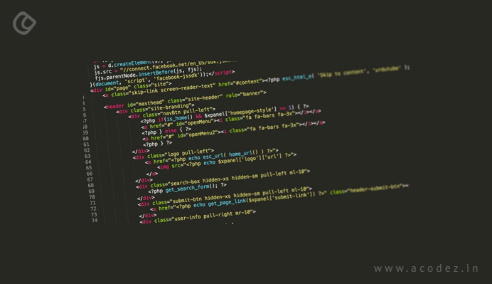
Today we have a large number of Markup options than the web developers in those early days of the Internet could find. But, as the saying goes it is difficult to get rid of the old habits and so are these old markup techniques that web developers have been implementing to-date.
Some of the common mistakes that ruin the course of development are when developers still use <table> elements for layout, <div> or <span> elements when there are other appropriate options available or using certain outdated elements such as <center> or <font> or spacing elements with a large number of “ ” entities that are incompatible with the latest HTML standards which have replacement elements for all these.
Outcome: These outdated HTML techniques can create a complex markup structure that exhibits an uncontrolled efficiency and inconsistency across the different browsers. Some of the latest and most modern browsers like Microsoft Edge as well as the past versions of Internet Explorer like 11, 10 & 9 do not support these.
How do you avoid these complications?
Limit the usage of the <table> element for content layout and also for displaying tabular data and these can be easily replaced with the current markup options. Focus more on utilizing HTML for describing what content it is and not on how it is being displayed. CSS provides you with the best tools to format your content appropriately.
2. Do You Think it is Great if it Works Fine Across Your Favorite Browser?
My dear developer, firstly you need to keep in mind the fact that not all people out there are fond of your favorite browser. It is a common mistake that many of the developers have been committing while testing their web pages because they love certain browsers and detest others. Also, when you copy-paste code samples that are available online, it is not necessary that it works the same way across all the browsers because the default values assigned for styles may vary across different browsers.
Outcome: Remember that when you apply a browser-centric approach, the outcome is of poor or extremely low quality when the user views it on a different browser window.
Avoiding these complications: It is practically quite a tedious task to test the web pages across all the available browsers and their respective versions during the development process. But it is recommended that you submit your site for quality assurance across multiple browsers at regular intervals. Also, you can take help from some of the free tools that are available, regardless of the platform you are using. There are certain websites that are excellent at detecting and displaying how your site will appear across various browsers, versions, and platforms. Also, there are excellent tools that facilitate you to check for the compatibility of a single web page across multiple platforms.
3. Assuming Too Much
You are the web developer and very much clear with why you are doing this. But this is not the case with your users. Usually, web developers make the mistake of overestimating the users when they request the users to submit information via forms and assume that the data will be received as per their discretion.
Outcome: Things go wrong when the entries made by the user is quite distinct from what was assumed at the time of designing the form. What happens when the data entered is incompatible with the underlying data schema or if the expected data is not provided is quite unfortunate, as it leads to page failure. Also, the deliberate violation of the site’s database through injection attacks is another serious issue that again leads to page failures.
How to avoid the complications?
Firstly, you need to convey your users the exact message on what type of data you intend them to enter. For instance, if you prompt the user to enter an address, they are unsure of whether it is home, office or something else and they might even mistakenly enter the Email Address. So, you can take advantage of the number of data validation techniques that are available in the latest version of HTML to get rid of this issue.
Also, make sure that regardless of the techniques employed to validate data on the browser side, the validation takes place on the server side too. Whenever a user entry is being updated, ensure that the concatenated T-SQL statement does not use the data without examining the type of data entered across each of the fields.
4. Page Bloat

One of the commonly observed practices among the web developers is that all of them have a tendency to create pages filled with numerous high-quality graphics, & images using the element <img> with its height and width attributes. Also, another common design pattern is when a large number of files on the page are linked via CSS and JavaScript, again a least recommended practice. Avoid complicating the source HTML Markup which appears to be more attractive when kept simple and less extensive.
Outcome: The page load process takes too much of time resulting the users to either abandon the request or reload the page all over again. In some situations, pages that take too long to load results in errors.
Avoiding these complications: One of the major setbacks that result in page bloating is the unnecessary stacking of images. If you can answer the following questions then you have the best results with you:
- Ask yourself “Are all these graphics necessary?”. If there are unnecessary ones, have them removed.
- There are tools that help to minimize the file size of images.
- Preload images. This technique helps to force the other pages on the site utilizing the same images to load faster.
Also, you can minimize the usage of linked CSS and JavaScript files.
5. Create a Code that Works

As a developer, you might have tested and confirmed that your JavaScript or code is functional on the server and this leads you to confirm that it will work once deployed too. You might execute the code without error trapping because it worked while you tested it.
Outcome: When you develop a site without performing the necessary error checks and error handling, the end users are going to suffer from the errors that were left unchecked. Also, it favors hackers with the information on how to easily infiltrate your site.
How to overcome these?
It is a general tendency of human beings to make mistakes and as a developer, it is likely that you might commit errors. While using JavaScript, you are an advantage of utilizing the best practices that will help you to prevent errors and also catch them. Whenever an error occurs due to failures in server-side code, arrange it to be caught without revealing too much of the technical details to the user. It is recommended that you set up friendly error pages for HTTP 404s without giving in too much of the details. Here’s some of the best 404 error page examples from real websites across various industries.
6. Stacks of Code
Now, that the web developer is quite keen on aligning a perfect code structure that will make the app responsive across multiple versions/browsers/ platforms, they get carried away and overdo the code and it doesn’t come as a surprise to find heaps of “if” statements branching out in all the different directions.
Outcome: As we have already discussed in # 1, it is unnecessary to heap piles of code as it becomes too tedious to manage the code files that are bulky. This is a continuous process as and when newer versions of browsers are updated.
Avoid the complications: You can avoid these kinds of code stacking by implementing feature detection in code versus browser/version/platform detection. This technique helps to reduce the amount of code and also makes it easier to read through and manage it regardless of the number of versions being updated.
7. Implementing Responsiveness
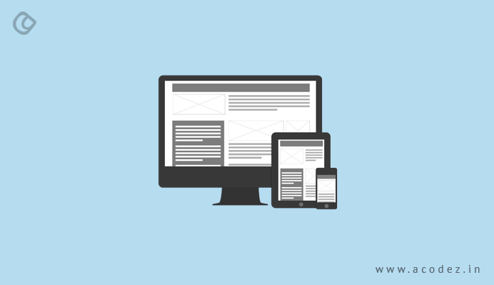
Web developers again commit the mistake of testing the site development across the same monitor size on which they are building the product.
Outcome: It provides an unruly and ugly user experience while they try to view the site across mobile devices or other devices with larger screens. The user experience suffers as they cannot access the most important aspects of the page and also sometimes it is impossible to navigate to other pages.
How do you overcome this?
Implement responsiveness in your design.
8. Why Create Meaningless Pages?
Sometimes or most of the times web developers get carried away by optimizing their web pages from the user perspective while failing to align it across SEO guidelines. Search engines fail to identify these websites.
Outcome: What use is a page that stays undiscovered by search engines with zero visits.
How to avoid this disaster?
You need to implement the SEO tactics and the relative support accessibility in the HTML and do not fail to add tags including the related keywords and descriptions, from the SEO perspective to make a page meaningful. Also, you can use the alt=”your image description” attribute in the <img> or <area> tags to enhance the accessibility experience.
9. Avoid Refreshing Too Many Times

How successful will a site be that keeps on constantly refreshing its pages with each interaction?
Outcome: We have already seen how disastrous bloated pages can be (refer #4), and the loading time that affects the performance of a page. Here, the user experience is devoid of liquidity as the page tends to reload at each interaction.
How to avoid this disaster?
A simple tactic is to identify whether posting back to the server is actually required. For instance, you can easily utilize the client-side scripting to deliver spontaneous results as there is no dependency over the server-side resources. Also, you can implement the single-page website design approach or AJAX techniques to overcome this issue.
10. Work Smart
Another general tendency of web developers is to unnecessarily waste their valuable time creating web content. They might be doing repetitive tasks or typing irrelevant content.
Outcome: This results in utilizing too much of the time than it is actually required to launch a website and even the subsequent updates might be too time-consuming. If you think you are the only one handling these tasks with a high level of efficiency, then my dear developer you are quite mistaken as there are other developers capable at producing enhanced outputs in lesser time implementing easier techniques. Yes, mistakes are part of your job and troubleshooting will take even more time.
How to avoid these complications?
There are a large number of new tools and process techniques that you can utilize effectively to increase the efficiency at each stage of the development process. You can smartly utilize the time wasted over the documentation purpose to do something fruitful. For instance, you can use the free tools available to simplify the process of testing and troubleshooting.
Summarizing our discussion:
Once you identify these web-related common mistakes, you can easily eliminate the errors in your work models that already others have endured and spent most of their time identifying and fixing. It not only helps you to reduce the errors and also you can effectively utilize your time to do something more important & productive.
Have you come across any of the above-specified errors while developing your website? How did you tackle those? Or did you find and fix any errors apart from the ones listed here? Share your thoughts and comments with us…
Acodez IT Solutions is a leading web development company offering a variety of solutions including web design in India and abroad. We also provide digital marketing solutions to our clients to help them take their business to the next level.
Looking for a good team
for your next project?
Contact us and we'll give you a preliminary free consultation
on the web & mobile strategy that'd suit your needs best.


Kudos to Krishnankutty, This article really pointed out some of the major web design mistakes people usually make and are unaware of. Yes it is true no design is perfect but we can really make improvements at any time, you just need to take care of some basic things that may go wrong unknowingly. Thanks for reminding about these mistakes.
thanks for the post.really helpful.
The way you have presented the post with all the examples is also very impressive.We have the details of some of the best and useful website development for those who want to make websites come to us we will help you out with any type web designing.
It is a nice post keep share the valuable information like this