Gone are those days when people would prefer visiting a local store to make purchases. I need not elaborate what I am trying to specify because each of my readers go online for shopping and you know why.
But, as web designers, we need to keep ourselves updated with the latest trends and technologies that are prevailing in the industry. In the year 2016, as you know mobile optimization and AMP are the strategies for designing websites.
Also read: Accelerated Mobile Pages: An Essential Guide
And, Google has strictly specified that non-responsive sites will be stripped off the Search Engine Results.
Now, the question is how do we survive the rat race if we own an E-commerce site? What are the changes that have evolved in the E-commerce website designing in the year 2016?
Do not worry! There are no major changes except a few that you are aware of, but a glance at this checklist will help you develop a site that draws customer attention, traffic and generates sales.
Here we go:
#1. The design of your online store:
As a designer, this is not a new thing but something that you cannot ignore for it has a huge prominence to play in the present and future of your business. Keep your design clean and attractive. When I say attractive it doesn’t mean that you have to embed in a lot of graphics and flashy images. How many of us would like to stay on a website that comprises of a lot of flashes and graphics?
To be honest, I would myself never stay on such a website. It is the designer’s ability that matters when designing an online store. Your site needs to be simple, easily readable and navigable. It provides your visitors to realize the value of your brand and read the content.
In fact, customers tend to associate professional website designs with the quality of a brand, something that prompts them to return and also spread a word.
#2. Functionality of your E-commerce website:

What are the things that come to your mind when you think of an online store’s functionality? The main point is whether your website is functional? You might have included either a few or a large number of components on your website expecting the visitors to take some action. But, the expected action occurs only if these are functional.
Examine your website for broken links and also examine whether there exists any loading issues. Often, designers include heavy images that prevent the site from loading faster which increases bounce rates, something that Google doesn’t approve.
Also, the security features that you have on your website must be peculiar to your business requirements. It should be safe and secure for the customers whenever they make a transaction.
The other things that you need to consider are the surveys, contact forms and customer feedback sections, which are the most important ones from the user’s perspective.
As you know if we happen to find a problem with any of the website’s functionality, we automatically abandon the site. It is human psychology.
#3. Website Color:
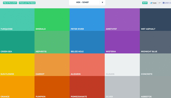
I don’t know whether you have ever realized the fact that colors have a huge role in retaining visitors. Certain colors tend to ward them off even before they take a look at your website, while certain colors make them curious to find out more.
As a designer you must know that there are colors that can flush out various responses such as sad, anger, calm, happiness, confusion, or even frustration.
What are the things you need to consider when choosing the colors for your online store?
- Target audience
- Brand
- Emotional elements of color theory
- Company’s niche
I have seen designers maintain the logo and brand color throughout the website which is in fact one of the best tactics to attract customers.
But, before you choose a color I would recommend you study the emotional responses that a color tends to generate.
#4. Is your website navigable?
One of the questions you often hear when you research on how to improve the performance of your website or online store?
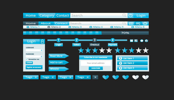
A website that is easily navigable has more number of visitors than a site that lacks intuitive navigation. If your site’s navigation is confusing, then you are automatically driving bounce rates. You are generating the possibility of customers who leave the site to never come back again.
Also Read: 15 Reasons Why People Leave a Website
It is necessary that you conduct sufficient user tests before you launch it. This will help you to refine and review your site’s navigation from the user’s perspective.
How to help your users navigate your site with ease?
Add a site map. It will help both the users and search engines to crawl your site with ease.
You can also eliminate pages that are unnecessary and also replace the ones that fail to please the customers. This helps to decrease the load time thereby improving your brand’s online presence.
#5. Loading speed:

When it comes to a website, specifically an E-commerce site it is necessary to cut short the loading speed to improve performance and reduce bounce rates.
Nothing can be as frustrating to your users as much as a site that takes too long to load.
If you have unnecessarily included many images with bigger sizes, you can eliminate these as it helps to reduce the load speed of your website providing your users with a better experience over the website.
I would recommend you test your website for its load speed from the user perspective in real life scenarios before its release.
This will help you to fix any such issues that are preventing the site from loading fast.
Also Read: 3 Great Ways You Can Improve Your Website Page Loading Time
#6. Call-To-Action:

Yeah, well we all know this is the most important part of any business website, not a new thing. But, my point is to design a call-to-action that is attractive. Something that is different from “contact us”!
See these are the usual and boring things that we find everywhere. Our customers are always on the forefront and they are smarter beyond imagination. Your visitor might not want to click on the button that contains the same old “click here”, but something unique like “Let us help you!” could generate better responses.
The main purpose of a call-to-action is to inform your visitors that you want to build a relationship with them.
You can either ask them to subscribe your newsletter, so this will help them to know more about your brand if they are first-timers.
An existing customer can help enhance the brand’s presence by participating in the brand’s loyalty rewards program.
You need a call-to-action that prompts the user to take some action and make sure it is engaging.
Alos Read: How to Write Persuasive Call to Action That Make People Click
#7. Mobile or responsive?

We have already discussed Google’s strategy on making sites mobile responsive. And, most or all the designers are making it a point to design sites that are mobile optimized. As you know, these days people prefer shopping via their Smartphones rather than using desktops or laptops.
Even for local business searches, people use their mobile phone. So, if you already own a large business and have a website optimized for the desktops, I would recommend not disturbing the website’s existing vibe by optimizing it further.
It has been found that websites that are optimized for desktops when tweaked for mobile devices do not deliver great results when accessed via desktop.
So, it would be cool to have another one designed for mobile phones.
But, if you are planning to launch a new website, it would be an excellent idea to develop a website that is responsive and can be accessed via multiple devices.
It does not end here. As you know we have a large number of browsers too. We need to do something to please them all.
This is where browser compatibility comes into action.
Ensure that your website is compatible with all the different browsers. It has been observed that sites which perform well over Chrome give up over Firefox.
Even the older version of your website needs to be tested via all the browsers to provide a great user experience, which is our ultimate aim.
Also Read: Responsive or Adaptive Design? Design trends to look for in the year 2016
#8. SEO that is friendly:

I do not need to elaborate SEO further. Recently, I came across a lot of posts wherein people are mentioning that SEO is dead which I would say is joke.
As you know SEO is in fact one of the important gradients of your website design. It should happen while you decide on what are the design components of your website.
It has an equal role in deciding whether your site reaches your people or whether your site stays in the dark without anyone ever realizing your brand does exist.
Your site needs to have a SEO-friendly code that helps the crawlers to decide that you have the content your people are searching for and will automatically direct them to your website.
Content Management Systems such as the WordPress comes with plugins that enhances the process of cleaning up the code on your website and finally improving the search engine rankings.
You need not be proficient in WordPress to use it as the coding part is too simple and it has the power to drive search engine traffic, I would recommend it if you are struggling to drive traffic to your site.
#9. Social Media and Blog:

My next question is how active are you over the Social Media? I am aware of businesses that have an active Social Media account but they do not engage with their customers.
This is a failure. Having a social media account that is active is one of the most important steps in taking your business to the next level.
But it is useless unless it does not communicate and engage with the customers.
Also, not all customers are active over all the social media networks.
When it comes to B2B type of businesses, LinkedIn could be more powerful in generating customer engagement.
Also, Facebook could be more engaging when it comes to business-to-consumer type business.
Facebook is in fact one of those social media sites that have been bridging gaps and bringing all kinds of businesses closer to their network of audience.
Other social media sites such as Twitter, Google+, Instagram, Pinterest, Tumblr, etc. also have a great role to play when it comes to attracting customers and generating engagement.
My next question is do you have a blog?
If yes, how often do you blog?
It is important that you have a blog as it is an information counter where your customers can get to know more about you and your brand.
It helps to engage customers and generate positive responses from their side. Keep updating your blogs regularly as it will bring your customers to your site automatically and frequently.
#10. Security and say no to robots:

How secure is your E-commerce website?
It is necessary that you implement all kinds of security measures to prevent viruses, malware, malicious apps and hackers from attacking your site.
A site that compromises on its security automatically loses its integrity among the users.
You can prevent browser based hacking by adding SSL certificates to your site.
Read next: WordPress security: A Quick overview
Also, it has been observed that the comments section usually receives spam data. To prevent this kind of spam data from utilizing your valuable time, use Captcha code section as it prevents robots from commenting on your site.
It is more about humanizing. We need only humans building relationships with us.
Also, use only original content on your website to improve its credibility. This is an additional tip.
There are a number of free and paid E-commerce website development software available. You can utilize any of these to build an excellent online store.
Magento and Shopify are the most commonly used platforms.
What is the platform that you have used to build your online store?
How comfortable are you with the site’s management? Share your thoughts, comments and feedback with us.
Acodez IT Solutions is a E-commerce website design company in India providing services to clients globally. We use the latest technology to develop websites and apps that are the best in the industry.
We also provide assistance for inbound marketing and help with strategizing SEO solutions for your website during its development phase.
For further assistance, you can contact us today.
Looking for a good team
for your next project?
Contact us and we'll give you a preliminary free consultation
on the web & mobile strategy that'd suit your needs best.


Customers always likes creative and responsible websites. Creating beautiful websites plays an important role in eCommerce sites. Tips you shared is informative.
Tara, Ecbilla
hi,this post gives a idea about how to design a best e-commerce wesite ,this tips is very usefull to me am also using various recent tools to develop my site
Great post! Thank you for sharing useful information.
E commerce is using many peoples. customers always like new creatives for web design attracting. its useful information.
such a great article ,thanks for the tips for ecommerce