As humans, we interact with user interfaces every day – from our smartphone screens to ATMs to websites.
An impactful user interface plays a critical role in not only how efficient and pleasant an experience feels but also how functional and purposeful an application or product ultimately is. The key UI design principles drive focus on optimizing the user experience above everything else.
From simplicity and clarity that reduce cognitive strain to consistency that fosters familiarity to feedback that conveys progress and outcomes, each UI principle aims to make interfaces intuitive, logical, and accessible so people can accomplish their goals seamlessly.
As interfaces become an indispensable extension of our daily lives, the art of designing users in mind – rather than technology – will only become more essential for creating products and services that truly delight.
That’s why timeless design principles remain central to crafting compelling user interfaces for humans, not machines.
8 Principles For Crafting Intuitive User Interfaces
Good user interface design is like magic – when executed correctly, it disappears. You interact with a clean, intuitive design and accomplish your goal without noticing the hours of hard work behind it.
Here are a few UI design fundamentals that you need to consider when creating UI designs.These eight UI design will guide you toward creating user interfaces that simply work.
Principle 1: Clarity and Simplicity
The hallmark of great design is simplicity, and simplicity begins with clarity. Simplicity and clarity are the UI design basics that focus on clean designs with only the important elements. Show users exactly what they need to accomplish their goals without distraction.
As Leonardo da Vinci wisely said, “Simplicity is the ultimate sophistication.” Simple user interfaces build intuitive products that captivate users and fulfill their needs.
For instance, popular apps like Instagram, Twitter, and Pinterest have beautifully simple interfaces that allow users to accomplish tasks effortlessly. They strip away excess options and focus only on the core functions users desire.
Let White Space Breathe
White space – the unmarked areas on your interface – serves a visual purpose. It allows elements to stand out and creates a visual breathing room that helps users process information more easily.
Steve Jobs famously said, “Simple can be harder than complex: You have to work hard to get your thinking clean to make it simple.”
He pioneered the minimalist movement in technology, removing everything unnecessary and only highlighting what mattered. Apple products like the iPhone set the standard for clarity and simplicity through their sleek, intuitive designs.
Use Consistent Typography
Consistent typography is one of the UI design elements used to maintain design clarity. Mismatched fonts create confusion. Pick one body font for paragraphs and another for headlines. Stick to that typographic style throughout your interface for consistency. Legible fonts like Verdana and Georgia help users read and process information quickly without difficulty.
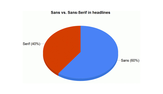
Statistics show 60% of websites use sans-serif fonts for headlines, led by Arial, Verdana, Lucida Grande, and Helvetica.
Serif Vs. Sans-Serif in Headlines – Image Source: Smashing Magazine
These include brands like CNN, ArsTechnica, Slate, the BBC, and NewScientist.
The lack of tails and gaps gives these font families a clean and direct style rendering text highly readable at small sizes. Despite a slight decline, sans serifs continue to reign supreme for grabbing readers’ attention at the top.
So it’s important to select fonts carefully to match your brand while prioritizing readability and clarity.
Principle 2: Consistency and Familiarity
Effective UI design relies on making interfaces consistent and predictable enough that users feel a familiarity with the system.
As the sharp-witted Oscar Wilde said, “Consistency is the last refuge of the unimaginative.” While consistency alone does not make for good design, it is an essential foundation upon which effective and intuitive user experiences can be built.
Maintain Design Patterns Across Platforms
Delivering consistent design patterns across platforms – web, mobile, desktop, and IoT devices – ensures that the visual style, interactions, and workflows remain familiar to users.
This mental model transfer allows users to leverage their previous experience when interacting with your product on different platforms.
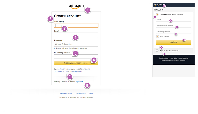
For example, e-commerce giant Amazon maintains consistent navigation and checkout processes across its website, mobile app, and Alexa voice assistant – creating a seamless customer journey regardless of the user’s point of access.
Desktop vs. Mobile Amazon Navigation Screens – Image Source: GoodUI
Offer Familiar User Workflows
When registration forms, checkout processes, navigation menus, and common tasks follow familiar workflows that users have seen elsewhere, they can complete actions efficiently and with confidence.
Minimizing users’ cognitive load through consistency improves the overall user experience and results in higher conversion rates.
Some of the benefits of building consistency and familiarity into your UI design include:
Easier onboarding of new users
Intuitive navigation that requires minimal learning
Reduced user errors
Higher perceived usability and trust in the product
Moreover, consistency helps establish and reinforce your brand identity. By utilizing similar design patterns, interactions, and language across all interfaces, you create an experience that feels distinctive and aligned with your company’s tone, voice, and messaging.
This consistency cultivates familiarity with and loyalty to your brand over time. So prioritize consistency in small details as well as big-picture design – it all builds towards a frictionless, human-centered user experience.
Principle 3: Flexibility and Responsiveness
Flexibility and responsiveness are two of the key principles of UI design that ensure users have an optimized experience across different devices and contexts. Adopting a mobile-first approach, creating scalable interfaces, and employing responsive techniques helps embrace these principles:
Adopt a Mobile-First Approach
“As of May 2023, 67.81% of the total web visits are currently mobile, compared to 32.19% coming from desktops.” Designing first for mobile screens ensures flexibility at the core of your UI.
Responsive techniques like fluid grids, media queries, and adaptive images allow a single design to render beautifully on screens of all sizes.
As mobile usage significantly surpasses desktop, with over two-thirds of web traffic now coming from smartphones and tablets, a mobile-first approach has become indispensable for meeting users’ needs across contexts.
According to Google, mobile search volume exceeded desktop searches for the first time in 2015, highlighting users’ significant shift towards mobile devices.
Create Scalable Interfaces
Flexible UI design employs interface elements that scale proportionally – from icons and text to containers and imagery.
Layouts that utilize relative units, percentages, and fluid grids can dynamically resize to any screen width, remaining readable for users. Flexible layouts optimize the user experience on any device resolution, avoiding the need for separate mobile and desktop interfaces.
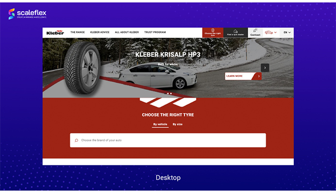
The responsive header images below from Scaleflex showcase the power of adaptive imaging – ensuring the most important visual element, the car, remains sharp and centered across devices.
How Responsive Images Adapt to Larger Displays – Image Source: Scaleflex
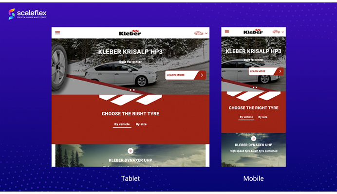
As the screen size decreases, only less crucial surroundings are cropped out, keeping the primary subject crystal clear.
How Responsive Images Adapt to Smaller Displays – Image Source: Scaleflex
To ensure flexible UI design:
Employ responsive design techniques
Opt for fluid and percentage-based layouts
Use scalable interface elements
Provide multiple interaction modes
Make content accessible to all users
Additional best practices include offering interactive and voice-based interactions to accommodate users with disabilities. Dynamic type allows font sizes to scale smoothly for improved readability.
And testing your design across a wide range of devices will expose gaps in flexibility that you can address with adaptive techniques.
Overall, a flexible user interface allows your product to perform optimally across any context – whether viewed on a smartphone, tablet, laptop, desktop, TV screen, or smartwatch.
No matter the device, your design should easily transform and respond to the conditions at hand so it places minimal friction between the user and accomplishing their goals. So build flexibility into every aspect of your UI design from the ground up to ensure it serves users well in the real world.
Principle 4: Feedback and Interaction
Effective feedback mechanisms are essential for user-friendly interfaces. Providing the right cues and messages in response to user actions helps build intuition and confidence, allowing people to engage fully with the design.
This principle of user interface design aims to foster engagement through feedback. As one of the key UI design principles, feedback encourages interaction by:
Providing effective visual and audio cues
Crafting contextual, helpful messaging
So with that foundation in mind, let’s discuss these essential aspects of feedback design:
Provide Effective Visual and Audio Cues
Clearly indicate what a user can do next through visual cues like-colored icons, progress bars, and highlights. When appropriate, supplement with audio cues like clicks, beeps, and voiceovers for users with visual impairments.
According to usability expert Jakob Nielsen, interface feedback is essential – users need to know “the results of their actions immediately.” Without proper feedback, users are left guessing whether their interactions are being registered or processed correctly.
Craft Contextual, Helpful Messaging
On-screen messages that provide context help guide users through complex processes. For errors, combine visual cues with plain language explanations and concrete next steps.
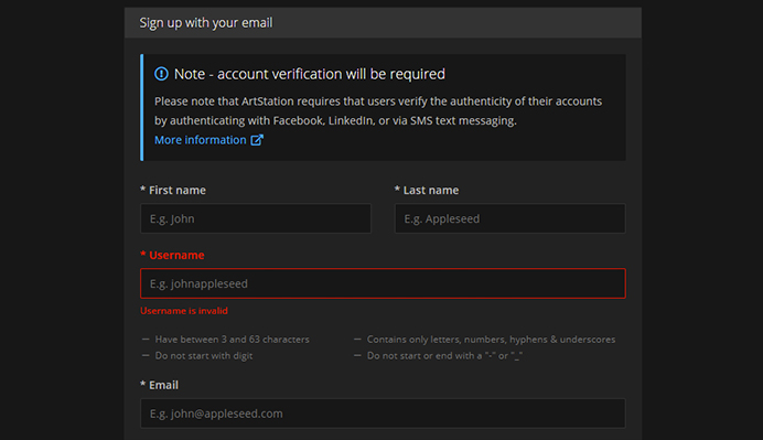
To give an example, here is how registration errors are indicated on ArtStation: the platform marks the problematic field in a colored manner and clarifies what’s wrong through a text prompt.
Use Well-Recognized Visual Markers – Image Source: Tubik Studio
Avoid cryptic, confusing error messages. Error messages should clearly state the problem, suggest possible causes, and offer solutions to resolve the issue – all using simple, unambiguous language.
The goal of feedback design is to give users confidence that the system understands and is responding appropriately to their inputs. Even simple visual cues like subtle highlight colors around active buttons tell users their selection has registered.
Over time, thoughtful feedback mechanisms build users’ trust in the interface, allowing them to engage more fully and accomplish tasks efficiently.
Principle 5: Efficient Navigation and Information Architecture
Navigation and information architecture form the backbone of an intuitive UI. Users depend on clear navigational structures and logical content organization to quickly find what they need.
Create a Hierarchical Navigation System
Group content into categories and subcategories to form a logical hierarchy. Use clear labels and descriptive icons to help users navigate between sections.
From breadcrumbs to sidebars, determine the navigation system that best suits your users’ mental model. Consistency in navigation placement and style are important for usability.
Implement Optimal Information Architecture
Organizing content by using logical methods involves wireframing, sitemaps, and card-sorting techniques.
Apply design patterns like progressive disclosure and categorization to guide users through information in the most effective way. Information architecture ensures that users can find what they’re looking for within three clicks, reducing frustration and boosting conversions.
To ensure efficient navigation and architecture:
Craft a navigational hierarchy
Label links and menus descriptively
Organize content logically into categories
Group related tasks into sequences
Employ design patterns for optimal flow
Test your navigation and information design with users early to identify and correct any usability issues, ensuring an intuitive experience at launch. Iterative testing and improvement will result in a navigation system that effortlessly guides users where they want to go.
Principle 6: Aesthetics and Visual Appeal
Visual aesthetics and appealing design play an important but often underrated role in user interface design.
While usability, functionality, and efficiency must come first, research shows that visual appeal can actually improve how usable an interface feels to users. Appealing visuals foster positive emotions that influence users’ perceptions of quality, ease of use, and satisfaction.
As one of the key principles of UI design, visual aesthetics aim to:
Enhance users’ subjective experience
Improve first impressions and build trust
Signal professionalism and credibility
With that foundation in mind, let us explore how judicious use of aesthetics can elevate usability and the overall user experience.
Looks That Improve Usability
While function should precede form in UI design, aesthetics play a crucial role in how users perceive and interact with an interface. Appealing visuals can actually improve usability.
There is empirical evidence that aesthetically pleasing designs make users happier, increasing their willingness to continue interacting with the product. Beautiful interfaces signal quality, credibility, and attention to detail that improves the entire user experience.
Prioritize usability over visual flair, employing aesthetics purposefully to enhance an interface’s functionality. Visually appealing elements should be simple, consistent, and non-distracting. Avoid skeuomorphic or ornate design elements that interfere with readability and usability.
The Benefits of Effective UI Aesthetics
Visually pleasing designs engage and retain users, fostering higher satisfaction and conversion rates. Appealing interfaces signal professionalism and legitimacy, instilling trust and building brand value.
Stunning UI aesthetics can even cause the “design halo effect,” where users perceive the product itself as of higher quality. Aesthetics improve first impressions and overall perceptions of a product.
Principle 7: Accessibility and Inclusivity
An inclusive UI places the needs of all users front and center – from people with disabilities to users of different ages, cultures, and abilities. The accessible design invites interaction from a wider audience.
Designing for diversity requires considering the barriers marginalized groups may face. Conduct research on the needs of underserved populations and employ human-centered design methods tailored for inclusion.
For example, focusing on colours alone to highlight or differentiate important aspects of the website would exclude colourblind people. Similarly, colours can have a symbolic connection to an ongoing political conflict or could be perceived as support for a particular social group. To avoid these misconceptions and add inclusivity, consider using alternate ways to highlight the important elements rather than relying on colours in these cases.
Ensuring color contrast, legible text, alt text for images, keyboard-only navigation, and compatibility with assistive technologies like screen readers allow people with disabilities equal access to content and functionality.
Consider users with low vision, motor impairments, etc.
An accessible, inclusive interface ensures that all potential users can interact with and benefit from your design, regardless of ability. Removing barriers to equal access should be at the core of every UI design principle – so keep the needs of diverse users front and center throughout the design process.
Principle 8: User-Centered Design and Iterative Process
The last most fundamental principle of UI design is prioritizing user needs above all else. A user-centered approach focuses on understanding users, gathering feedback, and constantly improving the design based on their experiences.
This iterative process lies at the heart of creating truly intuitive interfaces that are a joy to use. With that in mind:
Design For Users, Improve For Users
The core of good UI design is understanding and prioritizing user needs. An iterative process that incorporates continuous user feedback leads to ever-improving interfaces.
Prioritize User Goals and Behaviors
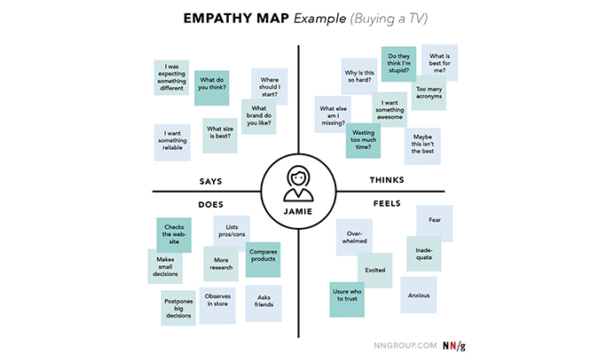
Employ techniques like persona creation, journey mapping, and empathy mapping to truly understand your users’ needs and goals.
Empathy Map Example – Image Source: UX Booth
Base decisions on how users actually behave, not assumptions.
Continually Test, Measure, and Refine
Usability testing reveals opportunities for improvement. Implementing feedback loops allows users’ voices to shape the design process. Regularly refine your UI through A/B testing, analytics, and iterative releases that respond to changing user needs.
To adopt a user-centered approach:
Conduct user research upfront
Base designs on user needs, not assumptions
Employ usability testing throughout the development
Gather and act on user feedback regularly
Continually optimize and improve the experience
The user-centered design process should never end once a product launches. Regular interactions with customers allow you to refine your design based on real-world usage.
Focusing on true user needs and implementing iterative improvements will lead to UIs that offer an optimal experience every time.
Ultimately, following these eight principles of UI design will help you create interfaces that work beautifully for users. Prioritizing clarity, simplicity, accessibility, user-centeredness, and feedback in your designs will enable intuitive interactions that bring joy rather than frustration.
And though aesthetics alone cannot save a poorly designed interface, judicious use of visual appeal can improve how usable and engaging your design feels.
So keep the human element front and center and iterate based on real user feedback – because well-designed interfaces disappear, leaving users to accomplish their goals with peace of mind.
And isn’t that the goal of all good design?
Acodez is a leading web design company in India offering all kinds of web design and website redesign at affordable prices. We are also an SEO and digital marketing agency offering inbound marketing solutions to take your business to the next level. For further information, please contact us today.
Looking for a good team
for your next project?
Contact us and we'll give you a preliminary free consultation on the web & mobile strategy that'd suit your needs best.
Rajeesh P.K. is the Director and Creative Head at Acodez . With an experience of 10+ years in UX Design & User Interface Design, when coupled with his expert coding skills in HTML5, CSS3 makes him one of the top UX Architects in India, with more than 15 international awards to his credit.