Fonts are more than just textual elements. They are the voice of the product. The types of font you use indicate the nature of the product you intend to sell. It is therefore very crucial to understand the logic behind the font design prior to using it.
What do you observe when you visit a website for the first time?
The eyes span across the content. Of course, images and flashes can manage to hold the attention of the visitors.
But, all eyes are fixed on the content. You might have explicable content written, and it might even contain words that come from an outer space far away from the universe.
Why settle for anything less when all eyes are set on your content? The overall appearance has the powers to jinx your people but let us see whether it can work the magic?
It should be readable. If the text lacks readability people will be least interested in reading further, and this will trigger your bounce rates.
Also Read: Call-To-Action that works: Above or below the fold?
In fact, it is the first impression that your font creates will decide whether people want to know more or else they quit.
You need no explanation on why it is necessary to focus on typography as it is an essential gradient of website designs.
The kind of font you use on your website conveys the character and personality of your website and the related content.
You can’t just pull in some font and use it for your website. It requires some forethought.
To help you choose some of the best fonts here are a few tips:
➤ 3-4 types of font on a single page is the limit:
You can combine 2-4 types of font faces on your web page. You can use all the three at random in each sentence or just one of them for a paragraph and another one in the corresponding paragraph and so on.
It is up to you to decide whether you want to limit your text to just one font or whether you want to change it every other sentence!
The magic lies in bridging a proper gap between the two
But, mind you, when your number of fonts starts to exceed the specified limit (2-4) you are entering the danger zone.
Not only are you deviating your visitor from the site but also, there are all possibilities that they will not want to stay on your site for longer.
Also Read: 10 Typography Terms Every Designer Should Know
➤ Your font will decide the character of your site:
When you choose a typeface, make sure that it will convey the character of your site. It should be capable of creating a strong first impression.
You need to analyze your company details, product information and also the content that you are planning to post on your site as this will help you with the font selection.
Now you know the purpose of your content. Once you get to know what is the intention behind the whole thing, you will be able to choose or design a font that will convey your site’s intent.
➤ How you align the typeface matters!
The readability of your content decides whether your readers will hang around or leave.
The alignment and arrangement of the content are the two factors that determine whether it is readable.
You can choose from either of the four types of font alignment that includes right, left, centered and justified.
Thanks to the awesomeness of CSS and Photoshop, as it provides us with the liberty of choosing an alignment that we prefer.
The alignment should guide your readers to the main piece of information on your website.
Here, we are sharing 20 different fonts that you can utilize in your website designs, and the best part of using these is that they are free::
#1. Adam
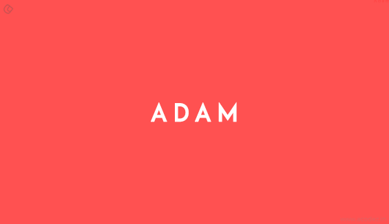
Designed by Shrenik Ganatra, the Adam is an urban font. Its distinct straight lines, industrial look and its semi-bold weight makes it an ideal choice for various mediums.
Download Adam font
#2. Arenq
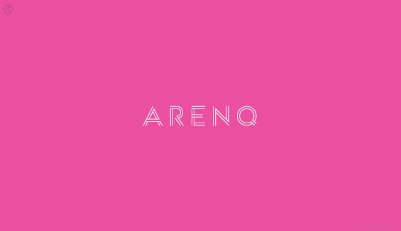
The linear properties of this font are ideal for logos and signposts. It has a unique open shape look which gives it a distinct character.
Download Arenq font
#3. Asfalto
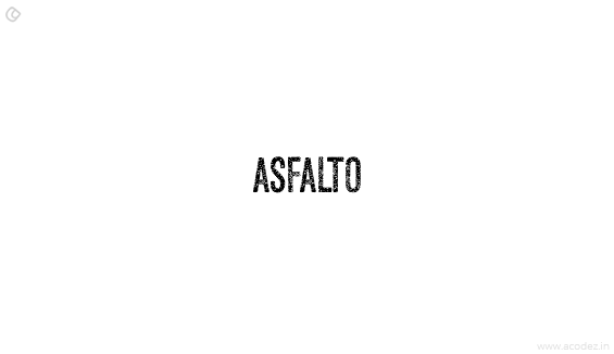
Asfalto is a clean and easy to read font that is great to use for most occasions.
Download Asfalto font
#4. Bebas Neue
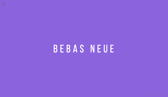
The no-nonsense Bebas Neue is reincarnated with four new weights, namely, light, thin, book and regular. It is a Sans serif font and is based on the original Bebas Neue free font designed by Ryoichi Tsunekawa.
The new versions have retained the distinct characteristics of its predecessors and still continue to charm designers with their clear lines and elegant shapes. The fonts are distinguished by the unique marriage, it portrays between technical straightforwardness and homely warmth. This feature makes it a favorite with designers to be used for Web, Print, commerce or Art.
Download Bebas Neue font
#5. Biko
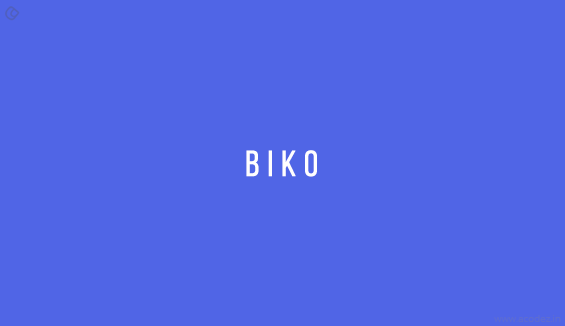
The clean and easy to read Biko is a much loved choice for many.
Download Biko font
#6. Borg
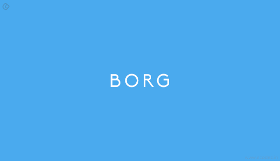
The slight curve in the tall, powerful façade of the Borg gives it an interesting dimension.
Download Borg font
#7. Canaro
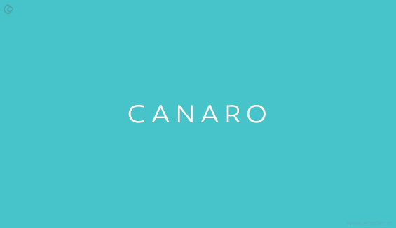
Offering a huge range of weight options for them to super bold, the Canaro is a great looking no frills font.
Download Canaro font
#8. Chase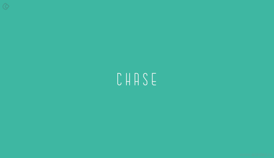
Designed by Anthony James, the tall Chase has a unique look which, if used intelligently is quite a winner.
Download Chase font
#9. Fancy Me
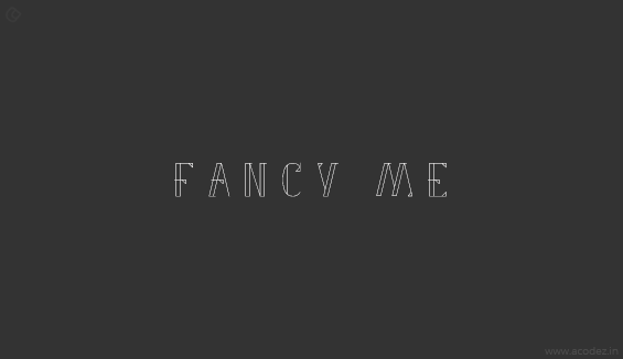
This is a beautiful fancy font which creates a lot of visual contrast with a unique interplay of thick and thin strokes.
Download Fancy Me font
#10. Falling
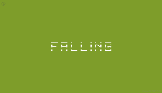
Designed by Viacheslav Olianishyn the Falling uses a unique style which makes it stand out from the rest of its league. It is based on the principles of the closure concept in designs.
Download Falling font
#11. Genica
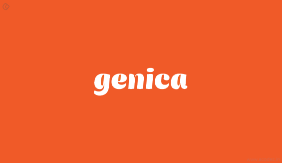
A unique interplay of broad and thin strokes gives this font a striking visage.
Download Genica font
#12. Hallo Sans
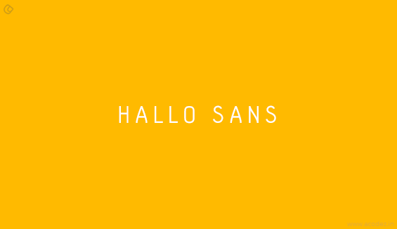
The big, bold look of the Hallo Sans font is beautifully complemented by its curvilinear structure. The bold typeface gives it a clear visage making it stand out above the rest.
Download Hallo Sans font
#13. Homizio Nova
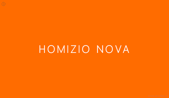
The contemporary look of the Homizio Nova is ideal for many occasions.
Download Homizio font
#14. Margot
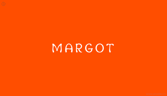
Designed by Adria Gomez, the rounded corners and the subtle indentations of the Margot makes it a popular choice.
Download Margot font
#15. Mohave
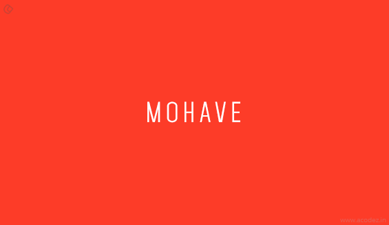
Seen in regular, semi bold,and bold plus italics the Mohave is an all caps font.
Download Mohave font
#16. Nurjan
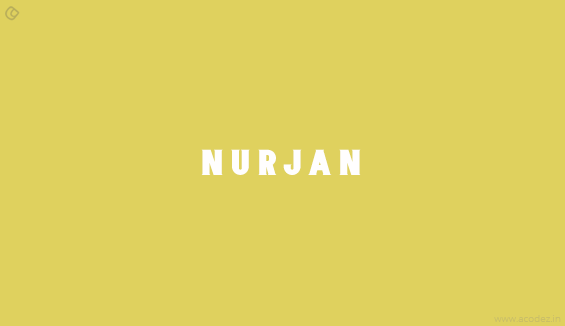
A bold typeface and minor serifs give Nurjan a unique look.
Download Nurjan font
#17. Odin Rounded
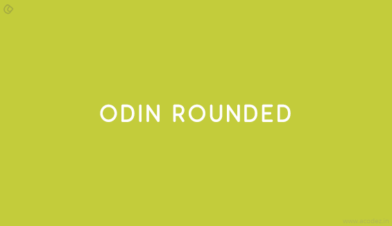
Just as the name suggests, the Odin Rounded is distinguished by its smooth rounded look. Great for providing for wonderful economy of space, its linear appearance and compact design make it a neat font to work with.
Download Odin Rounded font
#18. Ostrich Sans Heavy
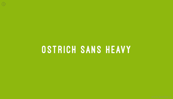
The heavy look of the Ostrich family font is ideal for headlines.
Download Ostrich Sans Heavy font
#19. Redressed
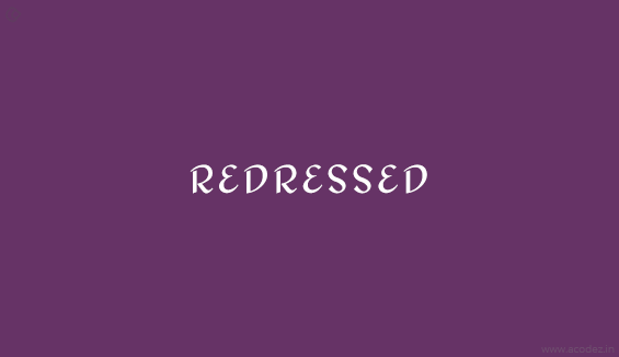
The Redressed has a simple and clean look which makes it endearing. The elegance of its curves and the charming way in which it rounds its P’s and dots its I’s is beautiful. The font does have a lot to fall for.
Download Redressed font
#20. Zwodrei
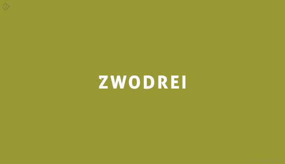
The bold font with a serif twist at its corners does have a unique look to play around with.
Download Zwodrei font
These are just a few though you can find a lot more free fonts that can be used to make your website appealing and readable.
Acodez IT Solutions is a web design company in India offering web design and development services to a number of clients in India and abroad. We induce in the latest technologies and the most modern software development techniques to provide them with the best.
We are also a digital marketing solutions provider helping clients to strategize a perfect inbound marketing and SEO plan for their websites.
For further assistance, you can contact us.
Looking for a good team
for your next project?
Contact us and we'll give you a preliminary free consultation
on the web & mobile strategy that'd suit your needs best.





This is very usefull to me , already i learn about various font style but it is very new tips for designing a best web site