Smart phones are now the coolest gadget in everybody’s hand and is being used for all those purposes a desktop computer or a laptop was used.
This includes online shopping too. If we look at the graph of smartphones and e-commerce, both have emerged as contemporaries and naturally go hand in hand.
People are now glued to their phones and tablets all the time, and online shopping occupies the significant chunk of time. It is, therefore, compulsory for every mobile ecommerce app to provide a UX, which makes e-commerce on mobile phones a delightful experience and not a nightmare.
Some of the factors that mar the e-commerce experience for a mobile user are failing to provide an e-commerce app which is free of all the unnecessary stuff on the screen.
As mobile first approach is implemented, these days in most of the e-commerce platform, it is also mandatory for the UX developers to create experiences which are optimized in every way.
The best shopping experience is offered when the app is light weighted and free of all unnecessary things.
Let me start the discussion with a question: do you think your Mobile E-commerce is smart?
Being smart is not about the appearance. There is more to it.
In the world of Smartphones and Android devices, when we don’t even have the time to take a second off and glance at the real world surrounding us, more is always less.
The next question is how are we going to handle the situation as designers?
The scenario is quite a bit critical. You might be great at designing for desktops, but as we both know it is out of trend. Speaking about the trend mobile E-commerce is no longer a trend even.
In 2016, it has become a necessity. The best way to start is to ask your friends and family what kind of shopping do they prefer?
More than 95% people would say they love to shop using their Mobile phones.
So, now before you think of optimizing your site for desktops, it would be an excellent idea if you could optimize it for mobile phones.
Often what happens is that when you optimize your Ecommerce site for mobile phones, there are a lot of factors that you knowingly or unknowingly ignore.
But, here I will help you fix it all with a cheat sheet on tips to optimize your m-commerce website. You can use this sheet while designing your site so that you do not miss anything.
Here we go:
#1. Free your interface from the clutter:
The user interface of the mobile app must be designed in a minimalistic fashion. There should not be any clutter on it, and only those links which will help the users in searching for their products should be present. The users are thus are not confused by the app and can perform the shopping with ease.
#2. Easy checkout:

It is common for the e-commerce app to get stuck at the checkout. When the user checks-out he or she wants it to be smooth. The coupon codes that need to be applied must be visible and options must be given to change the quantity of the product or the product itself. Address, mode of payment, and delivery time must also be mentioned when the users check-out.
#3. No need for the log in:
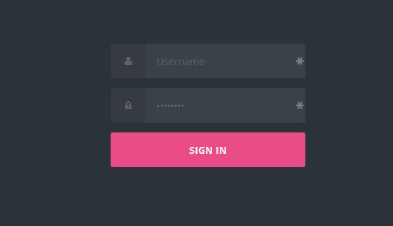
When the users shop through a computer, logging into the account is not warranted, but it becomes a compulsion when it is performed on the mobile phones. The shoppers must not be asked to log into the account unless he has selected the products and is ready to place an order. Doing this will not frustrate the users and they will be able to shop with more convenience.
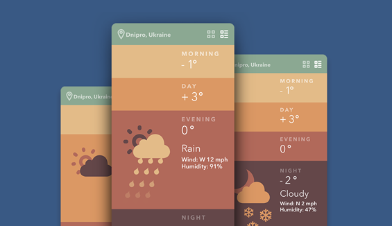
#4. Clear and high quality photographs:

The size of the mobile phones is tiny and a tinier photograph spoils the mood of the shopper. The pictures of the product should be large enough to give a clear idea of the product so that it aids in the shopping experience of the user. The quality of the photographs is an important part of the UX of a mobile e-commerce which can make or spoil the entire shopping experience.
Also Read: How to Create Better E-Commerce User Experience?
#5. Home Page should convey what your site is about:
When you design for mobile phones, the first thing that you need to check out is the main sections your site will have and how you are planning to manage the navigation.
Don’t think you can do it as easily as you get it done for desktops. The subcategories section will not appear on the first page or home.
The main menu that is displayed on the mobile is the thing that will guide people, and so it needs to be readily available.
Unlike in those apps where you can insert in a fixed toolbar either in the header or the footer, it will not work in the case of Mobile websites.
There is no sufficient room for decoration in Mobile apps. Why?
At the bottom the browser has Chrome and at the top, the browser has fixed the URL bar. Maybe you can use Javascript if your client insists on having an extra toolbar, but this would be a waste of space.
Also, how you design your home page determines the ease with which your people will reach the landing page.
#6. Homepage cannot handle too much of awesomeness:
Whatever we say or whatever we do, we can never predict what our customers are searching.
You might say you know the psychology of visitors and blah. But, the truth is no designer has the real idea on what their people would prefer to see on the home page.
When you are designing for the desktop, you are at the liberty of stuffing in all the components and entities of your site in one place.
It does not work that way for mobile E-commerce. Let’s not irritate the users by cluttering and cramping in a lot of information. It will give you bounce rates, and I don’t think you want that to happen.
Often designers forget the fact that mobile screen is smaller when compared to desktop.
And, what good is a mobile E-commerce site that is suffering from bounces?
Another important point is the content. Of course, content is the king!
But, when it comes to smaller screens, it is better to keep it small and clean.
Just make it easier for your users to find what they want.
#7. Transition of text sizes when we move from portrait to landscape:

All you need is to make your text that is readable.
What visitors or customers expect?
No one wants to read a lot of text but text that is larger.
Also, ensure that zoom is disabled to help your readers further.
You can use the following text specifications:
For title: 13-15 px
And, for body text: 12-14 px.
You can make it even smaller for metadata.
#8. How well have you designed the search functionality:
You need to give an extra importance to search functionality.
Don’t hide your site’s search feature. Position it such that people can easily find all that they want.
Some designers are in the habit of scaling a lower version of the search for mobiles.
A small tip: Use the same desktop version of the search for mobiles.
#9. Make scanning easier:
The lists should be large and easily come into the visitors view as they scroll down and not too long.
Also, it should not be that people have to scan a lot of times before they find the entire list.
Here comes what we call instant gratification.
As you know, mobile devices can quickly adapt and embed any kinds of entities that includes portrait orientation and vertical scrolling.
But make sure you do not cram in content because users are likely to leave your site if you stuff it with a lot of content.
#10. CSS could replace image based buttons:
As we know, image-based buttons slow down your site’s loading speed, and it would be an excellent idea if you could either remove or replace these with CSS.
The size of your image is another concern when you are designing for mobile.
Minimize it as far as possible.
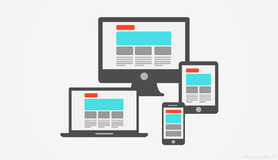
#11. Test for the site’s compatibility across a variety of devices and OS:
I know what you are thinking right now! You do it every time. We all get this done.
But, as this is a checklist and as we are all humans, it is a general tendency to forget, and so I mentioned the same here.
Get it tested across multiple devices and multiple operating systems. The success of an M-commerce site lies in its flexibility and responsive across a variety of devices and operating systems.
What are all the points you take into consideration while designing an M-commerce site?
Share these with us…
We invite your feedback, suggestions, and comments.
As one of the best mobile ui ux designers in India, we are quite aware of the every know-how to increase your sales via attractive website.
Acodez IT Solutions is a E-commerce website design company in India providing services to clients globally. We use the latest technology to develop websites and apps that are the best in the industry.
We are also a digital marketing solutions provider offering a variety of services including inbound marketing and SEO stratification for our clients.
Tell us what your requirements are or what kind of an M-commerce website are you looking for? We will contact you with a free quote.
Looking for a good team
for your next project?
Contact us and we'll give you a preliminary free consultation
on the web & mobile strategy that'd suit your needs best.


Great content Rajeev. I have also written a blog on this particular subject; please go through this at http://weavers-web.com/how-to-win-the-mind-of-smart-phone-users-by-designing-an-ecommerce-website-for-mobile/. At point number 4, you have advised to use high quality images, but I think the images should be optimized as well. Otherwise it will create problem in loading time.
hi ,this post gives a good ideas about how to design a uX in our e-commerce website design ,it is very usefull tips for develop my site very inovative; thanks for sharing your ideas