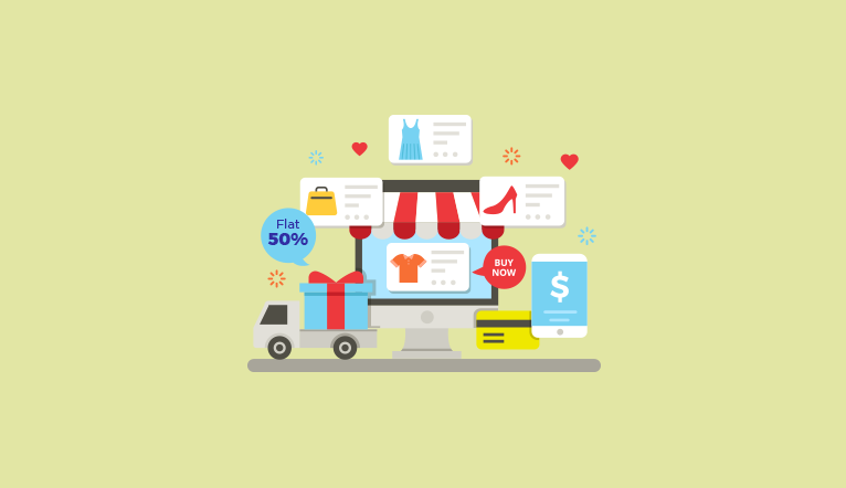
E-commerce is one such industry, which keeps on blooming every fortnight. The exciting fact about e-commerce is that new businesses and existing businesses are finding it easier to reach out to more number of customers while retaining the existing ones. The success of an e-commerce store is dependent on many factors, including the appearance of the store, user experience (UX), user interface (UI), content, design, SEO, social media presence and networking, paid acquisitions, and so on.
The customer acquisition is driven by one major factor – UX. As you provide a better user experience, better would be the customer engagement that drives growth.
While you spend all your money on ad promotion, marketing and distribution, why not think about how the UX can be improved to drive customer attention and engagement – which ultimately leads to sales.
Let us discuss how we can improvise the UX of your e-commerce store to enhance your business and what all needs to be taken care during an ecommerce web development project.
The e-commerce system is closely tied to UX and when you improve this, automatically things will fall in place, and you will end up accomplishing your business goals. Keep in mind that when you offer a great UX on your e-commerce site, you are achieving:
- Customer satisfaction
- Repeat purchases
- Customer support costs are minimal
- Customer acquisition costs are lesser
- Happy customers lead to great sales
- Increased rate of conversion
How a great UX can lead to increased sales on your e-commerce site
It is important that you follow some of the best practices to optimize your site. While some of the best practices might work for a few, it might not be functional for all. But, some of these are common to all, regardless of the platform on which it is developed or the browsers on which this site will be accessed.
An actionable and strong call to action (CTA)
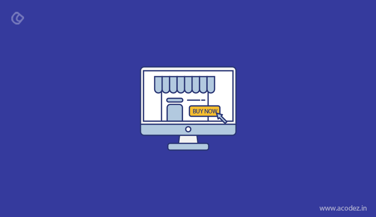
CTA is one of the major components of your site. It is important that while designing a CTA, you ensure that it stands apart from all other components of your website. It should be in contrast with the other parts of your page. When a user sees the CTA, they should automatically feel like clicking through this. Also, ensure that it conveys what would be next and provide inspiration to users.
Ask the following questions once you are done creating the CTA:
- Will it be clear?
- Is it noticeable?
Always provide a guest option for your people
There are a lot of sites that ask people to sign up before taking them into further details. Many businesses believe that why do they have to provide information unless people sign up. This is a wrong approach as it annoys the people and it is assumed that everyone in four users leave the site due to forced registration, which they don’t approve of.
It is recommended that you implement the guest checkout option while providing people with an option to register. If they are interested, they will register. Ensure that you generate the password and mail it to your people after they have placed an order or made a purchase.
Clear and high-quality product images
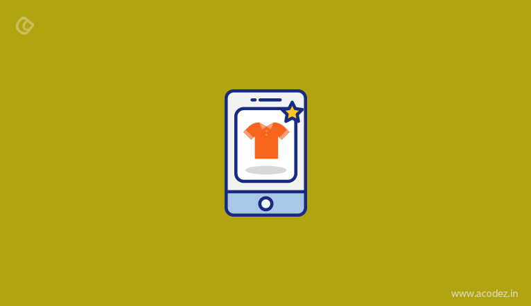
The main purpose of e-commerce is to ensure that people can enjoy the same benefits as that offered by the stores in the physical world. The concern is whether this gap can be bridged. There should be some provision to bring these variations together. It is not possible to try the products online and so you don’t actually feel or experience them in the real world. The only thing that fills in this gap is images.
Videos can also be used to bridge this gap and we can see videos being added up by a large number of sites to provide further details to people on how this will work.
You can also use videos to demonstrate the working of the product.
But, when you introduce images – be careful when choosing the size of images as it plays an important role in influencing the attention and engagement factors. Also, take into account the product type that you are planning to sell.
Product descriptions drive customers
As you are aware, the content part is most important in enhancing the UX of your site. Experience is driven by the description too. Imagine what use is an e-commerce site that provides a poor experience. The dummy content needs to be replaced with serious and important information.
The product description should not be something that would annoy the customers. Ensure that the content copy is sensible and supportive, providing people with essential information.
When writing product descriptions – examine whether it is convincing to the buyers as well as check whether it would take care of their needs. It should persuade the people to take the expected action. One of the best practices to develop a sales copy is to include all information that is relevant to the users.
Sometimes people implement some easy methods like copying from the manufacturer, which is not recommended for UX from the SEO perspective. Or they never get assistance from an experienced content writer to develop copies that sell the product.
Keep your copy from unnecessary jargons and complicated words, while ensuring that the readers can understand the point you are trying to convey.
Create a sales and specials section exclusively for your people
The point is sales happens only when you make an interesting offer to your buyers. Yes, studies and researches prove so. Buyers are interested to buy products with discounts. More than 50% of the users agree to the fact that they feel automatically pulled toward the sales and specials section.
It is recommended that you introduce a ‘sales’ section that is devoted to discounts and offers on your site.
Try this for your brand and find out how well it plays an important role in attracting people to your site.
Customer support that is easy and dedicated
It is necessary that you dedicate a live chat section on your site for your customers. It might not be necessary that the customers can find responses to queries on return policies or refunds, etc. unless it is a part of your brand’s agenda. Also, they are unsure where they can actually find help because it is a machine that is interacting with them.
This can be solved by introducing a contact point that is prominent and this is recommended to be positioned nowhere but on the home page.
It is an excellent idea to add live chat as an important aspect of online shopping.
Live chat has been voted as one of the highest ranking amongst the existing channels of consumer support available. Though this cannot be considered as an on-page aspect, the fact is that users enjoy using the option to chat.
Implement site-wide or prominent benefits bar
Why do you want your customers to buy at your store? For money? Of course, that is the ultimate aim behind every business. But, why do you think your consumer wants to buy at your store?
What is the benefit that you are offering?
When the product that you are selling is being sold by others, why do you think that people should buy from you?
A prominent benefits bar will be the answer through which you can actually carry the message and rationale behind why your products are better than others, and why people should choose this over your competitors. The benefits bar will remind your customers why they should shop here for the numerous benefits that they will acquire.
The progress indicators used during checkout should be clear
People are in control of the experience factor. People love to take control and ensure themselves why they are on your website, what will be their next move and how the navigation will progress and more.
The truth is we are all impatient to know what is the next phase of any process and this curiosity should be taken into consideration during the design process.
Here are some quick tips to help you through the UX process:
What kind of functionality are you planning
When you are prioritizing the functionality of your store, here are a few things that you need to consider:
- Automatic image sliders
- Transparent or ghost buttons
- Parallax scrolling, where you will find elements in the foreground scrolling at a faster rate than the ones in the background
- Video Backgrounds
Backgrounds power your website beyond imagination while attracting people even more. But, though their appearance is awesome, it is not necessary that they add quality to the website as they can tamper the functioning of certain elements on your site.
For instance, the poor or unnecessary implementation of parallax scrolling can annoy people. The image sliders that appear automatically could be distracting or disturbing, while their performance is poor. The problem with transparent buttons is that since these appear to be unclickable, people happen to avoid these.
Slow load time, as well as annoyance, are contributed by videos used as backgrounds.
Be careful when you include elements or decide to not include certain elements as some can annoy people while some can attract people.
Acodez is one of the leading UX design companies in India offering all kinds of UX and UI design services to our clients in India and abroad. We are also a full service digital marketing agency in India offering A-Z digital marketing solutions.
Looking for a good team
for your next project?
Contact us and we'll give you a preliminary free consultation
on the web & mobile strategy that'd suit your needs best.