When it comes to graphic design, there are a number of options to get it done. It might not be easy to design when there are a number of choices. This is where iconography comes into the picture.
When you have a good knowledge of iconography in graphic design, it will be helpful to transform your design into an amazing and stunning one. It is important to have a clear understanding of the design rules.
For that, it is important to be clear about the dos and don’ts of iconography graphic design when you start. We will take you through some of the rules for using these icons, illustration, and photography related to your design.
-
Starting From Scratch
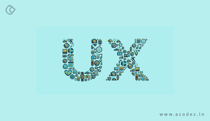
It is important to understand that icons have the power to make your design look amazing. You might be aware of how icons can help make words stand out in a situation where words might fail to capture user attention. Check this article on web icon fonts.
When you start to work on designing icons from scratch, most of the times, we have a tendency to use icons that have already been designed and developed by someone else. But here, it is important to think why you need this icon.
There are various reasons for using and developing an icon. Some might be to get rid of language barriers or any other association. Most of the times, it is the appearance of the icon that matters. When you think of it in terms of user experience, you will be able to come up with an amazing set of screens for your app or your website.
Here one of the most important points to remember is how well your user is able to understand what this icon is for. If that is achieved, then this whole thing is a success.
-
Understanding Your User

As we discussed, your success lies in the hands of your users. If you know them well and what you are doing for them, then everything will be in place. For this, it is important to have a clear idea of how they are going to interpret the icons. Icons come in different shapes and sizes. Some are really attractive to the eye, while some are not. Here are some of the most important rules to follow when you design icons:
- Start with your research: When you research well, you will have a great idea on who the target audience is. Then, you will get a clear picture of what they are thinking and how they operate. It is better to never make any assumptions. You can start by creating a survey, then having a conversation, and finally finding out what they need.
- Language: Based on the scale of your work, your icon or icon groups or the words to be etched on the message would be determined. In case you are designing for a country, then the wording needs to be obviously friendlier. But icons are not restricted to such barriers, as these can be easily interpreted across the globe – these speak a language known to all.
- Regions: When it comes to signs and symbols, based on the region and culture, there might be barriers to people following what an icon is trying to dictate. Different symbols carry different meanings across different areas of the world. This needs to be kept in mind when you design an icon.
- Instinct: When it comes to icons, do not give your users a space to think about what has to be done, but rather let them act upon it as and what their instinct says. It is important that you provide your users with a path of less resistance across an app or website, which would require no actual thought into the action that they take.
-
Planning and Strategizing
Sometimes, we are lazy and we have this habit of pushing things to a later date. However, it is always a good idea to start working on your designs at an early stage. At least, start sketching at the earliest when you plan to develop the icons.
This will give you ample time to design by strategizing and planning well. It is important to start with the hierarchy, this involves starting with ensuring the importance of each icon and organizing them in order. Next, it would be important to decide how often would you be using these icons.
Then, their location within a page and last but not least, it is important to contemplate over whether this is needed or not. Research is the most important strategy that you need to include. It is important to have a clear idea of the most common themes of the icon association along with the related trends. When you are done with all this, you can take your icons into the digital one and use the grid method to design them to start reaping the benefits instantly.
-
Collection of Icons
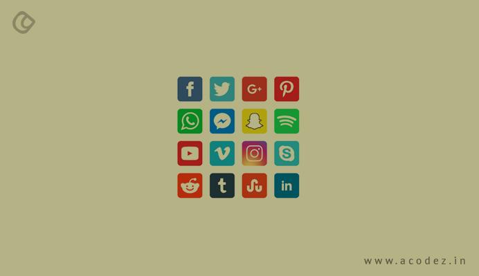
One of the most important things to consider when designing icons is a collection of icons. Uniformity and consistency are two factors that you need to take into consideration when designing these icons. It should look like each of them come from the same family. When you integrate these icons with the style of your business, it should be capable of radiating the brand’s message with ease.
The success of an icon emerges when the icons are matched to the UI design as well as other graphics. Researches say that icon design impacts the decision of the user to make a purchase. This means the family of icons is really important when it comes to choosing the perfect design for one. To drive use attention, it is important that your icons are ready and well-prepared to exhibit the high-level of uniqueness that is expected.
Instagram has its own radiant family of icons that is all set to match the needs of the target audiences.
-
Screen Size

When you design an icon, it would be viewed across all kinds of screens, of which the large screen would be the most frequently used one. You can enhance the graphic using a stunning piece adding amazing details to it. In case, you are adding detail to a graphic, it would be an interesting approach, but when it comes to icons, you need to rethink when adopting such an approach.
The icons all get scrambled a size that is quarter than that of a thumbnail – which means the detailing that you added might not be uniquely visible. You should make your design stand out – focusing on clarity and understanding – a symbol that would not require any wording but can rather communicate complex wordings with ease.
You need not put a lot of design details into icons – keep the details short and simple – it helps often. So when it gets scrambled, the message would be clearly delivered to the right audience.
Here, you also need to consider the file type. These days, PNGs and JPEGs are considered to be outdated, moreover, SVGs and icon fonts are highly popular as these do not become pixelated when the size is minimized.
-
Where Do You Place Your Icons?
It is highly important to choose the positioning of your icons because people have already seen specific icons placed in certain positions. So when you go and change the position, there are chances that they get confused as to what is happening. Another factor is bad UX. You are placing these icons to improve the branding of your company. Icons are most likely to look good when they are placed in the home point. Check out the UX Design Tips.
It is also important to take note of the shadow factor as well as the depth of field factor when designing icons along with their dimensions. These all have an important role to play in the UI hierarchy of any design.
-
Why Not Go With an Old One?
You can always choose an existing one for your design. A number of families of icons are available – both paid and free. Choose the one that suits your requirements or based on the client’s needs. But this should be based on the size and needs of the business.
For someone who would want to do business globally, it would be great to choose an icon family that sets them apart from competitors. You can start by personalizing existing works.
-
Do Not Mess Up Things
When you are designing icons, it is always good if you do not mess up with the existing company icons. Sometimes, people happen to mix up own logo icons by combining other social media icons into one, which ultimately becomes a mess.
-
Grids

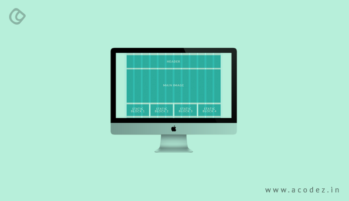
Consistency is one of the main aspects of designing an icon. Do not design all your icons on a blank page. You can attain consistency by designing icons within a grid.
A number of designers are providing icon design services these days.
Acodez is a web development and web design company in India, offering web design and development services at affordable prices. We are also a digital marketing agency offering inbound marketing solutions, SEO services to help take your business to the next level. For more information, please contact us today.
Looking for a good team
for your next project?
Contact us and we'll give you a preliminary free consultation
on the web & mobile strategy that'd suit your needs best.


