Have you ever visited a service provider and had the feeling that they cannot cater to what you need? They could be missing the size, color, or infrastructure you need, or use a language you do not understand.
Did you feel inclined to make a purchase?
Exactly, While the use of inclusive designs is not new, it has grown tremendously in the recent past. Professionals across all industries are increasingly creating products, services, and experiences that are truly inclusive.
Inclusive design is a concept that recognizes the many different needs of people and accommodates them in ways that are practical and workable.
It is about more than just making products or spaces accessible for everyone, but also creating an experience that can be enjoyed by all.
Inclusive design is a philosophy that considers the needs of all users in the process of designing products, services, and environments and helps create systems that are inclusive by nature.
The 7 Principles of Inclusive Design are Universal Design, Affordability, Accessibility, Flexibility, Customizability, Durability, and Low-Tech Solutions.
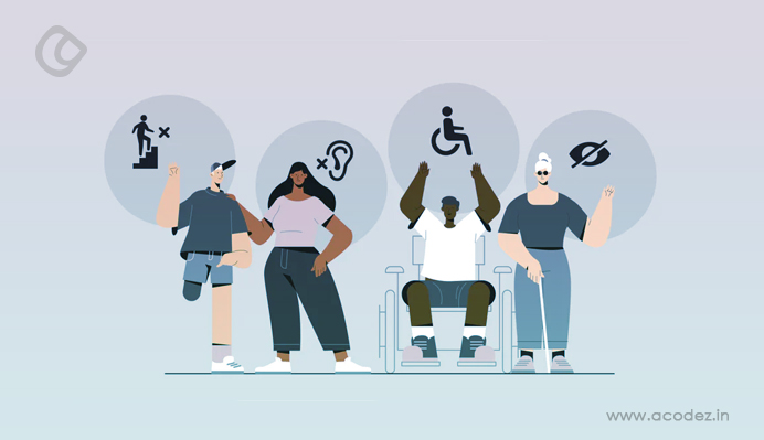
An inclusive design can be used by people of differing abilities, diversities, and perspectives. Creating such a design requires one to understand human diversity and their common pain points.
It involves interactions with a wide range of human diversity so as to craft something that caters to these varying needs. It is as creative a process as it is challenging.
Inclusive designs can be physical, which allows access for everyone including those who are physically challenged. The designs can also be in the corporate or digital environments when information is accessible to all.
The Paciello Group has been credited with creating the 7 principles of inclusive design.
These principles help industries to create environments, products, and services that can be used by as many people as possible without adaptation. Inclusive designs are also be referred to as universal designs.
Principle 1: Comparable Experiences
This principle states that the company should provide comparable experiences to all people.
This means that everyone should be able to use the product or service or experience to achieve intended results in a way that suits them. All this without undermining the quality of what they are getting.
It is understood that human beings are extremely diverse. This means that they’d have diverse opinions, approaches to solving issues, and choices that may not always be similar.
As such, the product, service, or experience should offer comparable efficiency, quality, and value.
For example, if a company releases a newsletter to its customers, it should provide a range of alternatives.
This means that it could give audio of the information contained therein, sign language if there is a video in it, and a transcript. The information in the audio, sign language, and transcript should be the same or bear the same message.
When it comes to ergonomic features, something like closed captions makes a video accessible. The captions should be synchronized with the video.
The features can also allow customization such as color-coding. It is also essential that ergonomic features can be repositioned to make them comfortable for all.
Principle 2: The Situation
Companies should always consider the different situations human beings can be in when using their product. The product or service should still give the intended value to the user regardless of the circumstance they are in.
The truth is that there are different classes of people who will use your product or engage your service.
This wide range of users includes experienced users, first-time users, and even users under pressure. It could also include users with disabilities.
The specific situation that a user is in can easily affect how they interact with what you are offering.
As such, the product or service should be designed in a way that makes it easy for everyone to use it as intended and still get the results needed.
If you are providing video content that is likely to be consumed on the go, you can provide alternatives.
For example, you can make it automatic that when the sound is switched off, closed captions appear on the screen. This ensures that the user still understands what’s going on in the video despite having it on mute.
Simply put, companies should be consistent in the application of familiar conventions. This means that they can use well-established patterns in their products, services, or experiences.
It means that the people who use that product or service should be able to do so, again and again, the same way over time and still get the intended value.
This also advocates for consistency in design patterns, labeling, text alternatives, language, formats, etc. If thinking about creating a website, its architecture should be consistent across the pages.
Principle 4: Control
The company should ensure that its patrons are in control. This means that the patrons should be able to access what they need and interact with the product in a manner that pleases them.
For example, products such as browsers allow users to customize the theme, colors, and sizes, etc. of their platform.
Similarly, the user experience should be enhanced such that the person is in control and can set their preferences.
Most mobile devices with a touch option have a pinch-to-zoom feature. This allows users to simply pinch on the screen to zoom out or in according to their preference.
The zoom function keeps the integrity of the object of focus and doesn’t distort it based on this gesture.
While the infinite scrolling feature is so handy on mobile devices, it can be a nuisance to anyone using a keyboard to navigate.
This is because the constant stream of new content hinders their progress. Therefore, keyboard users can have the “See More” feature instead of the infinite scroll feature. This allows them to control what they want to see.
Give consumers the ability to choose between different options when it comes to completing tasks. This is especially so when dealing with non-standard or complex tasks.
There are often many ways of completing a task. As such, there always have to be alternatives for task completion.
One cannot assume to know anyone’s preferred way of accomplishing a goal. The alternatives should give room for people’s preferences and circumstances.
Mobile phones give plenty of choices to consumers. For example, one can delete an undesirable piece of content with one swipe.
In other circumstances, the consumer can click on the edit button then select what they’d like to delete. iOS mail has such choices.
There are varied ways of presenting data to users. For example, the data can be presented in tables, infographics, charts, graphs, etc. during the data transformation process.
This representation covers the preferences of most data users. Additionally, it is more useful to many compared to presenting it in one chunk of content.
Principle 6: Content Priority
The content and its layout should prioritize the core information, features, and tasks. There are cases where users have found it difficult to understand what an interface is all about.
This is because the vital information is not clearly communicated from the onset.
The truth is that an application may have to provide a lot of information about its functionality. However, since people can only focus on one thing at a time, it is best to communicate the core functions first.
Once that is communicated, the features can be explained followed by general content on other functionalities.
For example, an email platform’s function is to read incoming emails and to send out emails. As such, you will find that the compose button is visible at all times, especially when using one of the main mail platforms. Additionally, the inbox list is prioritized over other folders.
Other features that are secondary to the platform’s use such as the spam folder or how to tag folders are not prominently displayed as they are not core functions.
However, these can still be accessed when the user wants to explore at their preferred time.
Principle 7: Value Addition
What is the value of the product’s features? How do these features help in improving the user experience for the diverse audience?
Every feature of a product or service should enhance the user experience by giving alternative ways to interact with what is on offer.
Features such as camera, geolocation, voice assist, or vibration APIs are often integrated with devices to enhance user experience.
Something like the vibration API makes it easier for the hearing impaired to know when a notification comes in on their mobile device. Geolocation API enhances the experience for those with mobility impairment.
Voice commands help users to control the output of a device such as a TV. This enhances the user experience for people who struggle with the TV’s interface.
Features such as “Show Password” make it easier for users to verify the information that they have input. This eliminates instances of passwords typed in error and the user doesn’t know what was typed in error.
Other features such as security questions or touch identification help users to access password-protected features even if they cannot remember their password.
It is essential for teams to integrate the principles of inclusive design right from the beginning.
This allows the stakeholders to understand who they are making the product for and how the intended audience will use the product.
The team can write down the different personas and their user stories and conduct research.
Armed with research, teams can build prototypes that support the various needs of the consumers of their product. It is no longer just about compliance with set standards; it is about making products accessible and usable by everyone.
Acodez IT Solutions is a web design company in India offering all kinds of web design solutions ranging from carousel sites to the ultra-modern sites that only a few of the multi giants have got. We are also an SEO agency based in India offering all kinds of SEO and inbound marketing solutions to our clients. For more details, you can visit our website or contact us.
Looking for a good team
for your next project?
Contact us and we'll give you a preliminary free consultation on the web & mobile strategy that'd suit your needs best.
Rajeesh P.K. is the Director and Creative Head at Acodez . With an experience of 10+ years in UX Design & User Interface Design, when coupled with his expert coding skills in HTML5, CSS3 makes him one of the top UX Architects in India, with more than 15 international awards to his credit.