Humans process information seen on computer screens and electronic gadgets differently. The advancement in technology demands that designers adapt to the change by arranging the visual content clearly.
Every element incorporated in web designs should contribute to a better user experience while conveying the desired message crafted by content creators.
With the average human attention span being as low as 8 seconds, designers must invest in the proper visual hierarchy to ensure the success of their design elements.
In this article, you will learn what visual hierarchy is, why it is important, and 8 visual hierarchy principles for designers.
Visual hierarchy entails arranging and presenting design elements in the order of their importance. This practice influences how humans perceive the information and visuals displayed.
For instance, in digital business cards, the most prominent visual element is the name of the organisation, which is followed by the card holder’s name, job title, and contacts.
Visual hierarchy is a system for prioritizing elements on a page to make them easily understandable.
In many cultures, reading visual information works the same, whereby text is read from top to bottom and left to right.
However, there are slight differences in how people process visual information, mainly the F and Z patterns.
Designers use these elements to establish a visual flow. They evaluate where the viewer’s eyes will go initially (the focal point), the second place they will go, and where the viewer’s eyes will finally end up.
What is the Importance of Visual Hierarchy in UX Design?
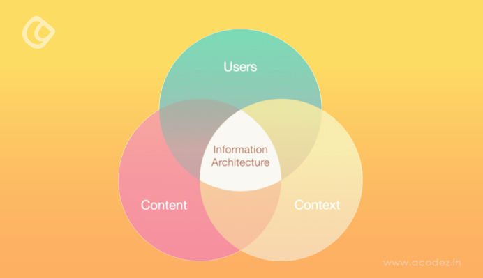
Information architecture (IA) connects the users with context and content.
The visual characteristics help designers and content creators establish the focal point. The entry point gives viewers a place to start when navigating your design as it directs them to the place with the most important information.
Visual hierarchy helps designers plan their information architecture (art and science of labeling and organizing digital media content), enabling users to navigate the page content more easily.
This technique can significantly lower the effort you need to engage with your product. UX designers use visual hierarchy to remove the friction in your web pages, enhancing your product’s visibility and usability.
Indeed, visual hierarchy controls how viewers perceive the user experience as it gives a clear structure in your page layout, making it easier to figure out where to look for information on a page.
With this knowledge in mind, let’s dive into the principles applied in visual hierarchy and how they influence how viewers navigate your content.
Many people will scan your page to determine if they are interested in the content before diving in to read or view the details. The scanning patterns take either the ‘F’ or ‘Z’ pattern.
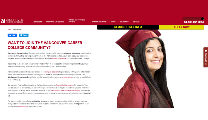
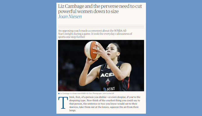
F patterns are used in text-heavy designs like blog posts and articles, whereby the visual information takes the shape of the ‘F’, and viewers read text from the top left and move horizontally towards the top right.
F-shape pattern viewers then scan down the left-hand-side of the content to look for either subheadings or short headlines with interesting keywords. The next step would be to read the text of interest from left to right, in an ‘F-shaped’ version.
Designers and marketers can use the insights to align their important information towards the left-hand-side of the page using attention-grabbing elements like short, bolded headlines and bullet points.
Vancouver Career College uses the F-shape pattern on their homepage, enabling potential students to easily scan through and learn more about the college, as well as sign up.
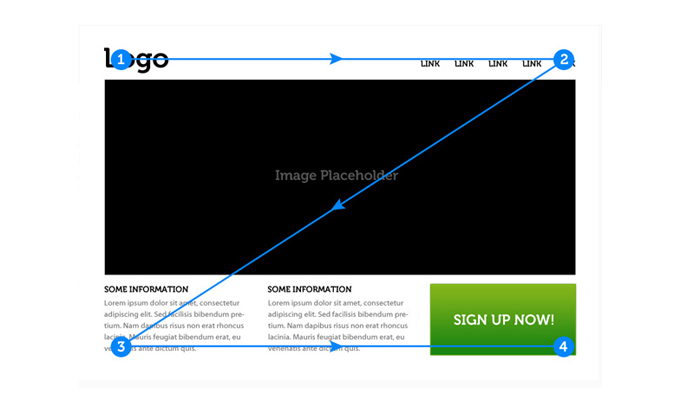
On the other hand, dense Z-shape patterns in ads and websites have viewers scanning text for important information, starting from the top left towards the top right. They then move downwards and backwards towards the lower-left corner of the page, and finally across to the right-hand-side.
Designers adhering to this user behavior place the most information details regarding a page in the corners and connect the top and button headlines in a diagonal pattern.
alsoRead
Cognitive psychology for UX
Size and scale for better focus
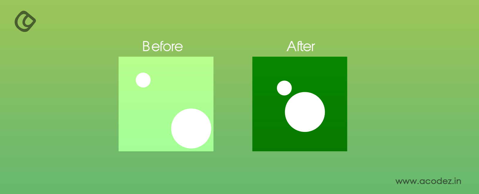
Viewers will perceive your visual elements differently depending on the size used. Elements and areas with a larger scale, for instance, can attract more attention from viewers than those with smaller fonts.
People tend to read content with bigger fonts first, and placing such text from the left towards the right-hand-side of the page will give your brand more engagement and reaction.
Sizing does not have to apply to everything on the page, but you should decide which elements are most important and decrease the font for the rest.
Newspapers use this tactic, whereby headlines have larger fonts, helping to draw attention to major stories.
Erin Lancaster also uses a similar approach, with upsized design elements for the most important information and less-visible text for elements lower in the visual hierarchy.
The larger the element, the more likely that viewers will see it first, followed by medium-sized and finally, small-sized text and visuals.
Color and contrast for visibility
Colors, especially bright ones, give the existing elements in your design more weight.
Designers use brighter colors to grab the viewers’ attention. High contrast colors also give the content more appeal and importance, as they make the content appear closer.
You can apply color and contrast in your designs in a number of ways:
Temperature
Green and blue are cool colors, red, orange, and yellow are warm, and white, black, gray, and brown are neutral.
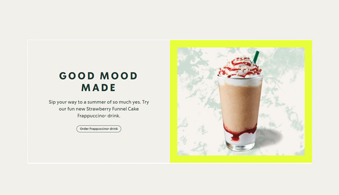
Bright colors with high contrast will appear closer when displayed on a darker background. To avoid overcrowding your pages with many colors, use one bright color to highlight your focal point.
You can also use one color temperature to unify your designs instead of creating emphasis, which still works well in driving viewers’ attention.
Many brands use colors and contrast in their CTA buttons, prompting page visitors to pay more attention to the most visible elements.
Value
How light or dark a color is referred to as value. You can contrast colors of different values against each other to derive the desired effect.
Colors with the same value will give your content a more visual appeal, such as mixing light blue hues with dark blue text.
Saturation
Saturated colors come in their purest form, and you can contrast bright pure colors with muted, dark versions to create a nice contrast that draws the attention of your page visitors.
When you play around with saturation, you will also be contrasting warm and neutral visuals.
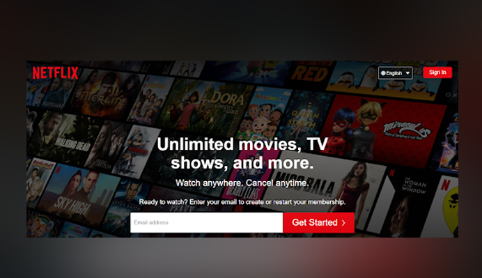
Netflix uses bright red colors contrasted on a dark background, which creates the desired perception and action from viewers.
Netflix red CTA’s on a dark background – Image Credit: Netflix.com
Mobile app designers leverage the use of colors, contrast, and tints because such backgrounds have limited space to apply other visual hierarchy elements like broad spacing and size differentiation.
Typography hierarchy is a must-have component for designers as it helps you structure your content into headlines, subheadlines, and body.
You can apply the three-level approach to your preferred designs, including on mobile pages, websites, or even business cards.
Level-one typography (headings) carries the most important content to be presented on your page. Ensure to make this typographic element very visible.
Level-two elements (subheadings) will help you align your design according to sections or groups of related content. Note that the subheadings should not be as visible as the headings, but they should still help your page viewers see the different parts in the page, as well as scan them with ease.
Level three carries the body of your design – it carries the complete message and design details that you want your page viewers or site visitors to see and interact with.
Whether level three is short like in product guides and short notes, or long like in the case for long-form articles, the typography should be highly readable by your audience because the text is likely to be small relative to the other levels.
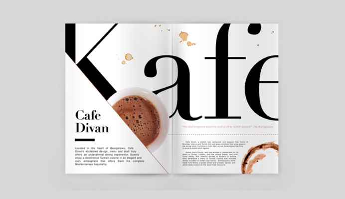
Starbucks’ product pages are layered into three levels with the call to action (CTA) button at level three, but still visible enough as to create the intended attention.
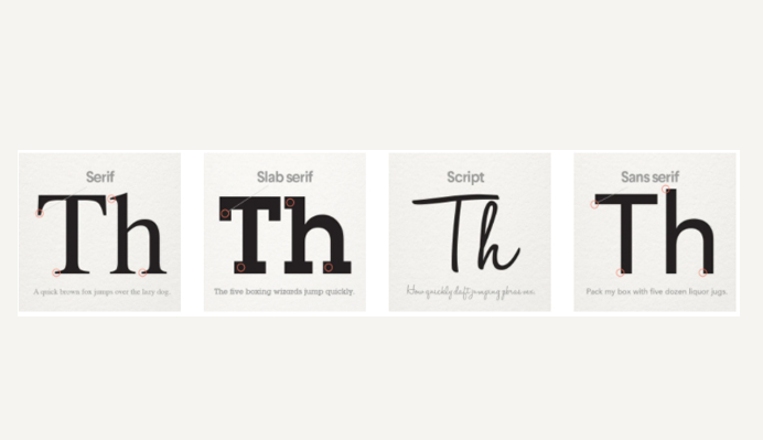
Typeface is all about the look of your fonts in design. How well you select and use your typeface will determine the impression it will create on page visitors.
Typography will make your designs appear more organized and easy to navigate, while typeface will give the content a more lively personality and mood, while creating emphasis on your focal points.
Some of the elements to consider in typeface selection are weight, such as the width of strokes in letters, style, and category. Style can be bold, italic, small caps etc., while categories can be decorative, script, serif, or sans-serif.
You can also modify your designs using italicization, but keep in mind that the type of word placement can work for or against you. A mixture of typeface elements, in terms of weight, style, category, and arrangement across the text will produce a more dynamic and less monotonous experience for your viewers.
Futura is a common typeface used by companies like Swissair and FedEx, giving the brands a modern yet friendly visual appeal.
Use typeface qualities strategically and appropriately to enhance the visual hierarchy of your designs.
Space and texture
You can draw even more attention by giving your designs enough negative space, such as around the CTA buttons.
Texture in visual hierarchy refers to the pattern or arrangement of text, space, or other elements within a page.
For instance, you can align some words or images with rectangles to give them more importance even when they look smaller than the level-one elements. You can also scribble over seemingly high-ranking text to give it less emphasis compared to other text.
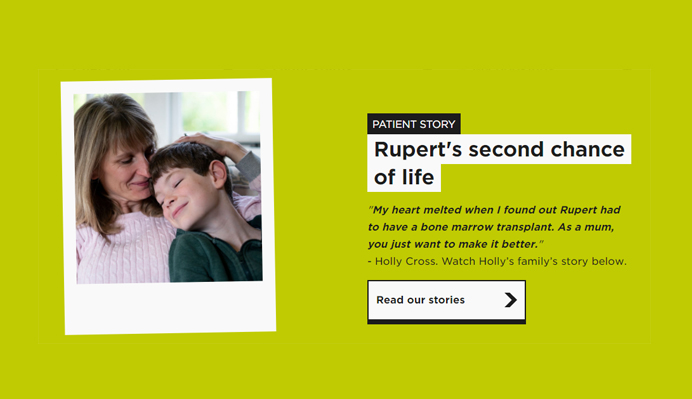
Anthony Nolan’s website helps cancer patients get the necessary support and attention, and to do so, the page uses adequate white space to highlight the most important messages.
Space gives your design layout more balance, flow, and focus as there is less jumbled and confusing context.
It is a great way to organize and separate your design elements, making them look well balanced and orderly, while giving your views a place to rest before scanning more content on the page.
Use space, texture, colors, and highly visible backgrounds to direct attention towards the focal points in your product and home pages.
While most page layouts are designed to display text and images in vertical and horizontal lines, you can break the grid to create a more attractive visual hierarchy.
For instance, you can arrange the focal text in a diagonal direction or curved pattern, making it stand out from the rest of the content.
You can also use guides and grids to arrange the layout of your design, enabling site visitors to follow a simple pattern that does not disrupt them as they view the page.
A good alignment will ensure all the elements in your design are clean and well organized. At the same time, you can alter the direction of the most important elements in the design to give them more focus.
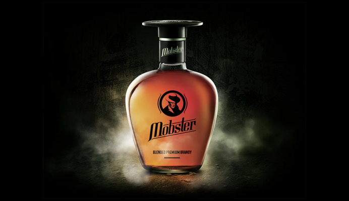
The Mobster-Brandy design below carries multiple elements of size and scale, color and contrast, typography, typeface, space and texture, direction and layout, and even space and texture.
You are allowed to combine other relevant elements like space and texture to direct viewers to the focal points in your design, while maintaining the flow and simplicity.
Composition and structure
Designers are now moving from simple designs to an organized structure, also known as composition.
While these elements have been here for centuries, not everyone has been applying them, yet, they can give your designs the desired visual hierarchy.
Let’s have a look at the three most common compositional techniques in use today:
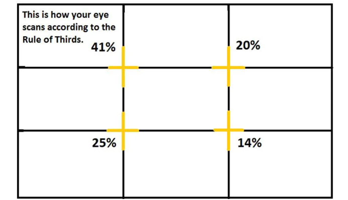
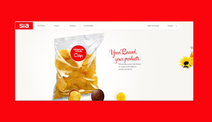
The rule of thirds
The rule of thirds enables you to direct attention to a focal point placed elsewhere on the page, other than the center.
According to the rule, you should divide your page into a grid containing three vertical and horizontal lines placed in equal proportions to each other. The focal point should then fall either on the lines or at their intersection.
The target should be to place your image on the top-left intersection as it is considered the sweet spot.
Application of the rule of thirds in design – Interaction-design.orgSia’s application of the rule of thirds in homepage design – Image Credit: Siaperitivos.com
Placing an image at the bottom-left intersection will also direct page viewers’ attention to the most important message on your page, deriving high engagement and conversions.
The rule of odds
The rule of odds is also a common visual hierarchy principle, whereby designers combine an odd number of images to attract high viewer page viewership.
To gain the most from this concept, ensure that you surround an object with two or four other images to make the total number of images in the structure an odd figure.
The two or four objects on the outside will help balance the focal point, creating a neutral, simple balance.
The rule of odds is common in logo designs, wherein many compositions surround an image with two other objects.
The rule of odds in design – Image Credit: 99designs.com
This tactic makes the visual images more interesting and pleasing to your page visitors.
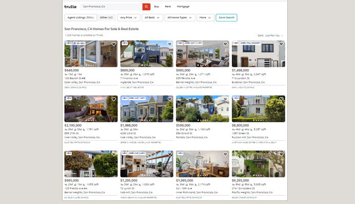
Implied movement
This tactic helps in directing page viewers to the most important information on the page, through a path in design.
The best approach for implementing implied movement is the use of leading lines in the form of shapes, objects, interaction of white and black space, or other elements which can form a visible or imaginary sense of direction.
The leading lines can be vertical, horizontal, or diagonal, or they can take z- or s-shapes.
Trulia lists properties horizontally, but it still establishes a direction that leads customers to scan the list vertically.
Trulia’s vertical and horizontal page layout with implied movement – Trulia.com
You can also use the z-shaped format, for instance, to emphasize the left-to-right reading pattern.
The composition and structure you choose will help improve interactions with page viewers, creating more engagement and sales conversions.
Visual hierarchy is a technique for arranging and presenting design elements in the order of their importance. It helps designers prioritize elements on a page, making them more visible and understandable.
Visual hierarchy is crucial in design because it helps designers and content creators establish the focal point, as well as plan their information architecture for improved user experience in-page navigation.
The tactic can significantly improve user experience, product visibility and usability, and conversions. Designers use visual hierarchy principles to ensure mobile and web pages have the best appearance.
The main principles include reading and viewing patterns, size and scale for better focus, color and contrast for visibility, typography hierarchy, typeface selection, space and texture, direction and layout, and composition and structure. You can combine two or more of these elements to direct user attention and drive engagement.
Acodez is a renowned web development company and web application developmentcompany in India. We offer all kinds of web design and Mobile app development services to our clients using the latest technologies. We are also a leading digital marketing company providing SEO, SMM, SEM, Inbound marketing services, etc at affordable prices. For further information, please contact us.
Looking for a good team
for your next project?
Contact us and we'll give you a preliminary free consultation on the web & mobile strategy that'd suit your needs best.
Rajeesh P.K. is the Director and Creative Head at Acodez . With an experience of 10+ years in UX Design & User Interface Design, when coupled with his expert coding skills in HTML5, CSS3 makes him one of the top UX Architects in India, with more than 15 international awards to his credit.

