We have had an opportunity to design a poster or flier for one or the other purpose. In fact, it becomes a part of your design career once you walk into it. Sometimes, it might be for a client, or if you are working as a freelancer, it might be to do some self-promotions. The best thing is to use posters to showcase and convey a message. Also, here you get an opportunity to display your skills at designing.
When designing a poster, regardless of whether it is part of a web design strategy or as part of promotional material, it is important to decide how the elements are organized across it. The most important elements should reach the eye first before any other element of lesser importance reaches the brain and is processed. This hierarchy will be discussed in detail as we take you on a tour of some of the poster design ideas to consider when creating posters.. There would be a lot of elements that you need to take into consideration, including fonts, images, icons, colors, and even shapes.
If you do not have a clear picture of how this hierarchy works, you will end up making a mess out of the lot. Our most important objective is to get the message clearly across to the right audience – this happens only when you are able to understand which elements matter most to them and why these are important to them. You need a common canvas to start designing your posters. The common sizes of a poster are 8.5 by 11-inch letter, 11 by 17 inches and when it comes to 22, it would be 34 inches.
When it comes to bigger posters, the sizes would vary from 34 inches to 36 inches depending upon the type of elements you wish to include in it. Usually, posters are preferred to be designed with a vertical orientation, though both horizontal and vertical orientations can be used – there is no fixed rule for these. Now, allow us to take you through some of the most important poster design rules that need to be taken into consideration when designing your poster.
Clear, Legible and Crisp Readability
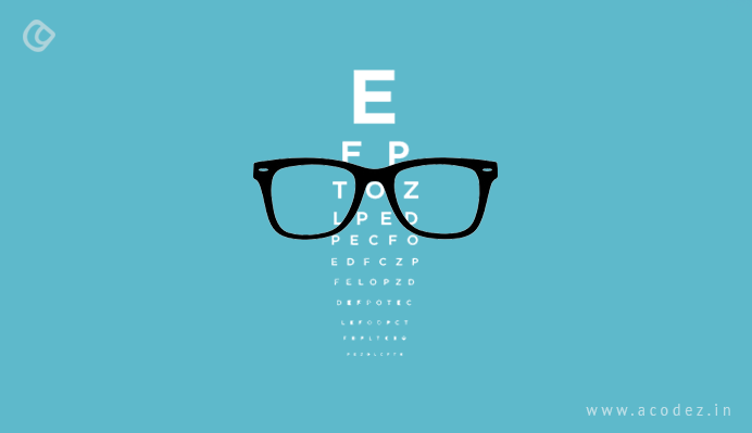
This one is an important aspect of any design, including web designs and website redesigns. The main intention of using posters is to attract the reader’s eye to some important event that might take place in a few days’ time. Your focus should be on ensuring that the crucial information is legible to readers from a long distance to draw people’s attention from a long distance.
So text within a poster can be divided into three important layers, including:
Headline: The foremost and most important element of any design is its headline. You have the liberty to add an art element to it or make it a part of the art element. It is ideal to choose a typeface that would be legible and automatically attracts user attention.
Next content: When it comes to the main content, all you have to do is think about what is happening, when is it happening and where is it happening. The next level of your text should apparently be the answer to these questions. Do not overwrite a lot of information, but make sure all the important details are included in it.
When it comes to sizing, you have two options: you can choose a size that is half that of the main headline or you can use the larger size and maybe a contrasting color for this part of the text.
The finest print: Explanation in detail – usually seen on posters that are used for movie promotions. Keep it small and in a way that it won’t drive a lot of attention because other parts of the content need attention.
Drawing a Line Between the Elements Through Contrast
You do not have much time to draw the user’s attention just like in the case of web designs. So when it comes to poster designs, you have hardly the time of a glance. When you maintain a high contrast amid the elements, you can actually draw the user’s attention. Unlike web designs, where depending upon the audiences, you are told to use lighter colors or monotone color palette, it would be great to choose bold colors and typefaces. You can experiment a lot with color palettes and typefaces when it comes to poster designs unlike in the regular web designs where you have limited choices.
The background color matters along with the color of your typefaces. White backgrounds are a general and commonly used option for canvases. But there are a lot of bold colors that you can experiment with when it comes to poster designs.
3. Size Matters
It is important to consider where you are going to have your poster displayed. This can impact a number of factors, including the poster’s size, the visual elements that would be used within it without creating too much chaos. All you want is to draw your people’s attention to the call to action.
When you have a clear picture of where your design will be used, you would be able to make better choices on how and what should be included when creating it. The visual contrast matters not only as an external factor but also as an internal factor as well. The place where it would be displayed should add contrast to it which would enhance its features.
4. Start With a Demo or a Miniature Version of the Main Product
Print projects always do well when we start with miniature versions and this applies in the case of your poster designs as well. Taking a person through something any number of times is the best principle of marketing. With more than one poster version, you can accomplish this.
For instance, scaling down an image that can be shared on social media would be good to start with. Postcard versions that are of letter sizes will do great as hand-outs. You could also plan a poster version of your website’s landing page. This can be emailed to your potential prospects.
5. Enlarged Visuals – But Keeping These to Minimal is the Key
Regardless of whether you choose to include a photo, illustration or text, choosing a dominant image is always the key. It would be ideal if as discussed earlier, this is legible from a long distance. When it comes to designing posters, it is important to get close-ups of crop faces or elements, single item illustrations, typography, etc.
Once you decide on which visual you would be choosing, next we need to think about element layering. Next, it is important to ensure that the types and images are in contrast with one another and can be independently read through.
6. Space Doesn’t Matter Unlike in Web
It is good to have a lot of space between the elements when you are designing posters. It might look a little weird because unlike your web designs, where you don’t have such liberty, you have a lot of space to do whatever you wish here. In some cases, extra spaces might create great wonders in poster designs, for instance between individual letters, between text or lines of text, around interior margins of your canvas and even between different element types, such as text and images.
Start by asking what do you want your people to notice first in your design.
7. Including Call to Action
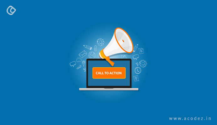
We want people to look at something important. We really want them to notice this. And here, we are mostly looking to invite someone to an event, such as a concert or maybe a movie. This is where a call to action becomes the most important part. Think of it in terms of designing a call to action for your web design. Enhance this by using the best QR code generator, allowing viewers to quickly scan and access event details or promotions. This deserves the same kind of priority as in your web design’s call to actions. Unlike in web designs, where a simple call to action can do magic, with posters, you need to be more specific, providing event information or a contact point where they can find further information.
This starts with you having a clear picture of what your users are supposed to do when they see the call to action.
8. Hierarchy and its Flow
Like we discussed earlier, there is a particular law for how the hierarchy flows in. There is a specific book of law for the hierarchy thing. But you would find that most of the best posters always think of out-of-the-box ideas rather than following the tried-and-proven techniques. It is important to have a clear understanding of where you want your users’ attention to be driven to. What you want them to notice first when they are on your poster. Which would be the most eye-catching element? Whether it would blend with the context of the poster. Where would be it located? Is it clear?
Once you have answers to all these questions, it would be easier to direct the eye in the direction of what they want.
Usually, the human eye has a tendency to move from top to bottom and left to right. You can design your poster in such a way that resembles a book, where the eye moves from left to right and top to bottom.
These are some of the best ideas for designing eye-catching poster designs. Do you have better ideas? We would love to hear from you.
Acodez is one of the leading web design company in India offering all kinds of web design and development solutions at affordable prices. We are also an SEO agency offering inbound marketing solutions to help take your business to the next level. For further information, contact us today.
Looking for a good team
for your next project?
Contact us and we'll give you a preliminary free consultation
on the web & mobile strategy that'd suit your needs best.