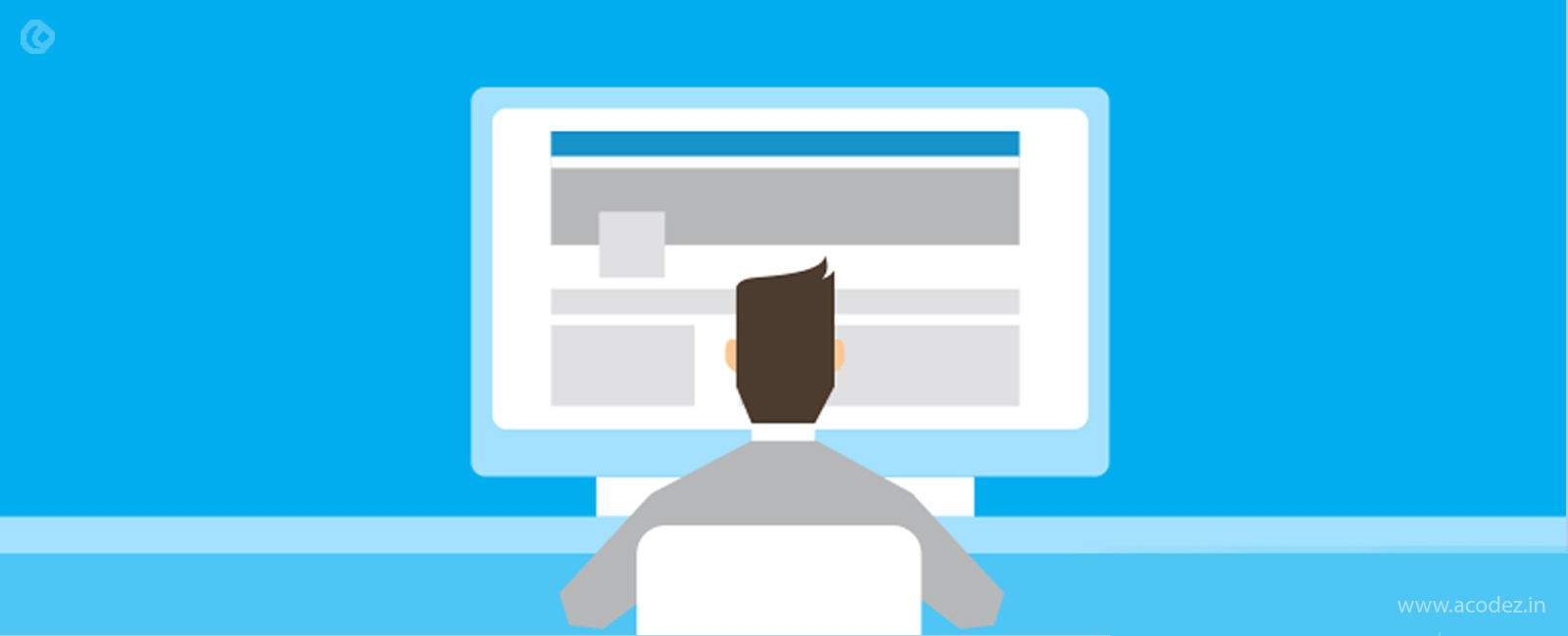
If you take a look at the websites over the web, you will find that there exists a standard factor common to all these. The design appears same in each of the websites that you happen to crawl over.
Have you ever wondered why is it so?
With the emergence of the Grid, there seems to be a universal standard according to which our designers are designing the websites. Moreover, these sites do not have a soul.
Do you think people will like it if you have a site that is more or less similar to your competitor’s site?
Visitors will stop coming to your site, and the result is you have lesser traffic, leading to poor performance.
But, do not worry! Just a few tweaks and we shall get it fixed.
Ever wondered what you could do to improvise the grid grilled websites that you design?
12 Simple Tweaks and you have an awesome website!
Here, we have come up with a few tips that usually our designing team at Acodez IT Solutions implement to make our websites beautiful, aesthetic and professional:
1. Keep what is needed (Dispose of the rest)
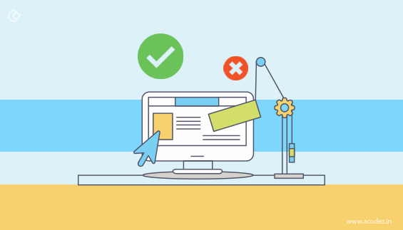
When we ask you to keep what is required, you are probably thinking who would like to focus on embedding in components that are unnecessary?
We know that there are ample of things that we might not need as the design flow proceeds, but intentionally or not we miss to eliminate these.
And, we are quite sure that we have not added even a single component that would be wasted and being a designer we have committed our first mistake in designing.
So, what can you do?
Good question! As a viewer think of all the things that you would want to appear on your website and forget the rest.
Let’s keep what is necessary and never bring in what is not needed!
Did someone ever tell you that only 20% of the things that are on your site helps to generate 80% of the revenue?
So, focus on making this 20% of the viewable part visibly the best.
People are looking for a reason to deviate from your site.
Sometimes you might have observed even though your customers are almost through adding the things in the cart and clicking through to make the payment, they just back out.
So, the process is too hard!
It is nothing but content. What kind of content?
It could be anything and everything on your website including the copy, social media proofs, customer reviews, testimonials, call-to-action buttons or sign up forms and more.
On each of the pages of your website, you can find elements that include a lot of visitor engagement.
Focus on these and avoid the rest. Often, this is referred to as the 80-20 rule. Now you know how you can utilize the 20% to get 80% of your profit from it.
Working smart is more important than working hard. A lot of hard work is involved when you are designing a lot of components which might not be necessary.
2. Helping you rid these unnecessary elements
We already told you that you need not keep up those elements which seem to be unnecessary and not in synch with the requirements of your business and customers.
So, now you have to get rid of those 80% elements that spoil the 20% chance of your business in acquiring new customers.
You have already identified 20% of the site’s components that will drive you more than 80% of the desired results. So, what’s the deal!
Identify them.
It could be anything starting from the sidebar elements to links in the footer including the social media sharing widgets.
There are a lot of unnecessary things on your website that are toxic to its health.
Eliminate these first!
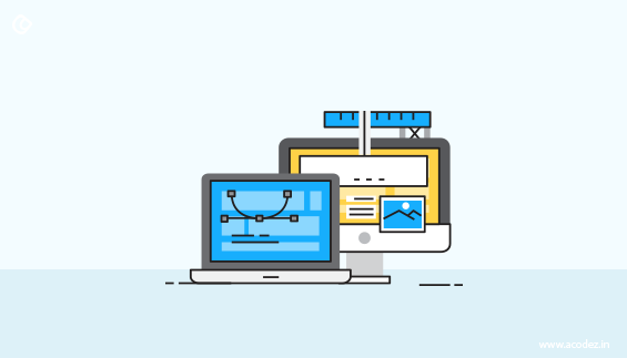
3. Whitespace
We have already discussed how removing the additional and unwanted crap from your website actually helps in attracting customer attention.
So, what remains when you cut off all the clutter?
Obviously, it’s the whitespace!
Now, you already have some whitespace on your web site that makes it look cleaner.
Apart from this whitespace that emerges out of the clearing of the crap it is imperative that you add some whitespace between the other elements of your website.
Also Read: 5 Simple Tweaks to make your website design interactive
There are those online nerds who are habituated to all kinds of overcrowded layouts of the web; they might find it easy when you have web pages that are overflowing with elements but what about the rest who are new here?
They are more in number and also, a huge part of your target audience. So, let us not frustrate them!
Give them all some space!
4. Where do you put the content?
A lot of speculations have been made till late on where to include the content.
Single page websites and carousels are dominating the trend and we are quite unsure about where to include the content on our web pages.
Now the question is where do you include the content?
Simple, above the fold.
Most of the people read content that lies above the fold, and they do not take the effort to move downwards.
Also, if you have a sign-up form or call-to-action buttons include them above the fold. Because, if people do not read what lies below the fold, then there is no chance that they will find the call-to-actions that you have put up below the fold.
You can minimize the header height if you have a navigation menu and a logo on top of your website.
A simple tweak, go to your stylesheet and edit the value of your header’s height in here.
And, if any of those call-to-actions and sign-up forms look like they are out of place(below the fold), then move it upwards.
Also Read: How to Write Persuasive Call to Action That Make People Click
5. Does your color scheme blend in well with your website?
You are not creating a rainbow out of colors. You are designing a website that is 100% professional and is meant to attract people.
So, be wise when you choose your colors. Of course, your color palette gives you an umpteen number of options when it comes to colors.
But, you can limit your choice of colors. Use a minimum of 2-3 colors for your website so that it looks clean and beautiful.
When you juggle in a lot of colors, your website will lose its shine and beauty, and it will resemble an overpacked unhealthy lunch box.
Why do you want to overcrowd it with colors when it can look beautiful with a few colors.
Also Read: Top Color tips that can help you create an awesome website design
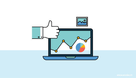
6. The number of pages in your website
How many pages does your website have? We do understand not all websites can be single paged because the business requirements, operations, and functionality all differ.
So, we cannot blame someone if they cannot have a single page website for their business.
As you know, we already discussed in #1 how minimizing the elements on your website could get you 80% of the sales.
So, is the case with minimizing the number of web pages, it helps in generating a better impact. You are not here to put pressure on your people by clicking through the pages.
It is observed that people include About the Site section even though they have an About Us section separately. That would be absurd! Why would someone do that?
Minimize the number of pages as much as possible, because you are not here to annoy your people, but your aim is to make things easy for them.
7. Call to Actions
So, now you have a beautiful and professional website that is cool and attracts more number of website visitors.
But, then, at the end of all, you want them to take the desired action and show you how much they are interested in you.
How do we get them do this?
Of course, they are all impressed and would like to express how much they like and would like to reach you.
They are searching for the Call-to-actions for they owe you this. Help them show courtesy with shining and impressive Call-to-actions that conveys why they have to do this.
8. Have you provided Contact Info?
We are already creating a space where our people are most welcome to interact and communicate with us.
But, there might be answered queries or confusions that stay in their minds and some of which only we can help them sort out.
So, how do you provide them with a channel to reach you out?
Anything starting from and including – your address, phone number, email address and even your social media links – are their point of contact to you.
You can use contact forms wherein they can reach you out with their contact details and queries.
Also, a small tip – provide prompt replies when they reach you. This will help increase their trust in you.
9. Responding to comments
Whenever you provide a space for comments, your people are happy and they express their interest in your business or products by responding here. They either put up comments and sit back expecting you to respond.
Do you respond or just ignore?
If you ignore, then, this is something that you are doing to give them a reason to cross with you.
Start responding to them through your comments immediately.
10. Social Media

One of the channels to connect with your dear people!
They are almost online every time and expecting you to give them some attention. They are actively engaged over these sites.
So, find out what they are discussing and help them out if it is something that you can do.
Stay active over social media. Keep an eye out for what your people are discussing and then, respond. It makes them happy!
11. Updating often
This is something that you could do.
Your people are visiting your website often. So, when they keep on visiting your website every time don’t bore them with the same content.
Keep on updating your website and content with new information.
Give them a reason to update content. Add fresh content every time and keep your people updated every time with new content each time.
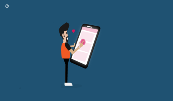
12. Responsiveness
You need make your site not just responsive but mobile-friendly.
As you know people are using a variety of devices to access websites rather than just the desktops.
So, it is important that your website is responsive and can be viewed across any devices of any dimensions.
These are a few tweaks that you could include in your website designs to make it user-friendly. Website design should be something that can speak to your people rather than stare at them as if it has no soul.
Do you think there are more of tweaks that can help in simplifying websites and make these more interactive?
Share your thoughts, comments and suggestions with us.
We are open to your ideas as we believe it would help us in enhancing this article further.
Acodez IT Solutions is a leading web design company in India offering a wide range of web design and development solutions to companies in India and abroad. Through our multiple offices in India, we now offer web development services in Gurgaon, Mumbai and Bangalore. We’re a Google Partner and offer all kinds of digital marketing solutions too.
We know what has to be done to take your business to the next level. Do you have an online business that is struggling to reach its customers?
Then, we can help you. Contact us today for further information.
Looking for a good team
for your next project?
Contact us and we'll give you a preliminary free consultation
on the web & mobile strategy that'd suit your needs best.


Thank you so much for sharing such great information with us, truly appreciated. Can we use push notifications for mobile websites?