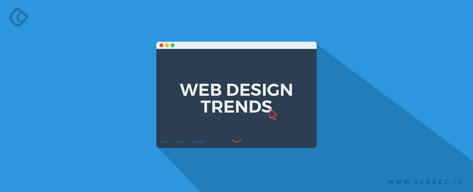
Web design is not a static process, but dynamic in nature – it is ever evolving and will continue to over time. Every year, we witness a number of changes that evolve, while there are also those trends that seem to vanish after a particular period of time. The end users accept some of the designs, while some do not go well with the receivers or end users, for whom the website is being designed. Of course, the end users are the most important aspect of your user interface design and they will be utilizing it for their needs. So, the design process needs to be strategized with this in mind.
The fact is web design strategy is 18-year old now. The most surprising factor about web design is that designers have been implementing various new and unbelievable trends into this. There are varieties of challenges that designers have been coping up with since the emergence of modern devices, including smartphones. But, this has not changed the way that web design strategy is being formulated with high-end designs, clear, consistent and innovative style. In the year 2017, we witnessed a number of trends that evolved to fit into mobile designs rather than desktop designs. In the year 2018, we will find designers bringing about a complete utilization of mobile functionality, implementing ideas and techniques that no one has imagined or thought of before, while the designs will stay compatible with desktops.
Here are a few web design trends that will stay relevant in the year 2018:
Web design Trends in 2026
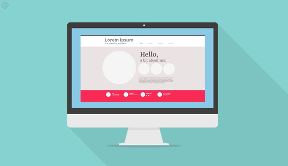
Drop shadows and depth
Of course, we have all used shadows – so, it is not a new thing. The web browsers and the inline design structures within these are evolving, which makes it imperative that the shadow aspect evolves too. We are familiar with an illusion of a creativity or art that lies far away from the screen that we see.
Shadows, when blended with parallax and grid layouts, will introduce an in-depth illusion of a fairer world. This is how flat designs have evolved over the years, bringing about a revolution in the shadow trend. Shadow play is one of those techniques that help in creating a flexible influence on the various aspects of the webpage, while also bringing about an enhancement to user experience (UX).
Some of the instances include the implementation of subtle and soft shadows as hover states to represent a link while combining a variety of color gradients, finally offering a three-dimensional effect to the shadows on the page.
Color arrangements that are inundated and vivacious
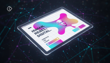
We all love colors, so do our clients and end users. So, why be stingy when applying colors? The year 2018 will witness the emergence of a bandwagon of lively and vibrant colors in the world of web. All this time, we would prefer only the web-safe and specific colors that have been used by our predecessors; it is high time that we brought about a change to this kind of an approach. The main objective of Let us add some interestingly effervescent and supersaturated color shades to the headers that no longer appear in the horizontal style, but could be slashed or in the form of hard angles. The technological advancement that has come about in the devices and their screens, including the monitors of our desktop PCs has made it easier and apt for replicating more affluent shades.
It is found that these kinds of flashy and vibrant colors play an important role in attracting user attraction, while some designers still believe in the ‘web-safe’ game by using soft colors.
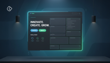
Social Proof
The website design that is too sophisticated and aesthetic in nature comes at a price that sometimes small businesses struggle to afford. So here is something that is affordable and no matter the size of your business, you can have one.
Through social proof, you can tell your new visitors about how your product or service has been a success in the past and how others have picked you instead of others. You can always write how your services are the best, but mere words from you won’t do the job. People want proof and nothing would do the miracle as much as a word from the already existing customer who says that this indeed is the best.
This could be the logos of companies for whom you have worked or the testimonials of your customers or anything where it would be clear to people that you are awesome. For instance, take a blog, it could be nothing but the number of email subscribers you got.
Particle Backgrounds
The websites that use videos as background are faced with performance issues. In such situations, particle backgrounds would be an excellent option. The best part of these animations in the particle background is that these are java scripts and lightweight too. The objective is to bring about movement naturally by ensuring that the page doesn’t take too long to load.
A moving image conveys and attracts people’s attention more than any static images do. So are the particle backgrounds – they are capable of catching the user’s eye while helping the brands to create or generate a lasting impression within the short span of few seconds that they have got. Social media networks are making use of these motion graphics to bring about user attention and automatically carry them to the landing pages.
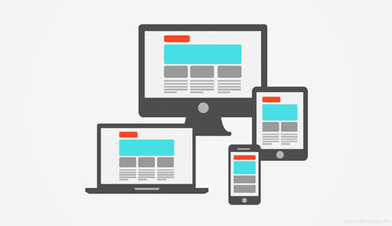
Mobile First and Responsiveness
How can we miss this? Or let us even think across the lines “should we include this point for discussion” anymore? But, yes, this point is so important that it should not be ignored and hence we are introducing it here. Responsive web design is one of the most important aspects of web design in the year 2018 and it is assumed that more number of website visits is taking place on mobile rather than websites. All the shopping, browsing, etc. happens on mobile devices, such as smartphones. A small screen with all the necessary and important ingredients, such as menu, submenu, etc. is possible here.
Mobile design is not an easy process. But, it has changed and evolved over time. The rollout menus are becoming more composed and minimized to fit into the small screen’s menu. You might not be able to view everything in a high resolution though you can possibly zoom out to view what’s being transmitted over the small screen. With the small devices, UX and micro-interactions can be fixed and you can easily get feedback on how users interact and engage with your designs.
Chatbots
So, most of the time, these days, when you visit a website, you would come across a small window popping up somewhere toward the bottom right side of the screen. And a representative is available to help you with anything you need. This kind of a window ensures that the visitor does not have to wait for ages till they get back a response for one of their most important queries.
But there are those websites, for which having a representation answer the questions in real time might not be so easy as these. Now, we have a situation wherein chatbots can be used. The chatbots can be programmed such that these answer any questions that your people might have at any point of time. At least, you can feed in directions to help people get in touch with live representatives in a situation where the chatbot cannot answer a particular question. Isn’t that amazing?
Customized illustrations
This is one of the most flexible media ideas to create images that are friendly, fun and add a lot of color to your website. Get help from one of the best professional illustrators to develop illustrations trends that exhibit a great deal of personality, which is customized to blend in with your brand’s nature ensuring that it attracts a greater crowd.
Sometimes customers feel that certain brands are not for them and might not even care to approach these. But, with the use of illustrations, you can ensure that people will start liking and stay attracted to this.
Bold and Big Fonts
One of the powerful and strongest visual identity tools is the website typography. The main focus of typography is to create a high-level personality while instilling in an emotion and setting a tone couture for your website that will convey your business information with ease. A lot of customized fonts are evolving with the increasing number of device resolutions that are getting easier and sharper, and are more legible than before.
A lot of browsers are supporting manually introduced typefaces that are enabled by CSS-web-enabled browsers. This does not apply to Internet Explorer. Large letters, serif headings, contrasting sans serif are a trend now as these help in creating dynamic counterparts, which ultimately improves the UX experiences, while the visitor reads the website.
Headers are the important SEO elements, which help the readers to scan through information that they are searching for. Web designers would be utilizing the advantage of these factors for web pages to create large and beautiful headers that would create an impact on the onlookers.
Rounder Edges
For decades, the website’s containers, buttons and windows had sharp corners. But now the trend is changing. Designers are in love with softer and rounder edges. You can see that most of the web designers are using rounder edges these days. This trend appears mostly across buttons and chat windows. You might have seen a number of websites with sharp edges and a few with both. Try using the soft and rounder ones for your website.
Broken Grid Layouts And Asymmetry
The asymmetry and broken grid layouts would be staying here in the year 2018 to live forever. These have been here – with a few modifications, evolving and emerging over the years. In the year 2017, we came across the introduction of broken layouts as well as asymmetry, which is different, new, unique and innovative that has attracted all eyes to websites.
But, there are a number of websites that are still implementing the traditional or old grid-based structures even now, still, we can expect an increased usage of unconventional layouts for the web. This is one of the techniques that brands can implement to set themselves apart from others. Though the old and traditional companies might not apply this technique, the new ones are sure to make use of these.
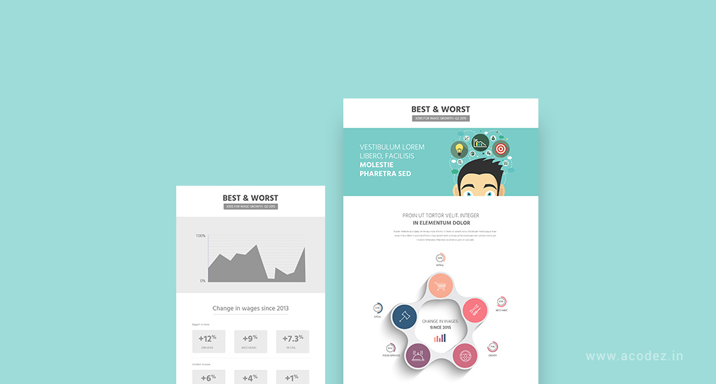
Data Visualization
As you might be aware, big data has been quite a trend for a few years now. And a number of businesses across various industries have been implementing big data to fine tune their businesses in the right direction. Now, slowly data is taking over web design trends as well. A number of websites have already implemented data visualization into their designs. Some of them have made it a part of their main website, while others are launching a separate site wherein they can highlight the valuable data they created.
So data visualization is part of the brand story that the brand tells along with the visual identity part to be a major part of the web.
Animations
We are not talking about animations simply, but the integrated animations. The browser technology as you see is emerging and evolving, with a number of new advancements replacing the existing contingencies. Websites have stopped using static images largely and are adopting animations. This will help in engaging users to improvise the communication between brands and their customers. These animations will bring about the interaction that is identified by a great UX, which is the major ingredient.
You can use animations in web design to engage users across the story of a website, by showcasing them as the characters that help to connect with the consumer band.
Floating Navigation
In most of the cases, the websites that you visit have the navigation at the top of the website. But there is always room for experimentation and most websites are doing that. Apart from the hamburgers, floating navigation is another important and interesting option. With floating navigation, it is still visible as you scroll toward the bottom of the page. With this, the experience is different with a practical benefit of ensuring that the navigation options exist and is visible regardless of where the user is moving through on the page.
Dynamicity in Gradients
Flat design has been one of the major trends in web design over the years. Gradients will now again been seen returning to the game in the year 2018. The present-day gradients would be loud, big and colorful, unlike the traditional ones that are subtle.
A number of web site design trends are expected to evolve in the year 2018 apart from these.
Now, let us go through some of those trends that we have carried from the previous years:
Web Design is a designer’s bread and butter. As much as oxygen is important to live, so is web design to us.
We are all well aware of the fact that web design has a constantly changing face. None of these trends seems to last as each season, they get replaced with something better.
Web designers are on the quest to find the best strategy that will help them create awesome websites that are simple, beautiful, aesthetic yet professional.
But, be careful, artificial intelligence, such as the Grid, make it possible to create professional website designs. Who knows, maybe one fine morning we might even hear “The Grid is all set to replace manual web designing.”
Years later, maybe. But, the essence of manual web designing is something that no machine can display.
Creativity is your key my dear designer friend. It will open the door to the bigger world out there.
People are always searching for something trendy, unique and new. You just need to fulfill their demands keeping in line with creativity.
Web designs that have been carried from over the past years to 2018
Responsiveness
It is no longer up to you to decide whether you want to implement responsiveness across your website or not. Things were different until 21 April 2015 when Google started pulling down websites that were non-responsive.
Though Google repeatedly notified site owners and webmasters about its move to make responsiveness an important strategy, it was not until the day that they found their websites were nowhere over the search engines, that they realized Google was serious about responsiveness.
If you already have a website that is non-responsive, then this is the first thing you should be doing right now. Make it responsive.
No one wants to lose their loyal clients over the web and this is why businesses are making mobile their first priority while designing.
Designer’s role:
Since responsiveness is what matters, providing a great User Experience over the mobile phones is the first priority.
A web-designing expert will never commit the mistake of hiding desktop functionality for mobile users.
As per the rules of responsiveness, you cannot create a layout that will fit in your artworks and Graphic designs. Stop following the “one format contains all” procedure to design your sites.
Logos, banners or images or whatever visual content you’ve got with you will be taken care of by your responsive design.
There was a time when designers found it difficult to embed any kind of visual content into their responsive designs. Netflix is one of the best examples that redesigned their brand to meet the growing needs and demands of responsiveness.
Love Hamburgers
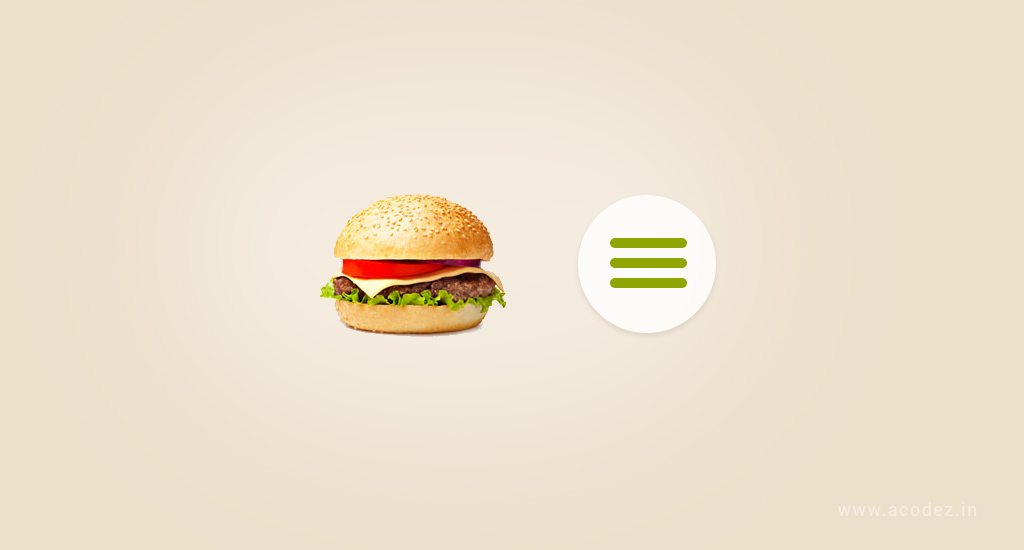
Being a designer never say no to Hamburgers. Ahem!!! I’m talking about Hamburger menus.
Hiding everything under Hamburgers:
It derives its name Hamburger from the concept that it looks like a bun-meat-bun-sandwich or 3 hot dogs held together.
But, the problem is it was not received well by the audience.
The Emergence of Mobile Responsiveness:
This is what gave birth to Hamburger menus.
When people view things across smaller screens, site navigation gets hidden under a single menu. This remains hidden until the user clicks through.
This helps to save a lot of whitespaces and keeps the users adhered to what they have been searching for.
The concept of hamburger menus is that though it is hidden, out of experience people know that they can get their hands on it whenever they need it.
Also, we will soon witness another trend which is one of the wildest predictions for the year 2016: hamburger menus paves the way for multi-directional scrolling.
Unsure of the form that this will take, let us keep our fingers crossed for a miracle.
Designmodo has illustrated the need for hamburger menus in websites.
Flat Designs
Flat Design has gained a lot of popularity since it was last introduced and is being used widely. It has even become one of the favorites of web designers.
Though the introduction of material design seems to have posed a threat to its existence but looks like flat design will live longer.
And, will grow all the way to becoming popular over the years to come.
Flat Designs works on the principle that “Less is always more.” People always accept less crowd when it comes to visual designs.
One of the added advantages of Flat Designs is the User Experience that it provides. The image files are lightweight and this contributes to reducing the page load time.
Let us work toward improving the user experience.
User and User Experience
Let us keep all other things aside. Users and user experience should be your key focus.
Do you think visual appearance actually matters if your site cannot provide an enhanced user experience?
Obviously, not, it never matters if your site has nothing much to contribute on the functionality front for a first impression. There are other things to start with.
Your site should be extraordinary if you want to drive an active user engagement. This is the only factor that will help in the success of your online business.
Customer or visitor behavior is the point that Google points to. This means your website should load fast, which is possible only if it is complex.
While designing sites, especially E-commerce websites, page load speed should come before creating an enticing appearance for your site. This is the most important aspect of customer conversion.
Infographics
People love Infographics that weave together beautiful stories through enticing images.
Why Infographics?
Statistics reveal that a cool Infographics gets shared three times more than any other kind of visual data.
This is one of the 1,000 reasons why people should utilize the power of Infographics for online promotion.
So, now the topic for discussion is not about the popularity of Infographics at generating customer interest, but the kind of Infographics that will create buzz.
Yes, I am talking about blending in Infographics with big data. This is the most anticipated trend that will change the face of Infographics. Here, you can find some tips on creating the right kind of Infographics.
Designs That Are Colorful
Let us make our designs more colorful. The boring colors will not do the trick anymore.
Time to bid goodbye to Stock Photos
Lately, we have realized that Stock Photos are too boring and we need something more interesting. Why don’t we utilize the power of natural photography when we are ourselves born talents?
�The trend of stock photos is declining. Looks like 2018 will have lesser or no Stock Photos.
The problem arose when a number of online sources came up with the idea to provide people with free images that are of excellent quality, but all the same.
You can customize images or get a professional do it for you. Even hand-drawn illustrations are highly accepted by people.
If not, any of these, let us think of something bigger …
Videos
We just discussed trashing the idea of Stock Photos and thinking about something bigger than that. How about Videos and GIFs?
Already, we can find a number of websites with some sizzling video backgrounds.
The only problem is that these sites take longer to load. This will get solved when people learn to compress the video as mentioned here.
Animated GIFs is again another thing that has already made a huge buzz winning over millions of hearts.
Typography
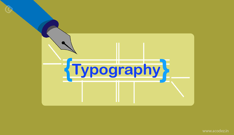
This is something that you need to keep an eye out for. If you examine some of the coolest Infographics of the previous year, you’ll find that each of them has appealing fonts. Ernesto Olivares says typography is a language and also specifies its importance in branding.
Gone are the days of those Arial font types. Typography is the new cool. Thanks to Google’s array of fonts.
Let us keep our fingers crossed for the return of the battalion of these long-forgotten fonts. These bigger fonts will be used in designing lettter logos and headings. Hand-drawn fonts are finding a new place in the new designing tool kit.
Infinite Scrolling
People prefer Scrolling to clicking.
And, what is the latest trend in scrolling?
It is Modular Scrolling. Modular scrolling is nothing but you can find that all the modules on the website scroll independently of the other.
This trend changed the face of web design long back, in the year 2015, when social media networking sites, such as the Facebook, Pinterest, and Twitter, started rolling out the infinite scrolling trend across their websites.
Scrolling is, in fact, easier than clicking and this is what makes Infinite and Modular Scrolling possible.
As the user scrolls down, the previous content fades away paving way for new content to appear.
Web Designs that are App Inspired
Web designers need to learn something from these apps. People get addicted to apps that provide them with a greater user experience.
The same applies to website designs that provide people with a better browsing experience.
This kind of app-like functionalities that provides null distractions, great speed, and an enhanced user experience should be tailored to website designs.
This idea of exclusiveness needs to be implemented to help users interact and gain access to your content as fast as they could.
All that it talks about is user experience.
The designer’s goal is to embed a great user experience in his designs.
Modular text
Repeatedly, we’ve been warned not to put longer texts. These appear to be too boring.
Honestly, I would myself never prefer to read longer texts.
By the year 2015, almost everyone had started practicing to write shorter paragraphs by breaking longer ones into shorter.
This is when Modular design came into the bigger picture and changed the face of web layout.
A number of big heads have already used Modular design to provide the readers a better experience.
A block grid technique is what Modular text and modules are all about. It might be a complicated structure to anticipate.
But, makes it easier to read. For instance, if you are searching for 10 tips on Email marketing and you want to know what the 7th tip says. You just need to scroll through the grid that contains the 7th tip for more information.
There is no wastage of time or effort here. The Grid is now a bigger picture.
Grids
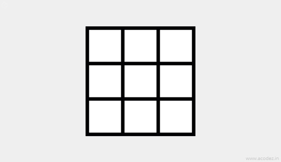
As we have already discussed, Grids are a bigger picture. We are now living in an era where web designs will be evolving in a gridular format, which is something that adds to a designer’s worst fear.
The Grid Layout will set a SPEC benchmark in the CSS language.
Grids are not the only trendsetters for web designs, but soon we will see varying geometrical shapes and patterns emerging.
If you observe the modern minimalist designs, you will find that these are all derived from Swiss designs. The underlying principle of Swiss Design is that everything will be contained within a Grid System.
Pinterest is already using the Grid System and we can see that there are a lot of others following suit.
As experts predicted free-form images are emerging apart from the Geometrical shapes and patterns.
Sophisticated Retros
Sophisticated or modernized retros will soon be emerging as a part of the web and graphic designs. This was once seen rocking the world of logo designs.
Storytelling
We have heard a lot about the magic of storytelling. It is, in fact, a great crowd puller. Now, the next question is when it has already created so much of hype, what is the new trendsetter.
Visualized Storytelling is all set to conquer the hearts of millions.
Let us utilize the power of visual storytelling for our websites and witness the magic.
Single Page Website Design Trends
We know that people love scrolling than clicking and this is where Single Page appears.
It helps to provide a greater User Experience. See what Rebecca Gordon says about scrolling. She says everybody loves to scroll.
With the smaller screen gaining more prominence, single page website designs will rule the world of website design.
Time to bid goodbye to Parallax Scrolling
We know that Parallax Scrolling has been a trendsetter for quite some time now. But, let it be not too late before you actually realize you have been doing it the wrong way all these times.
Under this technique, the content in the foreground and background scrolls at different speeds. It rather creates an illusion.
This illusion might have a visual effect but it has some problems too such as not good from the SEO perspective, poor performance and more…
Experts say that 571 numbers of websites are being created on the web every minute.
There was a time when people had no idea on how to build websites, say around 20- 25 years back, and thanks to all the software engineering professional experts around us who has brought about a revolution to it.
But, there is another section of the website development which is the one that drives all the necessary traffic from the search engines taking your site to the concerned group of audiences.
Content is the king
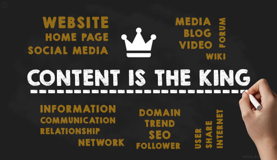
Of course, a design is something that attracts the eye of the visitor and they feel drawn to your website. But, what do you think could be the ultimate reason they visit your site? Is it just to check out the design you have put in there?
Content is one of the most important factors that attract people, but there is more to why they are on your website. They are here for the content!
And, the old saying “Content is the King” still rules your online store.
Years back when there were lesser web designers and lesser websites over the web, the designers limited their artistic excellence because they were intended on providing the people with information rather than distracting them with too much of elements like sidebars, the extra navigation panels, side boxes and all the crap!
But, now things have changed! With the variety of plugins and other techniques that are available, web designers do not restrict themselves from proving their excellence through their designs that speak for them.
The idea is to make your content more visible and readable by removing all those elements that serve no purpose but are rather annoying!
Omni-present is the new word for Responsiveness
As we discussed, responsiveness is not a new trend. We need to ensure that our websites are ready to fit into any device, screen-size or screen-space without any qualms.
In other words, ensure that you are designing your site to be Omni-Present.
Why is it important to be present everywhere?
You never know which device your customer is going to use since there are a number of them out there! But, ensure that your site is available whenever they click through.
Also, another point is that they might leave your site on a particular device half-way through without completing an action and may return back at a later time on a different device. So, you need to determine how your site is going to act when they return.
They should be able to complete the action when they get back to your site regardless of the device that they are using. This means you need to have a website that is highly intelligent and can tackle any situation adapting to the perception level your customer has.
The designer-developer collaboration
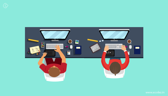
All designers are not developers and not all developers are good designers! But, designers could be good coders too while developers could design as well!
Designers are treated as a separate species while developers are an entirely different community.
There are things in common where they should be collaborating. If the coder is not careful while working on the backend, he might end up messing up the design and vice-versa.
Why not think about a world where both designers and developers are working in synch starting from the scratch which includes mood boarding up to the final product delivery!
In an article published by Tech Crunch, they mentioned that “The future of front-end development is design”.
There comes a point where the design innovation meets the development agility all that is directed to lowering the consumer frustration.
There are numerous examples of things that compliment well each other. Be it a certain combination of food items, apparels or even relationships, some things definitely work better with a supporting or complimenting idea.
Web Design falls more or less in the same category, which works best when the right ideas & techniques are used.
- These techniques or technologies complement each other in shaping up excellent aesthetics with functionalities like designing the site to look awesome while making sure it performs flawlessly in all browsers & devices.
- Some of the recent trends in web design owe it to the supporting techniques that have made it a popular choice worldwide.
Large Size Background Images & Responsive Design
The popular quote, “A picture is worth a thousand words,” holds very much true in case of web designs. If you really want to engage a viewer and get the message across, use images.
Graphics & Images have always been the focal point of work of a designer. The recent trend towards using a huge background image also helps in giving the visitors a better idea of the company, instead of using a color or pattern. However, the advantage of using this large background image is wasted if it can’t scale itself, especially for mobile device users.
This is where responsive design technology comes in to play. Full responsive design perfectly complements this latest web designing trend by making it possible for the designers to scale the images itself to the size of a mobile device of a user. This also eliminates the need to design separately for different devices.
Smartphone Optimization Complemented by Single Page Website
The number of smartphone users in the world is growing every day & as a result, web traffic from these divides are also increasing at a high rate. According to latest studies by Google, web traffic from smartphones now matches that from a desktop, in terms of volume. To accommodate these mobile users, web designers nowadays spend a lot of time & effort to create a solution that would appeal to mobile users as well.
While some designers still tend to argue on the best method to employ to harness this mobile traffic, it is no doubt that single page websites have been becoming quickly popular among mobile users due to the ease of access & user experience it offers.
While serving as the perfect complement to the mobile first concept, single page sites will take clicking out of the equation as users scroll through the page to consume all of the content. Well, it not only results in better user experience but also eliminates the need to load several pages when mobile data networks are not as fast as it should be.
Great Content Complemented by Typography
“Content is the king” is not just a phrase in the digital industry anymore. While optimized content has different aspects, many people have a confused notion that just adding more will deliver results. This happened as content creators began optimizing for search engines rather than users & quality soon made way for quantity.
However, as mobile traffic began to dominate, it was understood that adding huge blocks of text one after the other didn’t really serve the purpose. This is when designers thought to optimize the looks & placement of content to get the message to a user. Short, powerful content still needed a lending hand to make it attractive & easily catch a user’s attention.
This is where focusing on Typography helped. With the usage of proper visual elements like typeface, font size, and other elements, a designer makes use of his creativity to set the tone and mood of the content. Rather than using excess words, these skills can do wonders in creating an engaging content for the audience. This is why good content & typography works well for everyone.
Let us discuss a few trends that disappeared and then re-appeared in the year 2018:
Trends that disappeared and then re-appeared in the year 2026
Web design experts often argue on which trend is in and which ones are outdated. It is interesting to observe that whether in fashion or web design, the old trends keep coming back in a different form. There are many such instances in web design trends that has been a favorite of web designers & developers over the years.
Traditional ways of clicking on a webpage has been replaced by different ways of swiping, hovering, scrolling and sliding, especially due to the advent of touch screen devices. Simply clicking on a subject often was not a convenient solution. Whereas, features like that of: Swipe, scroll, slides etc. make it easy for website visitors to navigate through a site & find relevant information.
Another “once cool” trend that has faded away is flash. Once the integral multimedia tool, Adobe flash player helped web developers to create graphics, and animations to make a website a more interesting & attractive. This multimedia tool phased out for a number of reasons, including advancement of new technology and better tools in the market in addition to a closed-source development that lacked compatibility with various browsers. To end, it lacked safety & security features.
Using text formats and patterns such as sprawling texts have also become obsolete today. People prefer much more attractive websites with images & videos rather than a text based one. The “text webpage “era has almost vanished as a result and has transformed into pictures, videos, animation and graphic oriented ones. This is justifiable as why make users read long paragraphs of text when the same message could be conveyed to them within seconds through images & videos with minimum text content.
To end the list of faded trends, the old web-based irritating pop-up also parted the arena since a long time. Web designers these days prefer eliminating pop-ups while designing a website. However, some companies still today, ask for pop-ups, in order to acquire a user’s personal information, such as, name, address, email id, contact number etc. thanks to designers who make it much more convenient without affecting the user experience.
Speaking about trends becoming outdated, there are certain trends that pops out from the past all of a sudden from nowhere & goes on to become popular in a very short time.
Pre-Loaders
Many of you might have seen pre-loaders, a small animation that pops up while the website takes time to load a webpage. It is obvious that people visiting the website will not be interested in a webpage that takes ages to load. If it takes too long, they might move to some other website. Hence, smart web developers have adopted these pre-loader animations to entertain the website visitors and to hold their attention while the website loads in the background.
Ghost Buttons
Ghost buttons are another cool option many designers love to make use of. These are nothing but transparent & empty shapes, mostly in square or rectangular shape. Bordered by a very thin line, these buttons consists of simple plain text in the middle in a suitable font.
Image Captions
CSS3 have been intelligently used to generate image captions. The text labeling of an image can help users glean more information from the image. Moreover, the use of CSS3 to build these captions ensures that JavaScript effects need not be utilized.
Use of Videos as Background
In an attempt to add a more professional touch more and more organizations are indicating a preference for using Videos as the backdrop to their websites. As customers are increasingly attracted towards such sites that help to promote their business process through video rather than static content, the use of video has been perceived as a positive step towards converting potential leads into sales.
Interactive web sites
The Web is an interesting platform which combines the power of various media. Added to this is the latest trend of engaging user interaction to make the Web all the more exciting. The use of this trend has been utilized in creating Interactive websites which engage users effectively to generate productive results.
Multiple font Typography
Another trend that is picking up speed is the use of more than one font in one web site.
New form plugins
The availability of open source jQuery plugins has led to an increase in their demand. Designers, who realize the potential of iQuery to create clean and smooth JavaScript code to design various interesting content elements and consequently also help to adorn websites with enhanced user experience, are displaying an affinity to using this in their latest designs. Some of the fascinating utilization of query can be seen in elements like guided tool-tips, floating labels and also in the input validation in forms.
Bold Neon Colors
This helps to make websites look more vibrant and imparts them with more energy. The shades of fluorescent and neon colors will be primarily used to highlight the primary elements attracting viewer attention.
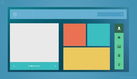
Tiles and card based designs
The designs are getting mobile friendly these days and card or tile based designs have become quite popular. This design trend has been brought into fashion by Windows 8 interface design and has been in and out of trend since the year 2015. Such designs are easily navigable and can also be tapped with ease, enabling the mobile phone users to use these websites with ease. The website with such designs does not appear stuffed and loaded despite having a lot of content. The design is most likely to enjoy popularity in the coming year and will be used by most of the content rich websites.
Design trends that we need to get rid of in the year 2026
Content Sliders
Content Sliders or Carousels which were once considered to be a cool way to attract page visits have recently been identified as conversion killers. It reveals several drawbacks, which do not help you in making money. Moreover, the sliding images work on normal human tendency and divert your attention, making it possible for you to miss the vital messages on the page.
Also, the sliding content holders seem to be too fast for their own good. They disappear even before you are able to finish reading the whole message and give you absolutely no control over their navigation.
Browser- Friendly Versions
There was a time when sufficient amount of time and cost was involved in making web pages compatible with every possible browser that inhabits the virtual space. That is no longer required as the idea is not only to work hard, but also to work smart. Therefore, with Google analytics, you can have a complete understanding of which browsers are preferred by your viewers and develop pages only for those specific browsers. This not only saves costs but also provides you with more time to invest in other productive areas.
Scroll Away or Away with Scroll
It is like the eternal dilemma to keep or do away with something like Scrolling that is the inherent behavior of users on Web sites. However, senseless scrolling has revealed to embed the Web pages with tardiness, which is definitely a dampener in the current evolutionary phase of Web site development where quick access to the content is attributed with high priority.
Automated Pop-Up
The host of popups that have been sliding or gliding into your screens of their own accord will finally be put to a stop. As the floating, flashing and dancing little demons continue to irritate and frustrate viewers they have managed to attract attention, which however is quite negative. The negative attention that you garner from these popping advertisements will never be able to improve your profit margins. Consequently, automatic popups have been deemed as being responsible for throttling your business potential and therefore best done away with.
Off with Sidebars
The new phase of website design would bid farewell to the broad sidebar band that has no relevance in the rest of your content other than drawing attention away from it can most certainly be done away with. Scrap your old designs and chalk a new layout without the sidebar lurking in the margins. If you happen to be too much in love with the sidebar and cannot bear to part with it, at least plan something innovative like linking it to the main content so that your viewers remain focussed and you are able to retain your old love, the sidebar.
Irrelevant Elements
There are many websites that use different types of irrelevant elements on the website that do not add to the real value to the people. In fact, these elements degrade the experience of the user and ultimately lose his interest in the website. If there is excess of photos as well as icons on the page does not help the visitor in finding some relevance in any case.
Flash Intros
These are extremely very annoying for the visitors as they are too slow and they take so much time to load. In addition to it, they do not even work on the Apple mobile devices and Google too does not recognize them, so it is advised to avoid them in any case.
Auto play Videos
This is actually a very weird way of pushing up the clicks on the video as it does not help at all. In fact the customers do not like such videos that run on auto play and this affects your brand name as well as restricts the visitors to interact with you.
Large Hero Images
There are so many websites that feature a hero image at the top of their website, but this is not an intelligent move as this would push the main content down the fold. This is actually a navigational blunder and most of the customers that visit a site appreciate a website that is simple, easy to understand and to the point.
Sidebars
The sidebar is not a very smart move and in real a website does not need it as it can function without it too. You must try that the customers focus on the main content of the website rather than the stuff that is crammed into a 300 pixel on one side of the website. In addition to it, they do not even translate well on the phones, which is again not good news for the effective running of your business.
Acodez is a web design company in India offering a wide range of services. We are a digital marketing agency offering all kinds of digital marketing services to our clients helping them take their business to the next level.
Looking for a good team
for your next project?
Contact us and we'll give you a preliminary free consultation
on the web & mobile strategy that'd suit your needs best.

Amazing article.. Well done 🙂
awesome blog..
thanks
I love ʏour writing style гeally enjoying tһis web site.
Mindblowing article….
thanks