User experience (UX), as we all know by now, is all about delivering greater user satisfaction and pleasure by making the software more usable, accessible and easy to use. With the UX design industry is evolving, you should be updated with the latest UX design trends that will benefit for your customer satisfaction and lead generation.
With every passing year, UX design became more and more sophisticated and encompassed every interaction between a user (potential or current customer) and the company. In 2015, UX designers championed the cause of ‘free thought’ in design and sites became increasingly responsive web design; intuitive apps and engaging services also saw a surge.
UX Design Trends in 2019
Here are a few of the latest UX design trends that you should be aware of as a web designer and which is going to be a hit in 2019.
We have heard and discussed responsiveness to a great extent, and we all know that when we say that a site is responsive, we mean that it offers the same great viewing and browsing experience regardless of the device it is viewed on. Well, there is a new trend in the offing – age responsiveness.
Soon, we will see sites adapting their content, layout, and structure to a range of user ages. Just as a young child, a teenager, and a senior citizen don’t watch the same programs on TV, they will react differently to the same content online – be completely disinterested in some, and excited about others.
For this reason, we can’t have a ‘one-size-fits-all’ solution for website interfaces. Expect a lot of meta-data to inform age-specific adaptations on websites.
An example could be navigation menus that expand and contract based on the apparent user competency: minimal interfaces that allow them to interact with the limited set of features novices or the not-so-tech-savvy are already familiar with; font sizes and spacing that naturally increase according to the poorer eyesight of the elderly; more vivid hues for younger users and more sober shades for older people, and so on.
Metadata and browsing histories will help to shape the apparent level of web literacy of the users.
With mobile devices proliferating in the world, there will be a humungous number of users who are not very tech savvy; they are likely to make a lot of mistakes when they use these devices initially. UX designers will have to take this into consideration, and design for non-ideal scenarios, so that erroneous usage of products and services will be handled in a better way.

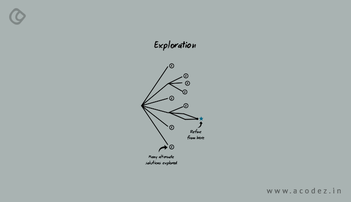
Whenever users have new experiences, they are curious; and this tends to make them happy. How? Well, scientific research tells us that when any person has a totally new experience, their brains release dopamine in high quantities; let’s call it the ‘happy’ chemical. This gets us excited and happy about the new experience and pushes us constantly to seek such experiences.
Therefore, a design which delivers new experiences to users in terms of information or engagement is definitely the need of the hour. Look at social media – you do so many different things there: sometimes you check out profiles, sometimes news feeds, you comment or post – a whole lot of activities.
So when you help users to roam through their digital experiences and make discoveries, you’re bound to be successful in getting them to engage with your brand more. The elements that compel users to explore on your site are usually blogs, community forum, affiliate opportunity, the point of sale resources and more.
-
Microinteractions Will Be More Important Than Ever
These are the little bits of activity that most of us don’t think much about – unlike features, which have a much larger scope, and include numerous user stories. Microinteractions are simple, hardly take any effort, and of course, brief. Effective microinteractions go follow this routine:
- Trigger – the visual signal that sets off the action
- Rules – define what happens when a user takes action, and in what specific order
- Feedback – the user gets to verify what happens when they take a particular action
- Loop and Modes – how long the microinteraction is in play (does it stop immediately or repeat itself?)
Examples of microinteractions could be – tabs at the top, which displays information about itself on mouse over, a button at the bottom that takes you straight to the starting of the page, and so on.
Though these are very small elements, these could mean all the difference between liking and loving a website. Concentrate on including elements that enable easy interactions, with details, feedback, notifications – and even a bit of entertainment; and make sure you do it in a way that conveys information without overwhelming or distracting users.
-
Artificial Intelligence in UX

It is highly likely that designers will soon begin testing several elements from computer engineering in the UX design. These will change websites drastically, paving the way for intelligent, open-minded dimensions for user interactions.
A good example is an iOS keyboard (now also available in Android); when you type on the keyboard, you are essentially interacting with the artificial intelligence, as it keeps changing its guess/word suggestion about what you’re going to type.
AI-based UX design sense that to win the attention of the user, you need to develop a prototype of their goals, and then enable the AI to interpret the actions of the user with reference to those goals. We are very likely to see an increasing number of designers testing artificial intelligence on not only websites but also web applications in this and the coming years.
The great thing is that AI can be easily integrated into the design without attracting much attention to itself; which means the user may not really be aware that there is an intelligent code running in the background of the website they are browsing. As a designer, you need to also remember that the enriched experience comes more from the way the suggestions are presented than the suggestions themselves.
[
acd_also_read]
Artificial Intelligence Web Design [/
acd_also_read]
-
Automatic Carousel will be passé
It has been suggested by several industry experts that carousel ads will be given a decent burial in this year. The automatic image sliders, say experts, actually distract users, and rarely succeed in converting visitors. Often, they are mistaken for ad banners, and you know how users avoid anything that looks like ads when they are busy browsing for something specific. Very few visitors click on carousels; the ROI on these clicks are barely worth your efforts and expenditure.
Rather than spend on carousels, you may do better by having a hero image in the background with excellent typography – Kissmetrics home page is a great example. Visitors are able to see what the company does, and if interested, can click on a button to learn more. You can also offer varying options to take visitors to different landing pages, and whittle down their focus rather than flash some info at them briefly. This also empowers the users by giving them control over which landing page they want to get to.
-
Innovative Display of Content

Don’t be surprised to see an increasing number of designers teaming up with content marketing experts and copywriters to showcase content in new, exciting ways.
Sure, visitors love reading blogs; why not enhance their experience a bit by displaying content innovatively using different elements: graphs, tables, lists, buttons, and so on.
The human brain is able to process visual content far more easily than plain text. A landing page usually does not have enough space to display all the content you want to show your visitors; there’s an easy solution: offer them an option to mouse over the content display and link it to another landing page so that they can read more details by clicking the display!
Empty white spaces can become boring, and could well be on the way out. Designers will leverage this trend to integrate optimal CTA buttons, message interaction, and length. After all, the visitor or user, is the King; expect the rise in popularity of this trend.
Let’s face it, we all love to be pampered and made to feel special. Giving users what they want, before they ask for it, is what we mean by personalization.
There is variation in the extent of personalization, but the most common examples are using relevant content, push notifications for special events like birthdays, recommendations for articles, social media connections, products and so on.
So how can you succeed in this task? You need to really know your user well. Conduct interviews, field studies, and surveys, and you will get a fair idea of what your target audience prefers. This will help you build these preferences into the design.
Buyer personas, user scenarios, and customer journey maps are your tools for personalization, which can be created by real testing data. Creating user segments can help you categorize who you are creating the design for, and what they’re looking for.
You can also ask for additional information at the sign-up stage, though it could annoy your users a bit. Using a combination of rules and algorithms will give you the best results – pre-set requirements are set by rules, and the algorithm ‘learns’ throughout the user interaction.
Haptic feedback is the use of the sense of touch in a virtual interface, like a keyboard; we know that we get tactile feedback when we press keys on the keyboard on our Smartphones.
Haptic technology has grown more complex over time, especially with the exponential increase in the use of higher-end mobile devices. You can expect to see it becoming even more sophisticated in the near future, especially since the cost of electroactive polymer actuators (EAPs) has reduced drastically.
Interaction specialists are now able to create innovative and exciting ways of altering user behavior through understated cues like a sequence of delicate vibrations to gently push the user towards a ‘Buy Now’ button, especially if they are dilly-dallying over a purchase; preventing a user from leaving a screen by creating a pleasurable texture sensation on the page and so on.
Comparing this tactic to subtle hypnosis, designers are calling this new method ‘hapnotic’ feedback; hypnosis+haptic. While this trend is just rearing its head, it has tremendous potential, and will definitely be much in demand very soon.

Minimalist website design may not always mean more user-friendliness. In the past couple of years, we did see a lot of simplification for apps and services: navigation menus were narrowed, interactions were highly compartmentalized into step-by-step processes and users were compelled to engage with content in a pre-set order, along with a direct track.
Consider the Uber App, the perfect example of constrained use:
Specify the pickup
Get your ETA
Pay Driver
Rate Driver
While these kind of apps are simple and easy to use and do the job needed well, you can expect users demanding better experiences in the very near future.
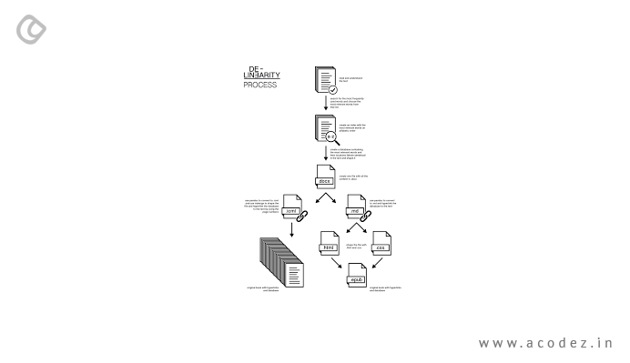
They resent being pushed from one screen to the next against their will; the future is going to be about allowing users greater control and flexibility, and designers will have to give them what they want. De-linearity is definitely going to be the trend of the future.
Users will have more options for navigation, more decisions to take through each process, and varying ways to complete all touch points.
Level configuration was conceived as the direct opposite to skeuomorphic outline, which is the demonstration of making a material visual sign for a computerized component. Level configuration is the rebellion against this outline strategy. Level configuration is about stripping an outline down to its easiest components and letting just the vital viewpoints and substance talk.

As the web keeps on evolving, so do the devices originators have for bringing web typography to life. Sort foundries are putting forth amazing web, textual style units at more sensible costs and the right to gain entrance to excellent web typography has stretched.
Card outline formats are very practical and powerful components for passing on fast fire content in compact blasts. Moreover, card’s little and deft size permits simple mix for responsive designs.
Logical UX requires the framework to be versatile to the needs of the client and focused around a situational connection. An incredible illustration of context-oriented UX in practice is Netflix’s ‘Prescribed-for-you” area. Truly, Netflix controls their own first-party information, and along these lines has simple access to make this logical experience, however, as the client data we’re ready to catch expands, so will our capacity to make customized client encounters.
Scrolling is more instinctive for clients, less demanding, and eliminates burden time. One-page locales are additionally a finer medium to recount a straight story. Parallax scrolling has been a hot pattern, will keep on being a vital piece of one-page site narrating.

Presently, less demanding and more practical to deliver, the feature is an extraordinary approach to rapidly convey your message. There’s a science behind it as well, our cerebrum forms visuals more quickly than different types of data. Utilizing feature, even as a foundation component, can highlight your center qualities and administrations to have an effect in a matter of seconds.
Visitors are bound to compare their interactions on different sites; incorporating the elements mentioned above may make all the difference in getting visitors to fall in love with your site and engage more with your brand.
Failure to do so may see your digital footfalls decrease and fade away. Simply put, as a web designer, you simply cannot afford to ignore these UX design trends!
Acodez IT Solutions is a UX Web Designing Company India that provides creative website design and web development services to clients world over. We can ensure satisfied customers for your business through our futuristic websites that are responsive, engaging and user-friendly.
We have also satisfied more than 10,000+ clients since our inception as a UX Agency in India. If our services interest you, please contact us or visit our website today.
Looking for a good team
for your next project?
Contact us and we'll give you a preliminary free consultation
on the web & mobile strategy that'd suit your needs best.


