A website is the forefront of your social media, email marketing, lead generation, brand awareness, and sales strategies. Website interface design is a continuous process as web technology changes from time to time. At some point in time, you need to redesign your website due to numerous reasons.
In order to help you in redesigning the website, the website redesign checklist turns out to be quite helpful. Website redesigning is quite a long and tedious process. It can either turn out to be a huge success or either fail terribly. Proper planning of the redesign of the website can help you ensure that the website thus redesigned can be able to achieve the desired goals. The website redesigning checklist helps you to turn your website into an inbound marketing machine for long-term success.
In order to help you with your website redesigning process, this guide may turn out to be quite helpful to you. Before you redesign the website, it is necessary that you answer some important questions. These are:
- Why do you need to redesign the website?
- What elements of the website do you need to redesign?
- What is the budget that you need to invest in your process?
- What is the time limit for your redesign?
- What goals do you wish to achieve with your redesign?
- Who is your target audience and how they perceive your audience?
- What keywords attract your target audience?
Answering these questions can help your website redesign in a better way and help you to make sure that apart from giving a new look and feel to your website, it also helps maintain the ranking of your website.
Website Redesign Best Practices
Here are some of the steps of the website redesign checklist that has to be followed
-
Get an Idea of Some of The Important Metrics

Before redesigning the website, it is necessary that you have a proper idea of some important metrics. It also helps you to provide some objective insights on how the website is performing. Some of these important insights are:
Traffic: Get information about the number of visits, visitors, unique visitors, etc.
Bounce Rate: It provides information about how the website is perceived by your users.
Time on Site: The time spent by visitors on your site displays how the users like your website.
SEO Ranking: The SEO ranking of your website is an important parameter and it is necessary that you get an idea of for what keywords your website ranks.
Performance Ranking: The Domain authority of the website is an important parameter of the performance ranking.
Conversion: The number of new leads and their conversion is the measure of the effectiveness of your website and how the users perceive your website.
Sales: The identification of the sales and their generated ROI also provides an idea of the success of your website.
Apart from these you also need to know about some other important metrics like:
- What are some of your most shared or viewed content?
- What are some of your most trafficked pages?
- Which keywords perform the best for your website and attract the maximum amount of traffic?
- Which pages get the best quality backlinks from high ranking websites?
These apart from several other factors like certain important metrics of your business. This can help you to decide if your website gets the desired results and then design the website design checklist. Here some important decisions can be made like how to provide the best results to your users, how to decrease the page load times, and other such amazing questions.
-
Identify Why You Need a Redesign
If you are considering a website redesign, there must be some genuine reasons for it. By using some information you gathered by conducting a survey from the experts about your website, you can start working for it. You may be in need of increasing brand awareness, create client loyalty or you may want to convert more visitors into customers. Answer these questions and you will get the right reason for redesigning your website.
- Are you getting enough traffic for the website?
- Why your visitors are not converting to customers?
- Whether your visitors are being directed correctly?
- What is the loading time of your website?
- Are your visitors getting with what they are looking for?
- How your website pitch the visitors?

Setting up your goals is quite necessary as it can help you to decide how you need to proceed with your business. Identifying the goals is the first step to accomplishing them and play a major role in the redesigning. It is necessary that the goals must be measurable which can help you to measure if your goals are achieved or not. Based on these goals, users can decide what action plan you need to implement. Here you need to answer some important questions that if not properly answered can take away some of the best assets of your website and may harm you in various ways.
- What do you want to achieve from your website redesign?
- What is the budget for your website redesign?
- What is the time limit you wish to spend on the re-design process?
- What is the number of users that can help you to achieve this task within your time limit?
While considering the redesign, it is necessary that you have a pretty good reason for the same.
Some of the important parameters that you need to implement on your website that you need to enhance are:
- Number of visits/visitors
- Bounce rate
- Time on site
- Domain authority
- Number of leads and form submissions
- Number of Sales generation
A majority of these goals are interdependent. Hence you need to lay out a proper plan to achieve it.
-
Analyze Your Current Website
Prior to your website redesigning, it’s vital to first look at your current site. Figure out what it is you like and dislike about the present site. Try not to be reluctant to encourage the involvement of assistance of teammates, shareholders, and current clients to get a balanced perspective of what’s working and what isn’t. Establishing KPIs and ensuring particular metrics alignment with the goals of the redesign will be a successful method. This will prove to be your website design basic strategy.

It is necessary that you analyze the competition of your website with other websites that are in the same domain as you. Properly analyzing your competition helps you to identify your website weaknesses and strengthen your business. Analyzing the competition can also help you to get an idea of the competitors, their technologies used, the reasons for their better performance, what are their customers, and how they can attract new customers. This turns out to be quite beneficial for the business and can help you to provide some suggestions on how you can enhance your website, where you are lagging and other such questions. Here you need to ask:
- What are the top-ranked competitive keywords for your industry?
- Who are your top-ranked competitors?
- What are some of the best competitor websites?
- What channels drive the traffic and lead to your competitors?
- What are the social media channels used?
- What is the contribution of their Organic and Paid traffic?
- What are the number of buyers and browsers?
Getting an idea of these can help you to properly redesign your website. Apart from these, you can also get an idea of your user’s behavior, why do you visit certain websites and other such elements.
If you need your site to be the end purpose of the online search client then you must know everything about your users first since this user information helps you to make a site of extraordinary user experience.
In this way, when re-designing a site the primary thing you ought to remember is your user and the rest some portion of your web design takes after as indicated by it.
These inquiries will help you in making an extraordinary website with great user experience:
- Who is your intended interest group?
- Does your site have an ordinary stream?
- On which page your group of users is spending more time?
- Discover from where your users are originating from?
- Recognize the keywords that draw in more users?
-
Identify the Unique Value Proposition of Your Business
Every business and website needs to have a Unique Value Proposition (UVP). It is necessary that you craft your content around this UVP and is consistent across your entire website. It can also attract a large number of unique visitors and provide better services to users. It must convey the unique information about what your website stands for and what answer the common questions of the users instantly. Here you also need to identify what is right for them and what they need to buy. It is necessary that you sound human that is able to make proper conversations with the users into dedicated buyers. It also affects your bounce and conversion rates.
-
Design Your Site Based On Personas

It is necessary that your website must appeal the users and must answer their question “what’s in it for me?” The website must speak in the language in which their user understands and design content based on the same. In doing so, the personas turn out to be quite helpful. Personas are the fictional representations of your ideal customers that is based on data about customer demographics, their online behavior, personal histories, motivations, and concerns. Proper knowledge of user behavior can help you to get better insights into the minds of your customers and identify their needs and aspirations. In order to design a persona, it is necessary that you answer some important questions like:
- What problems do they want to solve?
- What is their most important need?
- What information are they looking for?
- What trends influence their business?
- Which social networks do they use?
- What search terms do they use?
- What content do they like online?
Having a proper idea of the user personas can help you to redesign your website properly. Based on the persona you can redesign your website and categorize them properly to fit these personas. It must be designed in such a way that the users can easily find the content that is relevant to them.
It is necessary that the website is properly optimized so that it can be easily found online. This, in turn, helps you to improve the rest of your site metrics. Several aspects of the website must be properly optimized for page load times, design to be mobile friendly, search engine optimization (SEO) friendly, and responsive. It is also necessary that your website with a better SEO juice, most traffic, inbound links, and keywords rankings must be properly taken care of. In some of the cases, you need to redirect some pages. Hence the links must be properly redirected using a proper strategy so that you do not lose traffic and rankings. This can result in an increase in leads, downloads, or sales? It can be done by:
- Get an idea of the top keywords of your niche and optimize your website based on the same.
- Properly use the on-page SEO optimization technique using internal link building and using proper header tags.
- Optimize the different pages of the website.
- Get a proper track of your inbound links and the generated leads.
-
Implement Proper Call-To-Action
Call-To-Action elements of your website are the essential elements of your website. It is necessary that you implement proper call-to-action buttons that prompt your visitors to engage with your brand. This can be used in case of important items like free downloads, purchase buttons, email newsletter subscription, contests, promotions, contact, consultation, demonstration, and other such tasks.

Without a doubt, site re-design is the ideal time to build up a content strategy and see what you can enhance – or if nothing else rearranges what kind of content is working. It serves a chance to change your content creation propensities and the establishment of new practices. Building up a substance system is one approach to highlight your new site to the clients.
It was found that organizations that blog get 63% more traffic and 97% more inbound connections than the individuals who don’t blog. Continually redesigning your site with good content will profit your clients, as well as your SEO rankings. Record your most shared or saw content, most trafficked pages, and the number of inbound connections to individual pages on your present site. Utilize this information alongside your keyword research to decide a content strategy for your new site.
Here how you can approach content improvement and secured as much consideration you merit:
- Compose your content schedule
- The layout which content stays and which content goes out.
- Discover, what sort of content are your objective clients searching for?
- Are there offers or old content that can be re-purposed?
- Discover, how your present content is performing?
- Recognize what new call-to-action should be included.
- SEO optimization
There’s no utilization in a recently outlined site if nobody can find it. As you plan for the update, keep in mind to report any high performing keywords you presently rank for and the related website pages on your present webpage. In the occasion these pages are moved, it’s critical to make 301 diverts so you don’t lose any of that SEO esteem. Consider the words individuals at present use to discover your site and art your upgrade methodology around them.
Since we have got the site we needed now, it is the ideal opportunity for some tweaking, it’s the ideal opportunity for TESTING!
Regardless of the possibility that you have everything in your sites that work, however, you will never comprehend what works for you until you test it. To break down what works for you, begin by taking after the most recent updating patterns, for example,
- Is your site perfect with the most utilized programs?
- Does your content recount your story?
- Is it user-friendly on mobiles?
- Is the navigation easy and simple to understand?
- Does it have social validation?
- Are the tools of analytics installed and working?
-
Functional Requirements Must be Defined
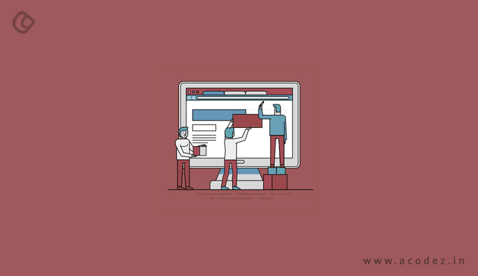
Begin by listing each element you’d like your new site to have. At that point, be careful while considering which elements will help you meet or surpass your site objectives and the necessities and inclinations of your site guests. Classify these elements by significance keeping in mind the end goal to figure out which are wants, needs, and would essentially be good to have if the financial status permits. Components to consider include:
- Fundamental HTML or HTML5/CSS3 site
- Blog(s)
- Responsive outline
- Login option for customer
- Newsletter
- Intranet framework
- Landing pages
- Video gushing
- Integration of social networks
- Search options
- Online payment gateways
- Forms of requests
-
Timeline and Budget of the Project
In the edge of finishing the above things, you must have a truly smart thought of the size and reach of your site update project. Presently it’s an ideal opportunity to consider what your financial plan and course of events for the venture are. Consider the objectives you need to achieve, the utilitarian necessities required, and the time it will take to accumulate all site resources. Having a pattern built up for how much the venture will cost and when you require the final item will be helpful in deciding the team of designers.
Redesigning a site is a daunting challenge, yet understanding the correct procedure can go far towards making it worth.
There’s no utilization in a recently outlined site if nobody can find it. As you plan for the update, keep in mind to report any high performing keywords you presently rank for and the related website pages on your present webpage. In the occasion these pages are moved, it’s critical to make 301 diverts so you don’t lose any of that SEO esteem. Consider the words individuals at present use to discover your site and art your upgrade methodology around them.
How Often Should You Redesign Your Website
It is important to know when your website needs a redesign. Let us look into the common issues we face. These are the signs that show you should redesign your website.
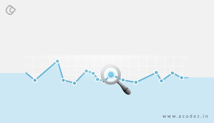
This is your wake-up call! Using your analytics tools you can check the number of visitors over a certain period of time. If you find that the number of people who are visiting your site is steadily declining, it’s time for a rethink and a redesign.
The reasons can be multifarious; you would do well to check every aspect of your website to determine what needs to be fixed. It may be that your site is not attractive to users anymore. Take a look around; what are others doing?
Take some cues from them, and act – liven up your website design. Research shows that your website design influences a potential customer’s opinion not only about the usability of your site but your brand in general. Try and incorporate trending design elements to give a fresh new look to your website.
It doesn’t end with just attracting visitors to your site; you want them to stay, browse, and eventually, buy. If you find that none of that is happening, it’s a sure sign that your website is not doing its job!
After the initial attraction, visitors are unable to find anything on your site that holds their attention long enough. Again, there are hordes of reasons why this is happening, and you need to conduct a thorough evaluation of your site to identify the crux of the problem.
If your site has many pages with very less text, or pages with tons of text, or even pages with tiny images and text in tiny fonts, you can be sure that their patience will wear thin, and they may very likely abandon their search here and move on.
Avoid such pages, and redesign your website to include long scrolling pages; this will break up the info for the reader in a way that informs them through a story like narrative, as well as enable them to scan for important info.
-
The Site is Not Responsive
Long gone are the days when you could just design your site to work beautifully only on laptops or desktops. Today a huge percentage of internet users browse, communicate and shop via their mobile devices – and they come in all kinds of screen sizes.
If your site is not optimized for mobile, they won’t display properly on smaller screens. Visitors won’t be able to view content, navigate, or even tap CTAs properly.
There is a very high chance that they will leave your site and visit one that is responsive. And having two sites – one for desktops and one for mobile won’t work well for you, because maintaining two sites is going to be a huge task involving tons of effort and money.
-
Navigation is Too Complicated

When visitors land on your home page, it should be easy for them to go the page they want directly, find the info they are looking for, and buy the product they were searching. It’s a no-brainer that this means you need to ensure that your navigation is intuitive, and takes them smoothly to wherever it is they want to go on your site. Never make visitors take multiple actions to get to their destination.
It’s a no-brainer that this means you need to ensure that your navigation is intuitive, and takes them smoothly to wherever it is they want to go on your site. Never make visitors take multiple actions to get to their destination.
-
Outdated/Ineffective Content
Often, people are looking to do more than just buy stuff when they go to a website. Today’s consumer is savvy, and wants to educate themselves, and wants to read interesting fresh content.
If your website content fails to pique the interest of the visitor, they may very well be disappointed, and go elsewhere to look for it. You need to write about things your target audience will be interested in. Research keywords and write content that attracts and satisfies your visitors.
You need to write about things your target audience will be interested in. Research keywords and write content that attracts and satisfies your visitors.
Research keywords and write content that attracts and satisfies your visitors.
-
Social Media Activity is Poor
You simply can’t afford to ignore social media. With spiraling use of this platform the world over, you need to be active on at least a couple of social networks, and your website to link prominently to those accounts.
Include social media components in your website; incorporate a shareable blog that is linked to popular social channels and allows your readers to share with ease. Make it simple for your visitors to toggle between social media networks and your website. Don’t be static – be social!
Ok, your site is attractive, people are browsing long enough, and sharing your content, but there are very few leads still.
There are a couple of reasons this could be happening. One is the lack of sufficient, explicit and prominently displayed Call to Action buttons on your site.
Get an expert to identify where you need to have these CTAs. Another reason could be that you don’t have lead capture forms or email newsletter signups – time to include them on your site.
Have a ‘Contact Us’ form, making it easy to have their queries regarding your product or service answered with minimal clicks. It’s important to let your potential customers know that they can contact you through a channel of their preference at any time; this helps instill confidence in your brand.
-
Your Site Still Uses Flash
Flash makes your website appear outdated; it can really make loading very slow and annoy your visitors. What’s more, Flash does not display on mobile devices; users may get an error message, and all the work you put into it is gone for a toss.
Instead, have a good programmer delete all this outdated stuff and use modern animation that loads quickly and works well on mobile devices as well. You also need to include videos on your site that tell your story, as well as explain what you stand for, how your products work and so on.
-
Your Business Has Evolved
Just like outdated content, you must delete the outdated persona. It’s natural for your business to have evolved over the years – even essential. And it’s imperative that your website reflects the evolution.
Whether your brand has changed gradually over time or has undergone a major overhaul, make sure your website is updated to keep pace, rather than showcase what you were when you started out.
A new color scheme, change of location, redesigned logo – all these require website redesign. Your website is your online presence and the first point of contact for your customers, so you need to make sure they know exactly who they are interacting with.

In the infancy of web designing, you could not create sites without proper programming knowledge, and a lot of heavy duty coding. Today the scenario is very different.
Thanks to user-friendly content management systems (CMSs) like WordPress, you can have full control over your website – add images, text, and pages without learning to write code – especially if you’re a medium-sized business. This translates into a lot of savings in both time and money, allowing you to focus more on your core business. This can result in saved time and money for website maintenance, which gives you more time to focus on your business. So if you’re still paying through your nose to make minor changes to your websites, hey! It’s time for a complete overhaul!
You may have noticed that many of these signs are interconnected: you may not be getting leads, AND search engine rankings may be dipping because of too much Flash on your site; you’re not getting leads because your social presence is poor, and so on. So it may not really help your case if you think that you will just change a few parts of your website and fix individual issues.
Website Redesign Mistakes To Avoid
-
Lack of Focus on the Real Goals
Before you commence with the redesigning exercise, you should define and discuss with your team and client, the objectives you intend to achieve with the redesigned website. A lack of focus usually leads to misrepresentation of the core objectives. Once your purpose is clearly in focus with the whole team, it becomes easy to plan out the design. For example, in order to generate leads, you need to position interesting offers and deals prominently. This is done easily if the whole team is in sync with the objectives.
-
Remain Oblivious to Evolving Trends
Since it is a new effort you are putting in, refresh your mind and open up to evolving trends and practices in the design landscape. Website redesigning requires a breath of fresh ideas. However, if you restrain yourself to remaining cloistered in your little shell, it is definitely not going to help you or your business.
-
Sticking to Older Technologies Like Flash
Shrug off your fascination for older technologies like Flash and move to the modern day genies like HTML 5. Flash, it has been identified, tends to make navigation difficult and has a negative impact on user experience. Evaluate your options and identify the correct technology that will best suit your purpose.
-
Lack of Proper Project Plan
Redesigning is a time-consuming activity. Owing to its nature, organizations and teams always need to be doubly sure. Therefore, simple things like the choice of a shade of color or selecting the appropriate font family may take several iterations thereby delaying the whole exercise. It is important, therefore, that you draw out a proper project plan which explicitly states the activities and responsibilities of each member and the turnaround time for every activity.
Also, ensure that your plan includes the high priority reasons for your redesign exercise. For example, some of the most disturbing user feedback on your website was around difficult navigation. Your action items should, therefore, focus on resolving this issue before taking on anything else.
-
Lack of Proper Use of Design Elements
Make sure that you have your primary goal in focus. A redesigning exercise should always be targeted at helping you earn better business. Therefore, use your design elements intelligently so as to be able to reap the best benefits. For example, Overuse of images might tend to divert focus from the intended message, thereby leading you to lose prospective customers.
While it may be true that you may have a lot on your plate, it is also true that it would be risky to attempt to get everything done in one go. Take things one at a time to get the best results. Focus on the highest priority issues and work down accordingly. Also, plan out small iterations for every change which will help you get more effective results.
Website Redesign Project Plan
-
Know What Your Business Is
This may seem a little confusing, as you are a businessman and obviously know what you deal with. But does your website reflect that? Figure out why you are getting a website, and what it will offer the users so that you can get everything just right. Strategize well and identify one focal point that the website should focus on above everything else.
-
White Spaces Are Your Friend
White space gives the visitor a break, allowing him a chance to process the information on your site. Ensure that the website has plenty of white spaces, or you will only end up confusing, or worse, irritating a potential customer.
-
Hand Over The Reins To The User
This is a major design fundamental and should always be practiced. Your user should always feel he or she is in control. The website should be easy to navigate, and the user should be able to identify where he is and what he needs to do next.
Avoid animations, or at least allow users to skip them. Don’t test their patience, and always make them feel like the website will do exactly what they want it to.
-
Keep Your Content Fresh And Diverse
Just because your business belongs to a niche, does not mean you only talk about products. Cover related topics as well to become a great source for information to your customers.
-
Balance Minimal Designs Like an Expert
Minimal website layouts are all the craze today, and they really do look amazing as well! You have a message that you want to get across to the visitor. If you can do that in one of two sentences and with a few images, then, by all means, go for it!
-
Let Your Brand Shine Through
Do not shy away from being bold, or doing something creative. It’s your brand, so make sure the website reflects that.
Test your website regularly as well, and stay on top of all issues or potential problems. And most importantly, make sure you have an expert who can handle all your needs.
Conclusion
Website redesigning is quite important and hence must be tackled properly. By implementing the tips mentioned above, you can rest assured that you can have a website redesign checklist that can help you to redesign a proper website that is user-friendly and provide a better experience to the users. It also ensures that your website is properly integrated with other functions like social media, email marketing, lead generation, and other such tasks. It can help you to grow your website and business in a great way. This checklist can help you prepare for your website redesign.
Acodez is one of the best web design company in India with experience in completing more than 700 projects. The experience gained from these projects and the knowledge of the latest web development trends makes sure that your website is user-friendly and provide a better user experience to the users. Our team of award-winning UX designers makes us one of the best UX design companies in India with 12 international awards to its credit.
Looking for a good team
for your next project?
Contact us and we'll give you a preliminary free consultation
on the web & mobile strategy that'd suit your needs best.



Targeting audience and Having Social Profiles and sharing options are very much necessary for the Website Redesign, Goals Setting is really important as mentioned
Hello, of course this paragraph is truly good and I have learned lot of things from it concerning blogging.
thanks.
Thanks , I’ve just been looking for info approximately this subject for a while and
yours is the best I’ve found out till now. However,
whazt iin regards to the conclusion? Are you sure in regards to
the source?